

Looking for the best camera for your budget, skill level, or unique use case? I've been a photographer for 10 years, and I've got countless camera tests under my belt, so I can give you an idea of what you should be looking for. My team and I have put the best cameras to the test, and we've put our favorites here.
It doesn't matter what you're looking for. Whether you want a camera with an interchangeable lens, an instant model for party pics, or a drone to take cool landscape videos, we've got you covered.
These are the best cameras you can buy right now.


Pete is a senior editor at Tom's Guide. He heads up the site's reviews team and all cameras coverage here at Tom's Guide. He bought his first camera, a Fujifilm, back in 2015 and remains a passionate photographer to this day, both at work and in his spare time. He's also the site's expert on action and 360 cameras, testing them constantly. Pete loves geeking out about cameras and comparing specs to help you find the right product for you.
The best camera for most people

Why it's the best camera for most people: the Nikon Z5II simply offers the most bang for buck out there. Beautiful stills, full frame image quality, professional features, powerful video specs. And all for $1,699.
✅ You want tons of features without spending huge amounts of money.
✅ You're upgrading from your first or second camera.
If you’re upgrading from your first mirrorless or DSLR and you want an investment now you’re taking photography a bit more seriously, the Z5II is going to offer you everything you need to keep growing as a photographer and expanding your creative horizons. Its full frame 24.5MP sensor and the variety of excellent Nikkor glass available are ideal for razor sharp, professional feeling images.
The Z5II offers incredibly strong low light performance and dynamic range, and features 5-axis IBIS, so it has your back regardless of the lighting conditions.
❌ You’re a beginner, pro or have a specific creative niche to fill.
❌ You want something stylish (try the Nikon Zf or a Fujifilm instead).
If you’re a new or aspiring pro taking on your first commissions, the Z5II features dual card slots and subject detection AF, so you won’t be losing or missing your shots and letting clients down. And if you want to dabble in video, there’s 4K/60p in internal 12-bit N-RAW on tap.
As I mentioned up top, this camera is in here because of its price versus its performance. For the money, the features and power of the Z5II are simply unbeatable.
- Read my full Nikon Z5II review
How it compares & sample gallery
How it compares

Canon EOS R6 Mark II
Nikon Z5II
Sony A7IV
Winner: Nikon Z5II
The Z5II packs the features and performance of cameras that cost a lot more. This is an enthusiast and semi-professional tier camera. It’s a reasonable purchase for serious amateur photographers who need a powerful all rounder, but it’s also a solid camera for new or aspiring professionals needing a reliable workhorse without breaking the bank.
As such, it’s competing against the likes of the Canon EOS R6 Mark II and Sony A7 IV, which are both full frame, entry-level professional bodies. The Z5II undercuts them both massively on price, without skimping on features.
The EOS R6 Mark II has a similar resolution at 24.2MP, while the A7IV has a larger 33MP resolution, so will be the better camera for cropping and larger-format printing. That said, 24.5MP is enough for most uses, so the Z5II holds its own.
The Canon in particular has formidable autofocus that the Nikon doesn’t quite match, but that’s not to say the Z5II’s AF is poor. Given it’s, oh, $700 cheaper, that’s a small sacrifice worth making.
Sample gallery


The best camera for beginners

Why it’s the best camera for beginners: The Canon EOS R50 blends excellent image quality, strong autofocus, intuitive controls and an easy-to-use menu. These make it fantastic for getting to grips with photography, but also to grow and expand your creativity as you gain experience.
✅ You’re just getting started and want a flexible platform to learn on.
✅ You're upgrading from an older DSLR or compact to your first mirrorless.
It’s a little more expensive than the EOS R100 below, but its better AF and vari-angle display make it a better long term proposition, so if you’re just getting into photography and want a camera that will last, I think you’re better off spending a little more on the R50.
I tested the EOS R50 personally, and was impressed with the images from its 24.2MP APS-C sensor. 24MP is plenty of resolution for online use so you can start sharing your images for feedback. Canon’s legendary naturalistic color science is ideal for a wide range of genres, so you can figure out which aspects of photography appeal to you most.
❌ You’re on a tight budget or are upgrading from another mirrorless camera.
If you fancy dabbling in vlogging and content creation, the EOS R50 is a great platform to learn video on, too. It shoots 4K video and has a vari-angle display for filming selfie-style footage to camera.
Simply put, the EOS R50 is a great entry-level all-rounder, making it perfect for beginners who also want the features they’ll need to get more technical.
- Read my full Canon EOS R50 review
How it compares & sample gallery
How it compares

Canon EOS R50
Panasonic Lumix G97
Canon EOS R100
Winner: Canon EOS R50
The EOS R50 is up against a couple of tough rivals in the beginner arena. There’s its stablemate, the EOS R100, as well as the Panasonic Lumix G97. All have similar-ish resolutions and are capable of taking lovely-looking stills. The EOS R100 is cheaper than the EOS R50 but much more basic, while the Lumix G97 is a similar price but, despite technically being newer, is only a very modest update to a much older camera. The Lumix also uses a smaller micro-four-thirds sensor, so it performs worse in low light.
The EOS R50 has them both beat in one key area: autofocus. The R50 uses Canon’s Dual Pixel CMOS AF II system (hybrid contrast/phase detection), which is a slightly stripped-back version of the AF in the manufacturer’s pro cameras like the EOS R6 Mark II. The EOS R100, meanwhile, uses an older, more basic system, which lacks the advanced subject detection modes. The G97 uses a contrast-only detection, which performs nowhere near as well.
As I mentioned earlier, the EOS R50 has a more advanced feature set than the R100, including better autofocus, as well as a vari-angle display for shooting video and at odd angles, while the EOS R100 makes do with a fixed LCD. It can also shoot 4K video at 30fps, while the EOS R100 tops out at a cinematic, but more niche 24fps (NTSC) / 25fps (PAL).
Sample gallery


The best budget camera

Why it’s the best budget camera: The Canon EOS R100 is my best budget pick for two reasons. Firstly, there’s the obvious: it’s cheap! Secondly, though, there’s the fact that it’s a good quality camera. There are lots of cameras out there that cost less, but to make it to this list, price alone isn’t enough. My best budget pick has to offer a certain standard of performance. If you're on an incredibly tight budget, see the sub-$200 category below.
✅ You’re a beginner who wants to take great images on a tight budget.
✅ You only want to take casual images of families and vacations, etc.
Key to that is the EOS R100’s imaging performance. It produces beautiful stills from its 24.1MP sensor. It also features Canon’s Dual Pixel CMOS AF which, while not the manufacturer’s latest system, is fairly quick and reliable — it also features face and eye recognition, making it a fantastic choice for portraiture.
❌ You have the cash or the need for a more advanced camera.
❌ You want to shoot video.
As I’ll cover in the comparison section below, the EOS R100 isn’t the perfect camera, especially if you want a wide array of features, but that’s simply the sacrifice one has to make at this end of the market. This is the best cheap camera you can buy.
- Read our full Canon EOS R100 review
How it compares & sample gallery
How it compares

Sony ZV-1F
Panasonic Lumix ZS99
Kodak PIXPRO WPZ2
Canon EOS R100
Winner: Canon EOS R100
In the sub-$500 category (which is my threshold for “budget”) the EOS R100 is a bit of an outlier, as it’s an interchangeable lens camera.
Its competitors in this segment are virtually all compact cameras (i.e. they have fixed lenses that can’t be changed), including the Sony ZV-1F and Panasonic Lumix ZS99. There's also the Kodak PixPro WPZ2 compact, our favorite sub-$200 camera, but in that price range, you're making big compromises on features and image performance, so it's worth spending more on the Canon EOS R100 or Sony ZV-1F.
Fixed lens cameras have their uses, offering built-in optical and digital zooms for lots of flexibility out of the box. However, being able to swap lenses is a huge advantage if you want to get creative with photography. And besides, Canon’s RF-S lens range includes lenses with very wide zoom ranges, if that’s what you want.
The EOS R100 features a larger sensor than both the ZV-1F and ZS99, meaning improved imaging performance (particularly in low light) and higher resolution images, giving you more scope to edit and crop photos.
The R100 also packs Canon’s excellent Dual Pixel CMOS hybrid contrast/phase detection AF, which is much stronger than the contrast-only AF in the Lumix and Sony.
Both the ZV-1F and ZS99 are vlogging cameras, and they are better for video, shooting 4K/30p, while the EOS R100 tops out at 4K/25p.
Sample gallery


The best camera under $200
Why it’s the best camera under $200: In the sub-$200 category, pickings are slim when it comes to decent cameras. Very slim. This price range pretty much limits you to compact cameras.
✅ You want a rugged, outdoorsy camera that’s pocketable.
✅ You only have a couple of hundred dollars to spend.
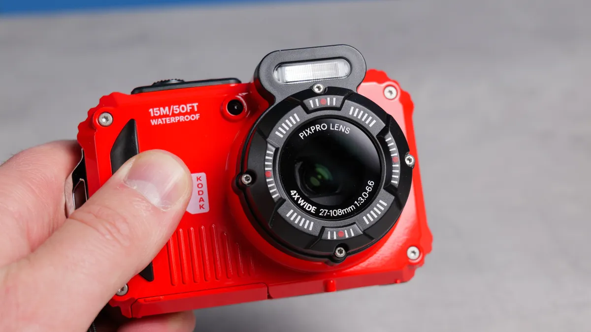
The Kodak PIXPRO WPZ2 is the best camera for those on a serious budget. This camera is extremely pocketable and easy to travel with, it takes good photos and video, and it boasts long battery life. What’s even better is that it can take a beating as it’s waterproof, dustproof and shockproof.
As is the nature of compact cameras, the PIXPRO WPZ2 is small and lightweight, so you can easily slip it into your pocket or a handbag. Its tactile controls are responsive and the camera itself takes good photos, even though they are just 16MP.
The photos have a vintage tinge to it too, which makes me nostalgic for my childhood and teenage years. If you want to capture your adventures on video, the PIXPRO WPZ2 shoots decent 1080P/30fps video too.
❌ You want a more advanced feature set.
When I tested this camera, I was impressed with its ruggedness — it can truly take a beating! Battery life for a compact camera is fairly decent too, as the camera is CIPA-rated for 200 shots or 70 minutes of video.
For those who don’t want to spend too much money, but want a super compact and rugged little camera, the PIXPRO WPZ2 is a fantastic choice. In a world where compacts can cost you thousands of dollars, I still think the humble little WPZ2 is the best compact right now.
- Read Nikita's full Kodak PIXPRO WPZ2 review

How it compares & sample gallery
How it compares

Kodak PIXPRO FZ45
Kodak PIXPRO WPZ2
AgfaPhoto Realishot DC5500
Winner: Kodak PIXPRO WPZ2
There is no dearth of affordable compact cameras today, and cameras like the Pentax WG-1000 and the Panasonic Lumix ZS99 take the fight to the Kodak PIXPRO WPZ2. However, neither of those cameras hits the sub-$200 mark, being much pricier than the PIXPRO WPZ2. Then there’s the AgfaPhoto Realishot DC5500 which is much cheaper but also much worse, and the Kodak PIXPRO FZ45, which costs just $99.
Both the WG-1000 and the PIXPRO WPZ2 feature 16MP sensors so they’re nearly on equal footing when it comes to image quality. They’re both extremely waterproof, dustproof and shockproof too. Video quality is also similar at 1080P/30fps, and both cameras feature electronic image stabilization.
However, the PIXPRO WPZ2 is better for low-light environments as it has a wider f/2 aperture (vs f/3 on the WG-1000). The PIXPRO WPZ2 also upstages the Lumix ZS99 as the latter struggles in challenging lighting conditions. There’s also no form of stabilization at play in the Lumix ZS99. Similarly, the Kodak PIXPRO FZ45 also struggles in low light, so it isn't worth saving money on that camera.
The WPZ2 has much better battery life than its sibling, the FZ45, which uses disposable batteries that are also worse for the environment.
When it comes to value for money, the PIXPRO WPZ2 is the superior camera of the lot. It’s powerful, extremely compact and lightweight, and it takes good photos and video, making it the best compact camera.
Sample gallery


The best camera for street photography

Why it’s the best camera for street photography: Blending power, speed and usability in a compact body, the Fujifilm X-T50 is a formidable camera for street photography.
✅ You want an agile but high-performance street camera.
✅ You want instant creative and stylized images out of camera.
Its high-res 40.2MP sensor captures plenty of detail which is especially useful for cropping in post without a noticeable drop in quality. When I tested the camera, this came in handy during unpredictable street scenes where perfect framing wasn’t always possible.
The X-T50 boasts a rapid autofocus system that easily locks on to faces and eyes, even in challenging lighting, which makes it great for street. In low-light conditions, the 5-axis (up to 7-stops) IBIS came in clutch, allowing me to shoot handheld at shutter speeds as slow as 1s.
❌ You don't want to carry spare batteries.
❌ You're on a super tight budget.
What really sets the X-T50 apart for street work are its tactile, intuitive controls, and the dedicated film simulation dial which gives you access to 20 film recipes — ideal for when you want to quickly share your photos online without any editing in post. There’s a recipe for every mood and tone, and I personally loved using Nostalgic Neg and Acros for a moody look.
The X-T50 weighs just 15.45oz too, making it easy to travel with, and its sculpted grip makes the camera a joy to handle and use all day long. On the “all day long” point, one slight issue with the X-T50 is its battery life, which isn’t amazing. It’s also a little on the pricey side. That said, there really is no better camera for shooting street and architecture, which is why the X-T50 is my pick for the best street camera.
- Read Nikita's full Fujifilm X-T50 review
How it compares & sample gallery
How it compares

Fujifilm X-E5
Fujifilm X100VI
Fujifilm X-T50
Nikon Z f
Winner: Fujifilm X-T50
The Fujifilm X-T50 faces fierce competition from its stablemates, the Fujifilm X-E5 and the Fujifilm X100VI. All three cameras’ specs are near identical: 40.2MP sensor, X-Processor 5 image processor, IBIS, 20fps electronic shutter, etc. Speaking from personal experience, I compared all three cameras and ended up buying the X-T50.
Even though the X-T50 isn’t the cheapest, a lot of it still comes down to the cost, as the X-T50’s body is $300 cheaper than the X-E5’s. But it also comes down to handling. The X-T50’s sculpted grip protrudes further than the X-E5’s and the X100VI’s, making the former better to handle and use for long periods of time.
The X-T50 one-ups the X-E5 and the X100VI in another key area: monitor resolution. Its touchscreen has a higher resolution of 1.84M dots, versus the X-E5’s 1.04M-dot and the X100VI’s 1.62M-dot displays. Both the X-T50 and the X100VI also have built-in flash for shooting in low-light conditions, which can come in handy when you’re shooting the streets at night or dusk. But the X-T50’s handling and interchangeable-lens design make it the better investment.
The X-E5 does, however, feature a “Surround View” mode which simulates an OVF by applying a frame crop to the EVF/display and JPEGs, but still shows the full 3:2 frame outside your frame boundaries via the EVF, like an OVF. Meanwhile, the X100VI has a full-blown hybrid OVF/EVF, which is great for immersive street shooting and will be a better shout for traditional OVF fans.
There’s also the Nikon Z f to consider, which is a highly capable full-frame camera for street photography, but like the X-E5 it’s more expensive, and its sensor is only 24MP. This is brilliant for its low light performance, but it limits the cropping potential, which is often important in street photography when you may not have time to frame properly.
At the end of the day, the X-T50 is the street camera that provides the best blend of handling, features and image performance, for a reasonable price.
Sample gallery


The best camera for vlogging

Why it’s the best camera for vlogging: The Canon EOS R50 V is the video version of the Canon EOS R50 and boasts powerful video-centric features, a compact design and a beginner-friendly price point. This all makes it a massive upgrade from your smartphone or an older camera, if you’re starting to take your content a bit more serious. However, it’s very easy to use, making it perfect for new content creators looking for their first kit investment.
✅ You’re a new content creator looking for your first vlogging camera.
✅ You want a powerful upgrade from your smartphone or an old DSLR.
The EOS R50 V has been designed with content creators and vloggers in mind, and you can tell by simply looking at the camera. Its video-first design replaces the traditional mode dial on its non-video stablemate with a dial dedicated to swapping between different video modes. Dual video recording buttons also make it easy to use regardless of which hand you’re holding the camera with.
Its prowess lies in the EOS R50 V’s ability to shoot crisp 4K/60p video while offering advanced autofocus (with Auto subject detection) inherited from Canon’s higher-end models. Its Dual Pixel CMOS AF II system delivers lighting-fast accurate eye and subject tracking — perfect for solo vloggers or fast-moving scenes.
❌ You currently or want to take photography more seriously in addition to video.
❌ You already own a 4K/60p-capable camera.
Though its lightweight at just 13.05oz, the EOS R50 V doesn’t compromise on usability. I personally love the inclusion of a vertical tripod thread which makes the camera great for shooting vertical video for social media. Video can also be recorded in 10-bit C-Log 3 for those wanting to capture a wider dynamic range for use in post production.
For anyone wanting a video camera that doesn’t break the bank, there’s no better camera than the EOS R50 V right now. It’s a clear standout in today’s crowded vlogging camera market.
- Read Nikita's full Canon EOS R50 V review
How it compares & sample video
How it compares

Sony ZV-1F
Fujifilm X-M5
Canon EOS R50 V
Fujifilm X-S20
Winner: Canon EOS R50 V
The Canon EOS R50 V is up against the Fujifilm X-M5 and Sony ZV-1F vlogging cameras, but also the premium Fujifilm X-S20, which packs vlogging-specific features. While the X-S20 has the EOS R50 V in the IBIS department (the latter doesn’t have it), the EOS R50 V earns brownie points for its video-first design. Cameras like the Fujifilm X-M5 and Sony ZV-1F fall short here too. The EOS R50 V offers dual recording buttons, a vertical tripod thread and a video-first dial, which none of the others do. It's been built from the ground up as a vlogging tool.
The EOS R50 V also weighs less than the X-S20 (13.05oz vs 17oz), making it easier to travel with and perfect for on-the-go vloggers. It is, however, heavier than the ZV-1F (8oz) and the X-M5 (10.82oz) but the trade-off is better video-oriented features and fantastic handling.
The EOS R50 V is plenty powerful for shooting video for YouTube, Instagram, TikTok, what-have-you. It delivers sharp, detailed video without complex settings or post-processing. It beats the ZV-1F here which can only shoot 4K at 30p — and you can’t change its lens either.
The X-M5 shoots 6.2K/30p video, which is good for cropping and maintaining resolution, or for oversampling 4K video (where YouTube and most displays top out). That's great, but you'll be capped at 30p — meanwhile the EOS R50 V shoots 4K/60p that's oversampled from 6K anyway, but at that higher 60fps frame rate giving you more flexibility.
The X-M5 has a lot in common with the EOS R50 V, such as the 1.04M-dot monitor and similar sensors, but the EOS R50 V is far better when it comes to autofocus, boasting 4,503 points versus just 425 on the X-M5.
Overall, it's the EOS R50 V’s compact body, video-first design and features, and ease of use that make it the best vlogging camera — especially for newer vloggers.
Sample video


Sample gallery


The best camera for video

Why it’s the best camera for video: The Panasonic Lumix S5IIX is the best camera for video thanks, of course, to its powerful recording credentials, but also because of the sheer amount of flexibility it offers. The number of resolutions, formats, compression types (or indeed RAW), data capture rates, bit depths — and so on, so forth — is simply staggering.
✅ You’re a serious content creator or shoot professional video.
✅ You have complex video workflows and/or client requirements.
What that means is you can tailor the Lumix S5IIX to your precise workflow, production or output requirements. In short, this camera isn’t just about specs. It’s a professional video workhorse designed with the needs of video creators in mind.
If you want some specs, though, oh boy you can have ‘em. 24.2MP full frame imaging and superb low light performance; 5-axis IBIS for stabilized handheld footage; 6K/30p or C4K/60p in 10-bit 4:2:2 internally, with unlimited 4K recording thanks to an internal fan. There’s a custom LUT bank, V-Log and ALL-I or Long GOP compression when shooting MOV or MP4.
❌ You’re a beginner, vlogger or mainly a photographer
It’ll also shoot Apple ProRES in 12-bit 4:2:2 at bitrates of up to 1.9Gbps via SSD. Meanwhile, ProRES RAW and Blackmagic RAW can be output to to external recording devices via HDMI Type-A.
- Read my full Panasonic Lumix S5IIX review
How it compares & sample video
How it compares

Panasonic Lumix S5IIX
Nikon Z6 III
Panasonic Lumix GH7
Winner: Panasonic Lumix S5IIX
The Panasonic Lumix S5IIX has held our ‘best for video’ title for a while now, and that’s because there still isn't much out there that can compete with this camera based on bang-for-buck.
Just like the original Lumix S5, the S5II and S5IIX are designed with professional video shooters in mind. And that’s reflected in the sheer number of recording formats and controls open to you when using it.
The only other mirrorless hybrid that competes is the Nikon Z6III, which offers some better headline features like internal 12-bit 6K N-RAW and ProRes RAW HQ recording and a CFExpress port. The downside is that the Nikon comes with a hefty price premium.
Naturally, there are Lumix’s own cameras, including the Panasonic Lumix GH7, which is also an excellent camera for video. It boasts a CFExpress port, unlike the S5IIX, and will cost you a similar amount of money (as the S5IIX is easily available for less than its $2,199 MSRP).
The GH7 uses a micro four thirds sensor, though, versus the S5IIX’s full frame format. This means the GH7 is more compact and uses smaller lenses, but results in poorer low light performance, and lacks the full frame “look”.
Overall (and especially considering its price), the S5IIX still pips the competition, offering enough features to satisfy demanding professionals without breaking the bank.
Sample video


Sample gallery


The best camera for wildlife photography

Why it’s the best camera for wildlife photography: The OM System OM-1 Mark II is the ideal Micro Four Thirds camera for wildlife enthusiasts who wish to add to their portfolio, share images on social media, or create small prints of them. This camera is fast, handles sublimely, and is compact and portable.
✅ You’re a wildlife enthusiast or buying a wildlife camera for the first time.
The OM-1 Mark II utilizes a 20.4MP M43 sensor with the ability to stack images in the High-Res Shot mode, which captures 50MP handheld and 80MP tripod photos. A rapid autofocus system, advanced subject detection, and a high-res 5.76M dot electronic viewfinder with blackout-free sequential shooting mean you never miss a shot — especially when photographing birds in flight or land mammals sprinting.
When it comes to speed, the OM-1 Mark II features a maximum 120fps shooting rate with pre-capture which starts buffering a running series of photos at 120fps when the shutter button is half-pressed, ensuring you don’t miss the action. For moments when you don’t need such a high drive, there’s the option to shoot at 10fps, 12.5fps, 16.7fps, 25fps and 50fps.
❌ You want more resolution for large format printing or extreme cropping.
Sporting a chunky grip, the OM-1 Mark II feels lovely to handle, with either one hand or both. You also get up to 8.5-stops of in-body image stabilization, enabling you to shoot at slow shutter speeds handheld. The camera also features a 1.84M dot touchscreen which is responsive and bright enough to view in direct sunlight.
Most importantly, the OM-1 Mark II is IP53-rated so it offers significant protection against dust as well as water, and can withstand freezing temperatures down to -14°F / -10°C. If you want to dabble in light videography, the camera can shoot stunning C4K/60fps video too.
- Read Nikita's full OM System OM-1 Mark II review
How it compares & sample gallery
How it compares

Fujifilm X-H2S
Panasonic Lumix G9II
OM-System OM-1 Mark II
Winner: OM-System OM-1 Mark II
The OM-1 Mark II’s main competitors are the APS-C Fujifilm X-H2S and the M43 Panasonic Lumix G9II. When it comes to high-speed drive, the OM-1 Mark II blows the other two out of the water, as the X-H2S’ drive tops out at 40fps and the Lumix G9II’s at 75fps. If speed is your priority, the OM-1 Mark II should be your pick.
But if resolution and image quality are what you’re after, the X-H2S might be more your thing. The OM-1 Mark II is great for social media-ready shots and online use (when shot using low ISO), but for top-notch noise-free images, especially at high ISO, the X-H2S should be your port of call. The X-H2S’ larger APS-C sensor delivers much cleaner images at ISO sensitivities higher than 6400. Both the Lumix G9II and the OM-1 Mark II struggle when shooting at high ISO.
The OM-1 Mark II, however, doesn’t struggle to focus on smaller animals like the X-H2S does. It’s capable of locking onto small wildlife — as small as ladybirds and goldfinches — and it continues to stay focused on them while panning or shooting video. The OM-1 Mark II’s sensor also has a 2x crop factor compared to the X-H2S’ 1.5x factor, which means you can carry more compact telephoto lenses while still being able to zoom in a lot.
Lastly, even though the X-H2S supports CFExpress cards for faster write speeds while the OM-1 Mark II doesn’t, the latter features better IBIS with up to 8.5-stops (versus 7-stops on the former), which I think is worth the trade-off if you shoot handheld a lot.
Sample gallery


The best camera for sports photography

Why it’s the best camera for sports photography: Sports photography tends to be the realm of professionals, and for pros needing a reliable workhorse, the Sony A1 II is the best camera. Its mindbending autofocus, 30fps burst, incredibly detailed viewfinder, CFExpress support and other features make it the undisputed king of sports photography.
✅ You photograph sporting events for work.
✅ You need best-in-class autofocus and speed.
The A1 II’s impressive 30fps burst rate and lighting-fast shutter speeds ensure pros don’t miss crucial moments and capture every bit of motion with precision. The A1 II is built like a tank but my favorite design choice is the clever viewfinder with a 9.44M-dot resolution and 240Hz refresh rate.
It eliminates motion blur when tracking subjects, making it easier to frame and follow with accuracy. Combined with a CFExpress Type A card which guarantees fast write speeds, there are no blackouts or downtime after bursts.
❌ You’re a hobbyist or amateur photographer on a budget.
There’s also up to 8.5-stops of IBIS which reduces shake and enables you to shoot at slow shutter speeds — or at nighttime, when many games take place. The A1 II introduced a new Auto subject detection mode too (first time on a Sony camera) which negates the need to swap between subjects (like animals to humans and vice versa).
And of course, the A1 II’s 50MP sensor captures crisp, incredibly detailed images, giving you room to make tight crops, perfect for isolating athletes mid-play without sacrificing resolution. All these qualities make the A1 II the best camera for sports.
- Read Nikita's full Sony A1 II review
How it compares & sample gallery
How it compares

Fujifilm X-H2S
Canon EOS R1
Canon EOS R5
Sony A1 II
Winner: Sony A1 II
There are many fast cameras on the market, such as the Canon EOS R1 and the Canon EOS R5 Mark II, as well as the Fujifilm X-H2S, but we still consider the Sony A1 II the best for sports. While the EOS R1 and the EOS R5 Mark II technically offer more autofocus points (1,054 versus the A1 II’s 759), the A1 II still performs flawlessly when it comes to subject tracking — especially for human detection, which is among the best I’ve tested.
It was close between the X-H2S and the A1 II, though, as the former offers 40fps burst shooting — but the faster drive is better suited to wildlife, so is its longer battery life (720 shots vs A1 II’s 420), especially when spending long periods of time out in the field. But for events, like 90-minute football matches, the A1 II’s battery and support for two-way charging, is more than adequate.
Also, the A1 II pulls ahead with its 2.1M-dot touchscreen and a class-leading, highly detailed 240Hz 9.44M-dot EVF (compared to the X-H2S’ 5.7M-dot EVF). While all three of its competitors are fantastic in their own right, the A1 II is the best camera for sports due to its speed, precision and superior display tech which make it the ultimate tool for pros in fast-paced environments.
Sample gallery


The best camera for professionals

Why it’s the best camera for professionals: Naming a camera as "best for professionals" is a little bit of a misnomer, I'll admit, as with their skill, experience and unique demands, each professional will choose the camera that best suits their individual style and workflow. However, the EOS R5 Mark II is, in my view, the best pro-tier camera on the market today.
✅ You take photos for a living.
✅ You need a reliable, versatile workhorse that delivers in all situations.
It's certainly the most user-friendly professional camera I’ve tested. When I took it out of its box, I was ready to shoot within seconds, thanks to its intuitive control scheme and a highly customizable interface — yes, nearly every button and dial can be remapped to suit your workflow. The well-organized, color-coded menu system makes navigating settings painless.
Our cameras editor Pete Wolinski also took the EOS R5 Mark II onto a product photography shoot, where he says he was blown away with just how easy and intuitive the camera was to use in the studio.
Whether I was capturing fast-moving wildlife or taking studio portraits, it was a versatile workhorse in all situations. Its 45MP Stacked CMOS sensor delivers sharp, highly detailed images that hold up even when cropped, although AI-powered in-camera upscaling delivers 180MP files which allow cropping to extreme levels while preserving plenty high resolution images with plenty of detail.
❌ You’re a beginner or enthusiast, or you're on a budget.
It's quick too, with 30fps burst for capturing fleeting moments, and with CFExpress Type B support, there’s no blackout between shots to slow you down.
Canon’s Dual Pixel Intelligent AF system is outstanding, and its subject detection reliably identifies and tracks humans, people, animals and vehicles. Auto subject detection also means you don’t need to manually swap between subjects, so you won't miss important shots while fiddling with detection settings.
This is a standout camera for video work too, featuring 8K/60p 10-bit 4:2:2 shooting (which is rare even at the high end where this camera sits). Full weather-sealing means your gear will stay safe no matter the conditions.
- Read Nikita's full Canon EOS R5 Mark II review
How it compares & sample gallery
How it compares

Sony A7R V
Nikon Z7II
Canon EOS R5 Mark II
Winner: Canon EOS R5 Mark II
The Canon EOS R5 Mark II competes against the likes of the Nikon Z7II and the Sony A7R V. The A7R V gives the EOS R5 Mark II some trouble with its 61MP sensor and higher-res 9.44M-dot EVF. But its 10fps burst shooting pales in comparison to the EOS R5 Mark II’s 30fps, which makes the latter far better for fast-paced sports and wildlife.
Speaking of, the EOS R5 Mark II has a faster autofocus system too (1,054 points vs 693 on the A7R V and 493 on the Z7II) for tracking animals, birds, humans and vehicles.
The Z7II is our go-to camera for product photography in our studio, and it has a similar resolution sensor to the EOS R5 Mark II which means we can crop into images extensively where needed in post. But like the A7R V, it has a 10fps drive which isn’t fast enough for, say, sports photographers. The Z7II is cheaper than the EOS R5 Mark II but for those who don’t want to compromise on specs, the latter is the better investment.
Another deciding factor that led to us choosing Canon’s flagship as the best full frame camera? Battery life. The EOS R5 Mark II is CIPA-rated for 630 shots (monitor) while the A7R V is CIPA-rated for 530, and the Z7II is rated for just 420 shots. And as I mentioned up top, the EOS R5 Mark II is a very capable video camera, shooting 8K/60p video — the A7R V can shoot in 8K/24p, while the Z7II is limited to 4K/60p.
At the end of the day, the EOS R5 Mark II offers better value for money, thanks to its razor sharp sensor, 8K/60p video, robust build and handling, and 30fps burst shooting.
Sample gallery


The best compact camera

Why it's the best compact camera: The Fujifilm X100VI blends excellent imaging performance, tactile handling, exquisite build and premium features. Importantly, in a time when compact cameras can cost you upwards of $8,000, the X100VI it won't totally ruin you financially.
✅ You want an all-in-one package with fantastic imaging and premium features.
✅ Street photography is a big part of what you shoot.
The X100VI uses Fujifilm's 40.2MP X-Trans CMOS 5 HR sensor, which we've seen in the X-T5, X-T50 and X-E5. Like those cameras, it also uses Fujifilm's latest X-Processor 5 imaging processor, delivering Fuji's latest subject detection AF algorithms. These features, and a 6-stop IBIS system, are big upgrades over the previous model, the Fujifilm X100V.
Imaging performance was very impressive when I tested this camera, especially thanks to the sharp built-in 23mm lens (equivalent to just under 35mm on a full frame camera), which does full justice to that high res sensor. As I mentioned above, you can spend a lot of money on a compact, but the X100VI delivers razor sharp images that won't have you complaining.
❌ You want to change lenses.
❌ You're only taking photos casually of family or vacation.
Naturally, as a Fujifilm, it also gives you access to Fuji's library of creative film simulation profiles for retro-styled photos straight out of camera.
More important, though, is how this camera feels to use. It's a lovely handling camera, with tactile controls befitting its street- and travel-oriented nature. It also employs a hybrid OVF/EVF, which is great for immersive shooting on the street.
As far as compact cameras go, if you want great image quality and very few sacrifices made, but you don't want to spend tons of money, the X100VI is the only real choice.
- Read my full Fujifilm X100VI review
How it compares & sample gallery
How it compares

Fujifilm X100VI
Fujifilm GFX100RF
Leica Q3 43
Ricoh GR IIIX
Winner: Fujifilm X100VI
The compact camera market is a mixed bag, to say the least. It ranges from super budget options like the ($179) Kodak PixPro WPZ2 all the way up to multi-thousand-dollar monsters like the $4,899 Fujifilm GFX100RF and $7,380 Leica Q3 43.
Sure, the GFX and Leica have the potential to deliver greater quality images thanks to their larger, higher resolution sensors. But is that worth spending several thousand pounds more on? And will most people be able to tell the difference? I'd argue no, and no. The X100VI is plenty of camera for the money, even offering more features than the Leica Q3 43 — namely sensor-shift stabilization and a hybrid OVF/EVF.
The X100VI's closest competitor is, without a doubt, the Ricoh GR IIIX, and yeah, that's a really tough tussle. The Ricoh also offers lovely image quality and stylized images. The X100VI has the upper hand with its increased resolution (40MP versus 24MP) and stabilization (5-axis versus 3-axis).
The Fuji also has a wider array of subject detection modes, plus an EVF/OVF and 1.62m dot display while the GR IIIX makes do with a 1.037m dot display and no viewfinder. The tactile handling and layout of the X100VI are, in my opinion, preferable to the more modern and pared-back controls of the Ricoh.
Although the Ricoh is around $500 cheaper and a great camera, the Fujifilm justifies the extra spend with its higher specs and better features.
Sample gallery


The best film camera

Why it’s the best film camera: The Lomography Lomo MC-A 35mm is a modern film camera, and it’s the best yet. Offering manual control over shutter speed, ISO and exposure compensation, a variable aperture between f/2.8 and f/16, as well as LiDAR-powered autofocus, it’s the best film camera you can buy right now.
✅ You love film photography and want manual control over shutter speed, ISO and aperture.
✅ You want crisp, detailed images with bright colors.
Fitted with a 32mm lens with varying focus zones, the Lomo MC-A 35mm is suited to shooting virtually any genre — whether that’s landscape, street, portraits and even travel snaps. The viewfinder is easy to look through and it enables you to accurately frame your subject, and there’s a handy screen on the top plate that gives you a quick view of your active shooting settings.
It’s also Lomography’s best built camera yet, sporting a full metal body that feels substantial to hold, and its film advance lever has a lovely, smooth motion to it. Photos taken on the Lomo MC-A 35mm come out bright and detailed, thanks to the sharp lens, but this will of course depend on the film you’re using too (we recommend using Fuji 200).
❌ You want to remain inconspicuous as the autofocus can be loud and jarring.
❌ You’re on a tight budget.
The Lomo MC-A 35mm’s variable f/2.8-f/16 aperture also means that you can add nice, background bokeh to your photos, especially when taking portraits of friends and family. While you can adjust the 12-3200 ISO manually, you can set it DX Auto too, where the camera will read DX-coded film and automatically set the ISO to the appropriate value. This is a great feature to have for moments when you can’t be bothered to manually adjust settings.
If you enjoy shooting at night or in low-light conditions, you’ll be pleased with the Lomo MC-A 35mm’s low-light performance too, aided by its powerful flash. It’s the best low-light performance we’ve seen from a film camera yet.
- Read Nikita's full Lomography Lomo MC-A 35mm review
How it compares & sample gallery
How it compares

Lomography Lomo MC-A
Kodak Ektar H35
Pentax 17
Winner: Lomography Lomo MC-A
The Lomography Lomo MC-A 35mm’s closest competitor is the Pentax 17 which is another modern but half-frame film camera. Head-to-head, the Lomo MC-A 35mm takes more detailed photos and it has one very important thing the Pentax 17 doesn’t: autofocus. The Lomo MC-A 35mm is the camera to get if you don’t want to bother with manual focusing, as focusing on the Pentax 17 can be hit-or-miss.
Unlike the Pentax 17, the Lomo MC-A 35mm comes with a rechargeable CR2 battery which means you can start shooting as soon as you’ve unboxed the camera. However, the Pentax 17 has a leg-up when it comes to the viewfinder. Its viewfinder is more detailed and shows some useful information, such as focus zones, which the Lomo MC-A 35mm’s doesn’t.
The Pentax 17 isn’t nearly as well-built as the Lomo MC-A 35mm. While the Pentax 17 feels very plasticky and hollow, the Lomo MC-A 35mm feels more substantial to hold and better to handle, thanks to its metal body. If you want a full frame film camera, the Lomo MC-A 35mm is for you, but if you want to double the shot count with a half-frame film camera, the Pentax 17 is the way to go.
But with autofocus, better build quality, and lovely image quality, the Lomo MC-A 35mm is the clear winner.
Sample gallery


The best instant camera

Why it’s the best instant camera: The Fujifilm Instax mini Evo is easily the best looking with its retro styling. It backs its looks up though, and offers extensive creative control. It offers 10 filters which can be combined with 10 lens effects, which means you can get 100 different creative combinations. It's also super compact and portable, making it a great travel companion.
✅ You want extensive creative control.
✅ You want the benefits of instant and digital cameras.
The Instax mini Evo produces gorgeous images on the Instax mini film sheets it uses. In my testing, it performed exceptionally well in all lighting conditions, too, so it's a great little camera to document evenings out with your friends or family.
With internal storage for 45 photos digitally and a microSD card slot, the Instax mini Evo lets you print photos at a later date or transfer to your smartphone. Having a microSD port also means that you don’t have to stress about running out of film and not being able to use the camera.
❌ You’re on a tight budget.
❌ You want a purely analog shooting experience.
The Instax mini Evo is also very compact and lightweight, making it the ideal instant camera to take on your travels. It easily slips into most pockets, or you can use the included strap to wear it around your neck. Battery life is also long at 100 shots, and the camera doesn’t use disposable batteries, making it environmentally friendly.
While the Instax mini Evo doesn’t come cheap, its creative capabilities and the freedom it provides make it the best instant camera today.
- Read Nikita's full Fujifilm Instax mini Evo review
How it compares & sample gallery
How it compares

Leica Sofort 2
Fujifilm Instax mini Evo
Kodak Mini Shot 2 Retro
Fujifilm Instax mini LiPlay
Winner: Fujifilm Instax mini Evo
The Fujifilm Instax mini Evo’s competition is the Leica Sofort 2: also a hybrid instant camera whose specs are near identical to the Instax mini Evo’s. Both cameras have a 28mm focal length, 45-shot internal storage, 100 effect combinations, f/2 aperture for shooting in low light, et al.
So what’s the difference? The Sofort 2 is double the price of the Instax mini Evo, and based on pure value for money, the latter is the better choice. But the Instax mini Evo’s price tag is a double-edged sword — it still isn’t cheap. Its stablemate, the Fujifilm Instax mini LiPlay, is also a hybrid instant camera and upstages it by letting you record voice notes and add them as QR codes to prints (although this is a very finicky process).
The Kodak Mini Shot 2 Retro also serves the same purpose as the Instax mini Evo, but the latter wins against the Kodak as image quality is far better, color reproduction is more accurate, and low-light performance stuns.
At the end of the day, it comes down to image and print quality and design, and the Instax mini Evo takes the cake.
Sample gallery


The best action camera
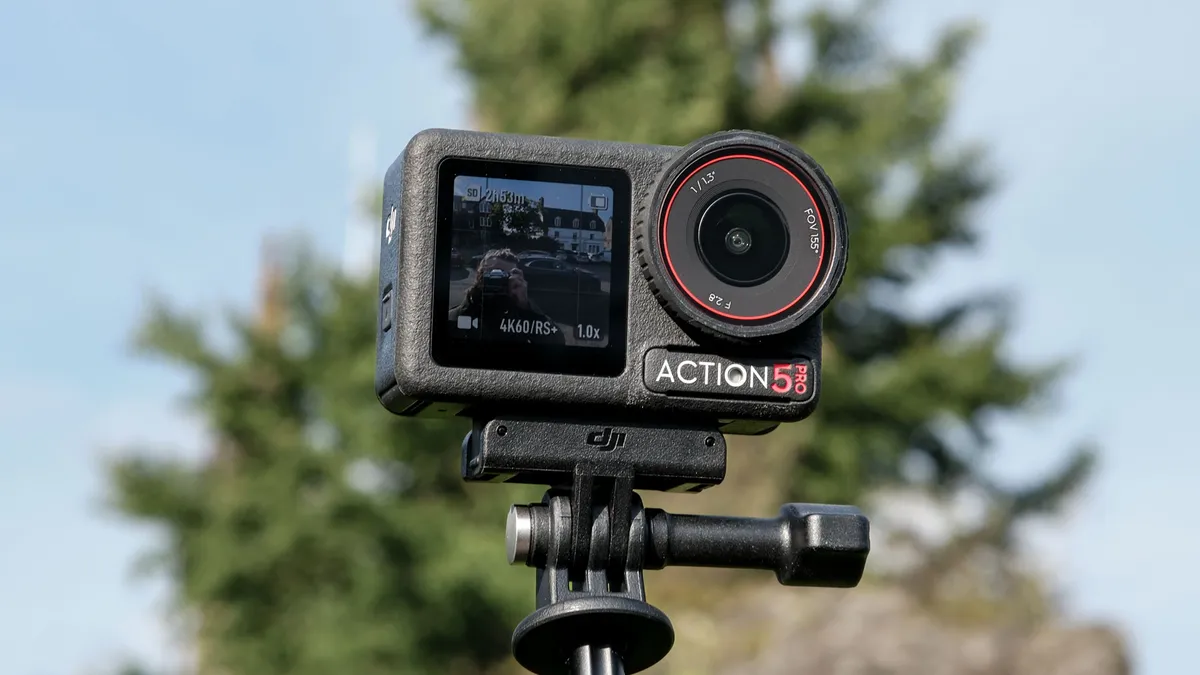
Why it’s the best action camera: The DJI Osmo Action 5 Pro offers the most professional features for the money of any action camera, yet it costs less than an equivalent camera from GoPro or Insta360. Whether you’re looking for your first action cam, you’re an experienced content creator or even a professional videographer, the OA5 Pro is the best all-round solution for high octane video recording.
✅ You shoot high-octane content for social media and/or YouTube.
✅ You already own other DJI gear.
The Osmo Action 5 Pro offers everything a pro shooter will need, with a price tag palatable to content creators and amateurs alike. It can shoot beautiful 4K/60p footage, while DJI upped the sensor size from the previous Osmo Action 4, resulting in better low light performance and improved stabilization. It also shoots in Log and HLG for those editing their own footage.
While the OA5 Pro has decent internal microphones, it can hook up seamlessly with DJI audio devices, such as the DJI Mic 2, making it a great shout for creators already in the DJI ecosystem.
❌ You need +4K res for oversampling or extreme cropping.
❌ You’re already heavily invested in GoPro or Insta360 accessories.
The camera also features 47GB of internal memory, giving you extra storage, best-in-class battery life and beautiful OLED displays. Oh, and it’s waterproof down to 65 feet — another best-in-class spec. And all while undercutting its rivals significantly on price.
- Read my full DJI Osmo Action 5 Pro review
How it compares & sample video
How it compares

GoPro Hero13 Black
DJI Osmo Action 5 Pro
Insta360 Ace Pro 2
Winner: DJI Osmo Action 5 Pro
Both the GoPro Hero13 Black and Insta360 Ace Pro 2 shoot higher resolution video than the OA5 Pro’s 4K (5.3K and 8K respectively). This may be beneficial to pros or hardcore content creators who need to oversample 4K footage or do lots of cropping into frame. Most people will only need 4K/60p, though.
In virtually every other way, the OA5 Pro is as good as or better than its rivals. Just like the Ace Pro 2, the OA5 Pro features a 1/1.3-inch sensor, which is larger than the Hero13 Black’s 1/1.9-inch sensor, making it better in low light. Its stabilization is a serious improvement on the DJI Osmo Action 4, and is on par with Insta360 and GoPro systems.
The Osmo Action 5 Pro features best-in-class battery life, lasting a huge 112 minutes at 4K/60p. The Hero13 Black lasted 80 minutes, while the Ace Pro 2 lasted 76. It also features best-in-class waterproofing, increased from the OA4’s 59 feet to 65 feet. This is almost double the waterproof rating of the Hero13 Black, and a whole 26 feet more than the Ace Pro 2.
As I touched on above, there’s also each camera’s ecosystem to think about. The OA5 Pro can hook up wirelessly to DJI devices, such as the DJI Mic 2 and DJI Mic Mini, and shares the same battery as the DJI Osmo 360, so if you’re already invested in the DJI ecosystem, you won’t have to buy whole new sets of accessories or batteries.
The cherry on the cake? All of this comes at a much lower price than the Hero13 Black and Ace Pro 2, so unless you need that extra video resolution or are already invested heavily in GoPro or Insta360 tech, I would recommend the Osmo Action 5 Pro.
Sample video


The best 360 camera

Why it’s the best 360 camera: The Insta360 X5 is the king of 360 cameras thanks to its combination of class-leading features. It packs excellent 8K/30p 360 recording, resulting in up to 4K footage when reframed to 16:9 (or 9:16) for social media. The two sensors have been upsized from the X4, resulting in noticeably cleaner low light images, too.
✅ You’re an action content creator or motovlogger.
✅ You're upgrading from another Insta360 360-degree camera.
The X5 features a built-in wind guard, excellent microphones and strong AI-powered wind reduction. The result is astoundingly clean audio out of camera, even when shooting high speed footage — it’s actually cleaner than a dedicated microphone.
The Insta360 X5 features removable lenses which you can replace yourself, removing the need for external lens guards that degrade image quality. It also features respectable battery life and decent thermal performance.
❌ You’re on a tight budget.
❌ You already own DJI gear, or only need a single-lens action camera.
Now, I'll admit it: the Insta360 X5 is a pricey camera for sure. Insta360's cameras are always priced at a premium versus other brands. But good 360 cameras capable of 4K output footage don’t come cheap, and for the performance the X5 provides, it’s worth the spend. That's why I awarded the X5 our full 5-star rating in my review.
- Read my full Insta360 X5 review
How it compares & sample video
How it compares

Insta360 X5
DJI Osmo 360
Insta360 X4
Winner: Insta360 X5
At its launch in April 2025, there wasn’t really any 360 camera that could compete with the Insta360 X5 — even its sibling, the Insta360 X4. And indeed, there still isn’t really anything that properly competes, despite the recent launch of the DJI Osmo 360.
The Insta360 X5 is just a much more compelling and complete package than all its rivals. It’s a huge step up over the X4. Although the X4 was also 8K/30p capable, it used smaller sensors meaning worse low light performance; it didn’t have the advanced microphones and wind reduction of the X5, meaning worse audio and the necessity for an external mic; its battery life was weak in comparison; and its lenses weren’t replaceable, so you needed to protect them with guards that affected image quality. The X5 addresses all of those issues, making it a much better all-round camera for high-quality 360 footage.
The only potential competition is the DJI Osmo 360, which is also an 8K-capable camera, and will in fact shoot up to 8K/50p (at serious detriment to battery life). The Osmo 360 does have some notable advantages over the X5, namely double the battery life at 8K/30p and seamless integration with other DJI gear — it uses the same batteries as the DJI Osmo Action 5 Pro and can wirelessly connect to the DJI Mic 2.
Even when the DJI is paired with the Mic 2 though, the audio still isn’t as good as the X5’s built-in mics and noise reduction algorithms — they’re simply that good.
Both cameras have solid companion apps to edit footage (DJI has improved its Mimo app massively in the last couple of years), and both will set you back a fair chunk of money, although the Osmo 360 is the cheaper camera.
In the end, it’ll all come down to your budget and priorities. If battery life and cost are the most important to you, and/or you’re already invested in the DJI ecosystem, the Osmo 360 may be best. In general, though, the Insta360 X5 is a better-developed all-round package, and I would spend the premium to get it over the Osmo 360, if I were torn between the two.
Sample video

The best drone
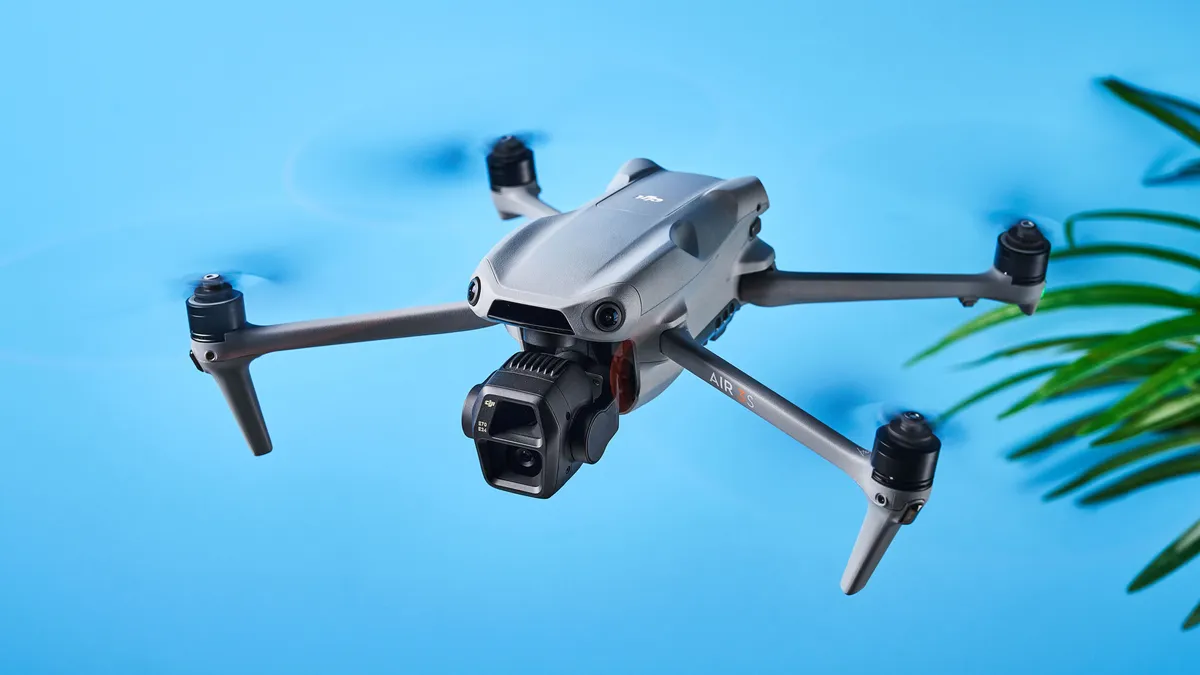
Why it’s the best drone: I test the best drones at Tom’s Guide, and out of every drone I’ve reviewed or flown in my spare time, the DJI Air 3S outclasses every single one. It’s my go-to drone and I rarely travel without it. It strikes the perfect balance between performance, portability and creative flexibility, making it ideal for content creators, travel vloggers and even hobbyists.
✅ You want best-in-class image and video quality.
✅ You want something easy to fly.
Its dual-camera system enables you to shoot 50MP wide-angle or 48MP tele photos with up to 9x zoom to capture every detail possible. The added ability to capture RAW stills helps you work your creative muscles in post, as does the ability to shoot 10-bit D-Log M for broader dynamic range.
Straight-out-of-camera JPEGs and MP4 files are extremely detailed and stunning with accurate color reproduction too. 4K/60fps footage is stable and smooth thanks to the three-axis mechanical gimbal, and you can record slow-mo 4K/120fps (or FHD/240fps) footage too, as well as vertical 9x16 video for quick sharing to social media. A plethora of next-gen safety features are available too, such as omnidirectional obstacle avoidance and smart return-to-home (even in low light).
❌ You want a lightweight drone that doesn't need FAA registration.
With 42GB internal storage and a microSD slot, and up to 45 minutes of flight time on a single charge, the Air 3S enables you to fly for a long time. For aerial videography and content creation, the Air 3S is, easily, the best drone today.
- Read Nikita's full DJI Air 3S review
How it compares & sample gallery
How it compares

DJI Air 3S
DJI Mavic 4 Pro
Winner: DJI Air 3S
I’ll be honest, the DJI Air 3S got a 4.5-star rating from me while its stablemate, the DJI Mavic 4 Pro, got a 5-star rating — so why isn’t the latter the best drone? It’s the best camera drone, yes, but the best overall drone is still the Air 3S, and a lot of it comes down to the price.
The Mavic 4 Pro is nearly double the price and not as widely available everywhere in the world, and more airspace restrictions apply to it because it weighs 2.34lbs (as opposed to the Air 3S weighing 1.59lbs). The Air 3S is simply more portable and cost-efficient.
If you’re into shooting slow-motion footage, the Air 3S has a higher slow-mo frame rate of 240fps when shooting in FHD. Meanwhile, the Mavic 4 Pro caps out at 4K/120fps. There are also no other drones in the same price bracket as the Air 3S, giving it a unique position in the market. It’s not cheap but it isn’t too expensive either. It improves on its predecessor, the Air 3, by introducing more internal storage.
Sample video


Meet the experts
I’m Pete, senior editor here at Tom’s Guide. I’m in charge of our in-house reviews team, as well as our cameras vertical. I’ve been a photographer for over a decade, since I picked up my first Fujifilm in 2015. Since then, I’ve shot both as a hobby and for work. I’m experienced in street, architecture, portrait, food and product photography. I’ve also written about cameras extensively for Tom’s Guide and Canon Europe’s editorial site.
I’m lucky enough that testing cameras forms a huge part of my job. I test many of the cameras that come into our reviews lab, from affordable budget mirrorless cameras, through to $8,000 medium format monsters. I’m also Tom’s Guide’s action camera and 360 camera expert, reviewing all the latest compact video cameras released by major brands.
As Tom’s Guide reviews editor, I’m also no stranger to rigorous testing. I have the experience to cut through complicated specs sheets or marketing fluff — I know when a camera is worth the money, and who should buy it.
I've been a photography enthusiast since I was a teenager so I'm very lucky that I get to test some of the best cameras here at Tom's Guide. Whether that's an instant, a powerful mirrorless for sports, or an 8K drone, I put these nifty devices through their paces to determine whether they're good value for money.
On average, I test one camera a week, and that involves testing autofocus, resolution, video capabilities, battery life and everything in between. In the past, I've interviewed pro photographers from all over the world, and I used to be part of Canon's content marketing team, so I'm well-versed with both the technical and artistic aspect of photography.
My favorite subjects to photograph are animals, birds and my partner, and when I'm not working, you can usually find me out on a walk with my trusty Fujifilm X-T50 or flying my DJI Air 3S in the English countryside.
How to choose the best camera for you
There are a lot of factors that go into choosing the best camera for you. The first question you should ask yourself is what do you plan to shoot? If you're doing more portrait photography, and don't plan on moving the camera around a lot, a DSLR may be the best way to go. If you're looking for something more mobile, a mirrorless camera is probably a better bet. Be sure to check out our DSLR vs. mirrorless camera guide, which goes into detail about those two camera systems, and also scroll down for a bit more info about all of the options.
It's important to be realistic about your abilities and your intended use, as you can easily spend thousands of dollars on equipment that you don't need, or don't know how to use. Before making a purchase, it's also worth your time to go to a camera store to see how a particular model feels in your hands, and how comfortable you are holding it.
What different types of camera are there?
Why you can trust Tom's Guide Our writers and editors spend hours analyzing and reviewing products, services, and apps to help find what's best for you. Find out more about how we test, analyze, and rate.
DSLRs
DSLRs — or digital single-lens reflex cameras — use a mirror to reflect light from the lens on to the sensor, and as a result are bigger and heavier than mirrorless cams. But they're still a great choice for beginners and enthusiasts alike, thanks to the ability to swap out lenses, good handling, sturdy build quality and excellent battery life. Some are also quite cheap these days, and they also benefit from large lens and accessory lineups. Canon and Nikon are the main players, with Pentax another option. Prices can range from a few hundred dollars to several thousand, but you can get a good one for as little as $450.
Here's our guide to the best DSLR cameras.
Mirrorless
These do away with the mirror of a DSLR but have the same advantage of being able to change the lens. As camera makers have switched to mirrorless they tend to get the latest tech, so they are often faster and have better autofocus and video options, plus features such as in-body stabilization. They're smaller and lighter, too, but battery life is not as good and there aren't as many lenses. Canon and Nikon both make mirrorless cams now, but the biggest player is Sony. Fujifilm, Olympus and Panasonic are all alternatives. Prices are similar to DSLRs.
Here's our guide to the best mirrorless cameras.
Point-and-shoot cameras
Also known as compact cameras, they can't swap lenses but are much smaller and lighter than either DSLRs or mirrorless cams. Some are small enough to fit in a pocket and they make great travel cameras. This is a broad category, with many different options; you can choose one for under $100 that you use simply as an alternative to a smartphone, or spend $1000 and get something with a big sensor and that takes photos to rival those from a DSLR. Sub-categories include tough cameras that you can use underwater or in extreme conditions and bridge cameras, which have a large body and very long zoom range.
Here's our guide to the best point-and-shoot cameras.
Instant
As the name suggests, instant cameras give you a physical photo as soon as you press the shutter (or a few seconds afterwards). They're basically what the old Polaroid cameras were, but updated — and indeed, Polaroid still makes some of the best. Many of them use different film formats that vary in size, so make sure you choose one that fits your needs. And also look out for extra features such as app integration and a flash.
Here's our guide to the best instant cameras.
Action cameras
These tend to be focused more on video than stills, although they will all do both. GoPro is the main player here (check out our guide to the best GoPro cameras for more), but all are designed to capture your daring exploits in (ideally) 4K footage.
Here's our guide to the best action cameras.
Cameras vs smartphones: Do you even need a digital camera?
These days, almost everyone has a very capable camera in their pocket, in the form of a smartphone. So is there still a need for a dedicated camera in 2023? To an extent, that depends on what type of camera you're talking about.
The best camera phones have now reached a level that would have seemed impossible a few years, with the likes of the iPhone 13 Pro Max and Samsung Galaxy S21 Ultra packing multiple lenses, large sensors (for a phone) and advanced software tricks. People can and do take incredible photos with their phone every day, and in some situations there really is no need for a dedicated camera.
But some types of camera still have key advantages over a phone. DSLRs and mirrorless cams, for instance, are still capable of taking better images than a smartphone in many situations.
That's partly due to sensor size — even the biggest smartphone sensors are many times smaller than those in an enthusiast DSLR. And because sensor size plays a key role in how much light a camera gathers, that has a massive effect on the overall quality of an image.
Lenses are another factor: while smartphones may have one or two wide-angle lens plus one telephoto lens, mirrorless cams and DSLRs have a choice of dozens, each optimized for its specific focal length or task.
Instant cameras can also do something that smartphones can't, while rugged cameras also have an advantage in one specific area (namely that they won't break if dropped down a mountain). With compact cameras, it's a different matter though, and unless you're looking for a really long zoom range, a smartphone may now be a perfectly good alternative.
Of course as the old adage has it, the best camera is the one you have with you — so either way, just make sure you get out there and use it.
How we test
Regardless of the type of camera we review, they're all subjected to a similar testing regimen: we use them in a variety of settings, including low light, outdoors, indoors and more. We also photograph a number of subjects, such as people and pets, to see how well the camera captures skin tones. If a camera comes with a kit lens, we generally use that lens with the camera, to more closely emulate the same experience as consumers purchasing the camera.
In addition to still and video quality, we also rate the camera based on its ease of use: are the physical controls easy to access, and are the menus logically laid out? Finally, we evaluate the camera's battery life and other features, such as wireless control. Once we've done all that, we're in a position to decide whether a model deserves to be on our best camera list.