I've created thousands of AI images and these are the best AI image generators of 2026
Create stunning art from text or images
I create a lot of content with generative AI, and at this point it feels less like a tool and more like part of my operating system. On most mornings, I’m bouncing between models instead of apps — generating visuals, refining them, animating scenes and layering in voice, all before my second cup of coffee.
My workflow changes constantly because the tools evolve almost weekly. One day I’m building images, the next I’m turning them into motion clips, and by the afternoon I’m using AI voices or music generators to finish the piece. The process that once required a full creative team can now happen in a single browser tab.
The speed of improvement is staggering. Just a few years ago, AI image generators struggled with hands, text and anything resembling realism. In 2026, the latest models produce cinematic lighting, consistent characters and photorealistic detail that can pass casual inspection — and they do it in seconds.
What used to feel experimental now feels production-ready.
We put Google's impressive Imagen 3 AI image model to the test with a series of 7 prompts.
In 2026, the AI image race isn’t just about who has the most powerful model. What separates platforms now are the creative tools wrapped around the generator — editing canvases, in-painting controls, upscaling, character consistency tools and built-in workflows that turn a single image into a finished asset.
Features like canvas editing environments, precision retouching, high-resolution enhancement and advanced editors that can modify external images have transformed these tools from simple prompt engines into full creative studios.
Choosing the right platform isn’t easy — especially when premium tiers promise better quality, faster rendering and commercial-ready outputs. That’s why I didn’t just try these generators. I pushed them hard.
I stress-tested each model with a wide range of prompts and real-world use cases to see how they perform beyond the demo images. I evaluated photorealism, text accuracy, character consistency and overall usability. I also tested how well the images held up in motion workflows, including animation pipelines, and compared how convincingly each generator renders human subjects.
The results form the foundation of this guide to the best AI image generators you can use right now.
How we test AI image generators
Why you can trust Tom's Guide
The best way to evaluate any AI tool is simple: use it constantly and push it beyond the marketing demos. I generate images every day as part of my workflow, rotating through the major platforms in this guide and running side-by-side comparisons to see where each one shines — and where it breaks.
I test with varied prompts, complex compositions and real-world scenarios, then push outputs through editing, animation and video pipelines to see how well they hold up across modern creative workflows. Today’s image generators don’t live in isolation; they feed into motion tools, lip-sync engines and multimodal production pipelines. Understanding how they perform end-to-end matters as much as the initial render.
Each platform also responds differently to prompting. Some reward concise direction, others thrive on cinematic detail or reference images. Part of my testing focused on uncovering the prompting approaches that consistently deliver the best results.
For this guide, I focused on platforms rather than standalone models. Many leading models — including Gemini, Grok, Stable Diffusion variants and others — now appear across multiple services and creative hubs. At the same time, proprietary models remain exclusive to certain ecosystems. The lines are blurring as APIs and integrations make top-tier models accessible across creative platforms.
To keep the comparison consistent, I developed a set of standardized prompts designed to test realism, text rendering, composition and character fidelity. The resulting images appear in galleries for each section so you can compare outputs side by side and see how each platform performs under identical conditions.
Amanda is a seasoned writer with a passion for blending creativity and technology. As a tech enthusiast, she has a deep love for innovation and a flair for encouraging others to embrace the power of AI. When she’s not exploring new ways to push the boundaries of the digital world, she enjoys long-distance running, spending time with family, and writing science fiction books for young readers.

Ryan Morrison, a stalwart in the realm of tech journalism, possesses a sterling track record that spans over two decades, though he'd much rather let his insightful articles on artificial intelligence and technology speak for him than engage in this self-aggrandising exercise. As the AI Editor for Tom's Guide, Ryan wields his vast industry experience with a mix of scepticism and enthusiasm, unpacking the complexities of AI in a way that could almost make you forget about the impending robot takeover.
Best AI image generator overall
1. ChatGPT
Specifications
Reasons to buy
Reasons to avoid
ChatGPT stands out as the overall best image generator. Different than Sora, the image generator is built in to the model, allowing users to text an image prompt within the chat.
OpenAI's model interprets detailed prompts with precision, producing images that closely match user descriptions. In comparative tests, it outperformed competitors like Midjourney V7 in areas such as photorealism and complex scene recreation.
Unlike many AI image generators, including previous versions of ChatGPT, ChatGPT-5 effectively incorporates legible and accurate text within images.
Leveraging its knowledge base, ChatGPT-5 can generate contextually rich images without needing exhaustive prompt details. The simplest text prompts can yield accurate depictions without further explanations.
Users can also iteratively refine images through natural language instructions. Whether it's adjusting colors, adding elements, or modifying styles, ChatGPT-4o facilitates seamless edits within the chat interface. The ease of which edits can be made also makes ChatGPT a top bot in the catagory.
Finally, the newest ChatGPT-5 features is an Image Library, allowing users to easily access, manage, and revisit their generated images.
ChatGPT-5 combines advanced image generation capabilities with user-friendly features and ethical considerations and strict safety measures in place.
Honorable mention for best overall image generator
2. Gemini
Specifications
Nano Banana is the collective name for Google Gemini’s native image generation and editing capabilities. It is a state-of-the-art suite capable of text-to-image creation, image-to-image editing, and multi-image composition.
Directly through Gemini, either on desktop or in the app, users can use conversational, natural language to iteratively refine and adjust visuals. Every generated or edited image automatically includes an invisible SynthID digital watermark to clearly identify it as AI-generated and promote transparency.
Nano Banana (The "Fast" Model): It is optimized for high-volume, low-latency tasks and quick, casual creativity. The AI image generator excels at maintaining character consistency, allowing you to keep the same person or product recognizable across multiple different scenes. It supports intuitive local editing, meaning you can use simple text prompts to seamlessly combine photos, change a subject's pose, or remove specific background objects.
Nano Banana Pro (The "Thinking" Model): This professional-grade tier is built on the advanced Gemini 3 Pro Image model. It acts as a reasoning engine that utilizes a "Thinking Process" to plan out complex physics, object relationships, and lighting before rendering the scene to deliver native 4K resolution output for incredibly crisp, high-fidelity professional assets.
It features superior text rendering capabilities, allowing you to generate perfectly spelled, legible typography in multiple languages directly onto your images. The tool offers advanced real-world knowledge and spatial understanding, making it highly effective for creating accurate infographics, UI mockups, and data visualizations.
To be completely candid, while both models are designed to handle ongoing conversational edits, AI image generators can sometimes get "stuck" if you ask for too many complex changes in a single chat. If you find the model ignoring your requested edits, simply starting a fresh conversation with your current image and a new prompt is a highly reliable workaround.
3. Midjourney
Specifications
Reasons to buy
Reasons to avoid
Midjourney remains one of the most recognizable names in AI image generation, even as the market has expanded into full creative platforms with editing suites, animation pipelines and multimodal workflows. While some competitors bundle multiple models and built-in video tools, Midjourney continues to stand out for its visual quality, artistic control and distinctive aesthetic.
The platform has evolved well beyond its early Discord-only roots, though its interface and parameter-driven workflow still require a learning curve. Once you understand how to guide it, however, Midjourney offers exceptional control over composition, lighting, style and mood. Power users routinely produce images that rival professional photography and high-end concept art.
One of Midjourney’s enduring strengths is how precisely users can steer outputs. Style references, character consistency tools and parameter controls allow creators to guide visual direction with remarkable accuracy. This flexibility makes it especially valuable for branding, storytelling and iterative design work.
Recent updates have pushed Midjourney beyond still imagery. The rollout of Version 7 introduced faster draft rendering, improved realism and personalization features that adapt outputs to a user’s visual preferences over time. The company has also expanded into motion, with its V1 video model capable of turning prompts or still images into short animated clips.
Looking ahead, Midjourney continues to explore deeper creative capabilities, including enhanced motion workflows and dimensional outputs, as the industry moves toward fully immersive media creation.
At the same time, the platform — like much of the generative AI space — is navigating ongoing legal scrutiny around training data and character likenesses. How these cases evolve could shape the future of AI image generation across the industry.
Despite growing competition, Midjourney remains a go-to tool for creators who prioritize visual quality and fine-grained artistic control.
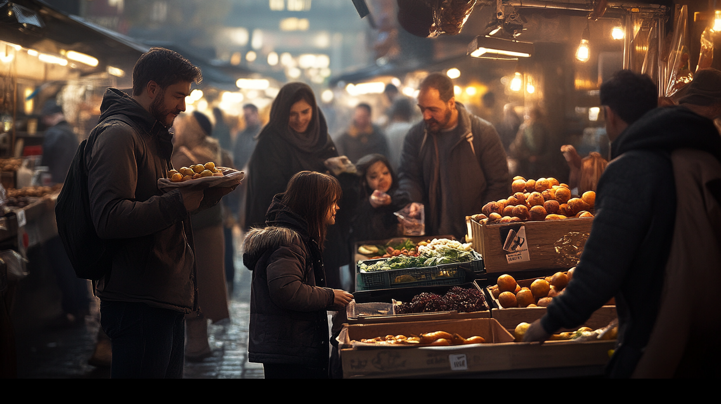
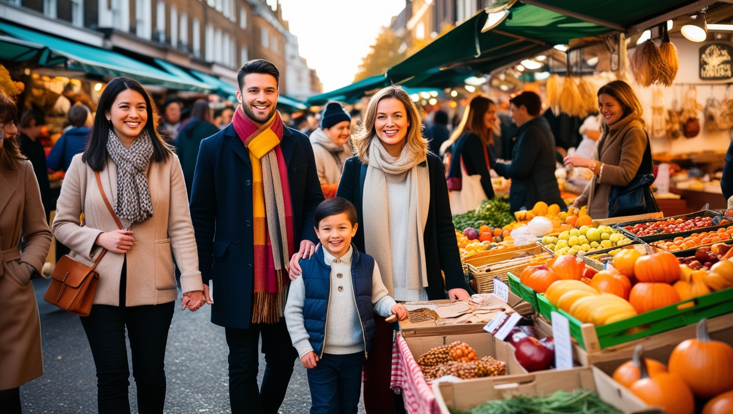
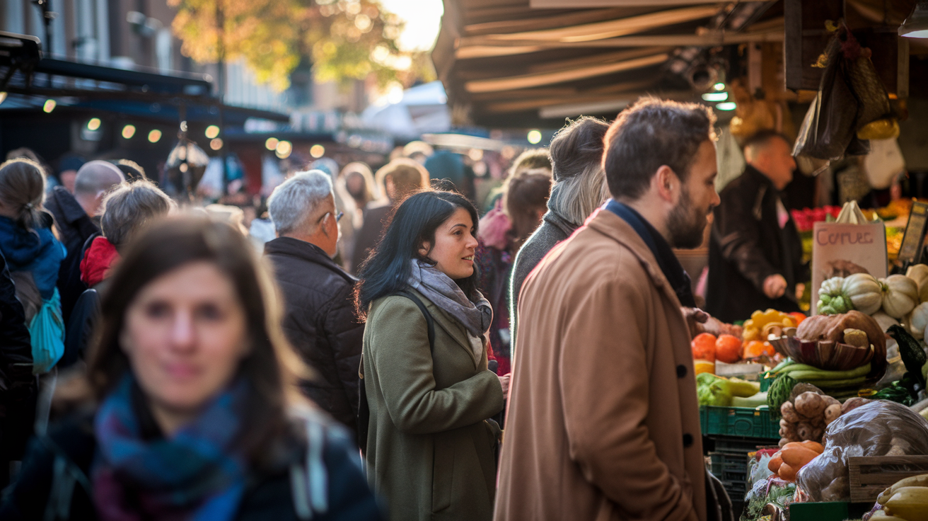
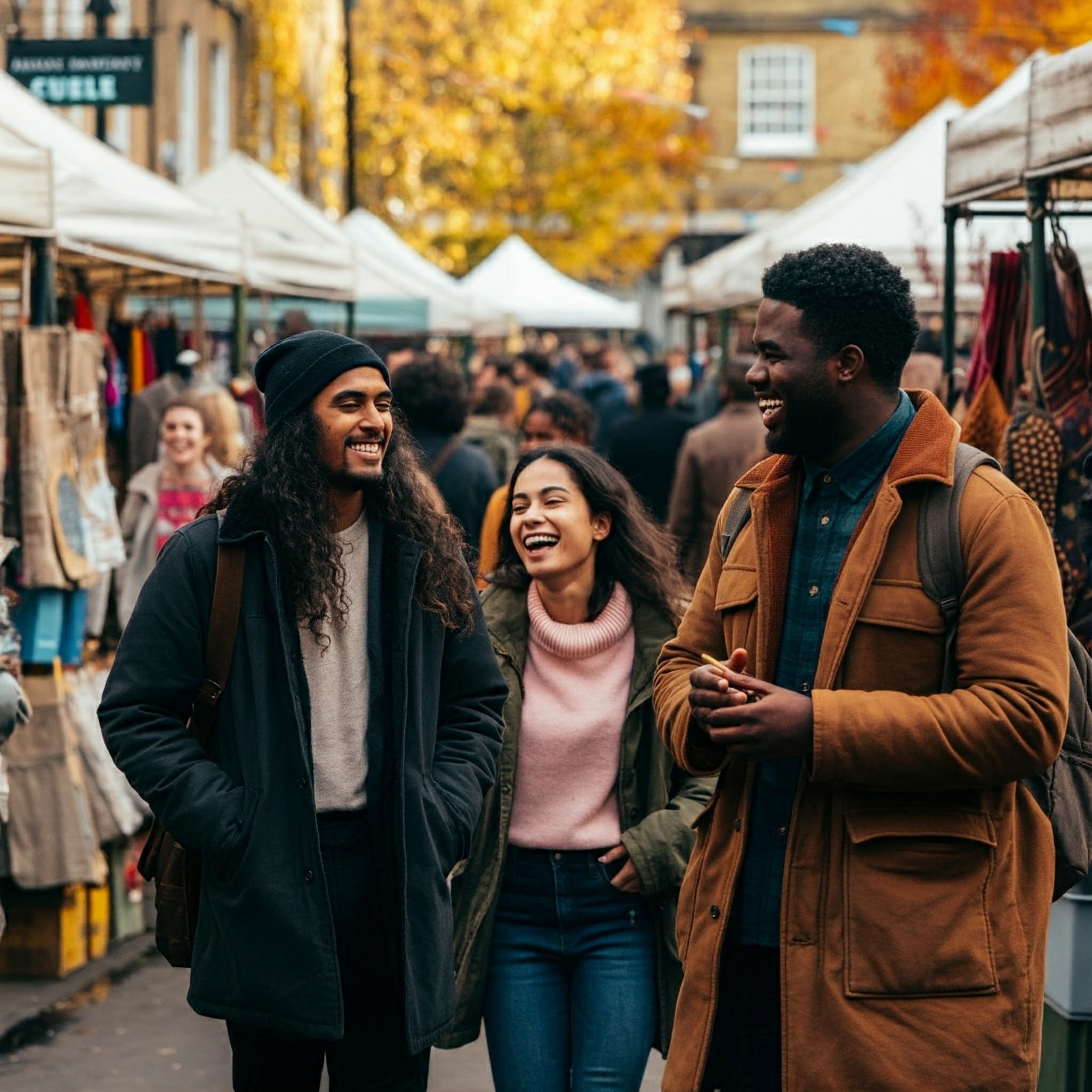
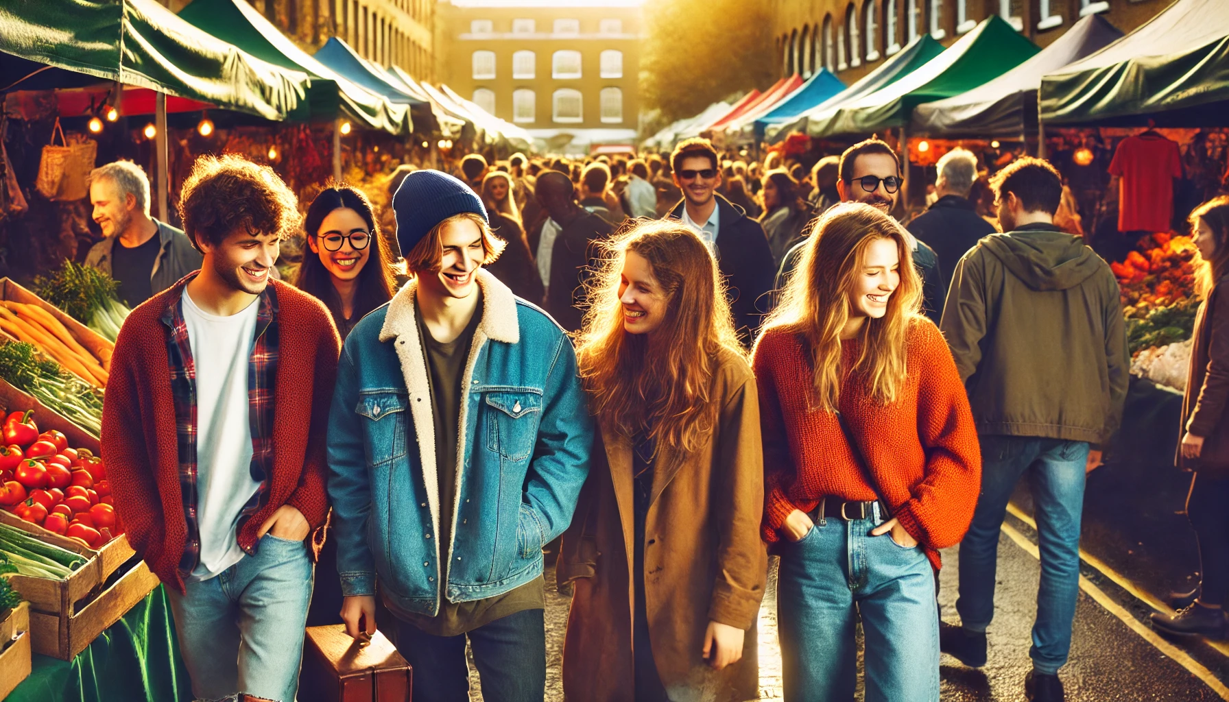
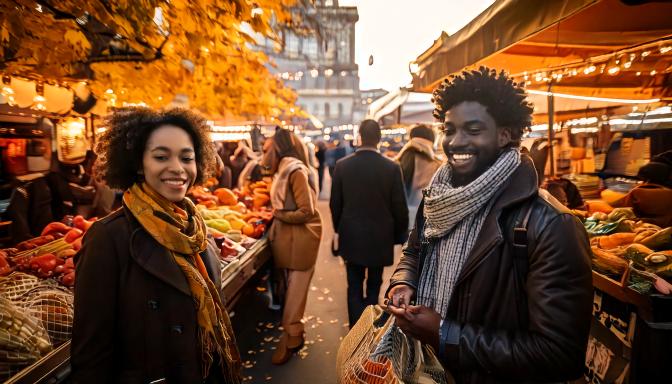
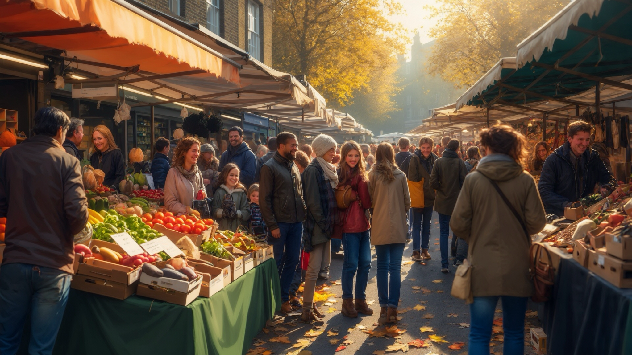
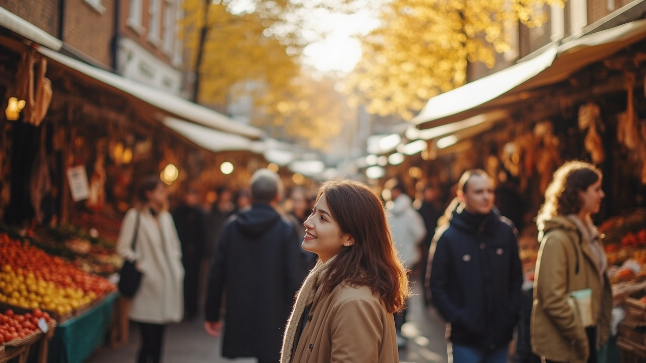
Prompt: A vibrant, candid street photo of people in a busy London market during autumn, focusing on diversity and interactions between friends and families. The scene should capture realistic clothing, natural smiles, and market stalls brimming with fresh produce and handmade items. Golden autumn light softly illuminates the scene, creating a warm atmosphere.
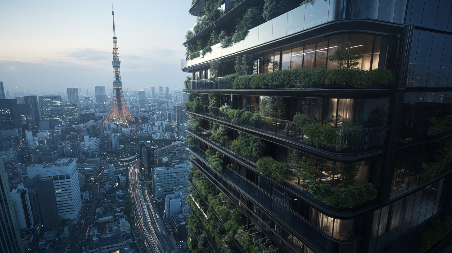
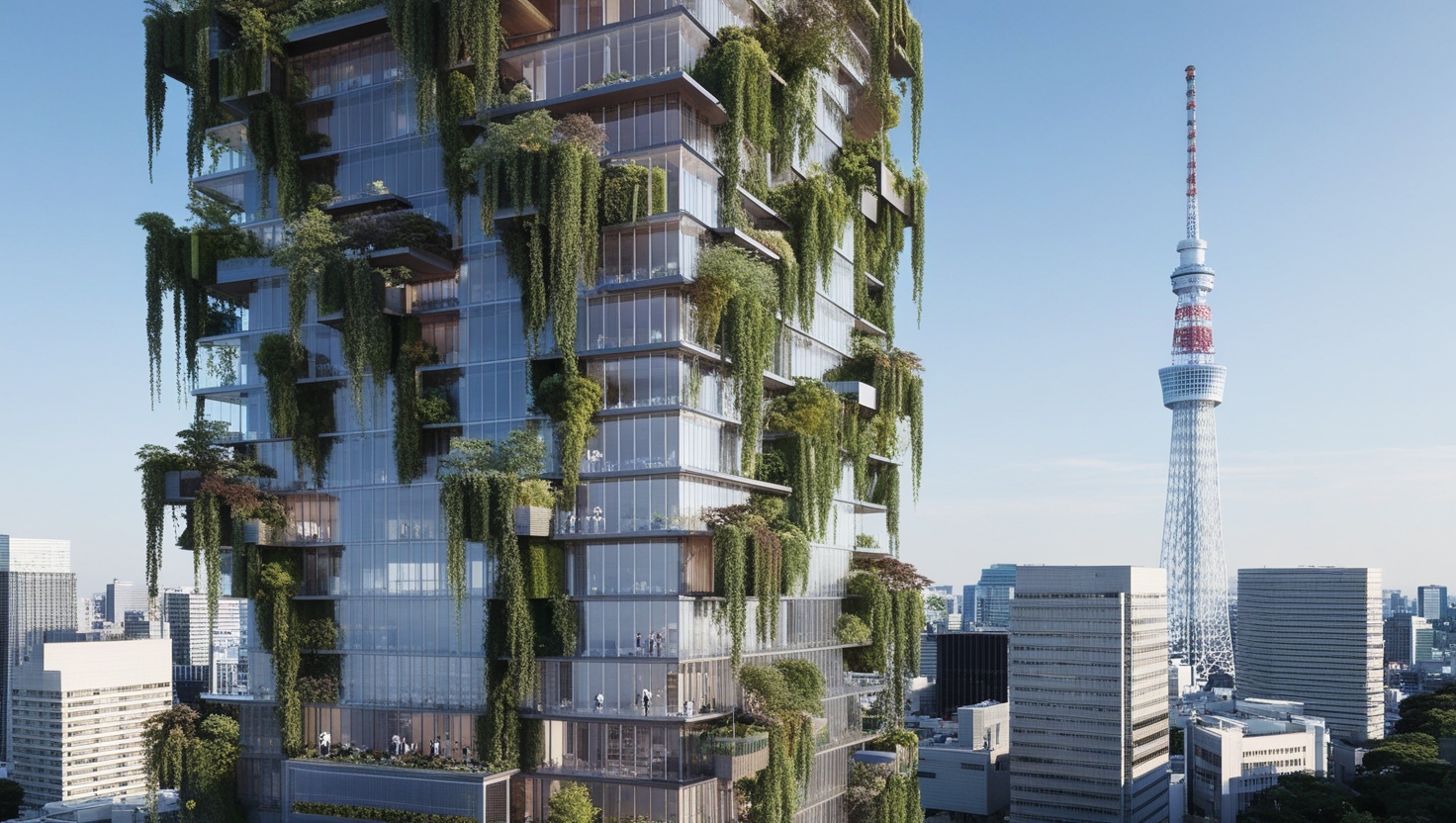
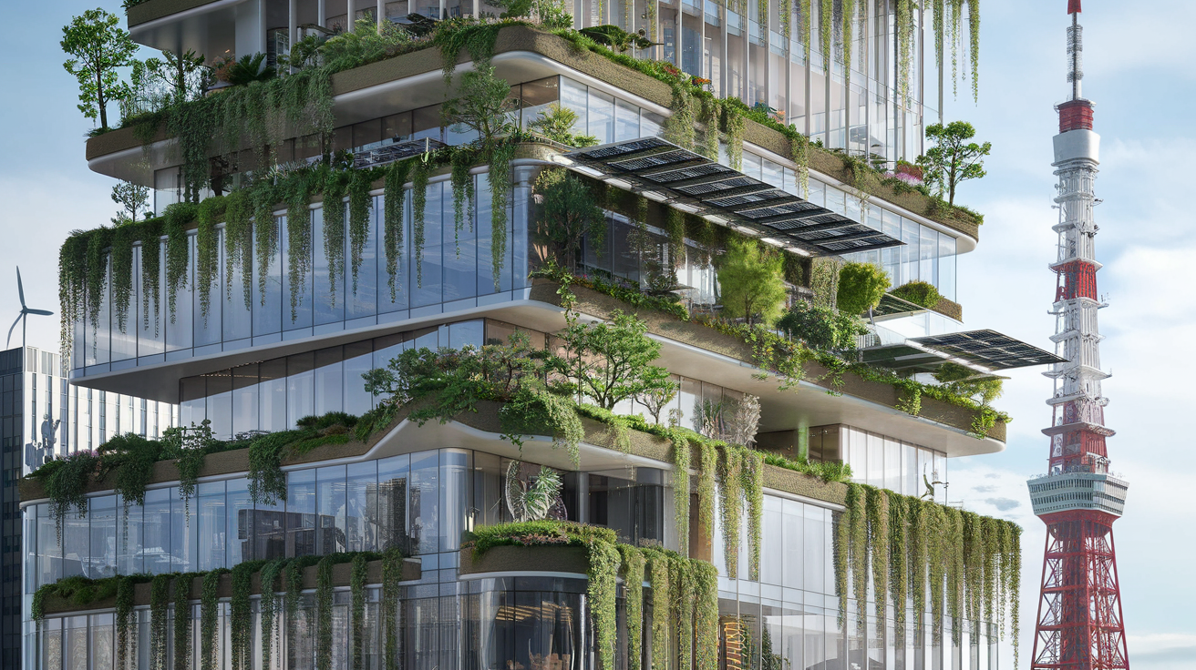
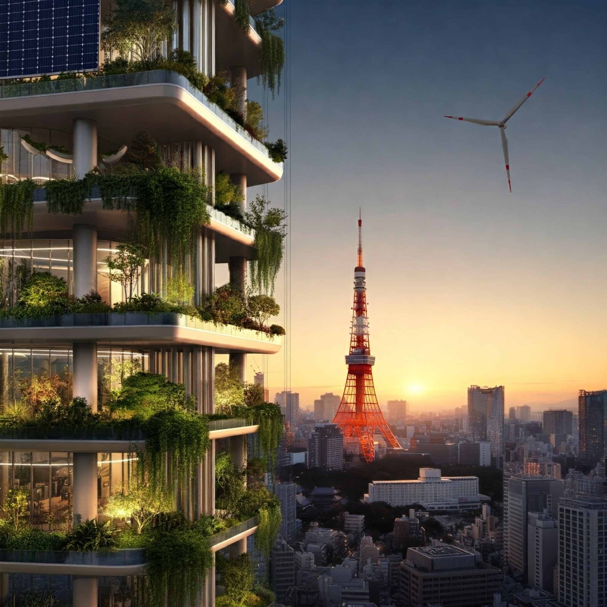
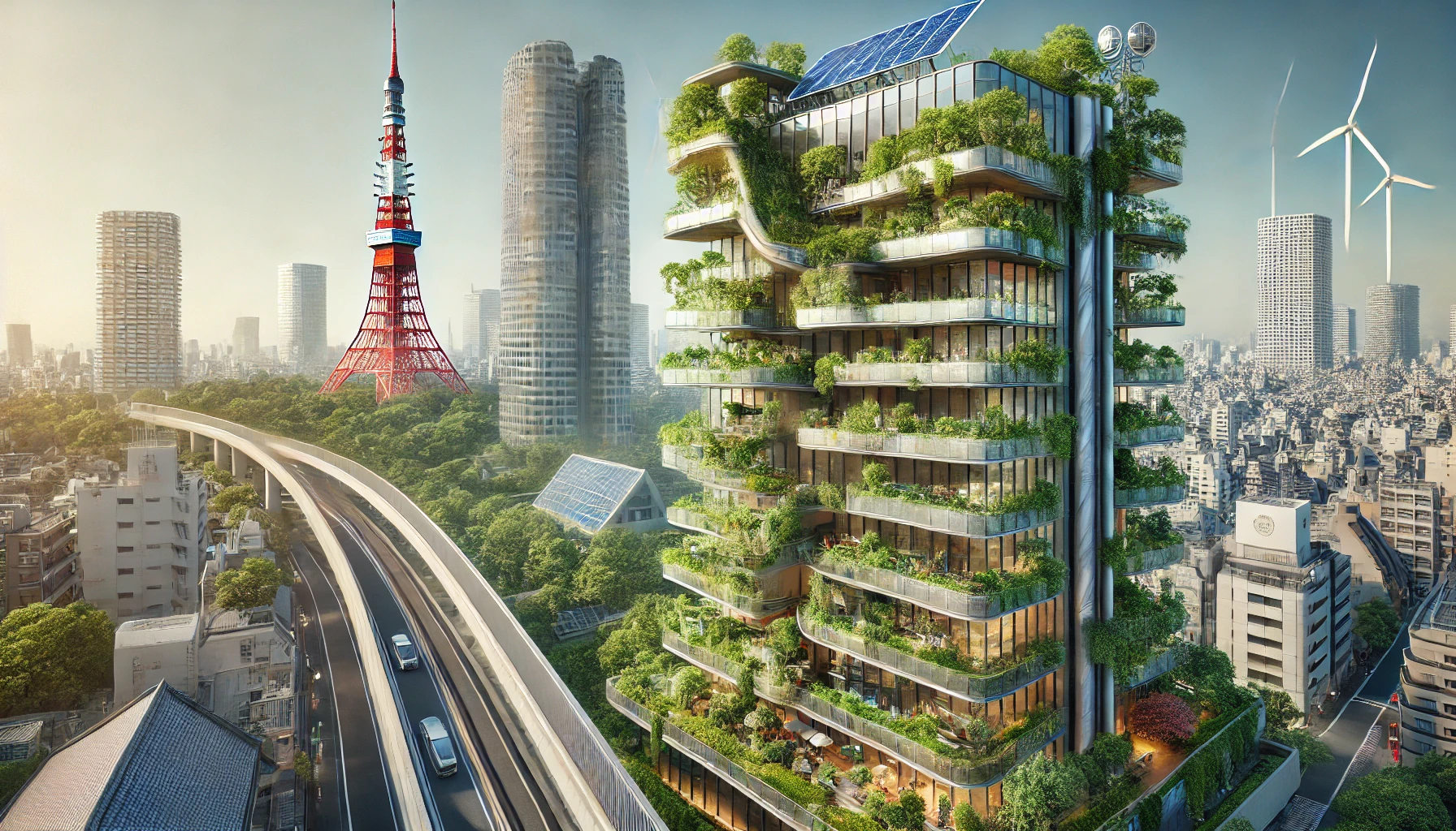
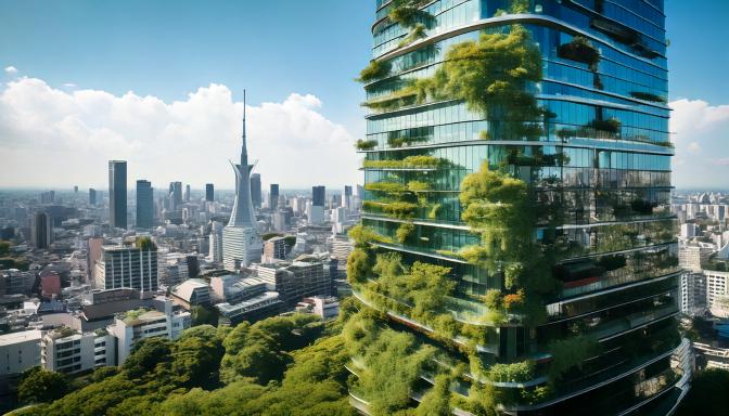
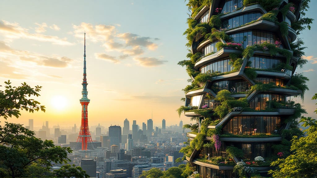
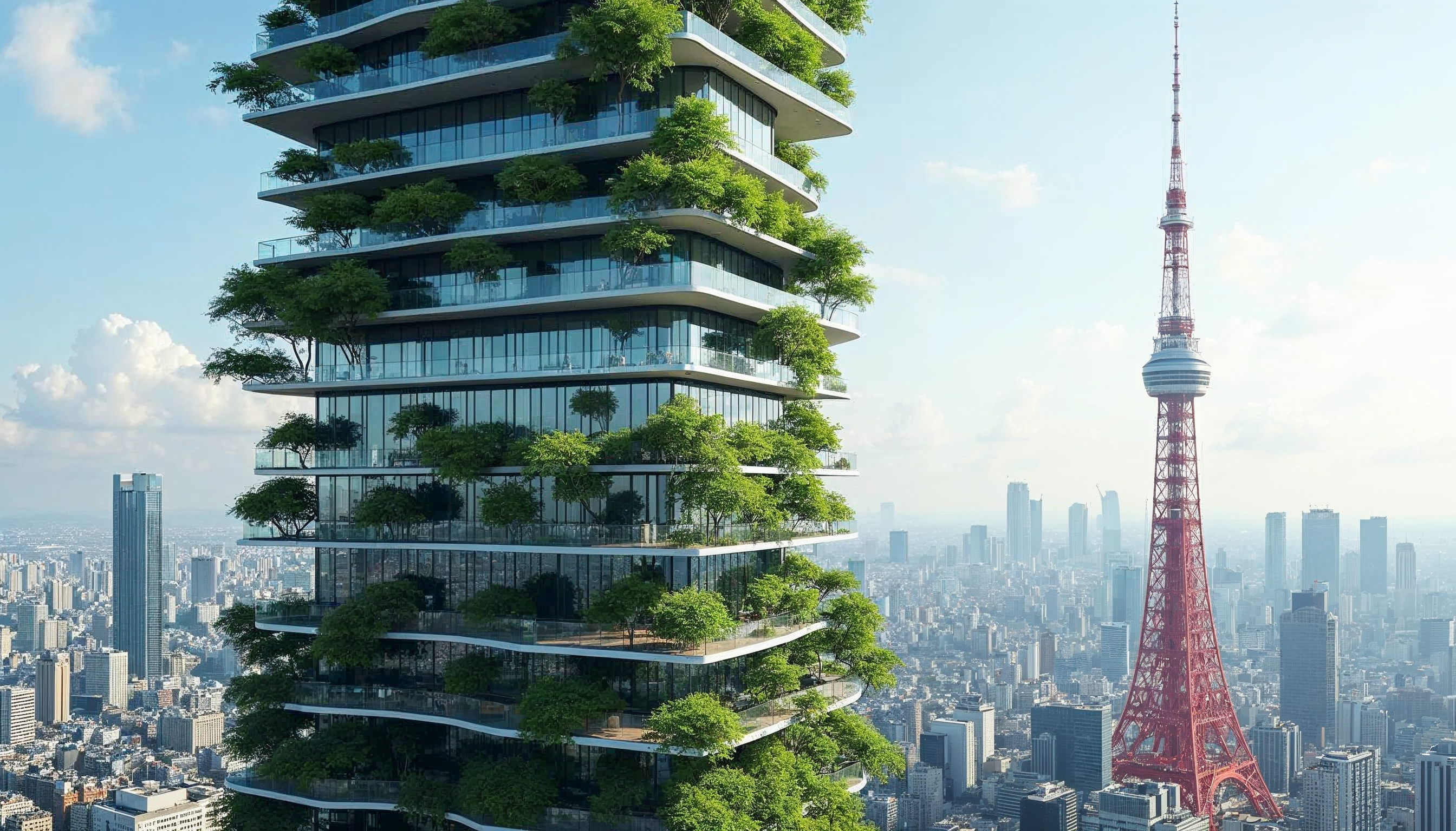
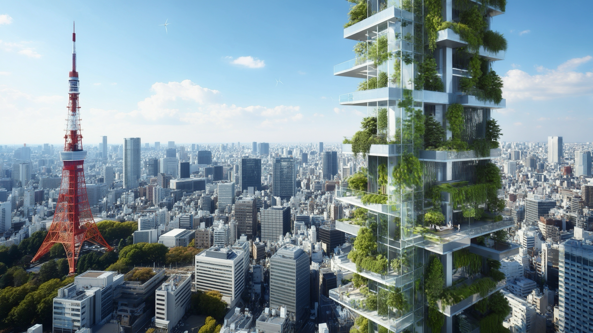
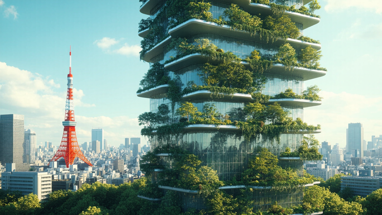
Prompt: A futuristic eco-friendly skyscraper in central Tokyo. The building incorporates lush vertical gardens on every floor, with cascading plants and trees lining glass terraces. Solar panels and wind turbines are integrated into the structure's design, reflecting a sustainable future. The Tokyo Tower is visible in the background, contrasting the modern eco-architecture with traditional city landmarks.

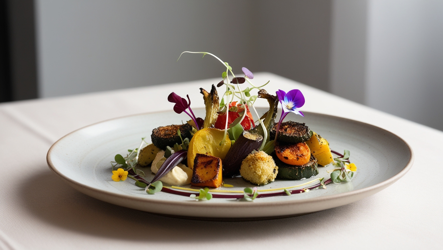
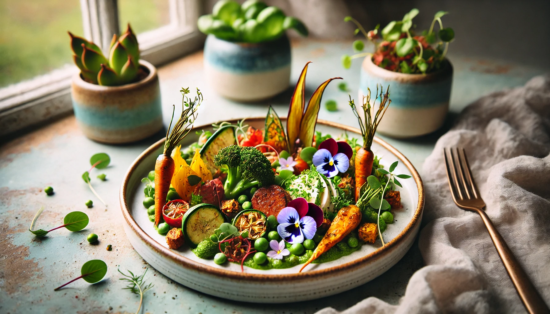
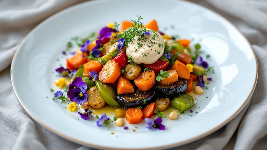
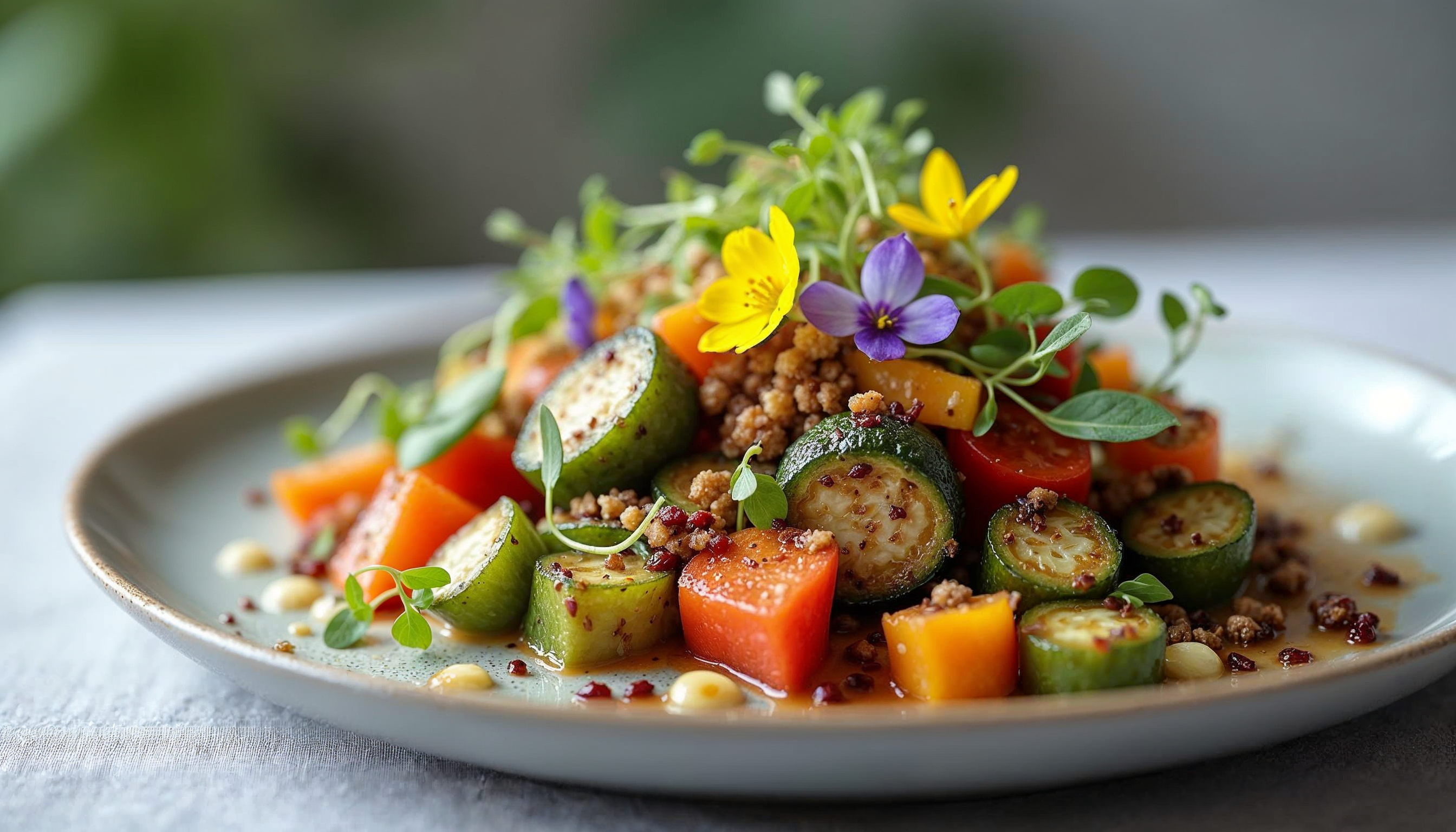
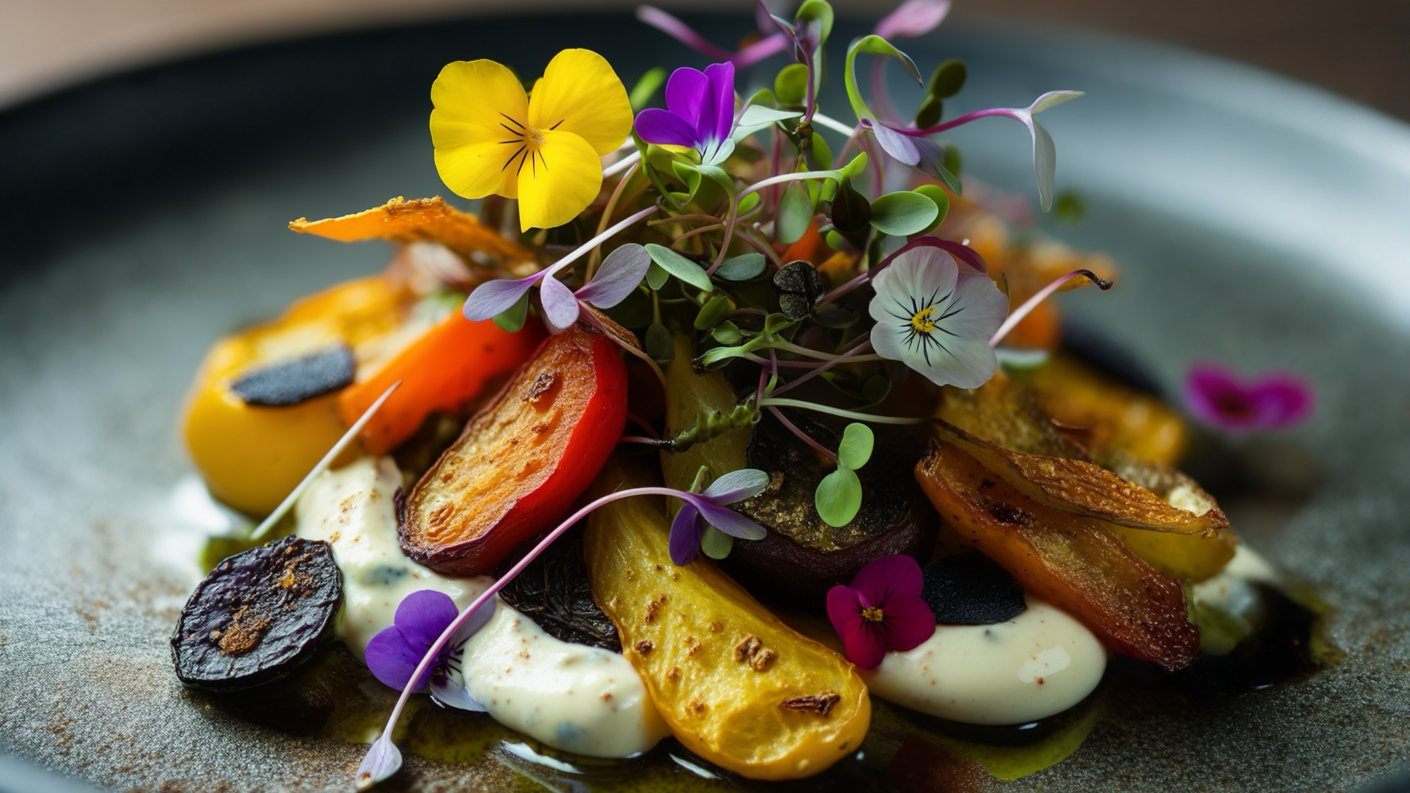
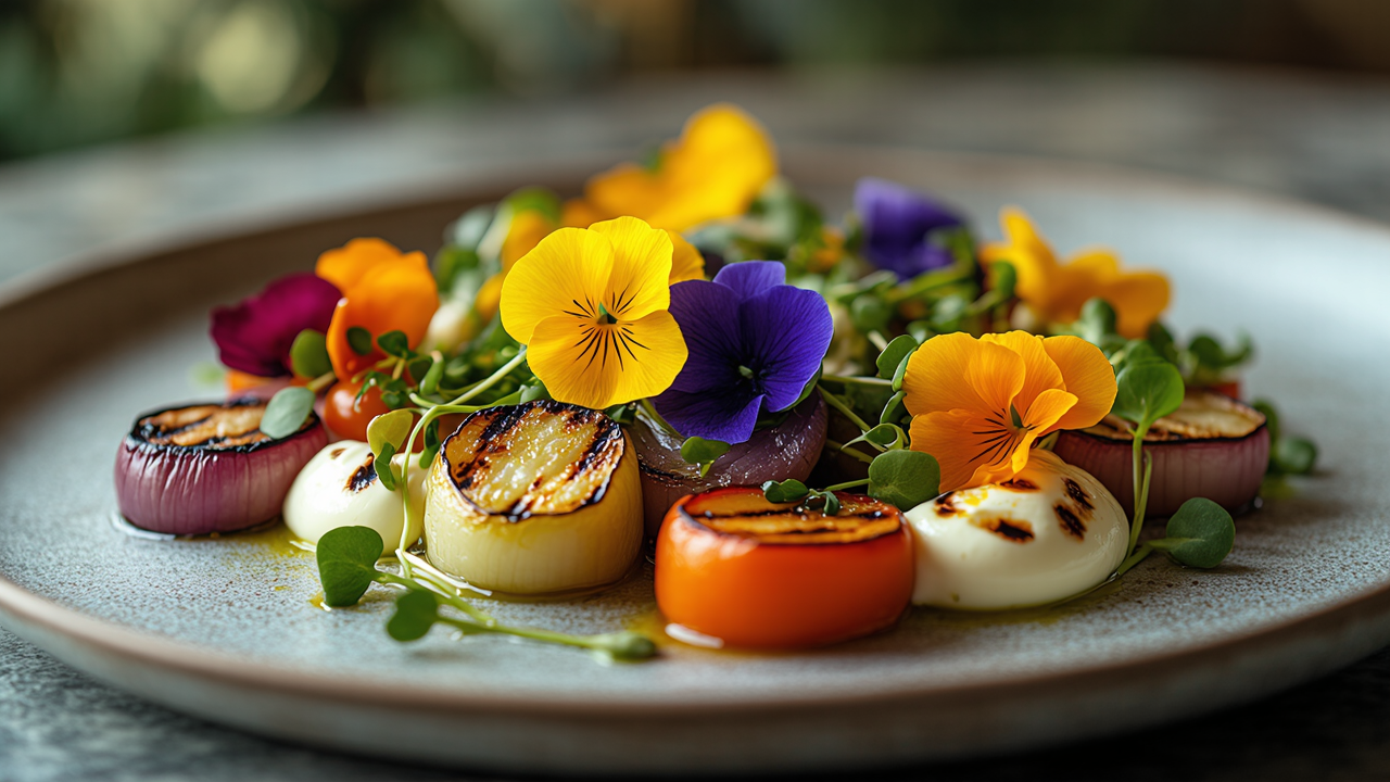
Prompt: A beautifully plated vegan gourmet dish featuring a colourful arrangement of roasted vegetables, microgreens, and edible flowers on a minimalist ceramic plate. Each ingredient should have intricate detail, capturing a mix of textures like roasted, crispy, and creamy. The backdrop is soft and blurred, making the vibrant colours of the food the central focus.
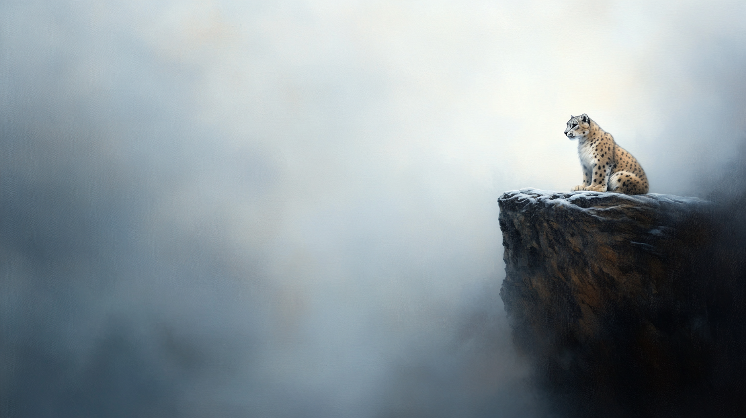
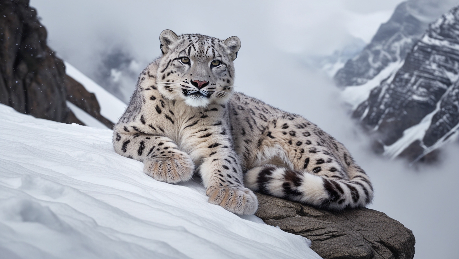
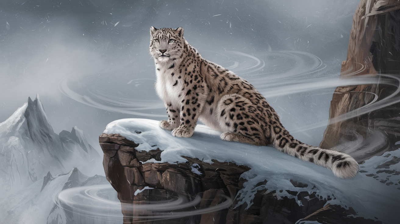
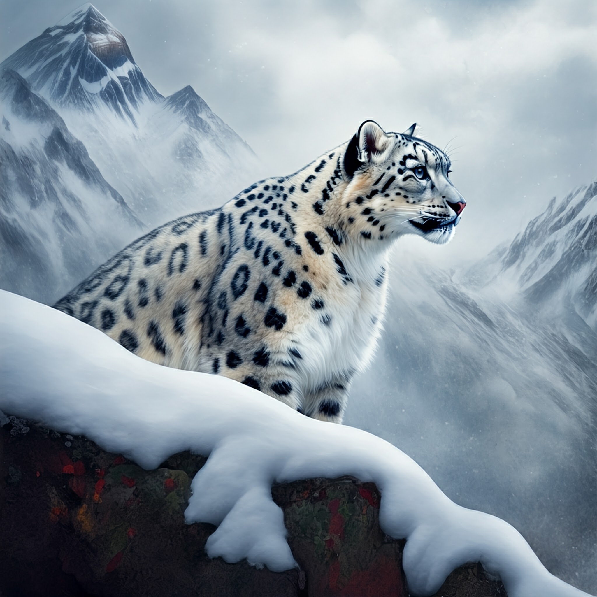
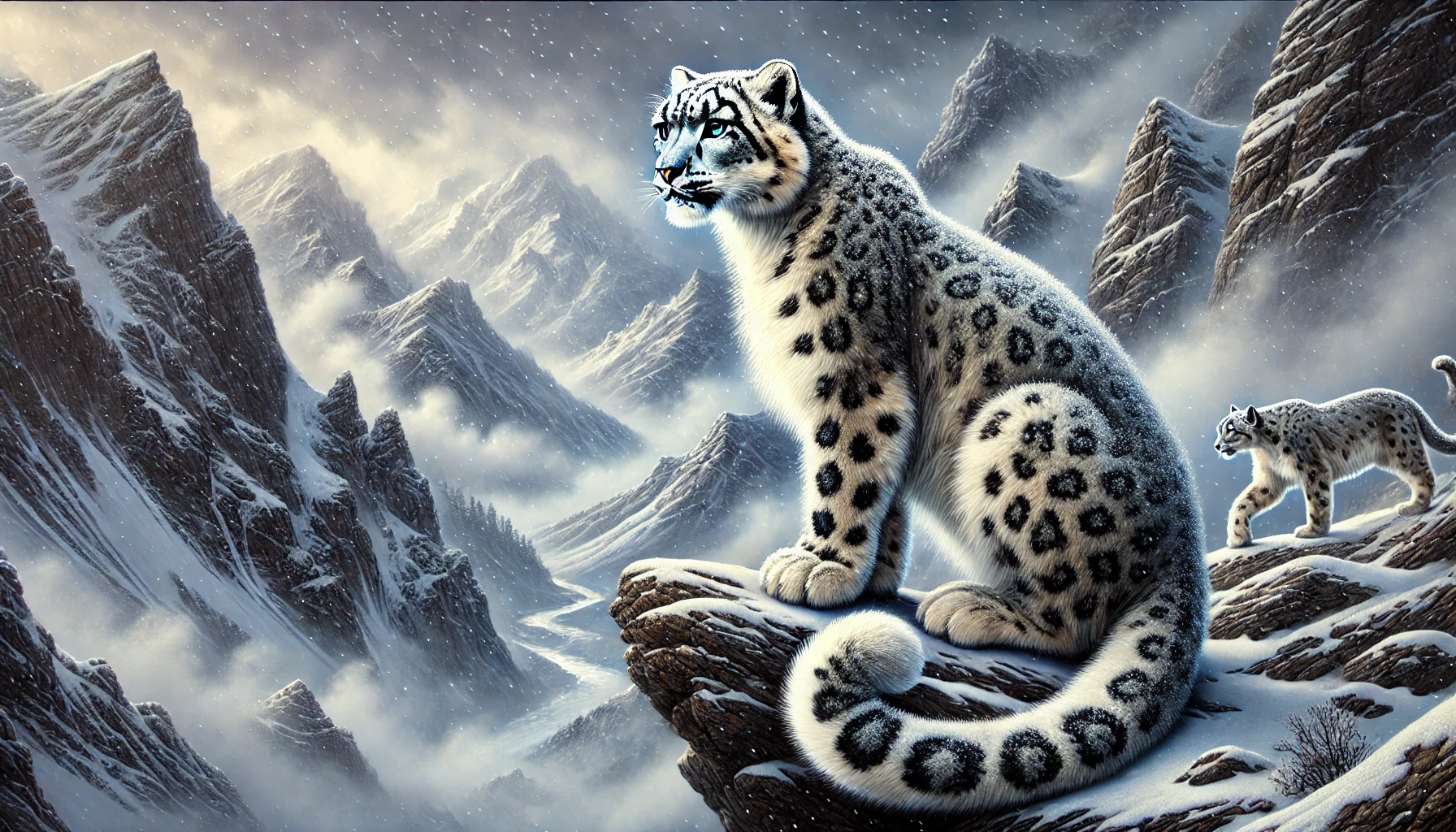
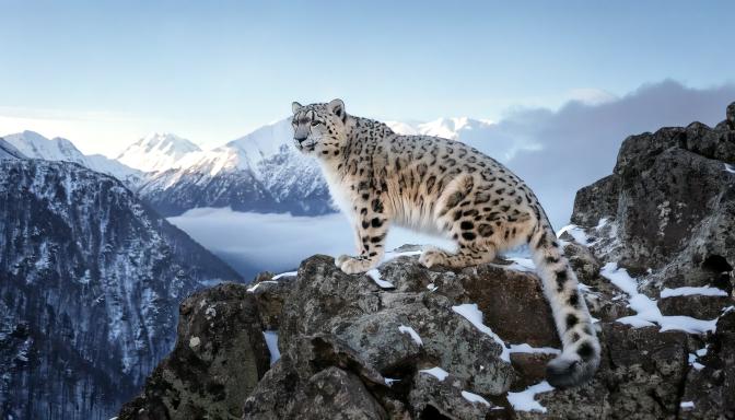
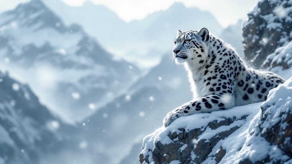
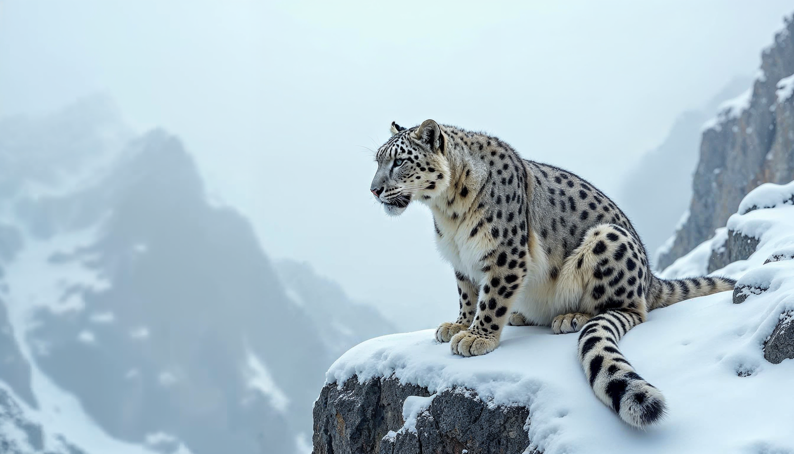
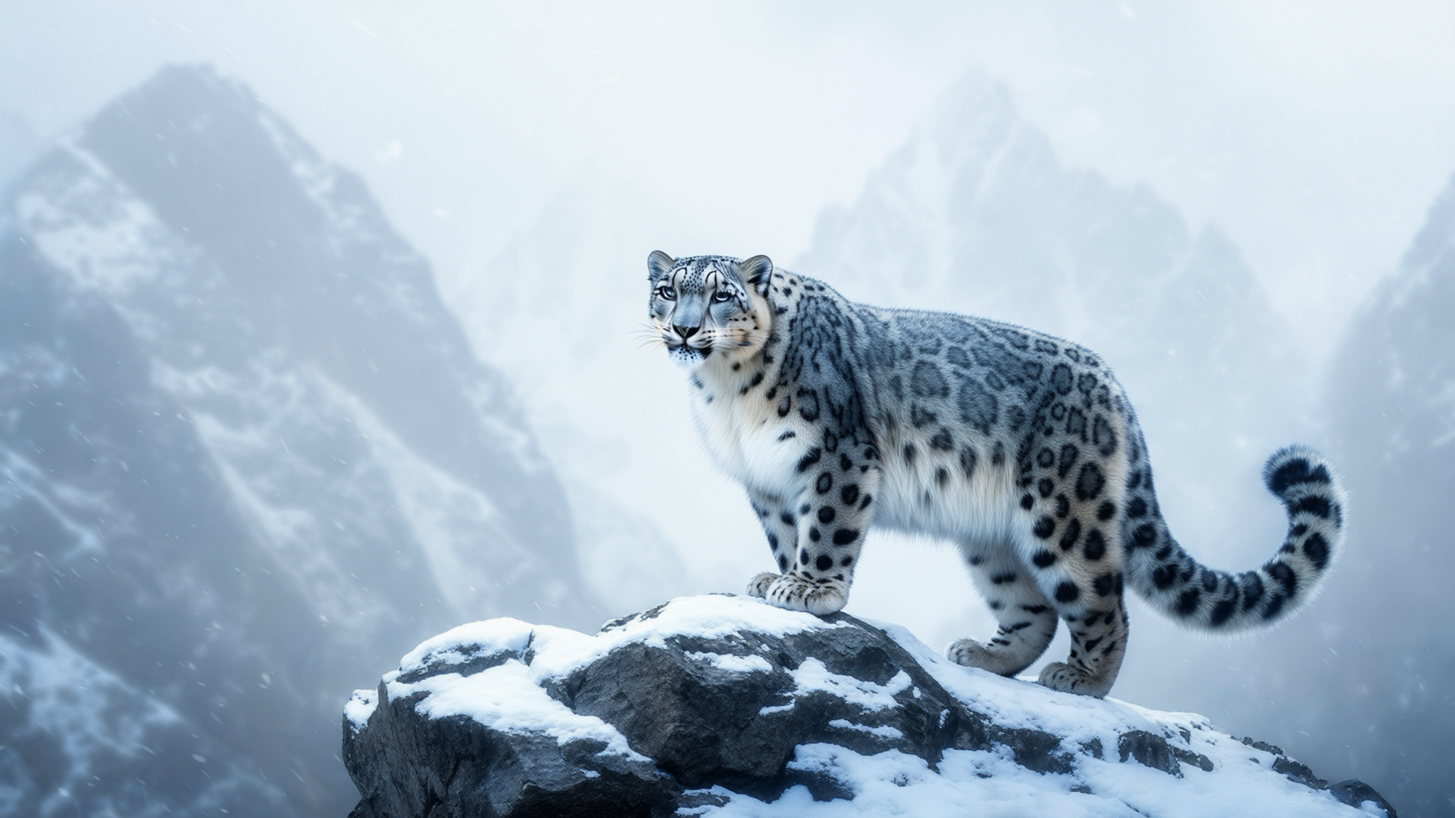
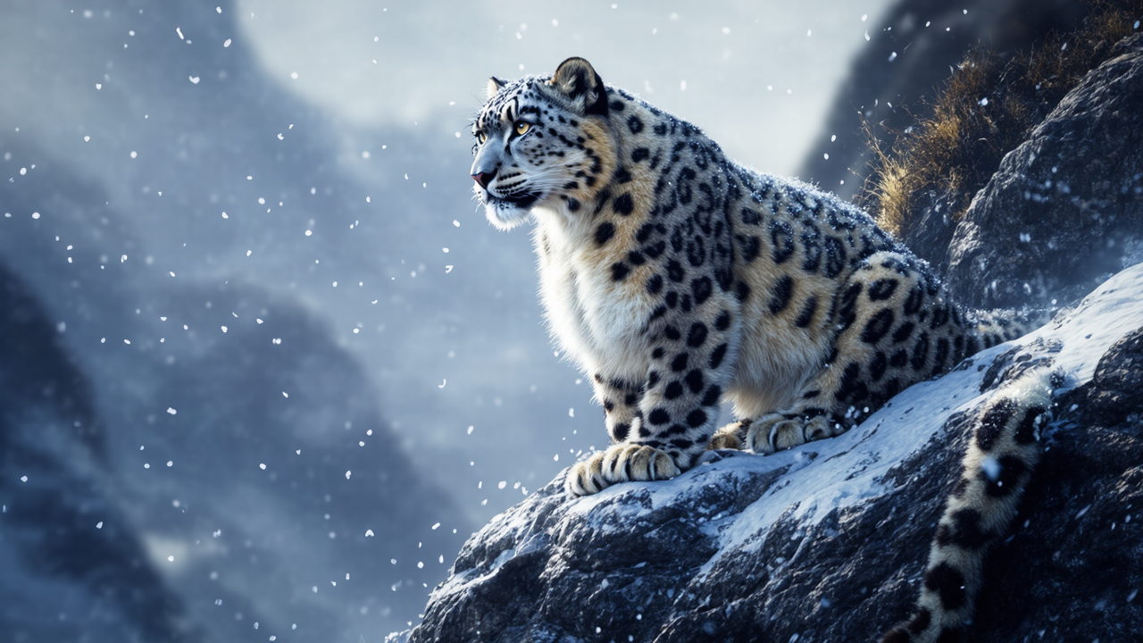
Prompt: An elegant snow leopard perched on a cliff in the Himalayan mountains, surrounded by swirling snow. The animal’s fur is intricately detailed with distinctive patterns and a thick winter coat. The scene captures the majesty and isolation of the leopard's habitat, with mist and mountain peaks fading into the background.
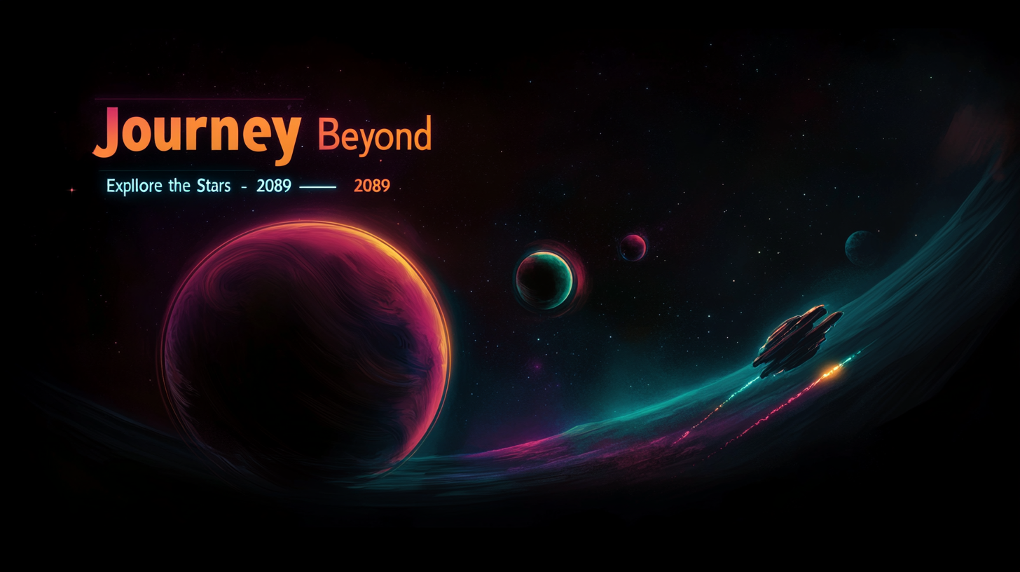
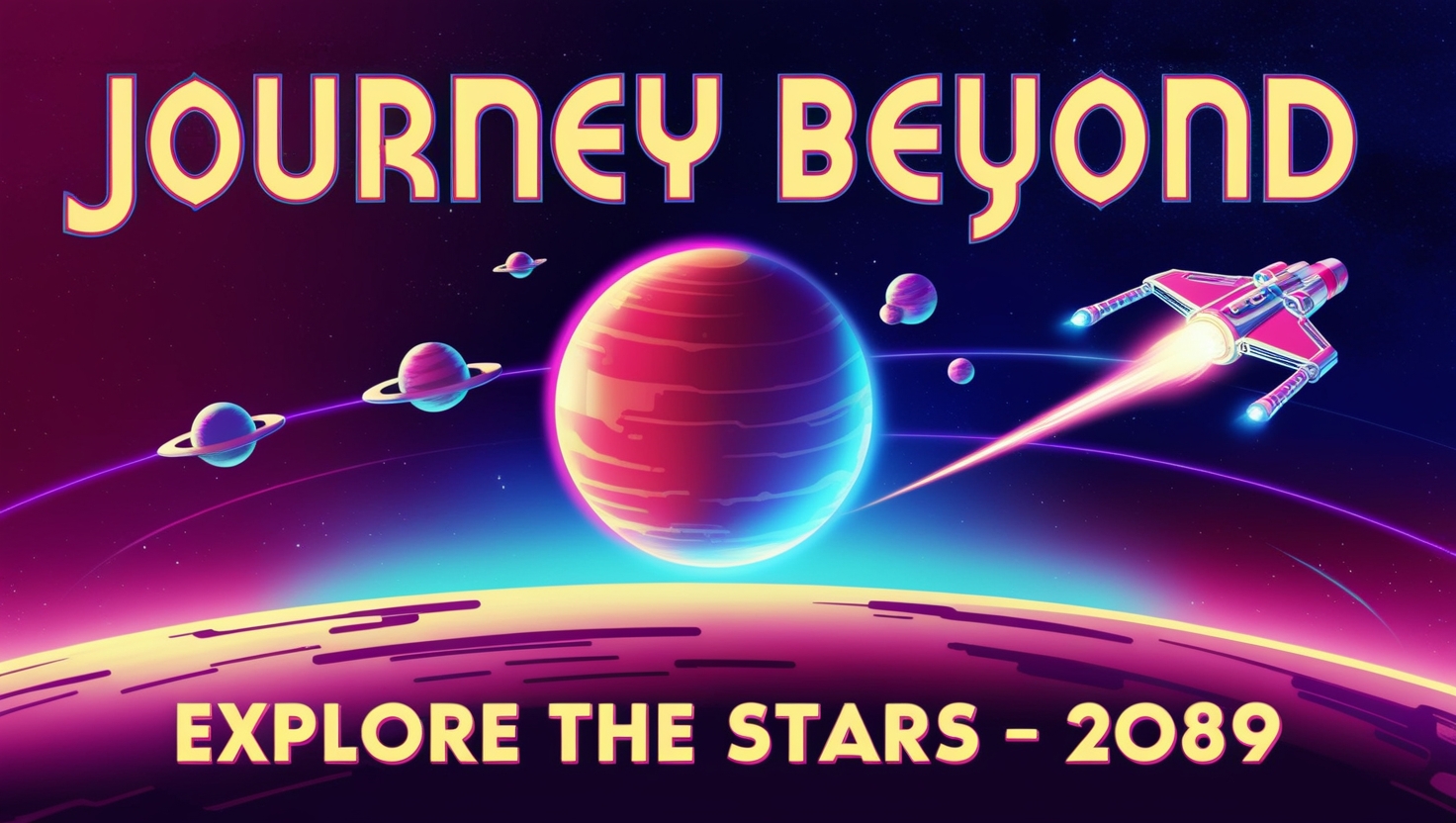
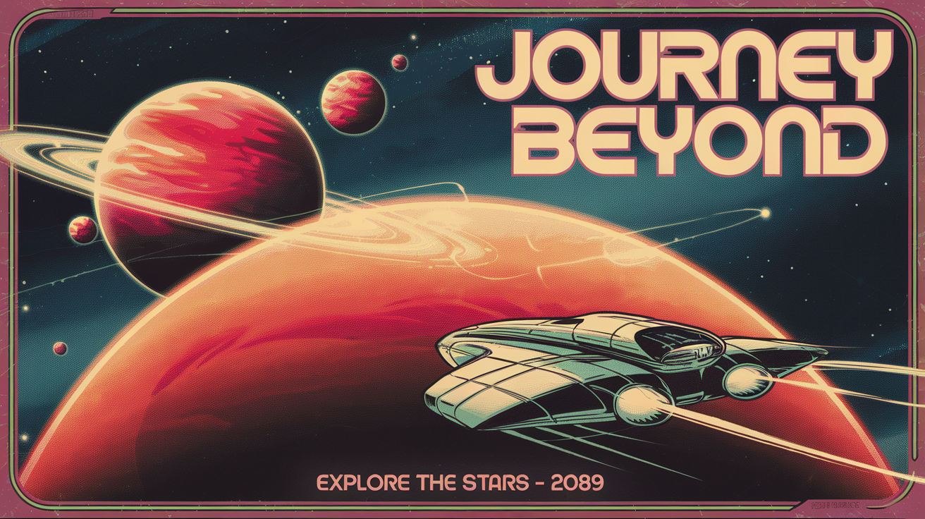
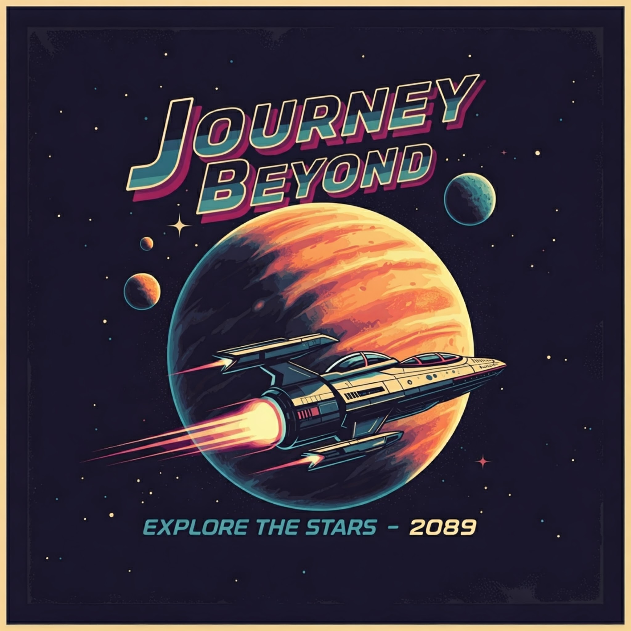
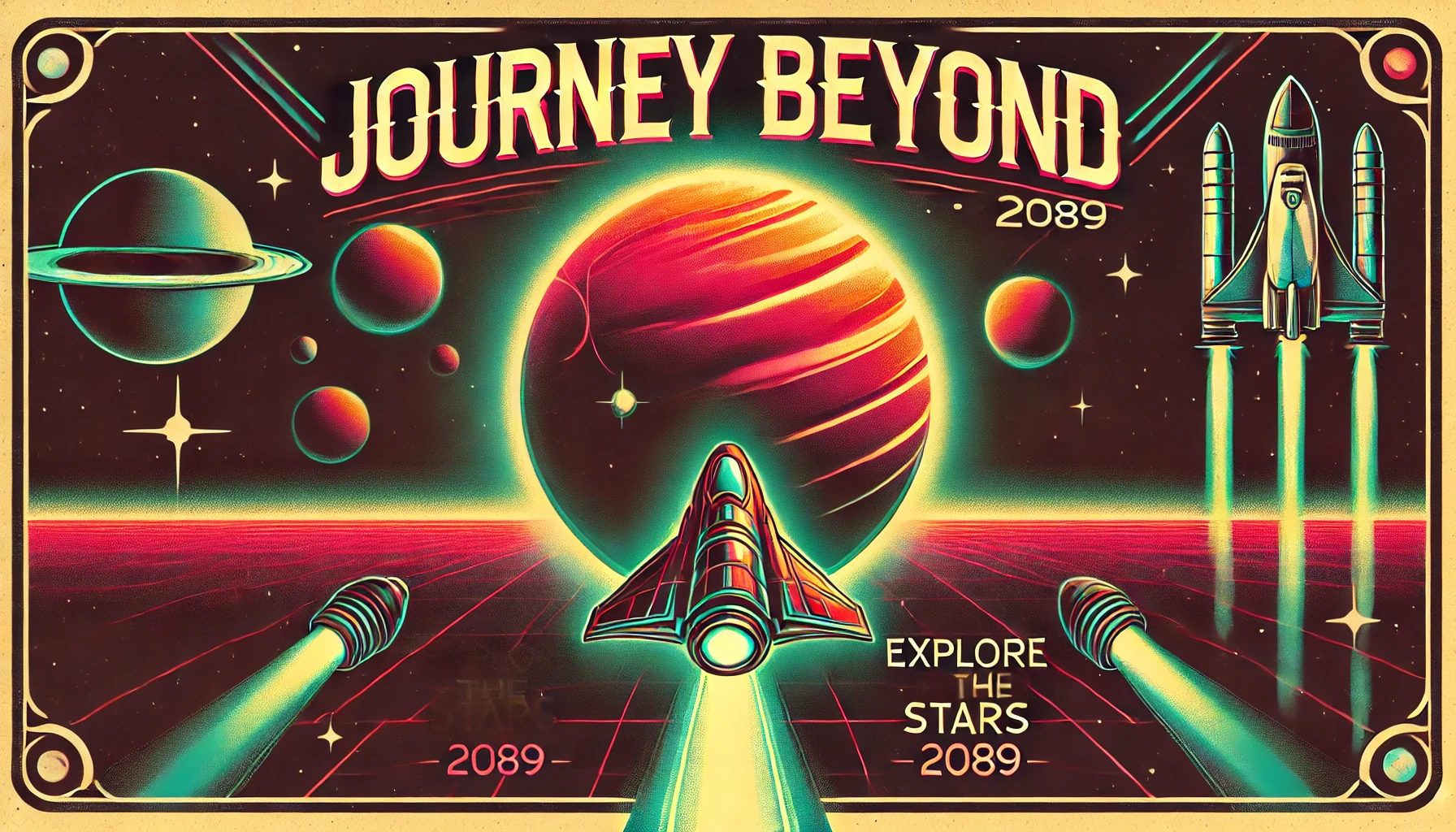
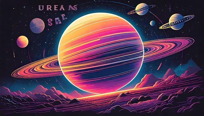
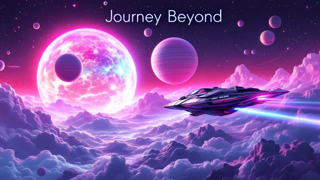
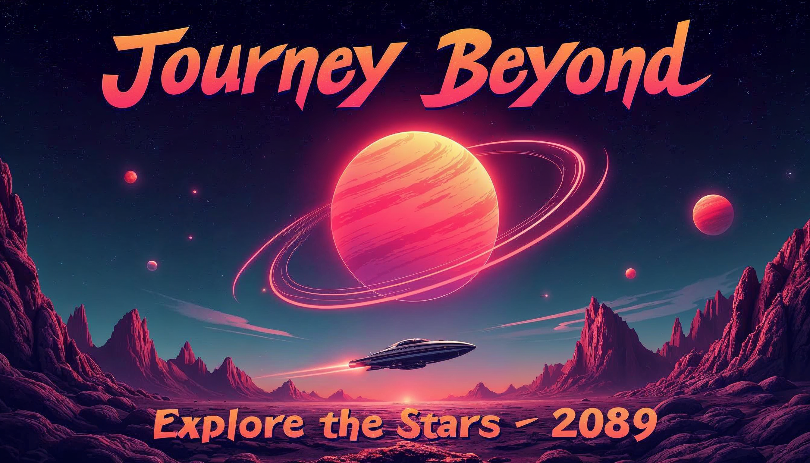
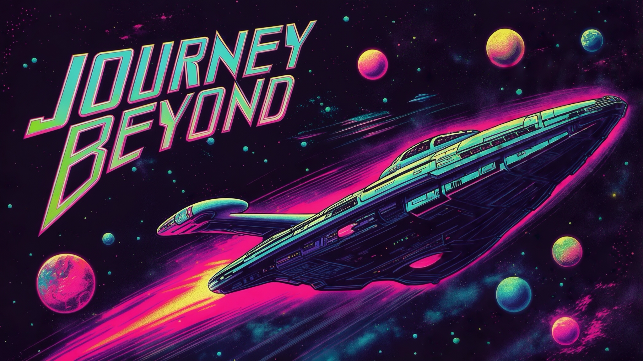
Prompt: A retro-futuristic sci-fi poster with a neon-coloured space scene featuring a large, glowing planet in the foreground and multiple smaller planets in orbit. Include a spaceship flying towards the largest planet, with a trail of light behind it. Add stylised text at the top saying, "Journey Beyond" in a bold, vintage font, and at the bottom, a tagline: "Explore the Stars - 2089." The image should evoke a mix of nostalgia and futuristic exploration.
Best for Features
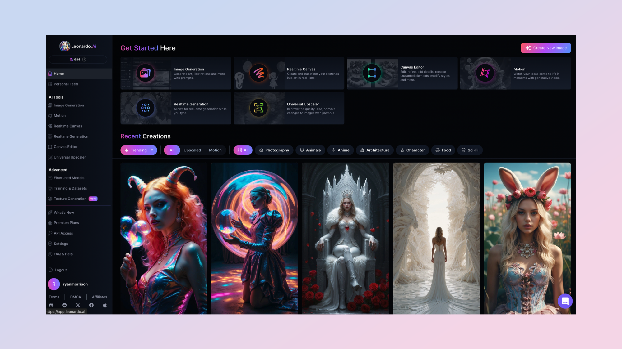
2. Leonardo
Our expert review:
Specifications
Reasons to buy
Reasons to avoid
Leonardo began as a polished interface for Stable Diffusion models, but it has quickly grown into one of the most versatile AI art platforms available. The launch of its Phoenix model marked a major step forward, delivering photorealistic results that rival some of the best outputs in the space, while still offering extensive style controls and fine-tuned model variants.
In mid-2024, Canva acquired Leonardo and began integrating its technology into Canva’s Dream Lab, an AI image generator designed to produce everything from cinematic landscapes to hyper-real portraits. Dream Lab runs on Phoenix while also drawing from Leonardo’s expanding model lineup, including PhotoReal for lifelike imagery, Lightning XL for faster renders, and Lucid Origin for bold, stylized visuals. Users can also experiment with Elements — fine-tuned styles like sketch or sculpture — and apply themes such as cinematic, food or long exposure before generating an image.
Since Canva’s acquisition, Leonardo has evolved far beyond a standalone image generator into a core engine powering a broader creative workflow. Its Phoenix model continues to improve realism, prompt accuracy and text rendering, while new style reference and brand consistency tools make it easier for teams to produce cohesive visual content at scale.
At the same time, Leonardo’s real-time canvas, sketch-to-image controls and advanced editing features support iterative design, and expanding motion and video capabilities reflect the industry’s shift toward multimodal creation.
Together, these updates position Leonardo not just as an AI art tool but as part of an end-to-end content production ecosystem built for marketers, designers and creators.
Best for text on images
3. Ideogram
Specifications
Reasons to buy
Reasons to avoid
Ideogram has long been a go-to for anyone who needs AI-generated images with flawless text, and in 2025 it’s only getting better. Originally known for design-friendly tools like color palettes, a dedicated “design” style, and text rendering that puts rivals to shame, the platform now offers even more creative control.
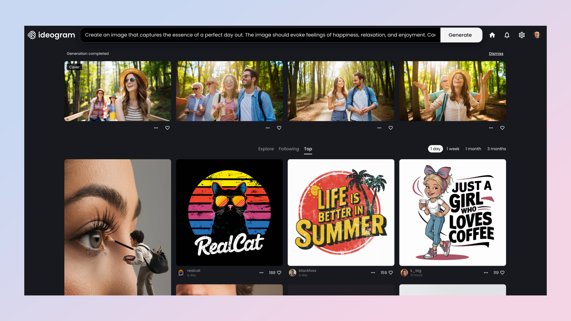
Its Canvas editor remains a standout, letting you refine or completely rework images with extended text prompts, perfect for fixing text alignment or adjusting graphic design elements. Batch Generation streamlines workflows by creating multiple images at once, making it easy to spin up posters, product mockups, or social media graphics in bulk.
Recent updates have taken things further. The new 2a model improves speed and cost-efficiency for design and photography workflows, while Ideogram 3.0 adds sharper photorealism and a style reference system that lets you upload up to three images to guide the look and feel of your results. You can also browse and apply from over 4.3 billion style presets using style codes.
Mobile users aren’t left out either, Ideogram’s official iOS app brings all these capabilities to your phone, with an Android version on the way. Combine that with Magic Prompt, which automatically refines your text for better results, and you’ve got a tool that’s equally suited to professional designers and casual creators.
Whether you’re building a marketing campaign, creating a movie poster, or mocking up a greeting card, Ideogram makes it easy to get polished, text-perfect images with minimal fuss, and that’s why it’s still one of the best AI image generators you can use today.

Best for collaboration
4. Google Gemini
Specifications
Reasons to buy
Reasons to avoid
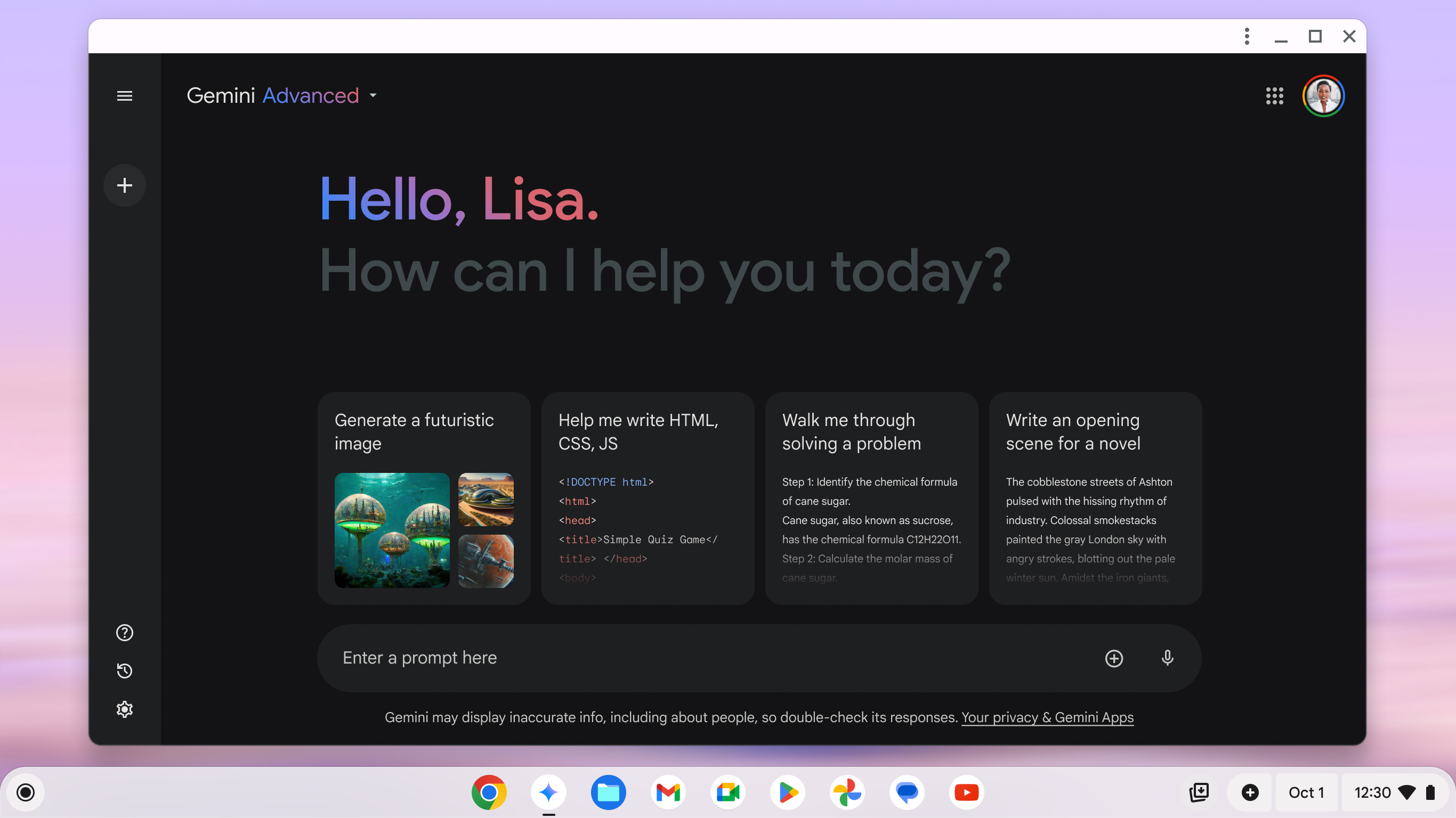
Google’s Gemini chatbot has had a rocky history with image generation. Early versions, powered by DeepMind’s Imagen 2, ran into trouble in 2024 when the system produced inaccurate depictions of people, prompting Google to suspend the feature entirely. Now, after a major overhaul, it’s back — and it’s much more capable.
The current system runs on Imagen 4, Google’s latest AI image model, which delivers sharper visuals, more accurate text rendering, and improved realism across styles — from photorealistic portraits to oil-painting textures. It also fixes the earlier issues with generating people, with stronger safeguards in place to avoid the same missteps.
Gemini’s image tools now go beyond simple generation. You can edit existing AI-generated or uploaded images by changing backgrounds, swapping elements, or refining specific details with natural language prompts. For developers, Imagen 3 is also available through the Gemini API, with fine-tuning options like aspect ratio control, multi-image outputs, and built-in SynthID watermarks for authenticity.
These upgrades are available to Gemini Advanced, Business, and Enterprise users, making them accessible to a much wider audience. Combined with its faster generation times and integrated editing tools, Gemini is evolving into a serious contender in the AI art space — and a far more polished one than the version that stumbled out of the gate.

Best for interaction
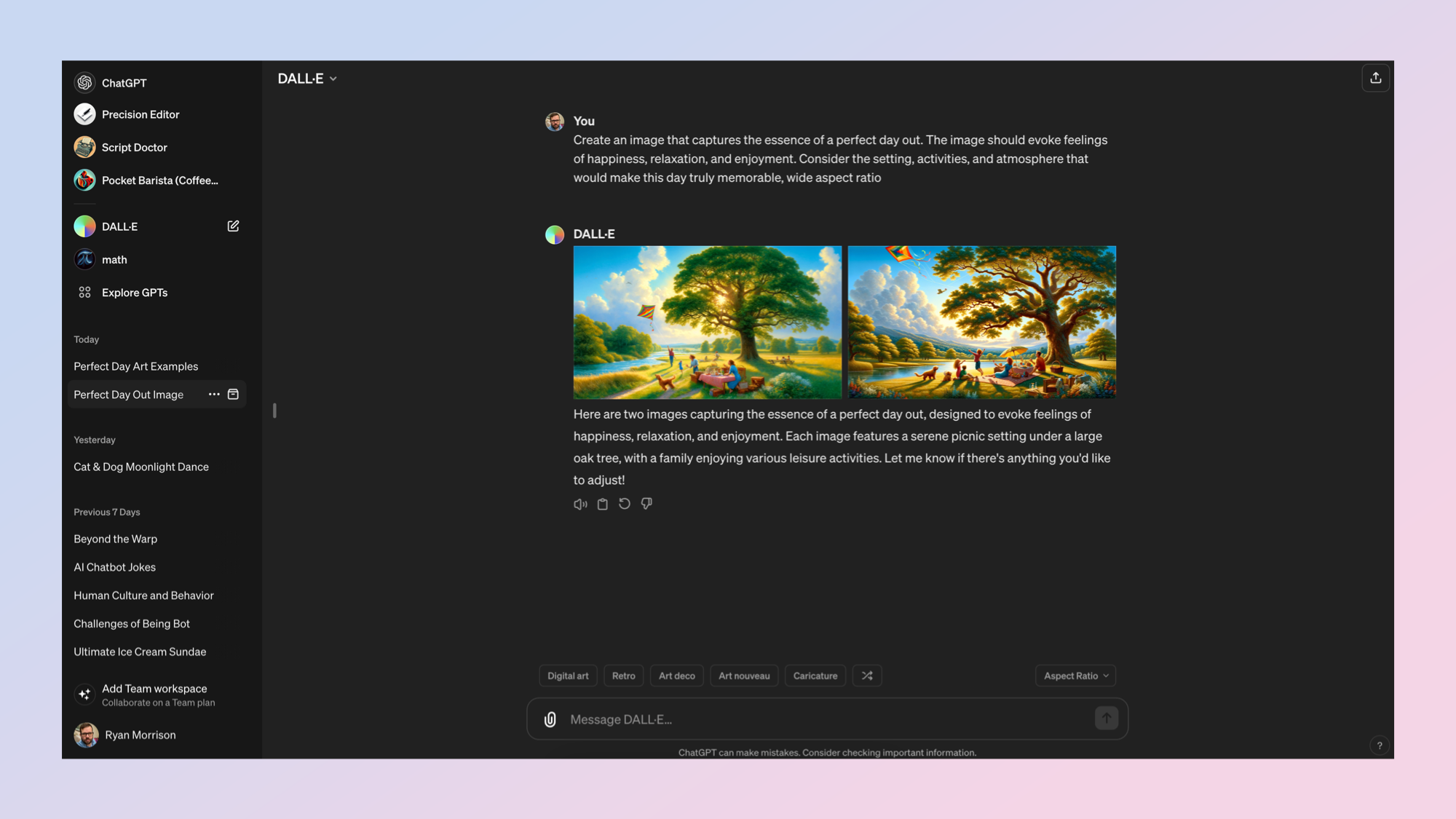
5. OpenAI ChatGPT (DALL-E 3)
Specifications
Reasons to buy
Reasons to avoid
Image generation inside ChatGPT has evolved quickly, and it’s no longer tied to a single model or paywall. Free users can now create a limited number of images each day, while paid tiers offer higher limits and faster generation. You can generate visuals directly within any chat, making it easy to move from an idea to a finished image without switching tools.
ChatGPT now uses OpenAI’s latest multimodal image capabilities rather than relying on a standalone model experience. This means you can describe an image conversationally, refine it with follow-up prompts and iterate in real time — all within the same thread.
The experience is designed to feel collaborative. You can ask for adjustments, change styles, improve realism or tweak details like lighting, composition or text. The system is especially strong at rendering readable text, maintaining stylistic consistency and producing photorealistic or stylized images on demand.
Editing remains one of the biggest strengths. Select an image, highlight an area and describe what you want changed. Whether you’re swapping backgrounds, correcting text, or adding new elements, iterative edits feel natural and fast.
While image generation models continue to improve behind the scenes, the real advantage inside ChatGPT is the conversational workflow: you describe, refine and evolve visuals without starting over.
Best for ethical training
7. Adobe Firefly
Specifications
Reasons to buy
Reasons to avoid
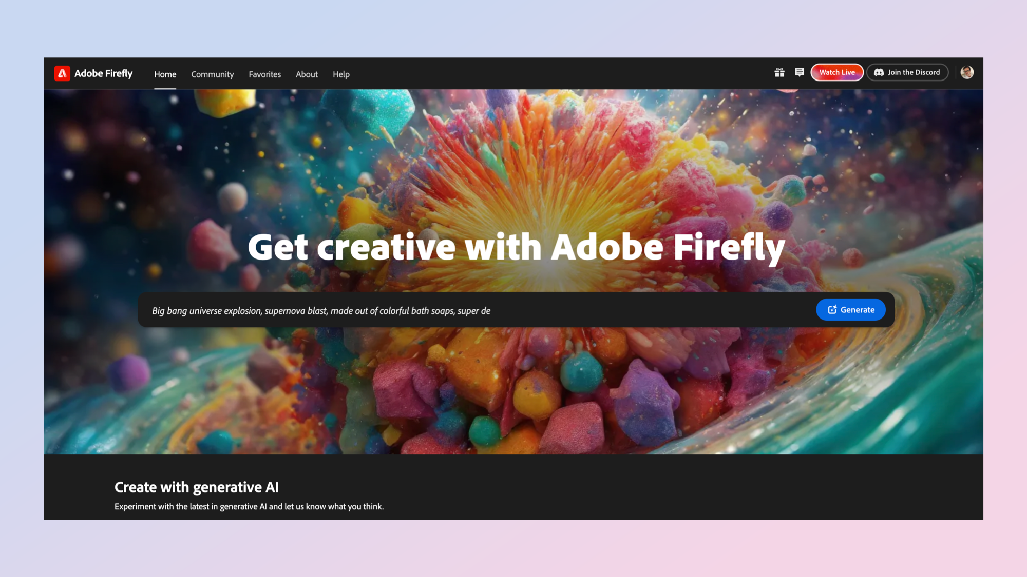
Adobe Firefly has always stood out for its ethical approach to AI, its training set is almost entirely built on Adobe Stock images, giving creatives more confidence that their work is copyright-safe. Adobe even offers financial indemnity for images generated with Firefly, something few rivals can match.
Now, Firefly is expanding well beyond still images. The new Firefly Video Model, currently in public beta, lets you generate high-quality, IP-safe video clips from text prompts or reference images and send them straight into Premiere Pro. It works hand-in-hand with Generative Extend, a feature that can seamlessly lengthen shots while keeping the style and motion consistent.
On the image side, the Image Model 4 upgrade delivers sharper detail, more accurate prompt interpretation, and even better realism for both people and environments. Adobe has also rolled out a Firefly mobile app for iOS and Android, putting image and video generation, plus Photoshop-style Generative Fill and Expand, in your pocket. Creations sync automatically to Creative Cloud, so you can start on mobile and finish on desktop.
For collaboration, Firefly Boards is now in public beta, offering an AI-powered moodboarding and remixing space that supports not only Adobe’s own models but also third-party tools like Luma, Ideogram, Runway, and Pika.
With these upgrades, Firefly has evolved into a full creative engine, spanning ideation to production, while holding on to its biggest advantage: giving professionals cutting-edge AI tools without sacrificing commercial safety.

Best for community
8. NightCafe
Specifications
Reasons to buy
Reasons to avoid
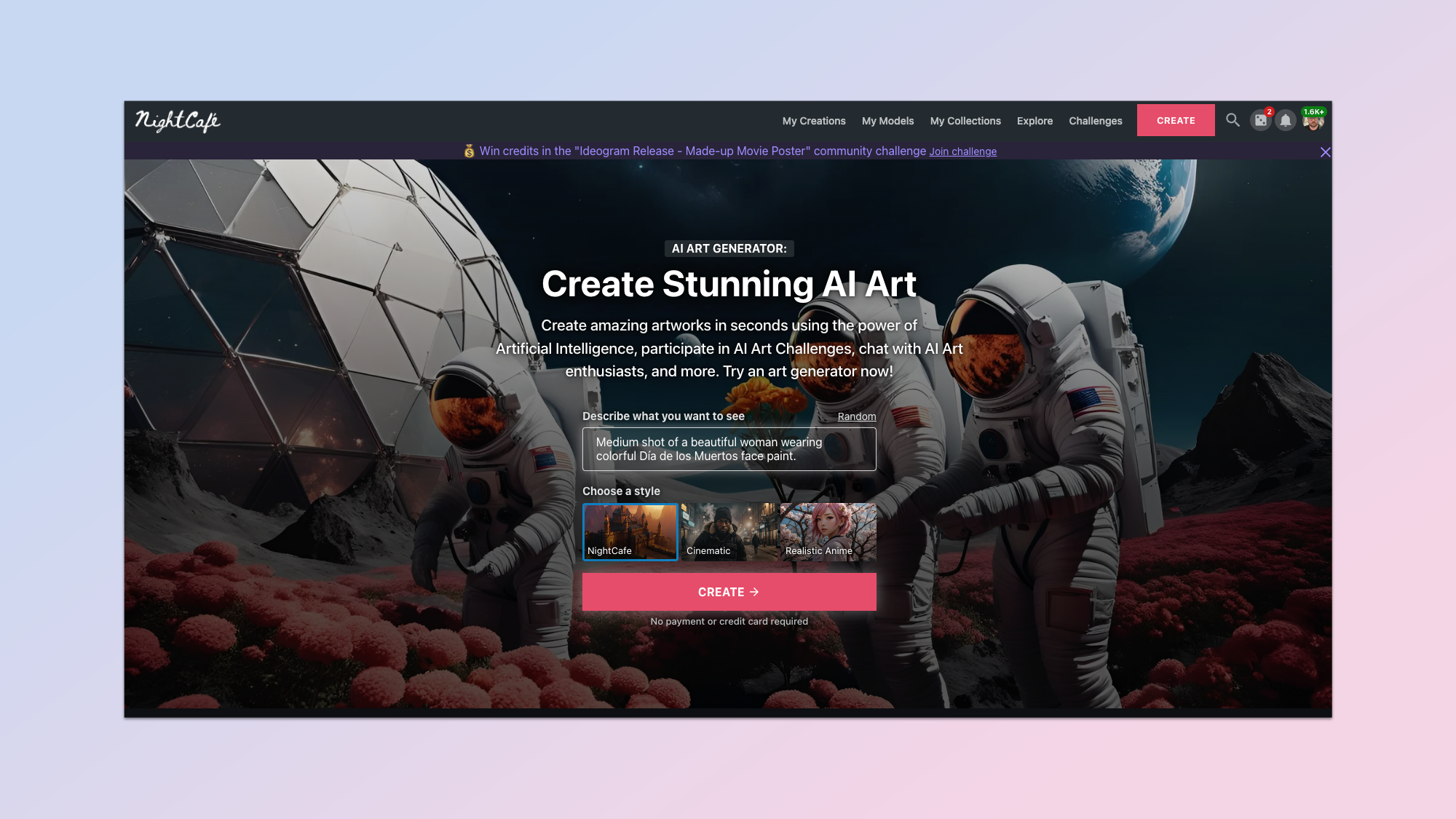
NightCafe was one of my first introductions to the world of generative AI. It was initially built on some custom models and later expanding to use Stable Diffusion-based models that have since been fine-tuned and customized.
As well as offering access to a wide variety of models, including Flux, Google's Imagen 3, Stable Diffusion, OpenAI's DALL-E 3 and now Ideogram, NightCafe makes it relatively easy to fine-tune or train your own models and lets easily manage and share your creations.
It even allows you to animate the individual photos using Stable Video Diffusion and upscale images using a range of upscaler models. You can even animate with Runway Gen-3 Turbo and Luma Labs Dream Machine within the single platform.
Its community is the real secret sauce behind why I keep going back to NightCafe again and again, regardless of which new models or services launch. There are regular competitions, chatrooms and creator jams for new ideas.
The company works to support that community, even engaging in partnerships with third party companies to offer prizes and free credits.
The credit system is also particularly helpful. Other services require a fixed monthly payment or have costly credit packs but NightCafe allows you to buy what you need.
It isn't perfect. The UI can be busy and the initial user journey can be daunting, but once you've engaged with it a while you'll find yourself coming back again and again.

Best for Innovation
9. Freepik
Specifications
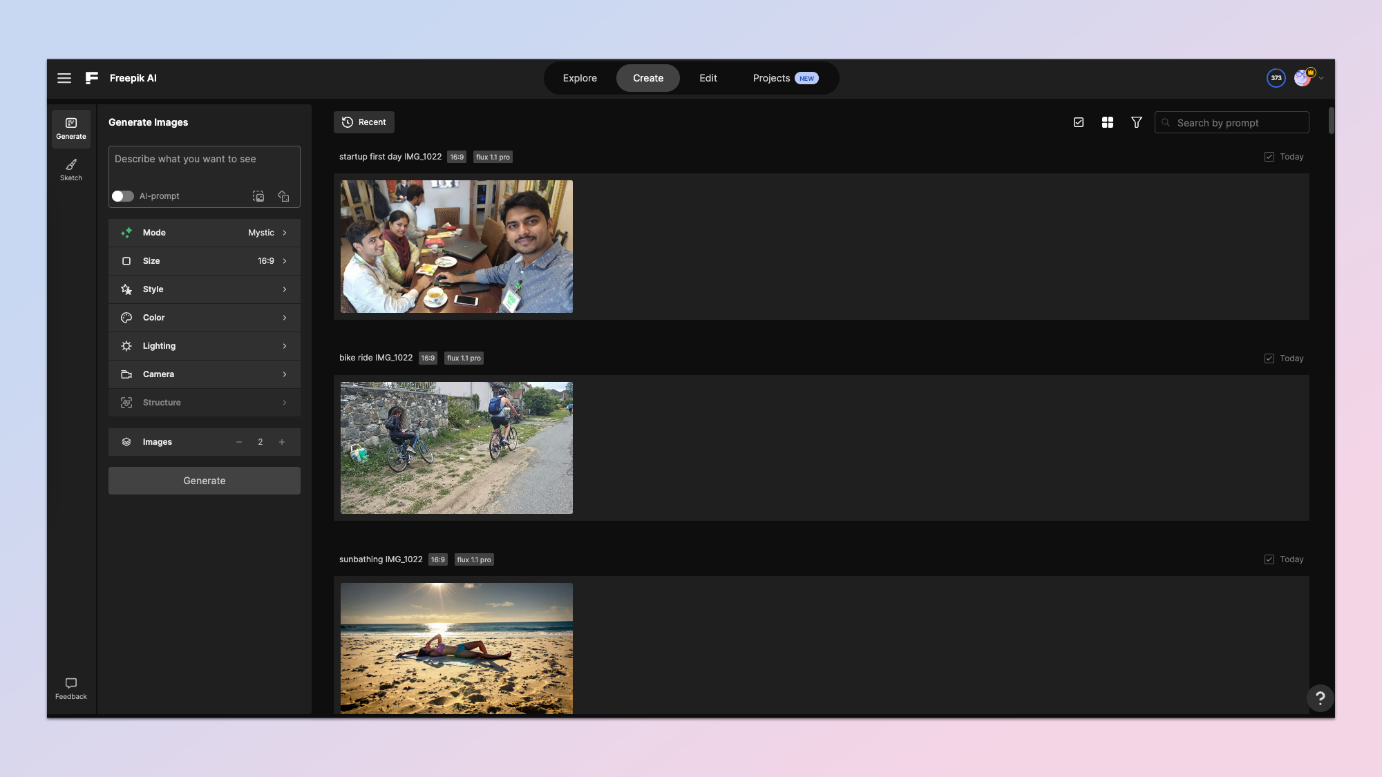
Freepik is an interesting platform. Originally know for its library of images, it has very quickly become a major force in the artificial intelligence space. Some of this was driven by its acquisition of AI-upscaler Magnific earlier this year.
The AI generation part of the platform is incredibly easy to use and intuitive. It also includes a prompt enhancer that uses a large language model to improve your simplistic prompts.
You can add filters and elements to the image generation such as custom styles, colors and lighting. You can also specify the camera type if you are taking a photo. When exporting you have an easy upscale button that happens automatically before offering the download.
The feature set goes beyond simple image generation. One of these is sketch enhancement using AI. You can doodle on the screen and the AI will turn your doodle into an artwork or photograph.
Outside of generation, editing and sketching you can also upscale images from outside of Freepik, expand canvas in a similar way to Photoshop and use AI to retouch existing images.
Freepik has become a good all-round AI powerhouse, a way to play with image creation, including offering the latest models. It has all versions of the Flux family of models including Flux 1.1 Pro, the new rapid and realistic version.
The big stand out though is Mystic, built by the Magnific team. This is a fine-tuned and customized version of Flux that is perfect for photorealistic depictions of people.

Best for originality
10. Luma Photon
Specifications
Reasons to buy
Reasons to avoid
Luma’s Dream Machine is more traditionally an AI video platform, at least that is how it started. With its most recent update, and the addition of the Photon image model it has become one of the most innovative approaches to AI creation.
The Photon model can generate compelling images and is surprisingly creative and personalizable through complex prompting. It is also higher resolution for a lower price than other similar-sized models from Luma’s competitors. Its big differentiator is its prompt adherence and integration with the new look Dream Machine, which is now both image and video.
In Dream Machine a user enters a prompt and then collaborates with the platform to enhance both the prompt and adapt the image. I tested this in a review and found that the customization makes it very easy to get the exact image you are looking for.
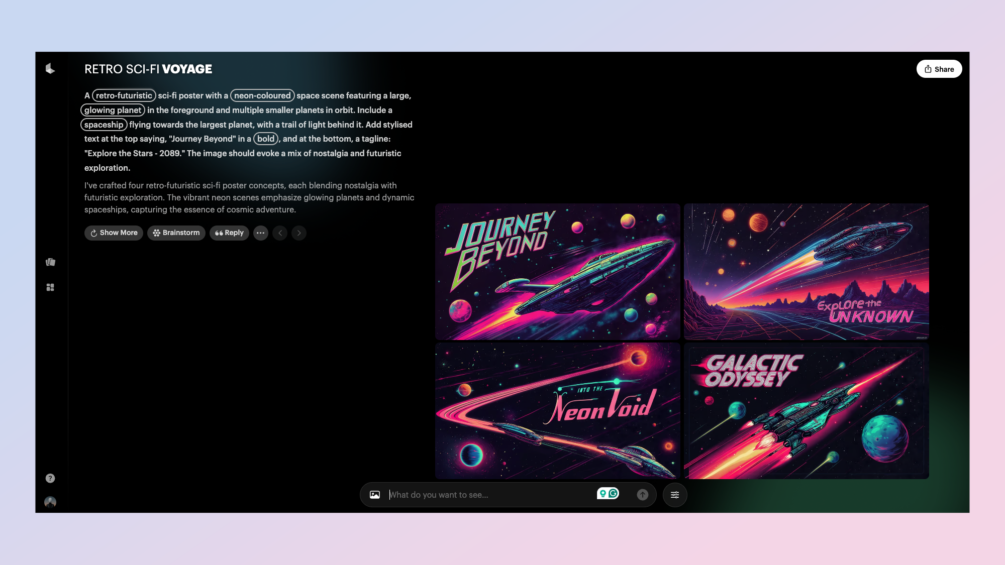
One of my favorite features of Dream Machine is the interface. It is more like a chatbot than a traditional AI image generator. After entering your prompt you get the full prompt as well as four images. Keywords within the prompt are highlighted and can be quickly customized to change specific elements within the image. The Dream Machine platform has undergone a comprehensive redesign to improve user experience.
You can then also opt to show more images, brainstorm on the side, and even reply to the response to that prompt to get specific changes. Clicking reply will load the generated images into the chat box as an attachment where you can send it to the video editor or change the image using as simple natural language prompt.
Luma Dream Machine works by creating “boards” for each topic. You can then iterate through the idea, brainstorming with the AI and keeping it all collected in one location.
Recognizing the diverse needs of its user base, Luma AI has introduced subscription tiers to cater to different levels of usage:
Hobbyist: $9.99 per month
Explorer: $29.99 per month
Professional: $99.99 per month
Enterprise: Custom pricing for larger teams
These tiers offer varying levels of access and support, allowing users to select plans that best fit their creative requirements.
Best for video linkup
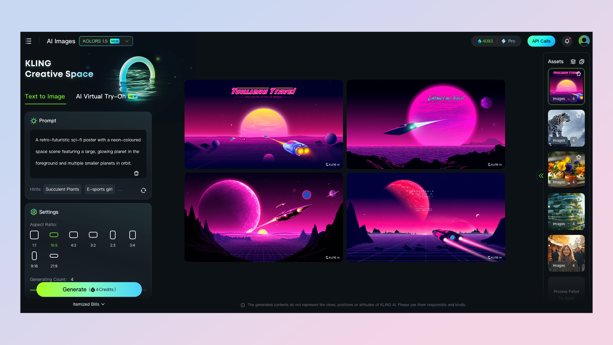
Kling’s KOLORS is its dedicated AI image model. A lot of the big video platforms are launching custom image models as they use them to enhance their video platforms. Luma has Photon, Runway is launching Frames and Haiper already has an image version of its model.
KOLORS is impressive for visual consistency, human realism and portrait aesthetics but I’ve found it struggles with text rendering, something other models now largely do very well.
One area it is particularly good is in generating portraits. It captures the light and shadow required from a prompt particularly well and follows a prompt accurately.
KOLORS also comes with a virtual “try-on” where you can generate a virtual model and then either upload or generate an outfit for the model to wear. It comes with a series of example images you can use for inspiration and each image costs 1 credit.
The true value of KOLORS though comes from the deep integration with the Kling AI video model. The user generates an image and then clicks to animate it. Kling is one of the best AI video models currently available. It can create hyperrealistic video with accurate motion.
Final thoughts
Generating AI images is a fun process. You get to see an idea you've had in your head almost immediately and with new features like Canvas you can edit and make changes to that image to fit your exact concept.
I've used Ideogram to create posters to remind the children to turn off lights, artwork for app icons and even entire app designs. I've used Midjourney to create photos worthy of printing and Adobe Firefly regularly contributes to cover images for my stories.
I hope this guide has given you some insight into the best tools for creating AI art. If you've tried something I've not included send me an email, find me on X or leave a comment and I'll give it a review.
More from Tom's Guide
- 7 ChatGPT productivity hacks that you're not using — but should be
- I use Gemini every day — here are 7 mind-blowing prompts I can’t live without
- These 9 AI prompts work like magic — no matter which chatbot you use
Get instant access to breaking news, the hottest reviews, great deals and helpful tips.

Amanda Caswell is one of today’s leading voices in AI and technology. A celebrated contributor to various news outlets, her sharp insights and relatable storytelling have earned her a loyal readership. Amanda’s work has been recognized with prestigious honors, including outstanding contribution to media.
Known for her ability to bring clarity to even the most complex topics, Amanda seamlessly blends innovation and creativity, inspiring readers to embrace the power of AI and emerging technologies. As a certified prompt engineer, she continues to push the boundaries of how humans and AI can work together.
Beyond her journalism career, Amanda is a long-distance runner and mom of three. She lives in New Jersey.

 Club Benefits


