I took my iPhone's dark mode to the next level — here's the hidden trick
iPhone dark mode not dark enough? These hidden features fix that
Here at Tom’s Guide our expert editors are committed to bringing you the best news, reviews and guides to help you stay informed and ahead of the curve!
You are now subscribed
Your newsletter sign-up was successful
Want to add more newsletters?
Join the club
Get full access to premium articles, exclusive features and a growing list of member rewards.
Hi, I'm Kaycee. Welcome to Hidden iPhone Tips, a weekly column where I dig into the best iOS features Apple doesn't tell you about.
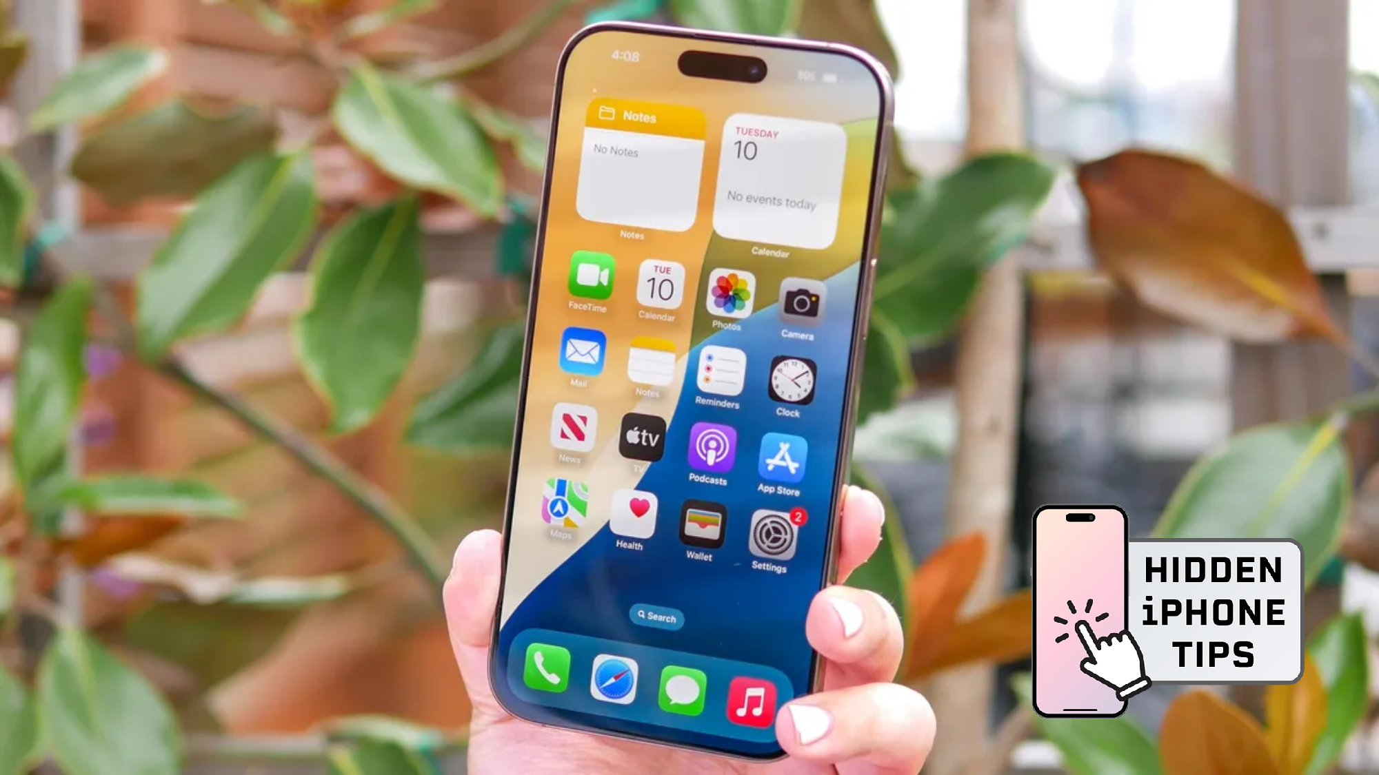
Dark mode on iPhone is good, but it's not at maximum. Most people enable it and assume that's as far as it goes. There are, however, three hidden settings that push contrast significantly further, making text sharper, icons darker, and everything easier to read.
This is particularly useful if you wear glasses, struggle with low contrast displays, or simply find standard dark mode doesn't go far enough. It's not a single switch Apple buried in settings — it's a combination of three adjustments that together create what most people would call maximum dark mode. Here's how you can take your iPhone's dark mode to the next level.
What you need to know
What we're about to go over isn't a single dark mode setting, it's a combination of three adjustments that work together to maximize contrast and darkness across your entire iPhone interface. You'll need iOS 26.1 or later installed on your iPhone to access these features.
Article continues belowStandard dark mode changes your iPhone's background from white to black. These additional steps go further by darkening icons, reducing transparency in menus and the dock, increasing contrast between text and backgrounds, and adding borders that make interface elements easier to distinguish.
How to enable maximum dark mode on iPhone
1. Customize your home screen icons
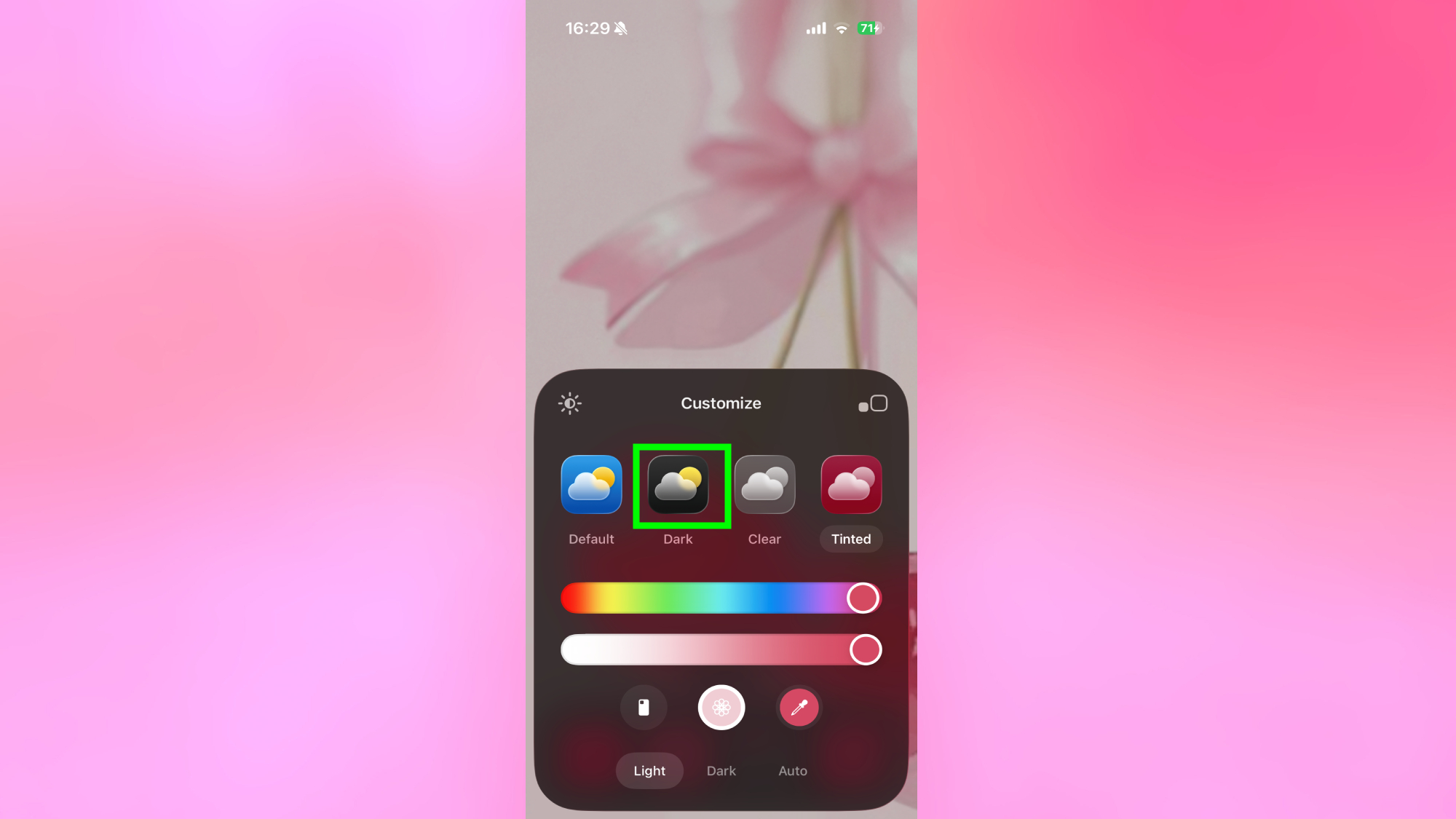
Tap and hold an empty area of your home screen until icons start jiggling. Tap Edit in the top left corner, then tap Customize.
Next, look for the Dark option and enable it. This applies darker styling to your home screen icons, making them easier to see against dark backgrounds and giving your home screen a more consistent, high-contrast appearance.
2. Enable tinted display in settings
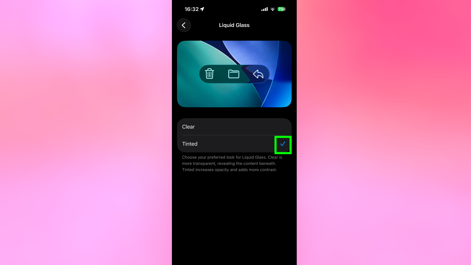
Open Settings and scroll down to Display & Brightness. Look for the Liquid Glass section and tap Tinted. This immediately darkens the interface further and improves contrast across menus, apps, and system elements.
You'll notice the difference straight away — everything appears darker and more defined than standard dark mode alone provides.
3. Adjust accessibility settings for maximum contrast
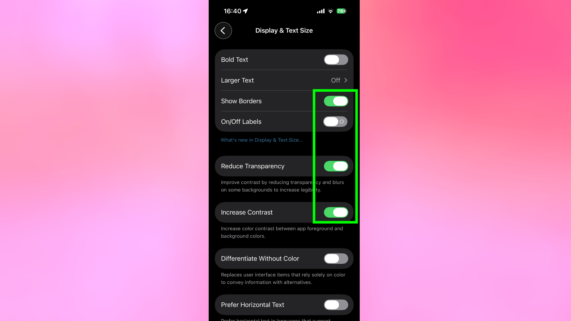
Go back to Settings, then tap Accessibility, then Display & Text Size. Here you'll find three settings to enable: Show Borders, Reduce Transparency, and Increase Contrast. Turn all three on.
Once all three are enabled, go back to your home screen. The dock and interface elements will be noticeably darker, text will be sharper, and the overall display will have a more defined, high-contrast appearance that standard dark mode doesn't achieve.
Why this feature is so useful
Standard dark mode switches backgrounds from white to black but leaves interface elements like the dock, menus, and icons with semi-transparent or lightly styled appearances that reduce overall contrast. The combination of settings above removes that softness and pushes every element toward maximum darkness and definition.
For people who wear glasses or have difficulty reading low-contrast text, the difference is significant. Text becomes crisper, buttons become easier to locate, and the overall interface feels more intentional and easier to navigate.
Even if you don't have vision concerns, maximum dark mode looks noticeably sharper and more refined than standard dark mode. It's a cleaner, more consistent appearance that makes the interface easier to use in low-light environments.
Get instant access to breaking news, the hottest reviews, great deals and helpful tips.

Follow Tom's Guide on Google News and add us as a preferred source to get our up-to-date news, analysis, and reviews in your feeds. Make sure to click the Follow button!
More from Tom's Guide

Kaycee is Tom's Guide's How-To Editor, known for tutorials that get straight to what works. She writes across phones, homes, TVs and everything in between — because life doesn't stick to categories and neither should good advice. She's spent years in content creation doing one thing really well: making complicated things click. Kaycee is also an award-winning poet and co-editor at Fox and Star Books.
You must confirm your public display name before commenting
Please logout and then login again, you will then be prompted to enter your display name.
 Club Benefits


