YouTube rolls out a redesigned video player and people aren't happy — here's what's different
Liquid Glass comes to YouTube?
Here at Tom’s Guide our expert editors are committed to bringing you the best news, reviews and guides to help you stay informed and ahead of the curve!
You are now subscribed
Your newsletter sign-up was successful
Want to add more newsletters?
Join the club
Get full access to premium articles, exclusive features and a growing list of member rewards.
YouTube is getting several visual updates thanks to a new UI redesign that started rolling out this week. These new features launched globally yesterday (October 13), though you may not have received it yet.
The redesign comes less than two weeks after a major UI overhaul launched on the mobile version of YouTube.
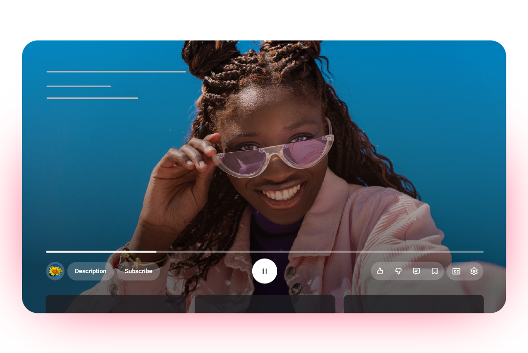
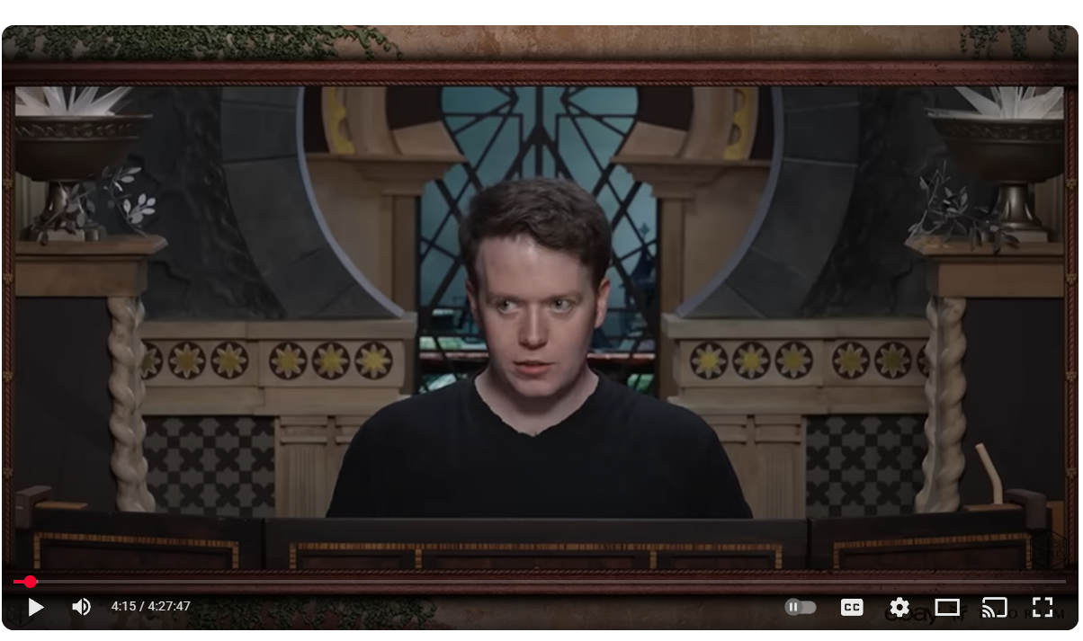
The most noticeable update to YouTube is the redesigned video player, which features new icons and elements that are meant to be more transparent. That way, they won't obscure the video as much.
Article continues belowA YouTube announcement post described the updated app as a "cleaner and more immersive" player. That includes improvements to "Seek" which enables you to double-tap to skip. This is supposed to feel more "modern and less intrusive." Transitions between tabs on mobile have been updated as well.
The new design seems bubblier and more transparent. The different buttons also have more distinct outlines. So instead of just icons on the player bar, now they're in distinct circles.
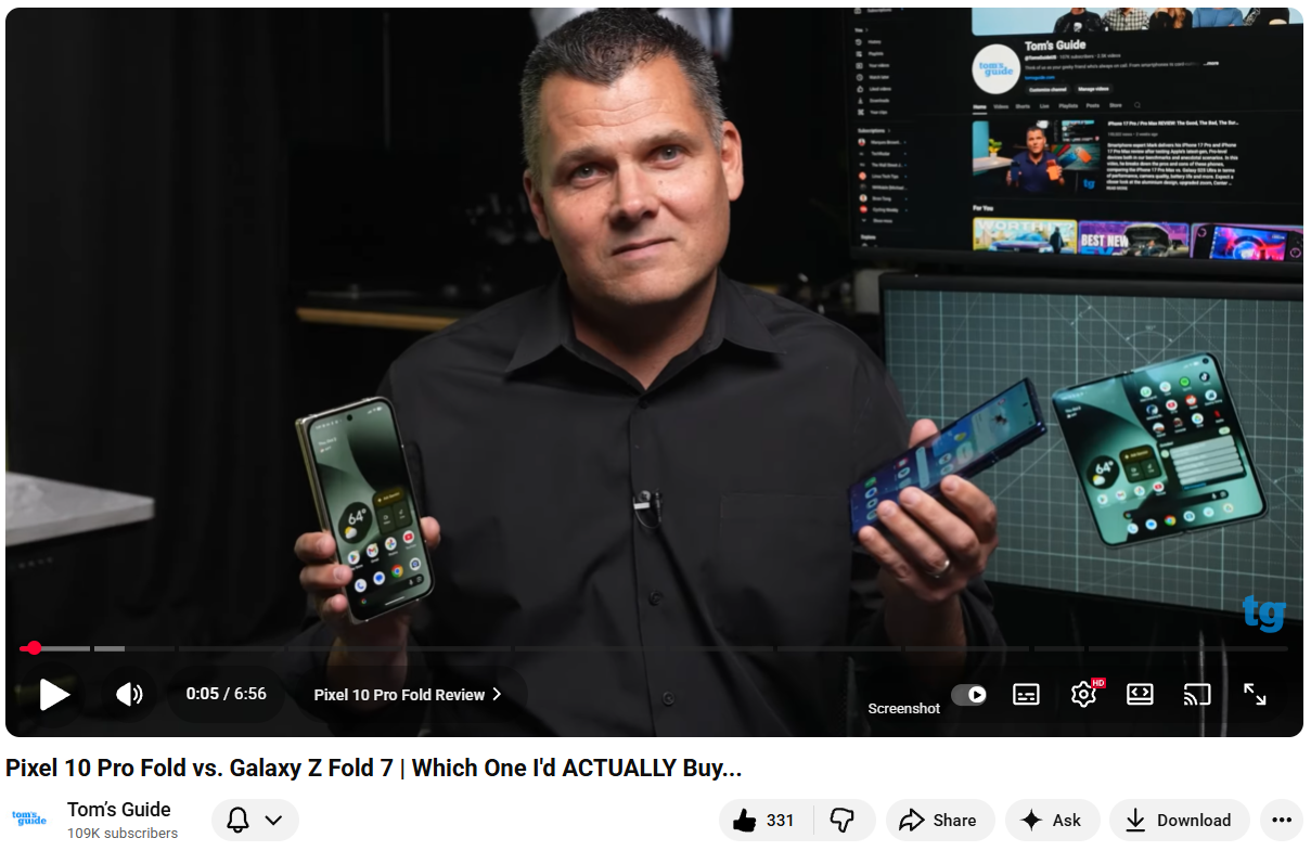
Lastly, the process of adding to playlists and Watch Later has been made simpler, while some videos will get little animations when you tap the like button. You might see this on music videos and sports highlights to start.
I noticed it on a movie trailer, where tapping the like button briefly turned the new thumbs up into a clapperboard.
Get instant access to breaking news, the hottest reviews, great deals and helpful tips.
It's possible that some people have had this layout for more than a month, since Premium subscribers tend to get some beta changes early.
Reddit isn't happy
When is Reddit ever happy? Nonetheless, the YouTube subreddit is filled with complaint posts about the new UI. Most people seem confused.
We've seen it called "genuinely ugly" among the nicer, less profane-filled comments.
Personally, I find the new YouTube look appealing, if a little too large, but not distractingly so.
Interestingly, the new feature that people on Reddit do seem happy about is the new comments section which has introduced "threading" that looks very similar to how comments on Reddit work.
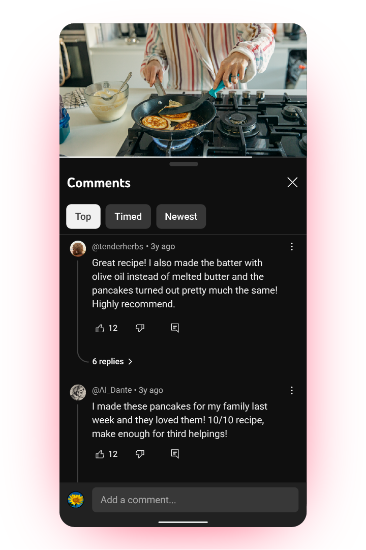
If you're not familiar with threading on Reddit and now YouTube, you can see how comments connect to one another thanks to threaded responses. This is especially helpful for convoluted, multi-reply comments that can go off on tangents.
YouTube says this should "provide a more focused reading experience within the replies panel."
Do you have it yet?
Google rollouts can be a little slow, taking days or even weeks to hit most people.
After some refreshes, I was able to see the new interface, but some of my colleagues have yet to receive the update. We checked both work and personal accounts in both normal and incognito modes.
Unfortunately, it's not clear from Google how long it will take until more people can try out the redesigned video player.
Follow Tom's Guide on Google News and add us as a preferred source to get our up-to-date news, analysis, and reviews in your feeds. Make sure to click the Follow button!
More from Tom's Guide
- I signed up for YouTube Premium on a whim — and it’s the best decision I’ve made in ages
- Google Chrome just got a massive upgrade — 10 new AI features that change the way you browse
- Google finally adds a way to tame notifications on Chrome — here's how it works

Scott Younker is the West Coast Reporter at Tom’s Guide. He covers all the lastest tech news. He’s been involved in tech since 2011 at various outlets and is on an ongoing hunt to build the easiest to use home media system. When not writing about the latest devices, you are more than welcome to discuss board games or disc golf with him. He also handles all the Connections coverage on Tom's Guide and has been playing the addictive NYT game since it released.
You must confirm your public display name before commenting
Please logout and then login again, you will then be prompted to enter your display name.
 Club Benefits


