YouTube is rolling out a major UI change — and some users are not happy about it
It's a lot more compact
Here at Tom’s Guide our expert editors are committed to bringing you the best news, reviews and guides to help you stay informed and ahead of the curve!
You are now subscribed
Your newsletter sign-up was successful
Want to add more newsletters?
Join the club
Get full access to premium articles, exclusive features and a growing list of member rewards.
YouTube appears to be rolling out a UI change for its phone app, but users don't seem too pleased with the new look.
A developer changing the look of its app is certainly nothing new, with YouTube itself having seen its fair share of changes over the years. Not every change implemented by the company has been positively received, but this new look, shown off on several Reddit threads, might be one of the more controversial ones.
In the current version of the YouTube app, all of the information you need about the channel is located directly underneath the video. However, the new UI completely removes the channel name, instead leaving only a username.
Article continues belowThe uploader's icon is also increased in size and has been moved to sit next to the video's title, while the join and notification options now live next to the like and dislike buttons.
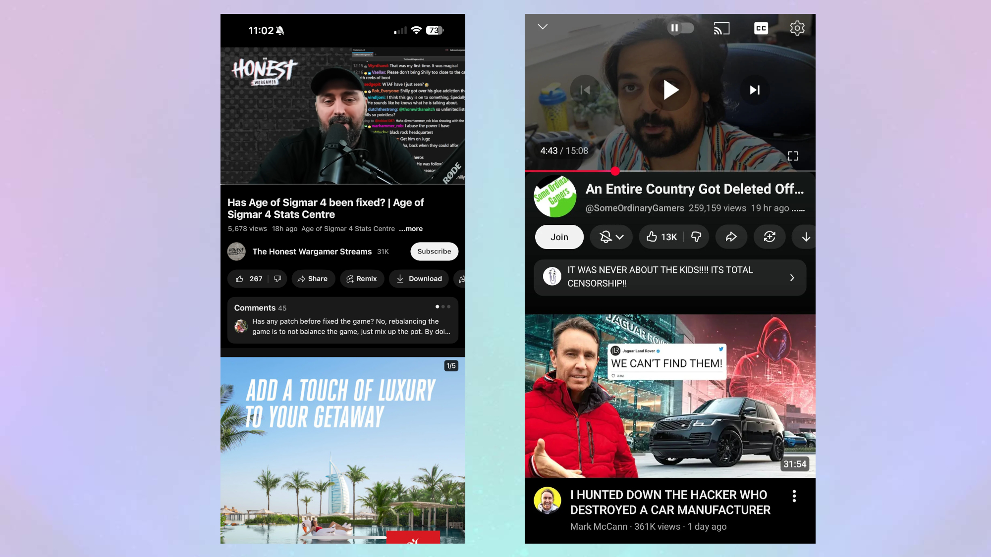
I checked my iPhone 15 Pro Max and, as seen in the above image, my app has the original UI. I also checked a colleague's Google Pixel 10 Pro XL and didn't see the change. Unfortunately, the Reddit post in question doesn't mention the model on which the screenshot was taken, but Android Authority reports that some of their devices have the new look.
For the most part, the common consensus on Reddit threads appears to be that the UI looks far too “squished” or “crouched.” I can see what they mean, and losing the channel name is an odd choice. On the other hand, there's an argument that it appears a bit more streamlined and allows users to better see the next video on smaller screens.
It appears that there’s also a new look for YouTube Shorts, although I'm not too sure about the validity of this one. According to a few posts on Reddit, the buttons on the right-hand side of the screen appear much smaller and smoother-looking than they did in the past.
Get instant access to breaking news, the hottest reviews, great deals and helpful tips.
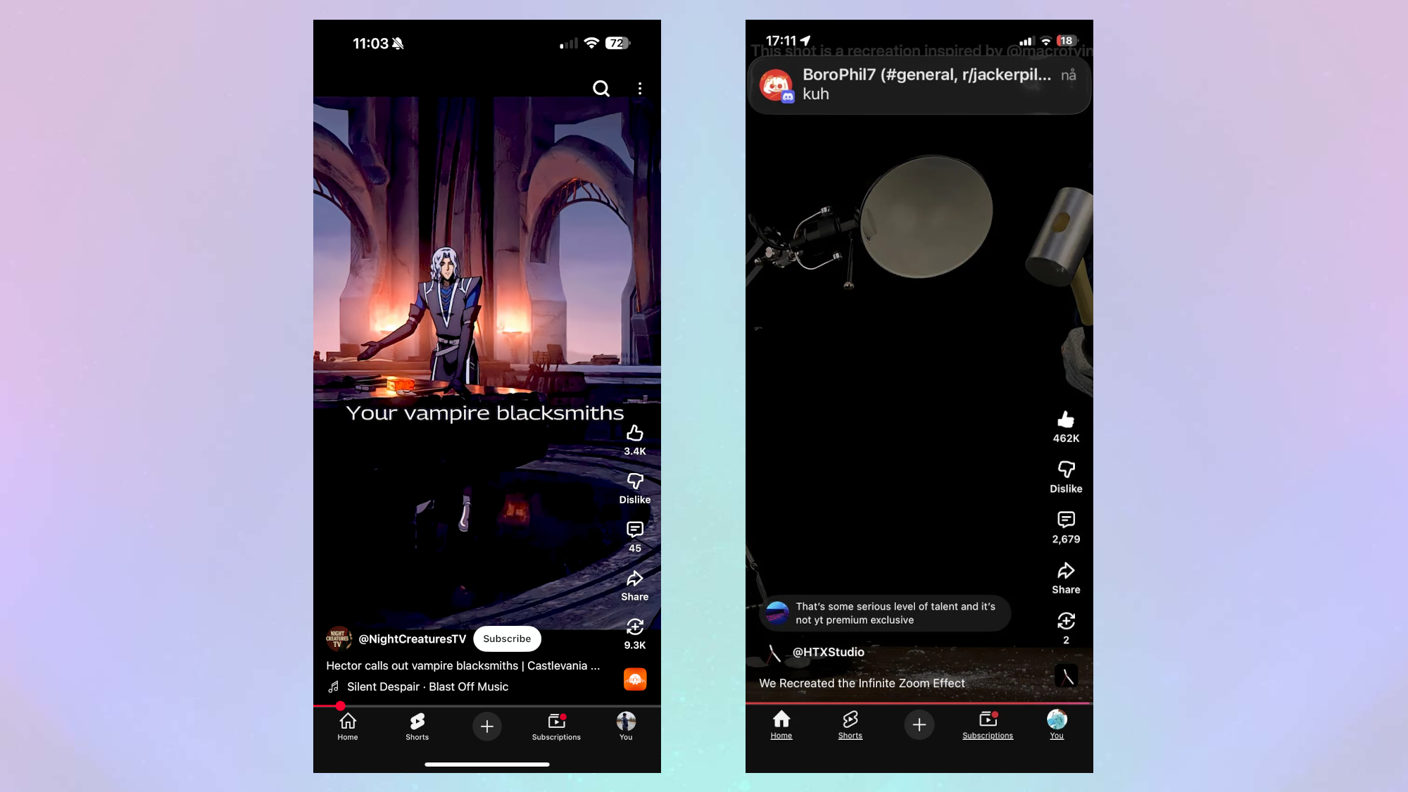
Looking at the YouTube shorts on my iPhone, which didn't feature the other UI change, the buttons appear the same as the ones seen in the screenshots. So, there are two possible outcomes here: Either I am far blinder than I originally thought, or Reddit users appear to be mistaken.
Although I will admit, the subscribe option does appear to be missing in the screenshot.
This isn’t the only change that we’ve seen with YouTube that has upset users, with the company recently rolling out restrictions to cut down on password sharing. Several subscribers to YouTube Premium’s plan received a message saying that their benefits will be paused if they are found not to be in the same household as their family member.
It doesn't appear that the changes are widespread yet, so it might be that YouTube is just gauging user interest in the new look. In the meantime, let us know what you think about the new look and if it’s one that you want, or if you think it’s the worst thing since a video of sliced bread.
Follow Tom's Guide on Google News and add us as a preferred source to get our up-to-date news, analysis, and reviews in your feeds. Make sure to click the Follow button!
More from Tom's Guide
- iPhone 17 has a Dual Capture video recording feature that records front and back cameras together — here's how to use it
- I put the iPhone 17 Center Stage camera to the test against the Pixel 10 Pro XL and Galaxy S25 Ultra — here’s the results
- Your iPhone 11 Pro Max and Apple Watch Series 3 are now considered 'Vintage' by Apple

Josh is a staff writer for Tom's Guide and is based in the UK. He has worked for several publications but now works primarily on mobile phones. Outside of phones, he has a passion for video games, novels, and Warhammer.
You must confirm your public display name before commenting
Please logout and then login again, you will then be prompted to enter your display name.
 Club Benefits


