iOS 26's biggest selling point is the one thing I dislike the most
Liquid Glass is easily the worst part about iOS 26
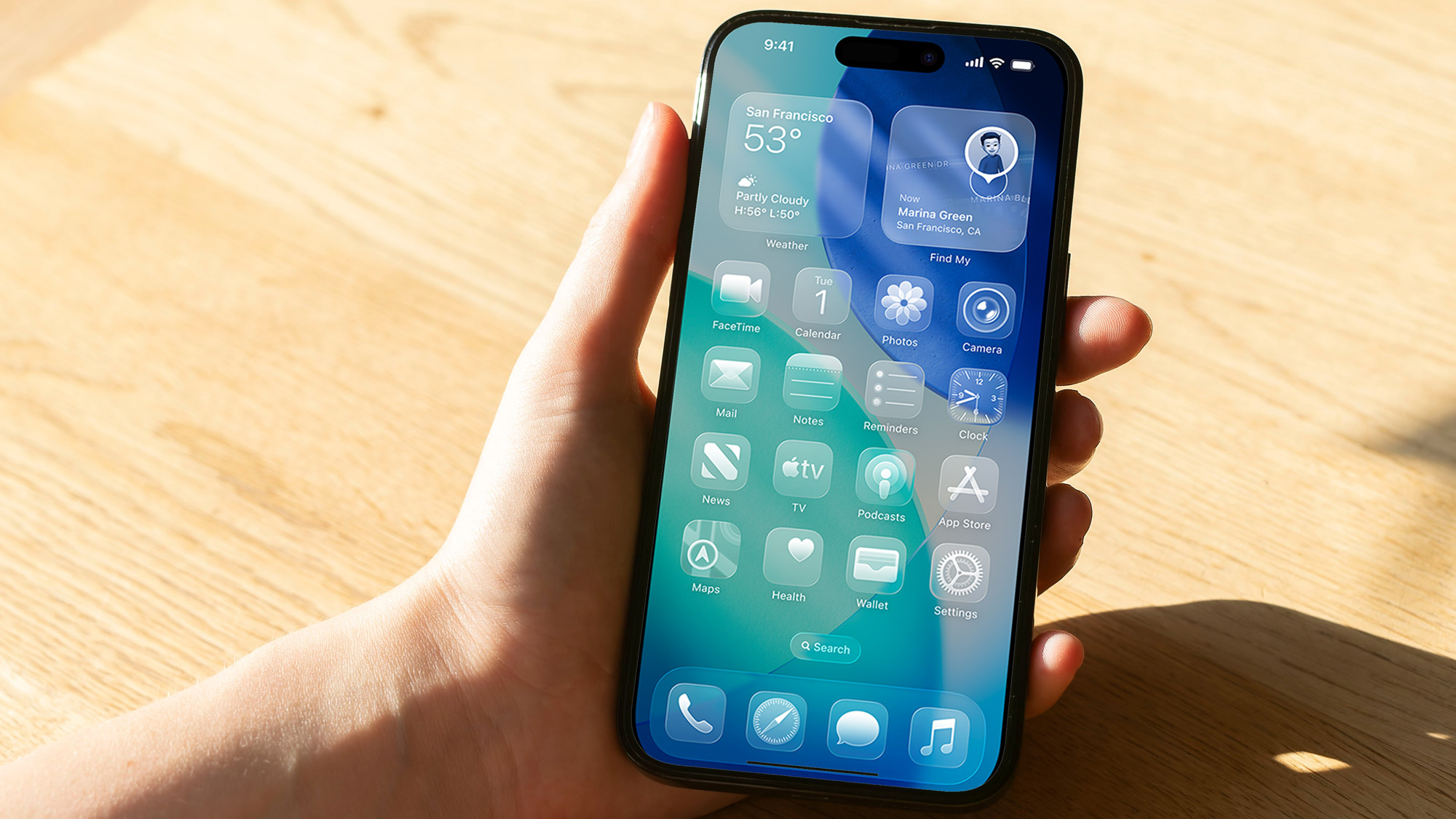
There's a lot going on in iOS 26, thanks to all the changes and features Apple is adding to the software. But as great as additions like Call Screening and customizable alarm snooze times may be, there's no denying that Apple has angled the Liquid Glass redesign as its major selling point.
Unfortunately, it's also the absolute worst part about upgrading to iOS 26. Or at least, that's my personal opinion. I've never liked the look of Liquid Glass, but going back to an iPhone 12 that is still running iOS 18 is a stark reminder of how much things have changed — and not for the better.
Call me boring, but Liquid Glass is way too loud and bright for my liking. While Apple has let given us opportunity to tone down the transparency, I don't think that goes far enough.
Article continues belowLiquid Glass is too garish and showy — and it looks worse for it
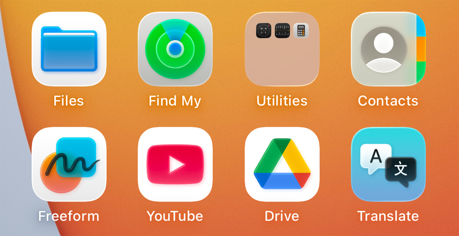
The key thing I really dislike about Liquid Glass is what it's done to the coloring of the iOS software. It's overly bright, with some strange emphasis on glowing patterns, and it instantly makes me think of tacky beach resorts that are a shadow of their former selves.
It's like iOS has been put through some gaudy neon filter that makes everything look significantly worse.
It's like iOS has been put through some gaudy neon filter that makes everything look significantly worse. Not just because the bright coloring doesn't exactly fit, but also because the glowing effects some features have end up making the colors blend together — especially from half an arm's length away.
Not all apps and icons are like this, but many of them are — particularly those made by Apple itself. I do have to wonder what the design team were actually thinking when they came up with this look.
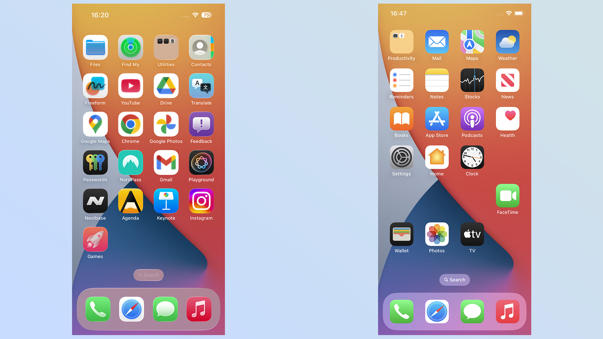
To be fair, the last major iOS redesign was widely criticized when it launched back in 2013. People wanted to keep the older skeumorphic design, rather than the flat more streamlined look that's coming up to its 12th birthday.
Get instant access to breaking news, the hottest reviews, great deals and helpful tips.
People didn't like the design, and some declared that it looked cheap and felt confusing. Joshua Topolsky, former editor-in-chief of The Verge, criticized some of the art for looking like it came straight from Clip Art.
People don't like change. They never have, and ever since the internet gave them a voice they've been using it to complain that the old thing is way better than the new thing. I know I've been guilty of that at times, even if I try and pretend not to be.
I feel like it would take me a lot to get used to Liquid Glass's design, though. As flat, boring and relatively simple as the old iOS look was, it worked out pretty well. Lasting about the same amount of time as the Lightning cable, which didn't have nearly as much going for it.
At least the transparency can be switched off
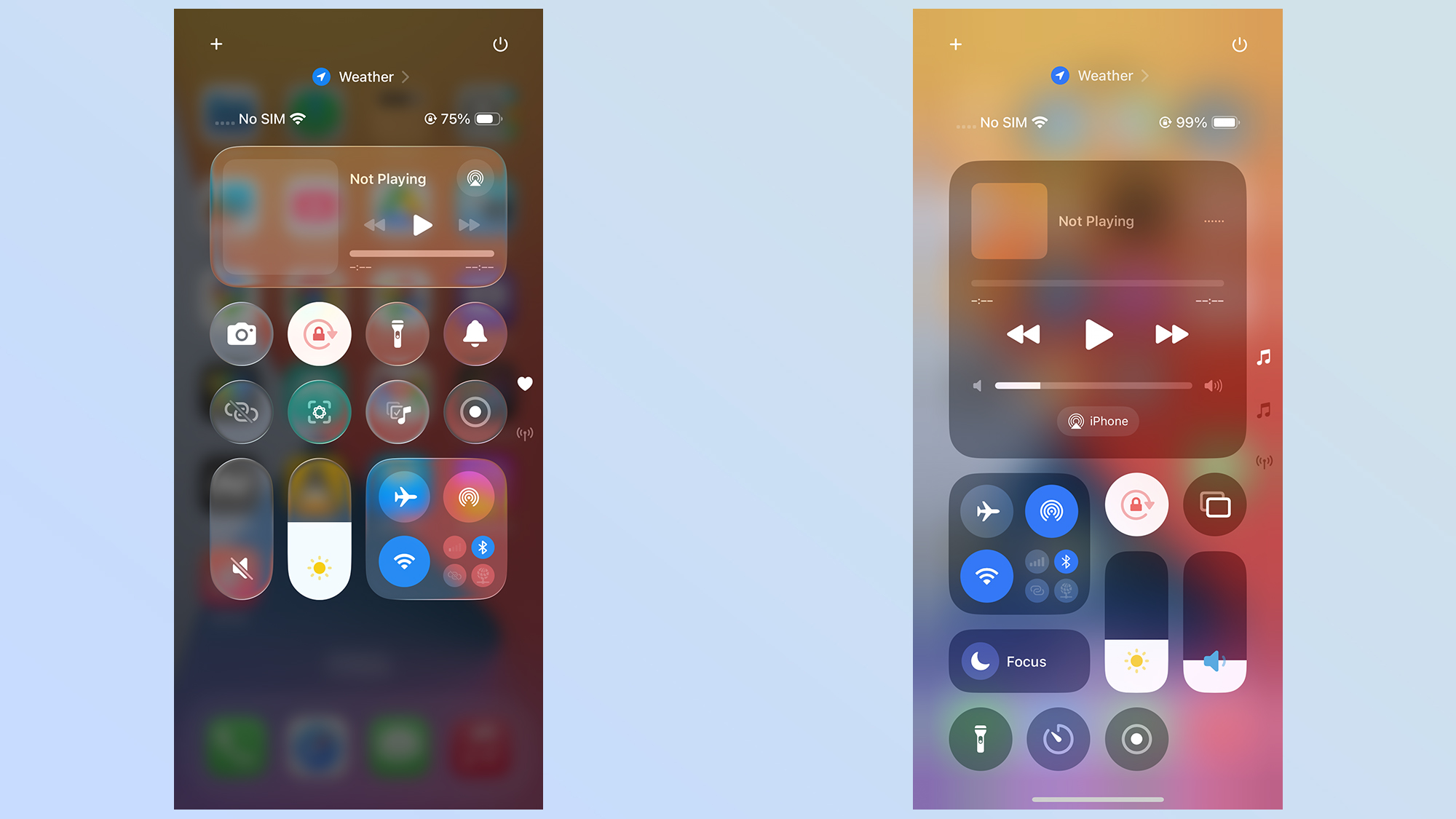
The other part of Liquid Glass I really disliked was all the translucency in the designs. When I open up a tab or a menu, I really don't want to have to see the blurred remnants of the last thing I was looking at in the background.
iOS 18 did this as well, to a degree, and I didn't like it there either. One good example of that was the Control Panel, which was like looking through frosted glass at the silhouettes of the home screen behind it. Liquid Glass tones down that frosting to the point where you can still recognize what's going on in the background.
Apple uses words like "beautiful" and "delightful" when talking about Liquid Glass, but the truth is it's none of those things. It's messy, awkward, and while it may look brushed up and optimized in marketing materials the real-world results are anything but aesthetically pleasing.
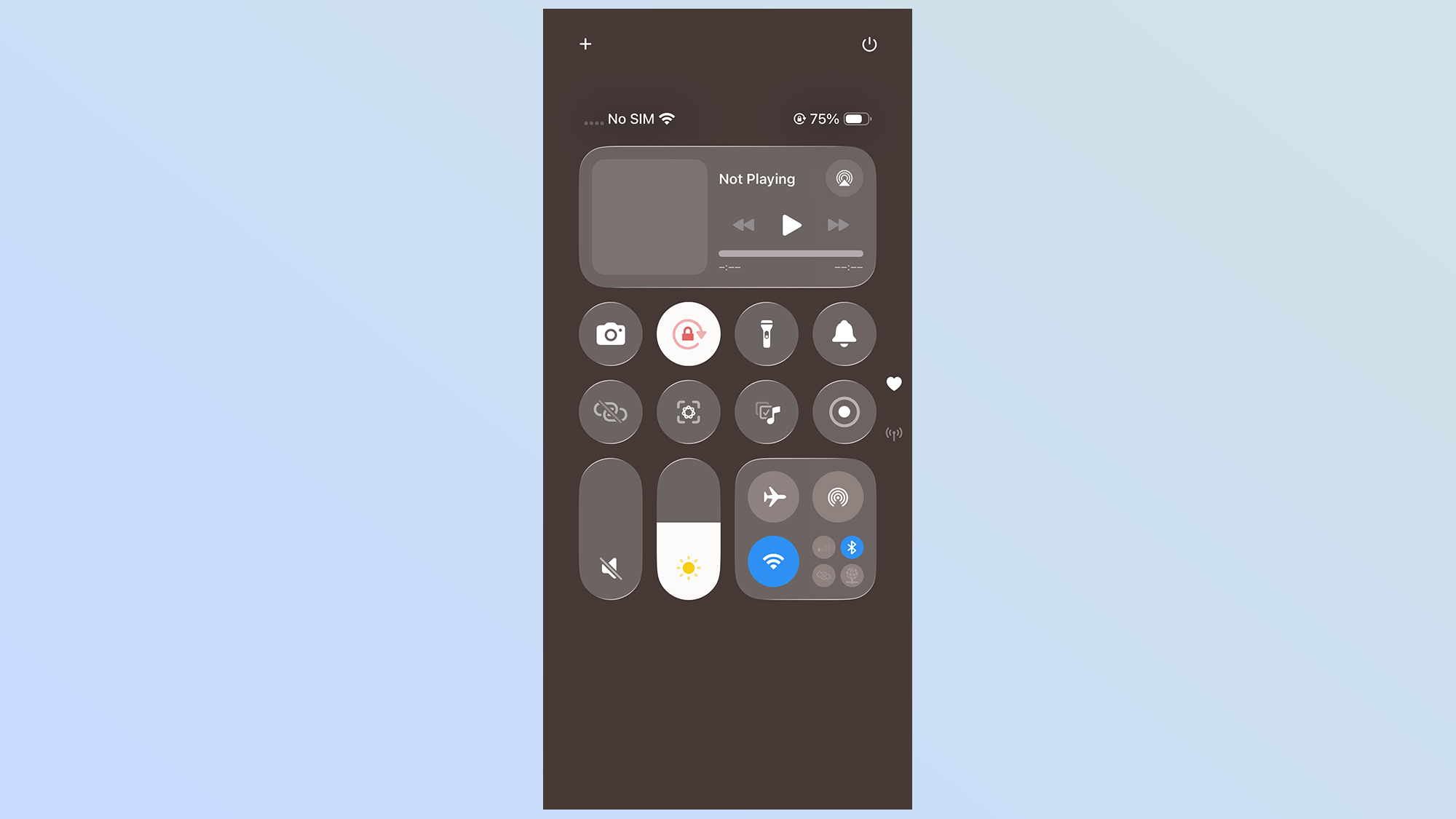
Apple has made changes over the past couple of months, toning down some of the transparent effects in places — to the point that some people joked it should be called "frosted glass."
This was reportedly to help optimize devices for better usability, and that finetuning shows why beta testing like this has been done. But, personally, as of the iOS 26 public beta 2, things haven't gone far enough.
Thankfully the transparency problem does have a solution right now. You can turn it off completely, and the formerly transparent menus and icons automatically get opaque backgrounds. Head to Settings > Accessibility > Display & text Size > Reduce transparency.
The grays and browns used when this feature is utilized may not be the most flattering colors, but they're infinitely better than the transparent menus.
Bottom line
Talk to me again in a few years time, and there's a chance I may feel differently about Liquid Glass. But right now, all I can do when I look at my iPhone is cringe at how things have changed, and how much worse I think it all looks now.
Thankfully, you can turn off the transparency effect in the Accessibility settings, I would be stoked if Apple would let us do the same with the glowing effects. Because right now the whole system feels like a Temu-style version of Las Vegas. But since those effects were designed into the icons and artwork, rather than the OS itself, that prospect is probably just a pipe dream.
Honestly, it just makes me glad I generally use Android phones. If I decide I don't like what the manufacturer has done with the software, I can always switch on one of the best Android launchers and mix things up. Maybe it's about time Apple did the same.
More from Tom's Guide
- iOS 26 Liquid Glass icons — how to get the stunning new look on your iPhone
- iOS 26 will bring GPT-5 to Apple Intelligence — what you need to know
- Mark your calendars — iPhone 17 release date may have just leaked

Tom is the Tom's Guide's UK Phones Editor, tackling the latest smartphone news and vocally expressing his opinions about upcoming features or changes. It's long way from his days as editor of Gizmodo UK, when pretty much everything was on the table. He’s usually found trying to squeeze another giant Lego set onto the shelf, draining very large cups of coffee, or complaining about how terrible his Smart TV is.
You must confirm your public display name before commenting
Please logout and then login again, you will then be prompted to enter your display name.

 Club Benefits


