I don't like the iOS 26 Camera redesign — but it does make sense
I think I know why Apple's made its latest Camera app much simpler
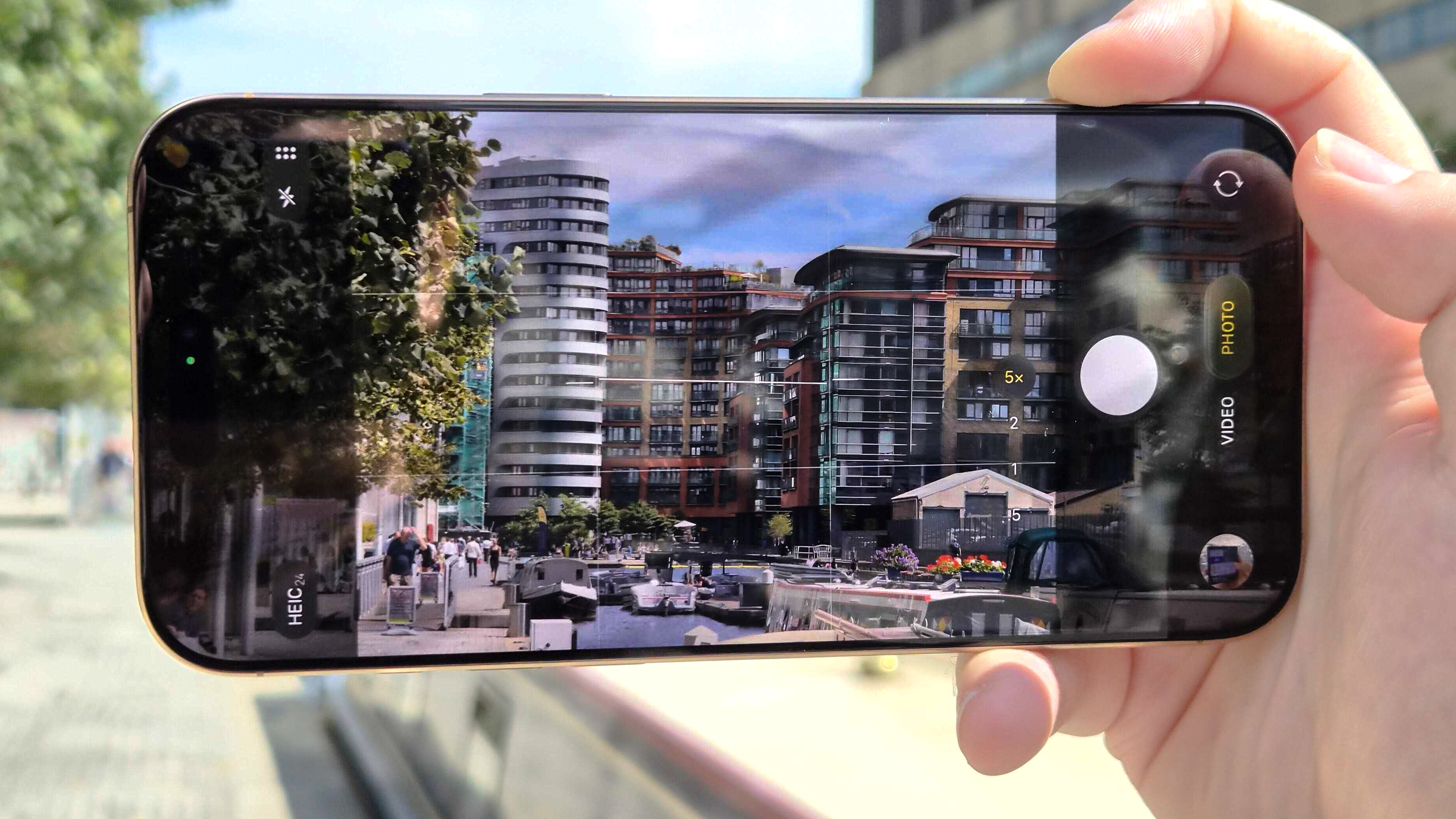
iOS 26 made enormous changes to several parts of the iPhone's interface. No app, menu or icon was spared from the Liquid Glass redesign. But the Camera app got more than just a face-lift in iOS 26. Its new look hides more fundamental changes to this basic iPhone app. And I am sorry to say that I am not a fan.
Changes made to other apps by iOS 26, such as the updated Photos interface, have been easy for me to adapt to. But with Camera, Apple has moved controls around and hidden others in new places, making for a confusing experience for long-time iPhone photographers. Let me show you what I'm talking about.
What's changed with the iOS 26 Camera app (and why is it bad)?
Apple hasn't completely thrown away the recognizable elements of the iOS Camera. There's still a viewfinder in the middle, options at the top and a shutter button at the bottom. You'll still be able to take a quick snap with the new app without an issue.
Article continues below 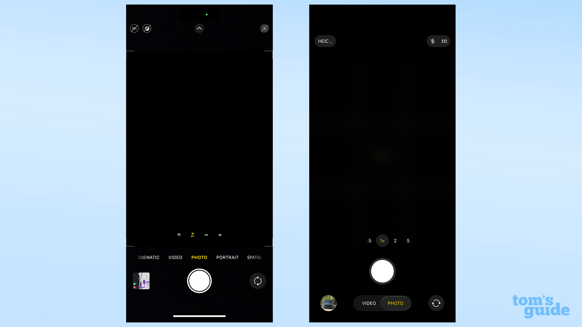
But if you want to do anything more complicated than that, you'll run into problems. Apple's decided that this version of the Camera needs to have fewer obvious options on display, turning an already minimalist design into an even more spartan one.
For instance, there's no longer an easy way to turn off live photos. Unless you re-enable it in Settings, you have to open a sub-menu to do that, an extra tap compared to the iOS 18 Camera app.
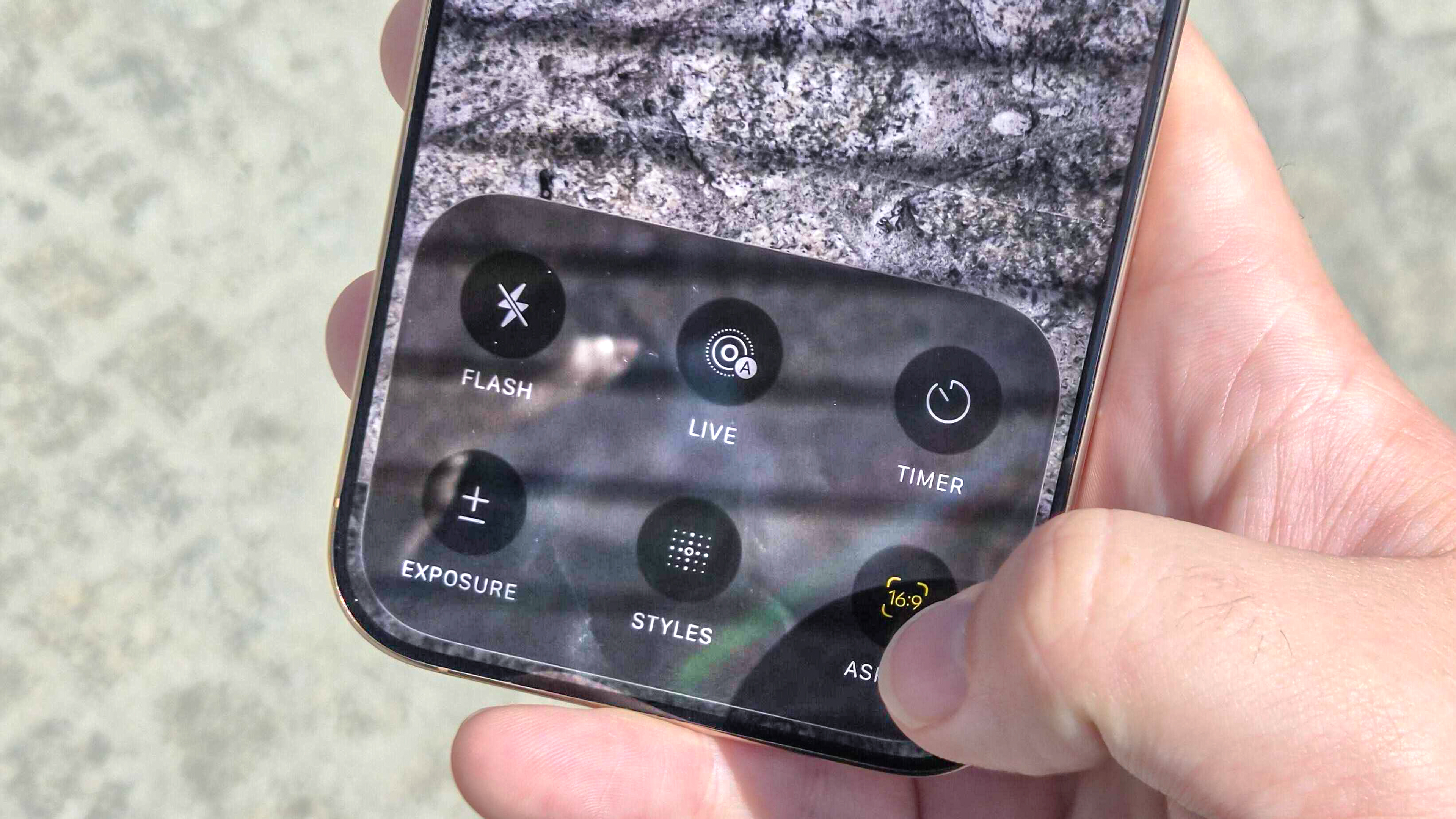
And where is that sub-menu? It's no longer obviously signposted with an arrow at the top of the screen. That requires tapping on either the Photo mode title at the bottom of the interface, or on the new six circles button at the top right. Once open, the menu houses flash, night mode, live photo, burst mode, aspect ratio and exposure options, just like before, and as larger, labelled icons. But making their menu button share space with others seems like an oversimplification.
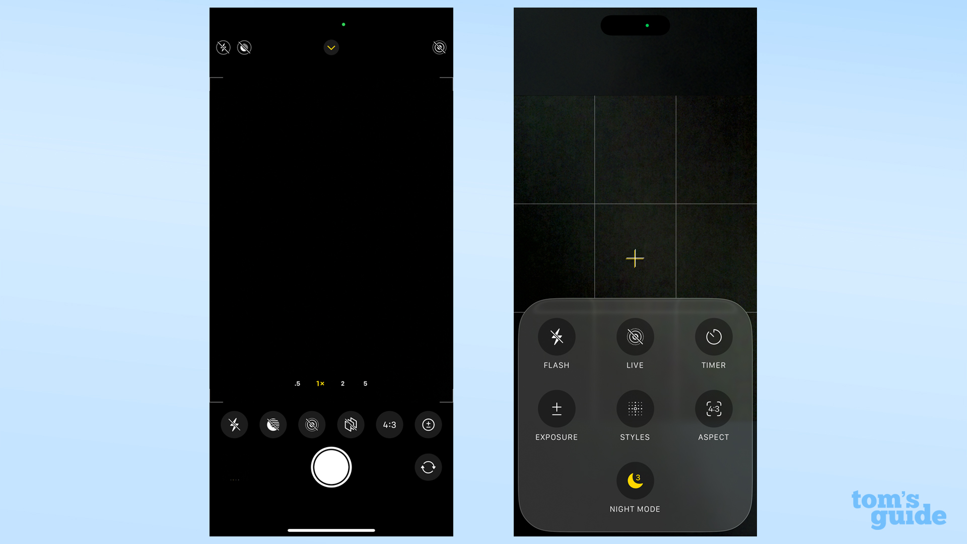
I often have to change image aspect ratios, since product images on TG need to be taken at 16:9, but I prefer to take my own photos in the camera's full 4:3 ratio. The ratio options appear as a pop-up list in iOS 18, but now in iOS 26 it's a single button that you need to tap repeatedly to cycle through the options. This is odd and inconsistent, since tapping the timer option in the same menu opens another pop-up which shows all the available options.
Get instant access to breaking news, the hottest reviews, great deals and helpful tips.
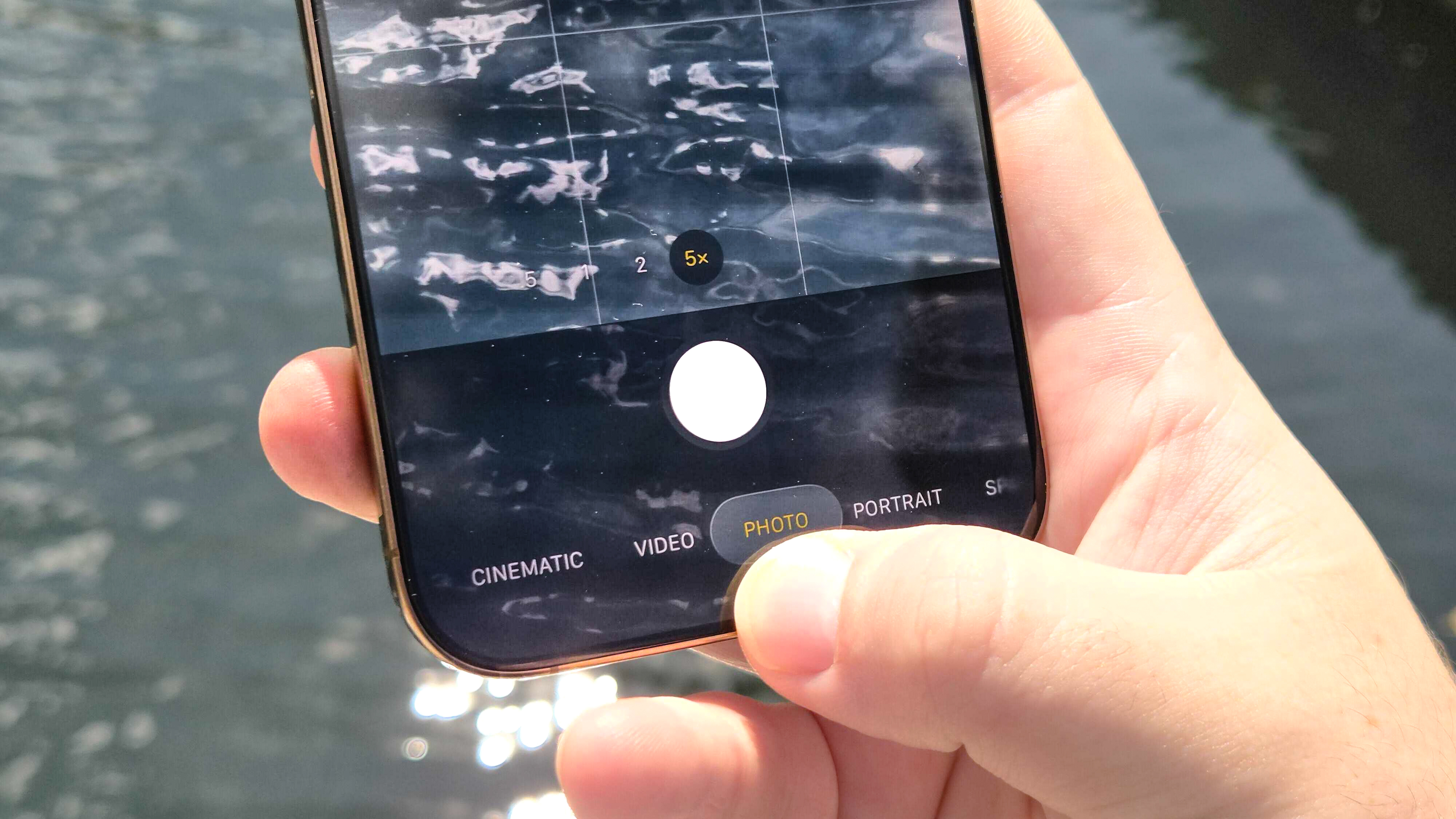
It's similar with switching camera modes. Inactive camera modes can still be swiped to, but don't display until you start swiping. It means you can't see which direction, or how far to go, if you want to enable Portrait mode or Cinematic video, for instance.
I know these options exist and can find them after only a moment's delay, but this feels like something that would put off inexperienced users from experimenting with other modes, wasting the potential of their iPhone's camera.
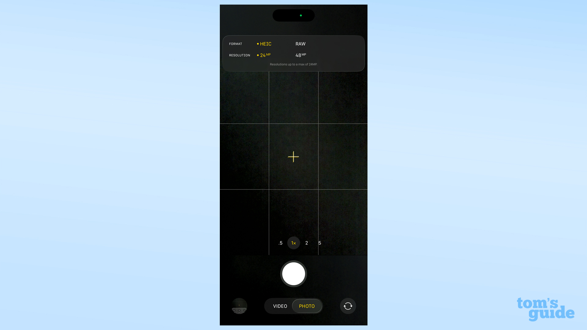
I should be fair to iOS 26, since some options like flash, and night mode when enabled, still live at the top of the camera app for easy access. And also to iOS 26's credit, the new shortcut to adjust image or video resolution and format is an option I appreciate.
But this doesn't outweigh the impact the other changes have had. I still view the iOS 26 Camera app update as a net negative, at least for the way I use it.
The first signs of a split
Ultimately though, my criticisms may not matter all that much. There are rumors of Apple launching a new pro camera app alongside the iPhone 17 series, which we're expecting in September.
If this rumor is true, it provides a likely explanation for the changes. If Apple knows it's got a pro camera coming, no doubt stuffed with options and capture modes for those who want to use them, it probably feels that it can hide away more options in the basic camera to make it less daunting for the majority of users.
The iPhone's cameras have to cater to two distinct crowds — a small number of professionals, like the creators of "28 Years Later," and millions of casual photo shooters. These two groups have different, diverging needs, so two camera apps may be the only way to make both happy.
I am confident in time that I will either adapt to the iOS 26 Camera app, or move onto the pro camera app if it does exist. I may even even make a full-time shift to Adobe Project Indigo once it adds a video mode.
But for now, I'm just going to have to accept I'm going to have to relearn how to use parts of the iPhone camera. After all, the last time we had a change this large to the Camera app was iOS 7 in 2013. No wonder things are feeling a little off.
More from Tom's Guide
- iOS 26 public beta 3 has already arrived — here's what's new
- iPhone 17 Pro Max vs iPhone 16 Pro Max: Biggest rumored upgrades
- I tested Waze vs. Google Maps for a weekend trip — and there's a clear winner

Richard is based in London, and curates TG's buying guides for phones, tablets, gaming, and whatever else people need advice on. Following on from his MA in Magazine Journalism at the University of Sheffield, he's also written for WIRED U.K., The Register and Creative Bloq. When not at work, he's likely thinking about how to brew the perfect cup of specialty coffee.
You must confirm your public display name before commenting
Please logout and then login again, you will then be prompted to enter your display name.

 Club Benefits


