Apple's TV app gives Apple TV a new look — and I hate it
An app redesign has made the rest of the Apple TV interface feel muddled

Over the holidays, I had some time off, which meant catching up with a backlog of streaming shows and movies that had accumulated during my holiday preparations. And that meant some quality time with my Apple TV set-top box.
All this binging happened to coincide with Apple updating the tvOS software that powers the Apple TV. Specifically, Apple rolled out a redesign to the Apple TV app that's at the center of the set-top box experience, with an eye toward making that app the first place you go when you fire up your streaming device.
Well — at least I enjoyed the movies and TV shows I got to stream. The new interface that's taken over my Apple TV? That I didn't care for so much. In fact, I'd go so far as to say that it's hobbled the Apple TV experience for me.
It is safe to assume Apple does not share my assessment. "The redesigned Apple TV app makes it easier than ever for users to watch the shows, movies, and sports they love through an intuitive interface that brings content to the forefront," said Eddy Cue, Apple’s senior vice president of services in an announcement trumpeting the Apple TV app update. In the interest of keeping things civil, I'll only mutter that "intuitive" is doing a lot of hefty lifting in that sentence.
Apple TV app's new sidebar

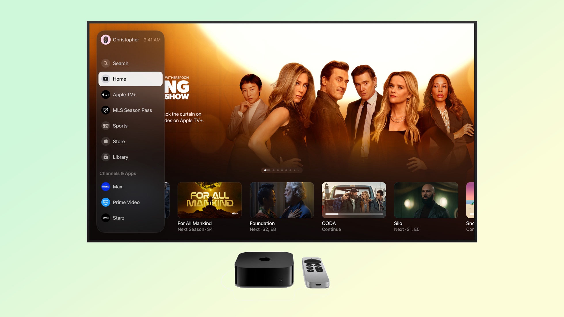
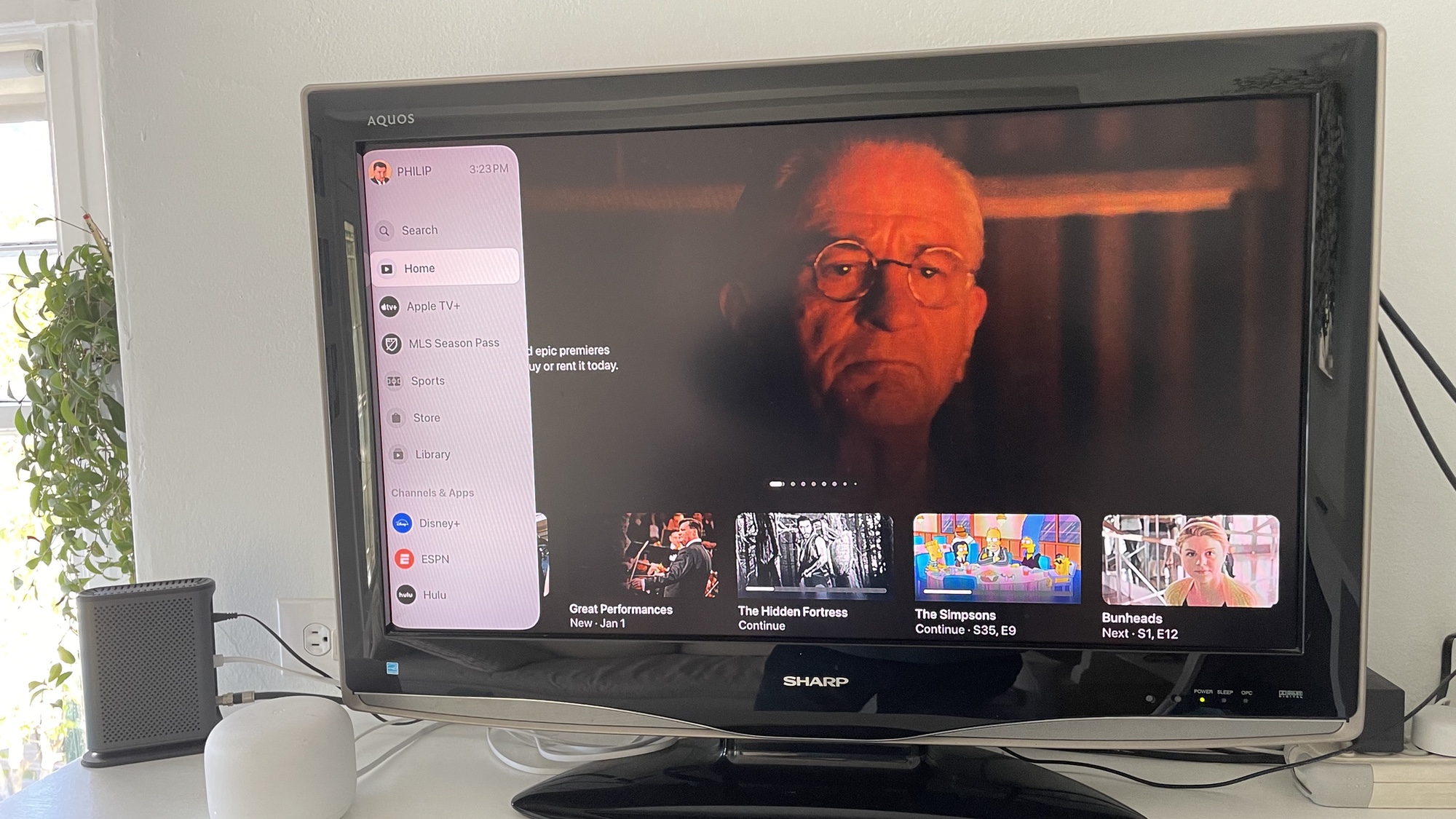
The highlight of the Apple TV software update, such as it is, is a new sidebar within the TV app that's designed to be a control center for your viewing experience. Here you have quick links to Apple TV Plus and MLS Season Pass, whether you subscribe to either service or not. (I've got Apple TV Plus, but not the soccer.) There are also sub-sections for sports, Apple's iTunes Store and the library of stuff you've downloaded from Apple over the years. Below that a Channels & Apps section lets you jump to the apps and streaming services you frequent the most.
The sidebar also has a search tool that seems to duplicate the search tool in the main tvOS menu. At the top of the screen, at least in the Apple TV setbox version of the TV app, you'll find a user profile that you can click on to switch between users. This makes switching admittedly more easy than it was before, and it's the one improvement Apple's new sidebar really brings to the experience.
Otherwise, the problems with the sidebar far outweigh whatever ease of use it's supposed to bring. For starters, you have to be in Apple's own TV app to access it — you can't just call it up in the main menu to easily jump around to the places on your set-top box that you want to be. Finding the sidebar itself is not very intuitive, either — once you're in the TV app, you have to swipe all the way to the left then navigate to a backward arrow to call it up. If this interface is supposed to simplify navigation, why make it so complicated to find?
Get instant access to breaking news, the hottest reviews, great deals and helpful tips.
Apple TV — what went wrong

But the biggest thing that has me grinding my molars when I think about this app redesign is how it's broken the rest of the Apple TV streaming device experience.
The main menu of the tvOS interface shows tiles of all the different apps and streaming services you've placed on your set-top box, and at the top of the screen are the main categories. Next to Apple's TV app, there are icons for movies, TV shows, games, fitness and settings. Clicking on those has been your primary way of interacting with your Apple TV device until now — selecting Movies when you want to watch a movie in your library or rent something from Apple's iTunes store, for example.
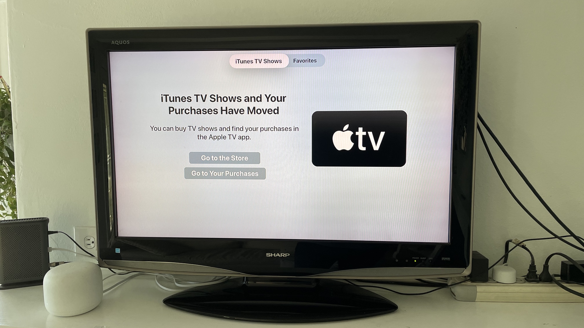
That's not the case anymore. Select the Movies category now, and instead you'll get a message that the iTunes Movies options and your own purchases have moved — you can then either click to go to Apple's storefront to rent or purchase movies or you can go to your own library of purchases courtesy of the new sidebar in the Apple TV app. Or to put it another way, Apple has added extra clicks if you want to find the things you're looking for.
But wait — it gets worse. Highlight the Movie or TV Shows categories, and you'll see thumbnails: one will be for the most recently viewed or purchased show in your library, and the others will be for movies or TV shows available for purchase or rental through Apple. Let's say you happen to the thumbnail for Oppenheimer and you think to yourself, "Yeah, I'd like to spend an evening watching the adventures of good ol' Bobby O." Click on that thumbnail before, and you'd jump straight to the page for purchasing or renting Oppenheimer; click on it now and you're taken to that message about how Movies and Purchases have moved, forcing you to click again.
In other words, even if you know what you want to find, Apple insists that you're looking in the wrong place.
An incomplete update
I can't pretend to understand Apple's way of thinking for why it left the Movie and TV categories in such a sorry state. My best guess is that it wants more people to make the Apple TV app their primary destination for finding and viewing content and leaving the trail of breadcrumbs in the Movies and TV Shows categories is a way to train people to go to Apple's app first before a bigger tvOS interface overhaul wipes out those categories.
If so, it's an odd decision that makes the Apple TV experience feel unfinished and disjointed. It doesn't encourage exploration and discovery; instead, it makes you watch TV and movies the way Apple thinks you should, regardless of how you prefer to do things.
Perhaps I'll get used to the Apple TV app sidebar the more I use it. (And there doesn't seem to be any alternative but to use it, so well played, Apple.) And there's nothing wrong with the now useless Movies and TV Shows categories that a tvOS update can't fix. But for a company that sees a big future for its business on the service side of things as Apple does, this is a clumsy backward step.
More from Tom's Guide
- 5 best Apple TV Plus miniseries to binge-watch
- Best streaming devices
- 'Slow Horses' season 4: Everything we know so far
Philip Michaels was a Managing Editor at Tom's Guide. He's been covering personal technology since 1999 and was in the building when Steve Jobs showed off the iPhone for the first time. He's been evaluating smartphones since that first iPhone debuted in 2007, and he's been following phone carriers and smartphone plans since 2015. He has strong opinions about Apple, the Oakland Athletics, old movies and proper butchery techniques. Follow him at @PhilipMichaels.

 Club Benefits


