Club Benefits


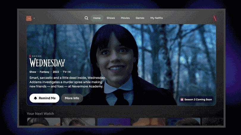
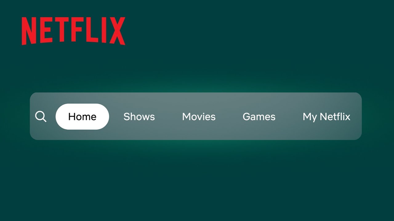
Netflix recently rolled out its first big homepage redesign in over a decade, and it’s definitely a noticeable change. The new look is cleaner and more modern, with a navigation bar at the top and recommendations that feel more tailored to what you like.
The service has streamlined how shows and movies are displayed, aiming to make it easier to find something to watch without all the clutter. Plus, Netflix is catering to the TikTok generation by testing a vertical video feed on its mobile app, packed with short clips from shows and movies.
Unfortunately though, not everyone’s thrilled. Since the update started rolling out globally, plenty of users have taken to social media to complain.

Spending any time on the Netflix subreddit quickly uncovers plenty of users sharing their frustrations and personal complaints about the service. This includes missing (and removed) features along with fewer titles being shown at once. Some have even gone so far as to start a petition to "bring back the old user-friendly interface."
It’s the first major redesign Netflix has done in years, so it’s understandable that change feels jarring for some.
Despite the grumbles, I actually like the new layout. It feels less overwhelming, which helps me focus on what I want instead of falling into the endless scroll vortex that usually ends with me annoyed and turning the TV off. Sometimes change is exactly what a streaming service needs, and here’s why.
What users are saying about Netflix’s redesign
As mentioned before, the Netflix subreddit is where most opinions are being voiced. The common complaint by far is how few titles are now visible on screen at once.
Previously, a single row could show around seven options, but that number has dropped due to the new design’s auto-expanding tiles and autoplay previews. Some users have even noted (somewhat ironically) that they can now see more shows on their phone screen than they can on their much larger TV.
I also noticed that a couple of well-liked features have quietly disappeared. The “new & popular” tab (which used to give a quick overview of trending titles and upcoming releases) is no longer part of the new layout. The update also did away with the “categories” section, though fewer users seem to be upset about that change.
Netflix highlighted the differences between the new "My Netflix" tab and the main homepage, but in practice, they look pretty similar as both show many of the same rows and recommended content. This is a criticism I can’t really argue with.

Of course, it wouldn’t be a real controversy without some backlash on X too. One user commented on how they can’t set reminders on movies and TV shows, because they can’t even see them. Meanwhile, another user called it “headache-inducing” due to the titles being too big.
However, it’s tough to tell just how much the online controversy reflects the opinions of Netflix’s entire user base. Plus, it’s unclear exactly how many people have even seen the new interface yet. The rollout started in May, but which countries or what portion of users have access remains unknown.
It’s also important to note that Netflix’s own testing indicates that most users (even if they’re not vocal about it) actually prefer the new layout (h/t The Hollywood Reporter). While it might seem like everyone’s unhappy, you’re only hearing one side.
I’m a Netflix homepage defender
Don’t get me wrong, I totally get why people are disappointed. Change is frustrating, especially when it comes to the platforms we use daily. But as someone who’s incredibly picky about what to watch, I’ve actually found the new Netflix homepage to be a refreshing update.
The fewer titles shown on screen at once make the experience feel less cluttered and more focused on your viewing habits. Instead of getting overwhelmed by endless rows, I can actually take in what’s there, and honestly, the larger thumbnails and auto-playing previews make everything look way more appealing (we love a good aesthetic).
Despite the redesign, all the essentials are still right where you need them. You’ve still got the top 10 list, the “continue watching” row, and the ever-helpful “new on” section. So while it might look different, nothing else has really been taken away. The same goes for the “My Netflix” tab. Your personal list is still there, plus a solid lineup of recommendations based on what you’ve been watching.

That said, I do understand why some people are frustrated. A few features do feel a bit more tucked away, and certain titles might not jump out like they used to. But with any big change, there’s a bit of a learning curve.
Hanging on to the same design forever can get stale pretty fast. People’s habits change, tech moves forward, and what felt great ten years ago might now seem a bit clunky or outdated. Updating the interface keeps things feeling fresh, shows Netflix is actually listening and evolving, and helps the service keep up with what we want and need.
Plus, with better screens, faster internet, and all kinds of new devices focused on AI, there are better ways to make browsing and watching easier and more fun. Changing things up lets Netflix use those improvements so the whole experience just feels smoother and more enjoyable.
So yes, I’ll keep defending Netflix’s redesign, and I don’t think it’s quite cause for anyone to rush into canceling their subscriptions over it.
More from Tom's Guide
- Netflix’s new mystery thriller movie gets first gripping trailer
- 3 ways you can get a Netflix subscription for free
- Prime Video reportedly doubling the amount of ads you’ll see