Gmail Logo Was a Rush Job With Two Totally Different Fonts
You might see it every day but have you ever really looked at it?
Here at Tom’s Guide our expert editors are committed to bringing you the best news, reviews and guides to help you stay informed and ahead of the curve!
You are now subscribed
Your newsletter sign-up was successful
Want to add more newsletters?
Join the club
Get full access to premium articles, exclusive features and a growing list of member rewards.

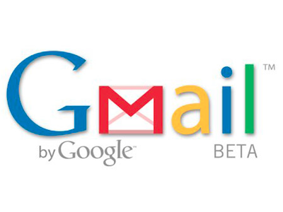
We've probably all left things to the last second, only to rush out a solution to whatever task we had been assigned with varying degrees of success. However, it might surprise you that the Gmail logo is the perfect example of how leaving things to the last minute doesn't have to mean a sloppy, terrible result. In fact, sometimes the rushed solution is good enough to last forever. You were likely also oblivious to the fact that the logo contains two completely different fonts.
The Verge reports that Google Product Designer Kevin Fox recently took to Quora to answer the question, "Who designed the Google logo?" His response revealed the two facts above, along with the fact that the logo was designed by Dennis Hwang, who at the time was doing almost all of the Google Doodles, as well as a fair amount of logos.
"The logo was designed literally the night before the product launched. We were up very late and Sergey and I went down to his cube to watch him make it," he said. "The initial version used the same font as the Google logo (Catull), but Catull has a very awkward 'a', so Dennis decided to use Catull for the 'G' to tie the brand to Google, then cast the others in a cleaner sans-serif (Myriad Pro, if I recall correctly)."
Article continues belowThere you have it.
Follow @JaneMcEntegart on Twitter for the latest news.
Get instant access to breaking news, the hottest reviews, great deals and helpful tips.
Jane McEntegart works in marketing communications at Intel and was previously Manager of Content Marketing at ASUS North America. Before that, she worked for more than seven years at Tom's Guide and Tom's Hardware, holding such roles as Contributing Editor and Senior News Editor and writing about everything from smartphones to tablets and games consoles.
-
amk-aka-Phantom Apple: pours millions of dollars and hundreds of workhours into so-called "design" of every last detail.Reply
Google: does design overnight, still kicks Apple's ass. -
Maxor127 amk-aka-phantomApple: pours millions of dollars and hundreds of workhours into so-called "design" of every last detail.Google: does design overnight, still kicks Apple's ass.That's a pretty pathetic stretch to spout Apple hate in an article that has nothing to do with them, and by using a horrible, broad, vague example to make your ridiculous point as well.Reply -
Maxor127 That said, I thought the origin of the logo was interesting. I never noticed the different fonts, but it's obvious when you actually look at it. Fontophiles will probably cry about using a font like Myriad Pro, though.Reply -
JOSHSKORN I just spent a few minutes looking for these fonts and found them. Found the Catull to be correct (for "Google" and the "G" in Gmail). As far as the Myraid Pro (for the "mail" in "Gmail"), it looks like it was used for the "ail" in "Gmail", and to an extent, the "m" as well, but more or less "Photoshopped" to match the envelope. The letters after it ("ail"), look as if they've been slightly "squished", so-to-speak. I don't know the term for that. I'm not a graphic designer. Otherwise, the font looks correct.Reply
At first, I absolutely despised Google. I thought it was just too plain looking and unattractive. It took me a while to get off of Yahoo's search engine and take advantage of Google. I still find myself hitting Yahoo for everything else because everything I "need" is right there. -
amk-aka-Phantom Maxor127That's a pretty pathetic stretch to spout Apple hate in an article that has nothing to do with them, and by using a horrible, broad, vague example to make your ridiculous point as well.Reply
It worked. Any more questions? :D -
someoneelse a google story with a comments section full of apple hate - just a little too familiarReply
Why hate apple? - after all if it weren't for the iphone google would have nothing to copy for android.
 Club Benefits


