
I like to think I’m a patient person, but now that we’re two weeks after the iPhone Duo release date, I’m starting to wonder what the heck is going on with the app situation.
It’s not like the iPhone Duo doesn’t have other issues, whether it’s “Crackgate,” the weighty design, or the lack of a telephoto zoom. But my biggest issue right now has nothing to do with Apple or the hardware.
Don’t get me wrong; there are plenty of apps that have already been updated and optimized for Apple’s first foldable phone. Some of my favorite iPhone Duo apps include YouTube TV, which allows you to watch four shows at once in a grid view, the PianoFold Rhythm game, and AirMail with its handy 2-column layout.
But overall I’m pretty shocked by how many high-profile apps still look awful on the $2,000 iPhone Duo 2. Here are some of the worst offenders, and I’m warning you now that several are from Google.
Google Drive
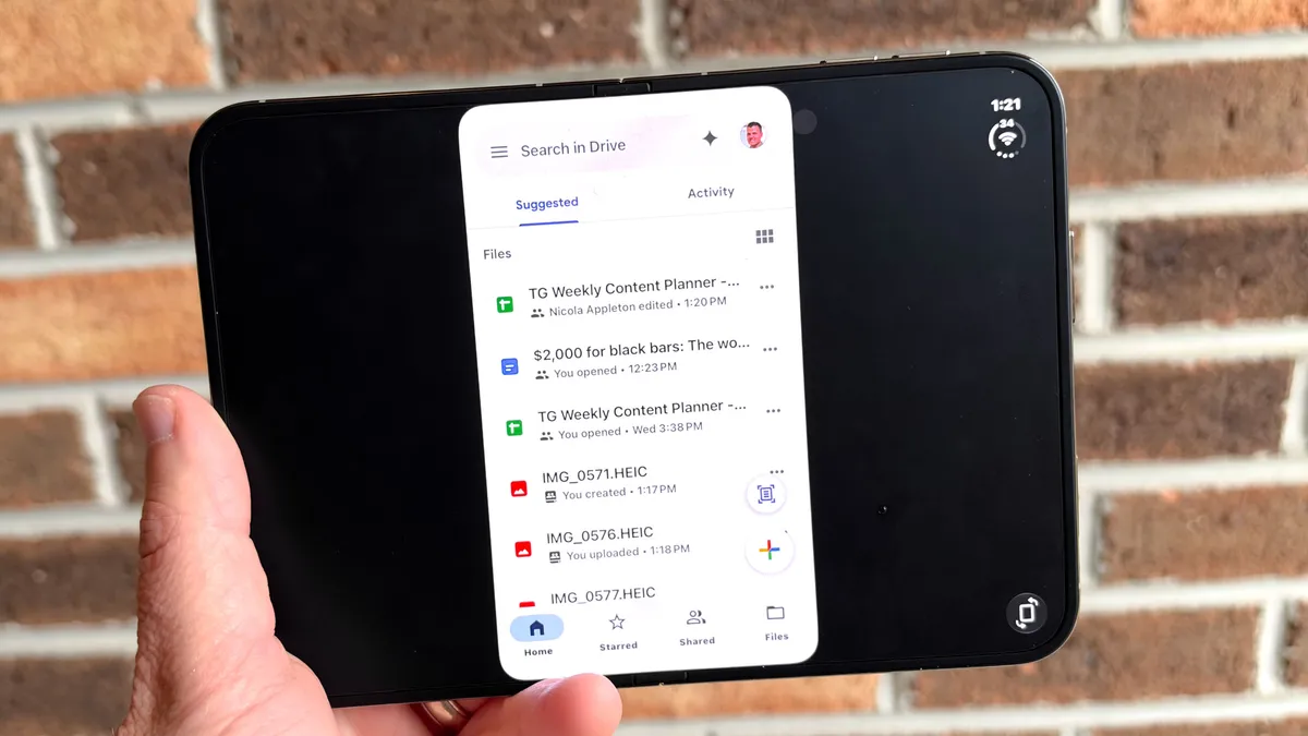
I use Google Drive all of the time for uploading photos and reviewing documents, but I simply don’t want to on the iPhone Duo because it’s so visually jarring. There are huge black bars on the left and right on the 7.6-inch display, and the buttons to rotate and enlarge the view don’t really help.
Google Sheets
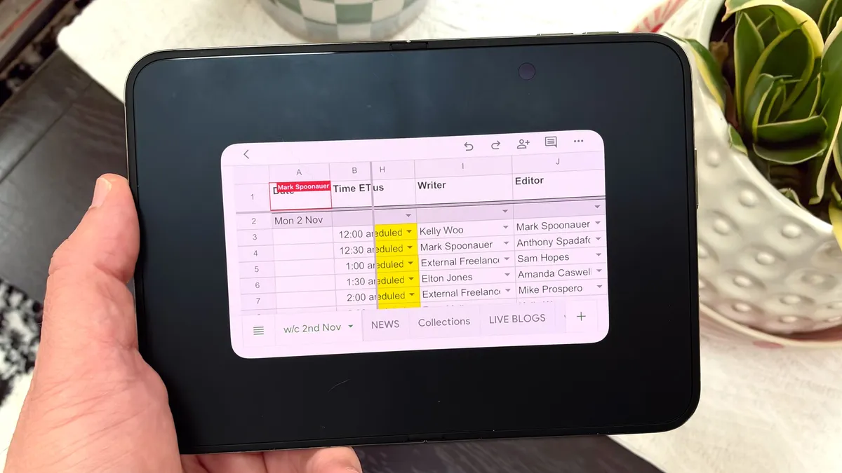
You would think that spreadsheets would look way better on the iPhone Duo’s main screen. And they would if the app was actually optimized. Instead, you get the same black bars here as in the Google Drive app, and you have to scroll a lot to see content. It looks totally unoptimized.
Uber
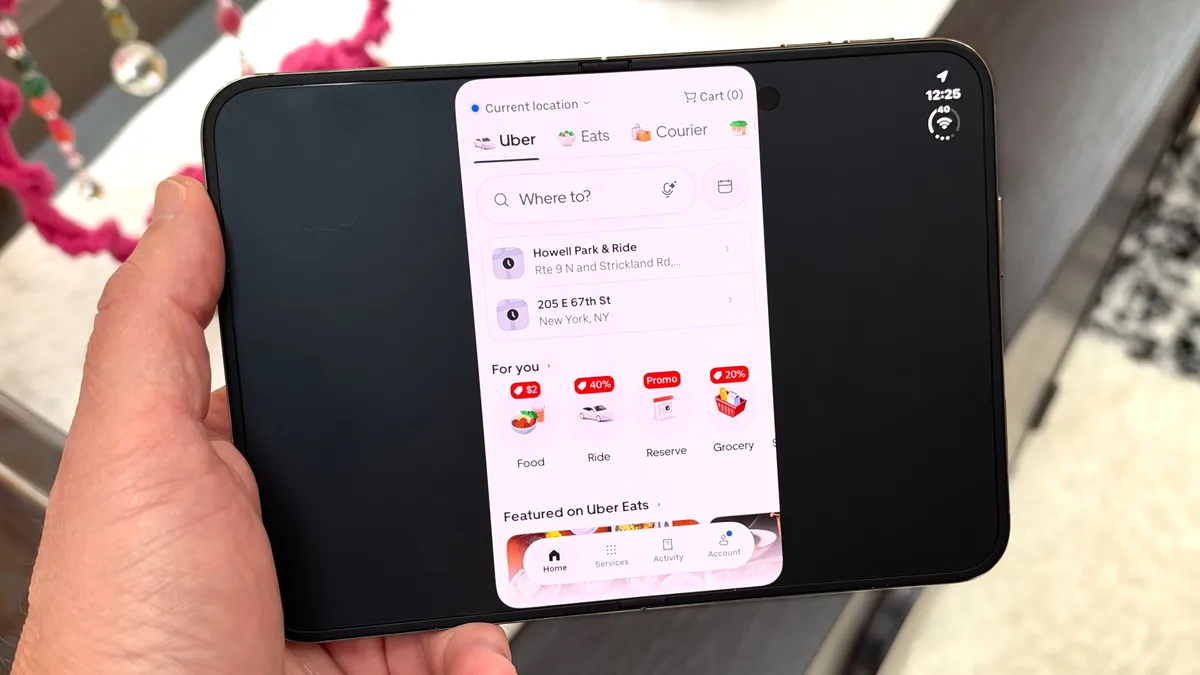
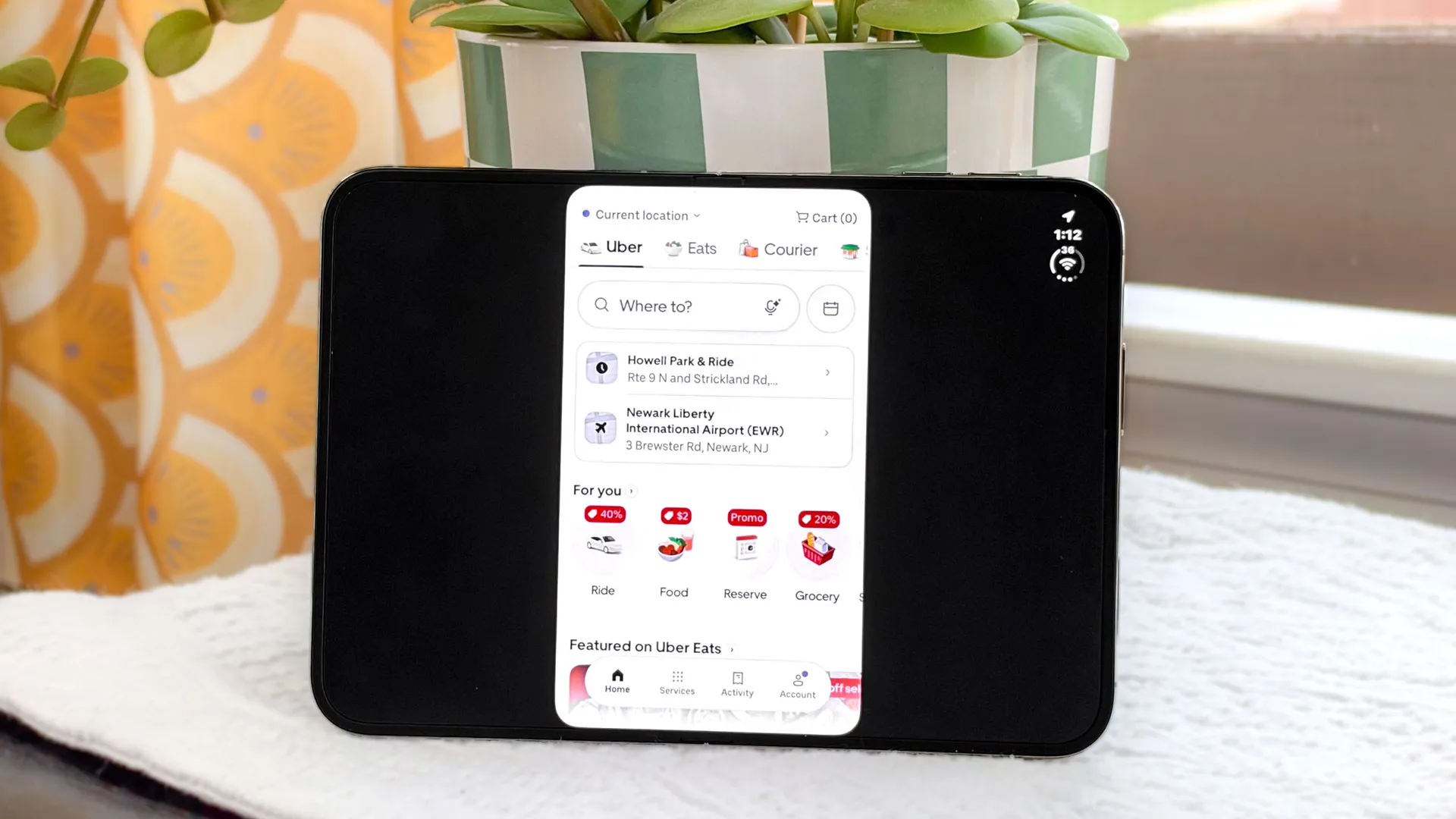
Here’s another app that fills up 1/3 of the screen. Granted, I mostly use Uber on the cover display for booking rides, but Lyft has already updated and optimized its app — so it fills the big screen.
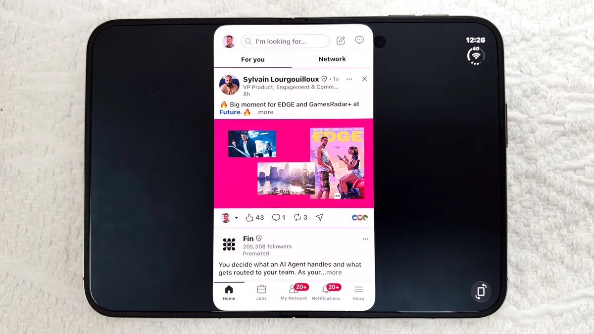
Look, I’m not expecting an immersive LinkedIn experience when I use my iPhone Duo, but I’m not expecting a layout that looks outdated and broken. Pressing the rotate button fills up more of your screen, but it’s still not great. Maybe LinkedIn could post an app developer job ad…
DoorDash
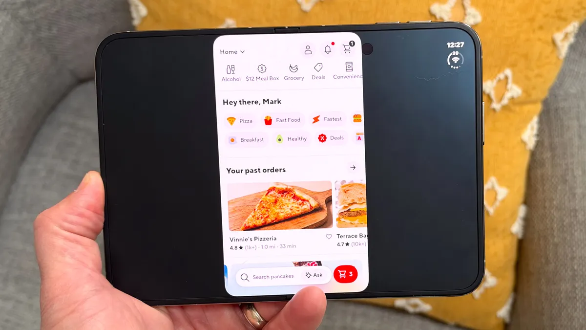
I don’t have a major problem using the 5.4-inch cover display for ordering dinner. But I would at least like to have the option to use the bigger canvas for browsing menus, especially Cheesecake Factory.
Google Calendar
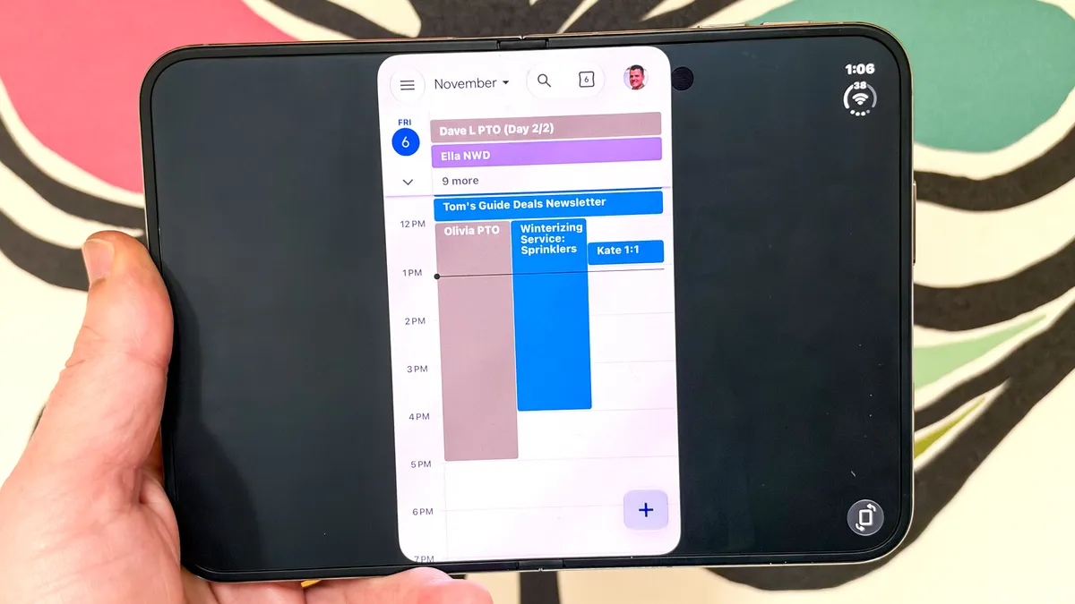
There are some pretty great calendar apps for the iPhone Duo. Google Calendar is not one of them. For now I would download Fantastical. It offers a wide format on the big screen and lets you easily check the weather along with your schedule and keep track of your to-dos.
Wells Fargo
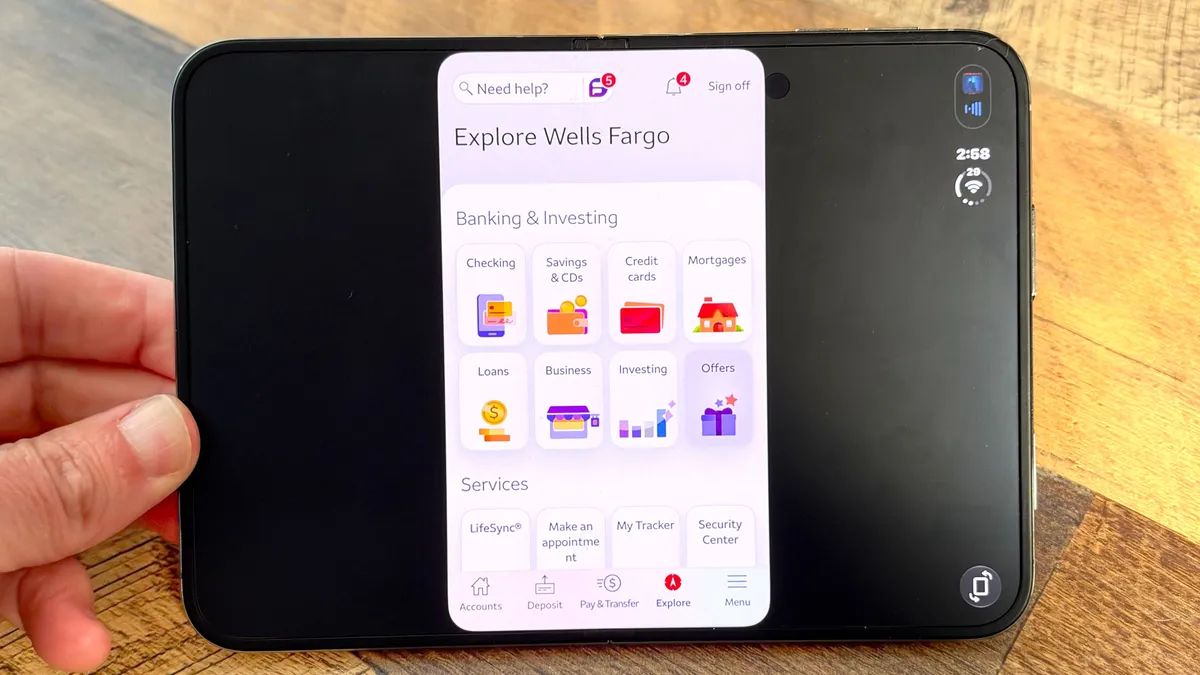
This isn’t the only banking app that hasn’t been updated for the iPhone Duo yet, but it’s annoying for me because it’s the one I use. Wells Fargo is fine on the front screen for checking your balance or doing a quick transfer, but not so much for reviewing purchases where it helps to have more real estate.
Gmail
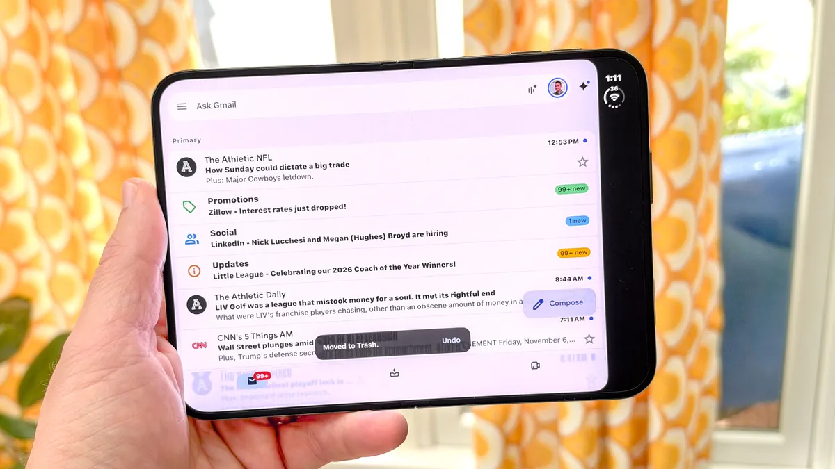
The Gmail app looks better than Drive and Sheets in that it actually fills the screen (yay!), but it doesn’t feature the 2-column layout that I would expect. So you can’t see your inbox on the left and your messages on the right as you can on Android foldables. It’s a massive waste of a 7.6-inch canvas.
Instacart
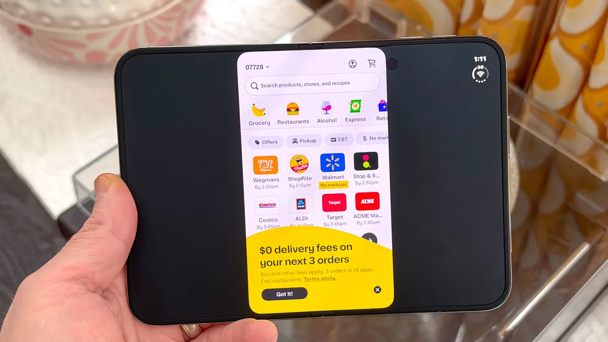
Did you hear that Doordash is buying Instacart for $17 billion? Well, it appears that neither company can afford to optimize their apps for the iPhone Duo right now. You basically get the phone app slapped on a larger screen, which makes shopping and browsing more tedious than it needs to be.
Bottom line
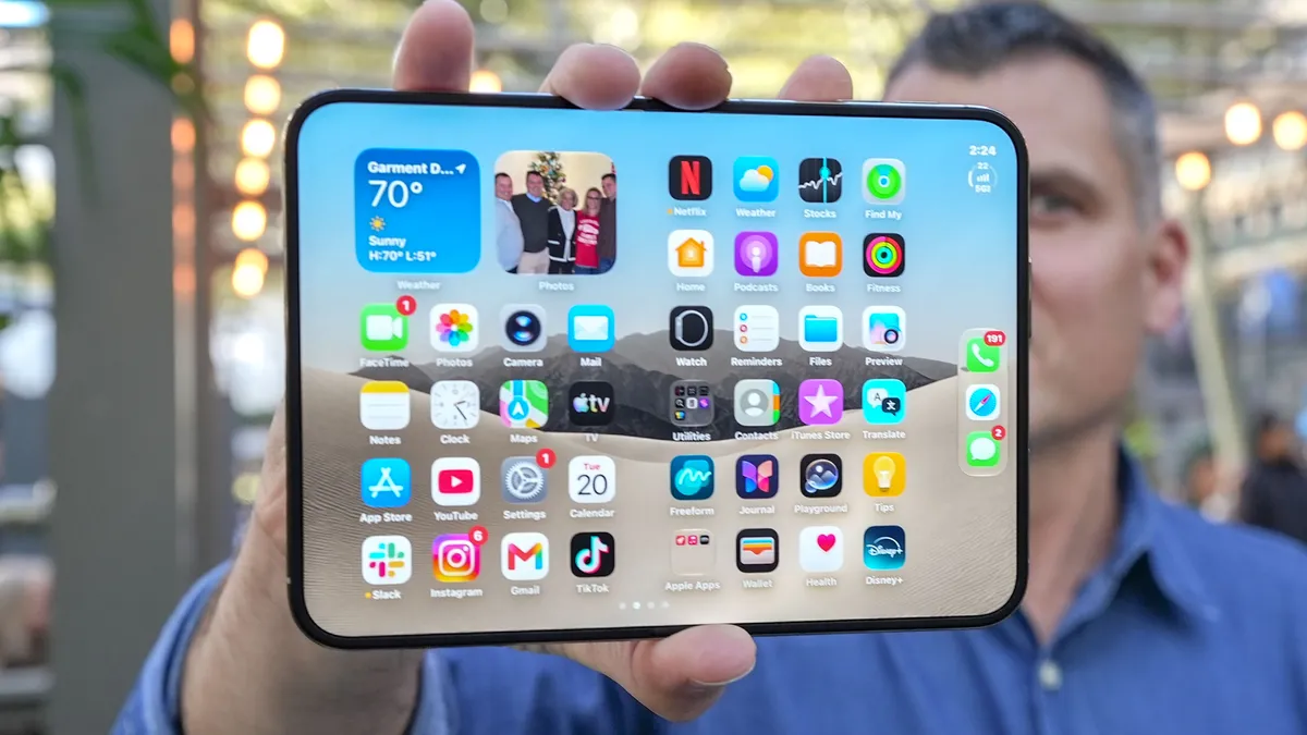
While there are plenty of apps that look great on the iPhone Duo, too many apps are just not optimized yet. And while it’s not Apple’s responsibility to fix the problem, the longer this drags on the more excuses people will have not to splurge. I would be way more aggressive in cajoling developers to update their wares for this form factor.
Maybe app makers are waiting for a critical mass of iPhone Duo users, which is a chicken-and-egg scenario that may be hard to overcome — at least until Apple is able to keep up with demand for this device.
Follow Tom's Guide on Google News and add us as a preferred source to get our up-to-date news, analysis, and reviews in your feeds.
More from Tom's Guide