HBO Max is better than Netflix in one big way
And it beats Hulu too
Here at Tom’s Guide our expert editors are committed to bringing you the best news, reviews and guides to help you stay informed and ahead of the curve!
You are now subscribed
Your newsletter sign-up was successful
Want to add more newsletters?
Join the club
Get full access to premium articles, exclusive features and a growing list of member rewards.
The more I test the best streaming services, the more I want to take Netflix's app team into a room, point them at the HBO Max app and say "Be more like that!" And I realize this may be a shock to some. HBO Max's app doesn't have the best reputation, as instability has been a thing over the years. Bugs, yes, are real.
But for as much as the recent shiny Netflix iPhone app redesign is a step in the right direction, I'm still disappointed every single time I opened the Netflix app. I was reminded about this after the news of Spotify's big redesign, because I don't really use Netflix anymore.
Frustratingly, I think this kind of decision has to be intentional — though I've reached out to Netflix for comment, and will update this story if and when I hear back. My big problem with the Netflix app, though, is simple: they make me click around too much.
Dear Netflix: fix the Continue Watching row to the top
When I boot up Netflix, I'm most often looking to resume what I was watching last time. As you probably know, that means I want to find the Continue Watching row on the home screen. Unfortunately, it's never quite in the same space. And it's always too low.
Always, though, Netflix makes you click a bit to get there. Do you remember which row Continue Watching is on on your Netflix? I may have canceled Netflix for now, but here's how my profile in my parents' account looks:
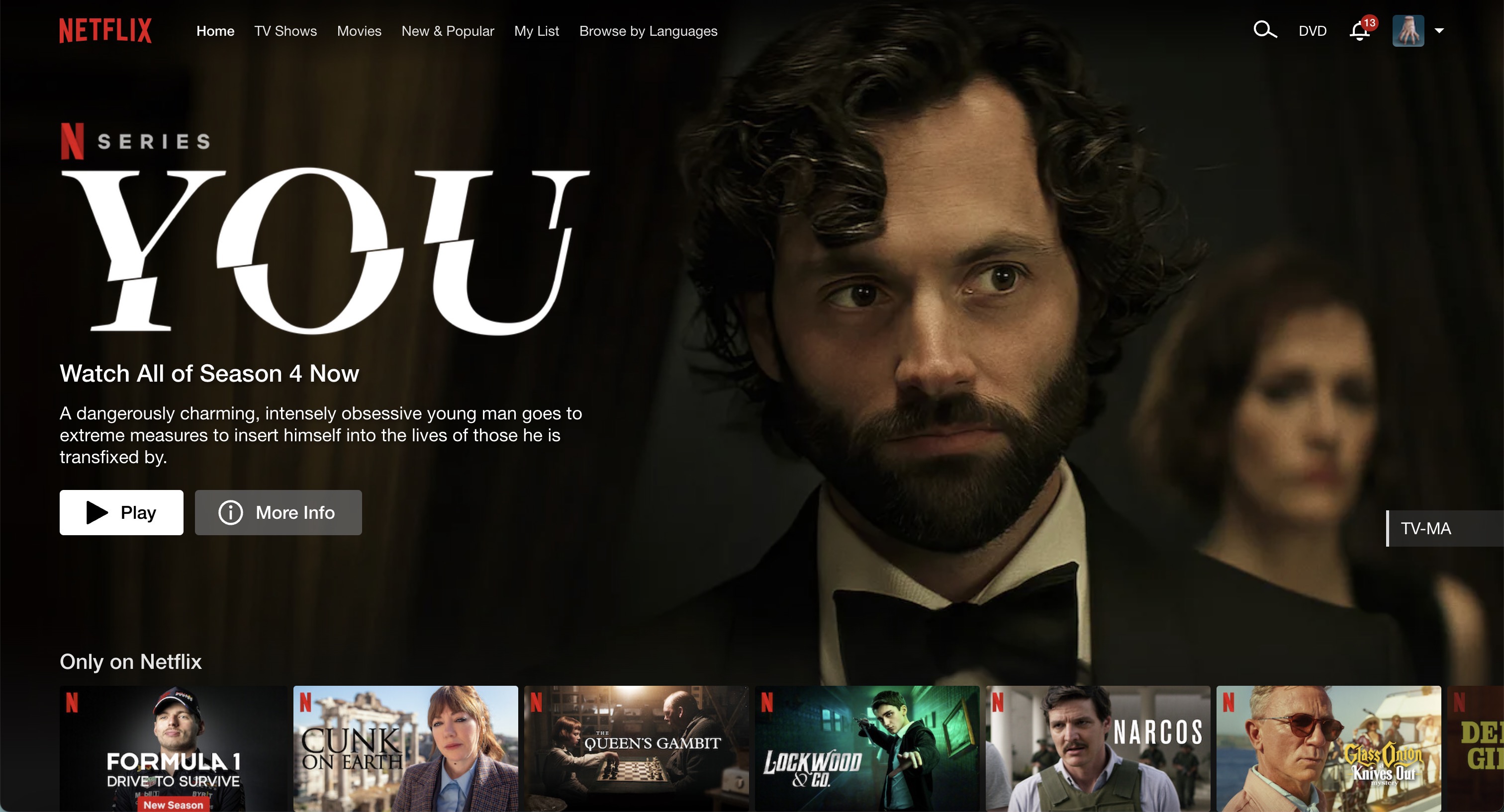
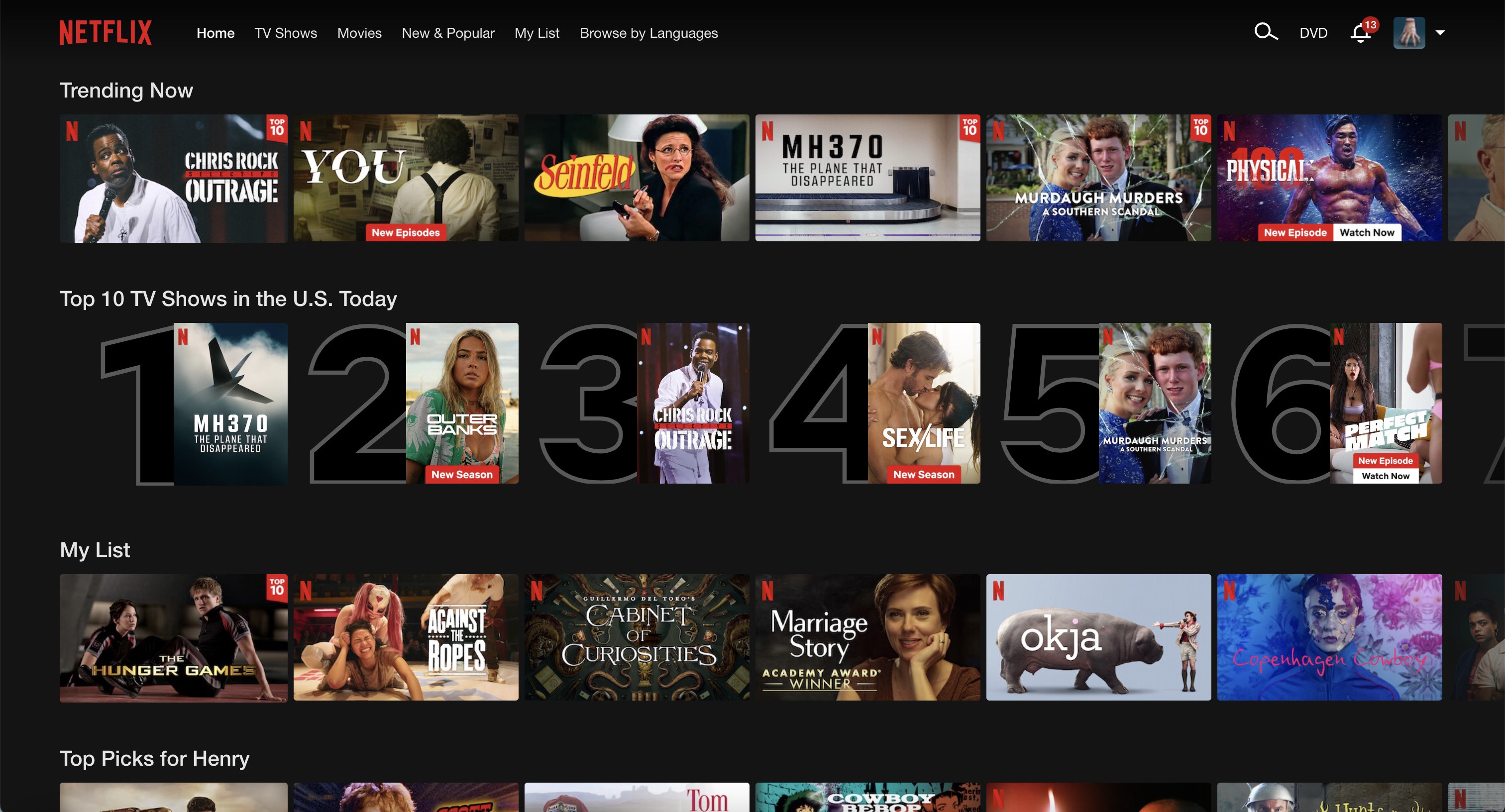
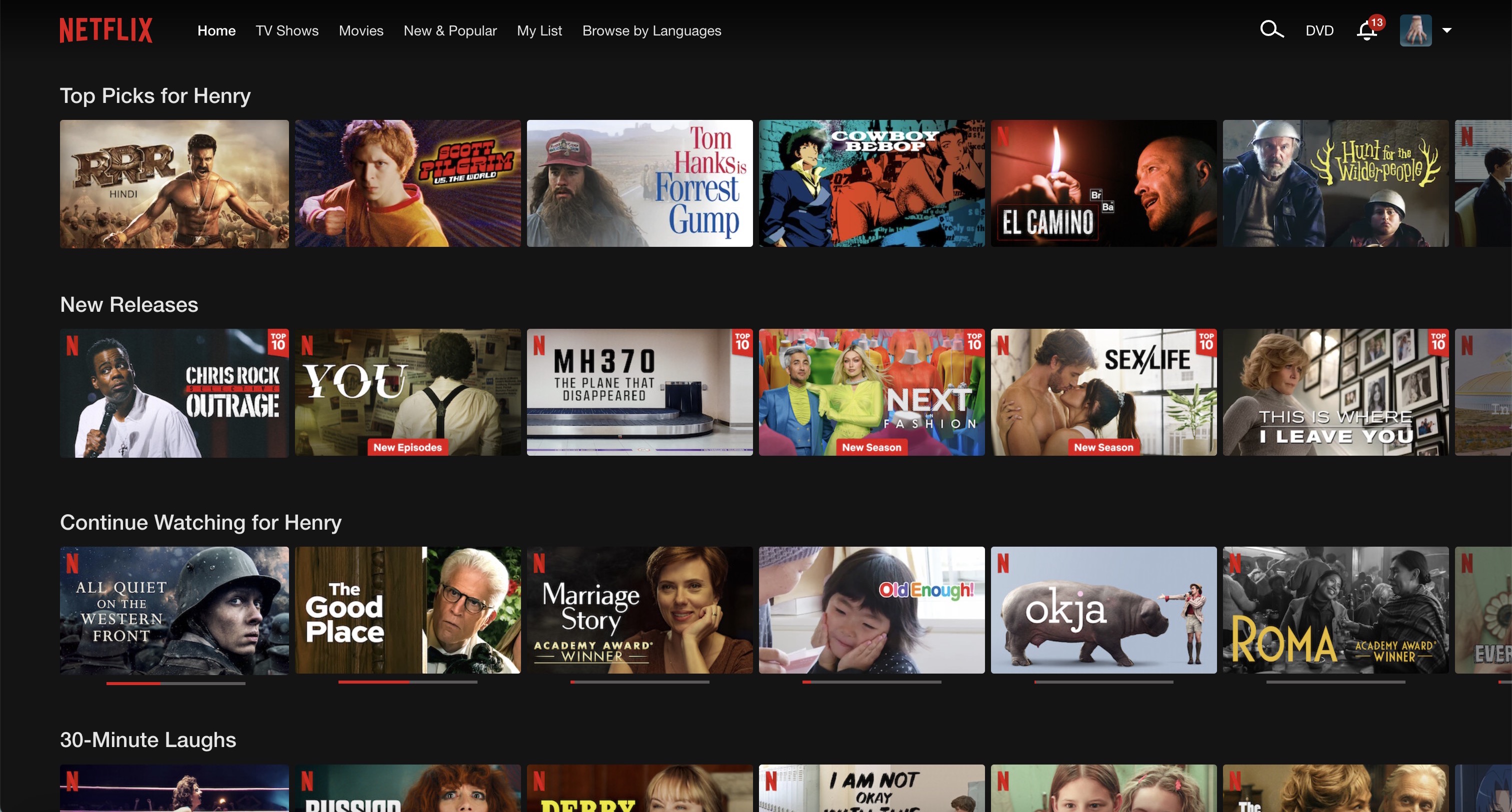
Yep, Continue Watching is my seventh row on Netflix when viewed in a web browser. While I try to get there, Netflix puts the following hurdles, I mean rows, in my way:
- Only On Netflix (cool, Netflix, that's neat)
- Trending Now (mostly stuff I didn't want to watch, but happy for the Seinfeld fans)
- The Top 10 TV Shows in the U.S. Today (a section I know better than to trust)
- My List (that place you put stuff you want to watch someday and never go back to)
- Top Picks for my profile (not terrible, but often stuff I've seen before)
- and New Releases (the one row here I could understand being high up)
If I could re-arrange these rows — the way I can re-arrange apps on my iPhone — I'd put all of those below continue watching. New Releases would get row 2, then Top Picks and My List at 3. I'd probably nuke the other three.
Get instant access to breaking news, the hottest reviews, great deals and helpful tips.
Of course, your mileage may vary greatly here. Not just for the rows you want, but for where the Continue Watching row shows up for your account. On the Apple TV 4K, the Continue Watching row for my profile was on the fourth row. Switching to my parents' profiles on that same streaming device, I found that theirs (rows 4 and 7) were further down.
Why is this so annoying? Because at row 7, it's down so deep that I always skip past it when I'm trying to skip past all that crud.
HBO Max beats Netflix on the home screen
So, I'd love to get Netflix to just copy HBO Max's homework. How much better is HBO Max at this? Check it out:
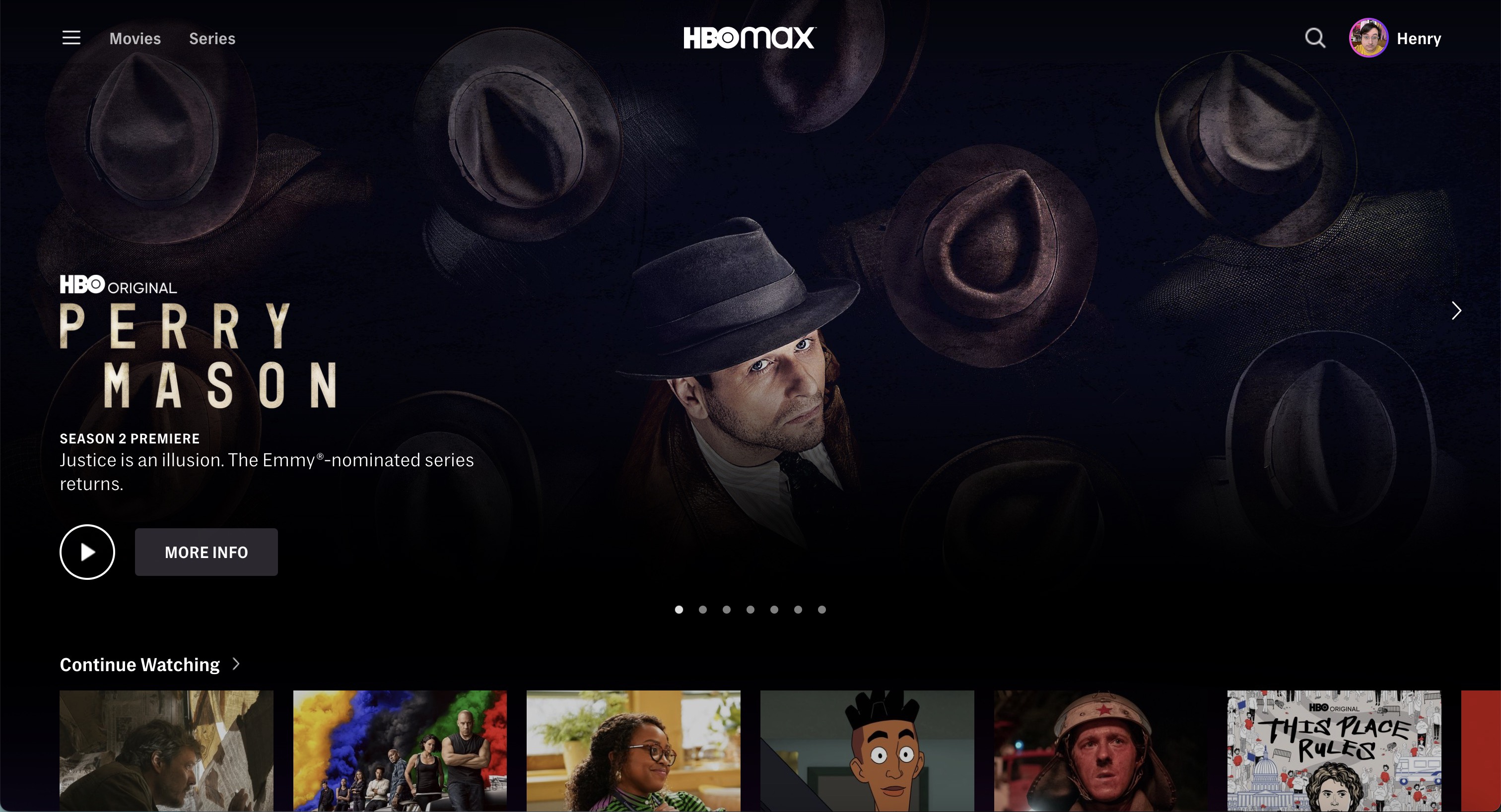
There, right under the main carousel, you get Continue Watching. And that's not just my experience on this laptop. It's my experience on streaming devices, and the same for my parents' account too. Because HBO Max knows that this is a priority section.
Even Hulu gets this wrong, too
So as to not just rag on Netflix, let's look at the Hulu home screen. Of course, it starts with a big graphic for a promoted show, followed by ... "Live Now" content. Even though I don't pay for Hulu + Live TV, they're pushing local news from ABC, and a lot of ESPN Plus content that I've never shown any interest in.
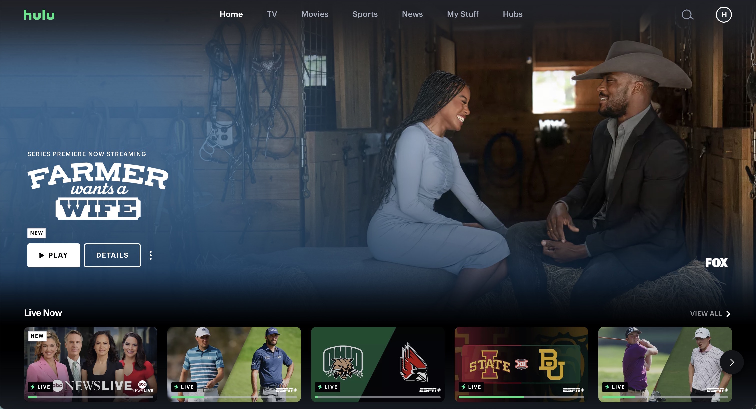
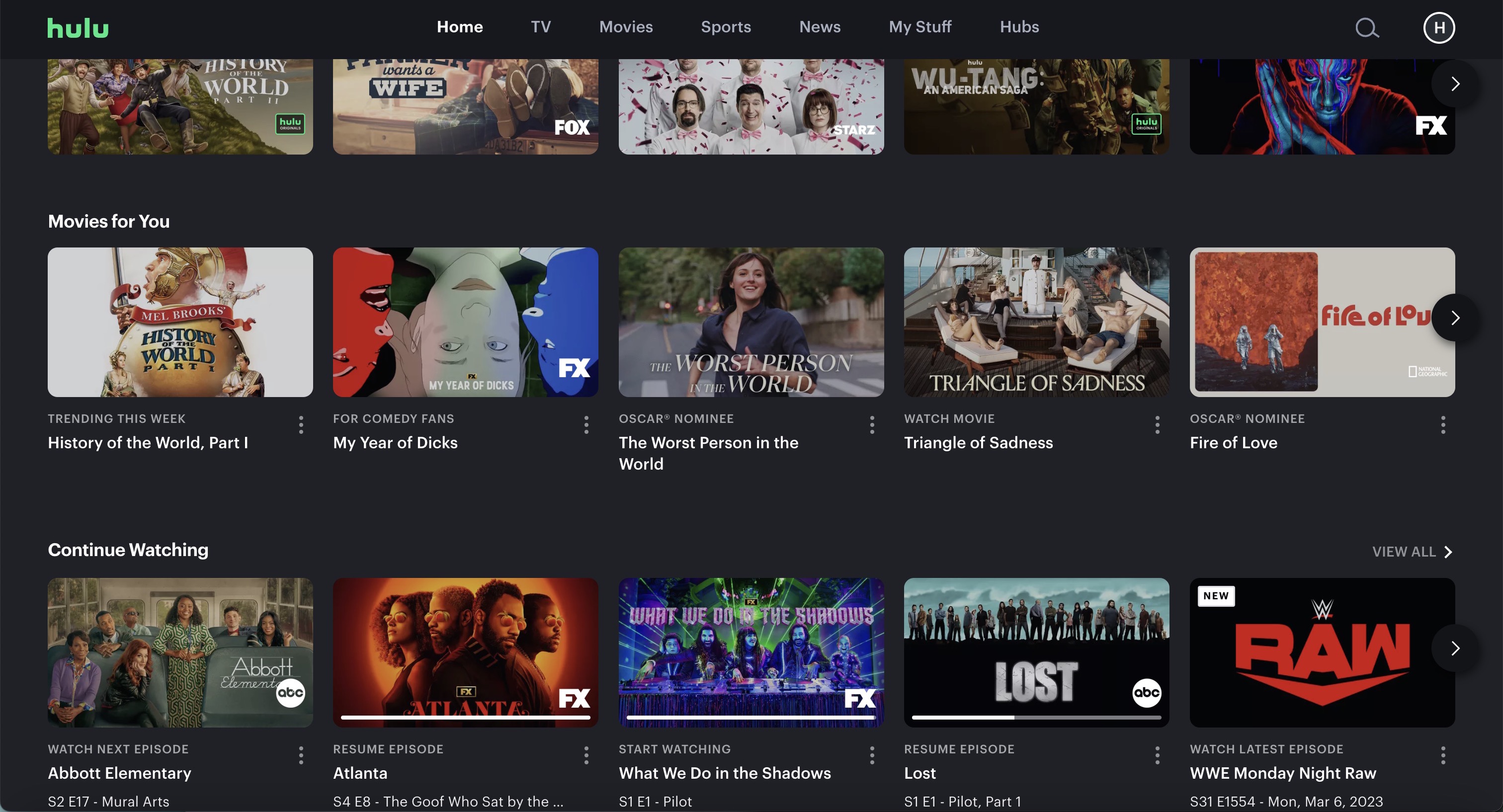
Below that, there are three rows: TV for You, Movies for You and Continue Watching. I've checked on my parents' accounts, and I've looked on other devices. Much like how HBO Max puts Continue Watching second, Hulu seems to always put it fourth.
Outlook: I think I know why this happens
While I wait to hear back from Netflix, I'll provide my theory about all of this. What does Netflix gain by us speedily bingeing the shows we want the second we sign in?
Well, they get an engaged user, but they're not hooking us in deeper. Those four to seven rows of stuff feel engineered to increase the user's exposure to what Netflix offers.
The more rows we browse, the more likely we fill the Continue Watching row with stuff we need to finish. And the less likely we cancel. A shame this can't be accomplished in another way.
More from Tom's Guide
- 7 best new to HBO Max movies that are 90% or higher on Rotten Tomatoes
- How to watch the Oscars online
- 9 new shows and movies to watch this weekend on Netflix, HBO Max and more

Henry was a managing editor at Tom’s Guide covering streaming media, laptops and all things Apple, reviewing devices and services for the past seven years. Prior to joining Tom's Guide, he reviewed software and hardware for TechRadar Pro, and interviewed artists for Patek Philippe International Magazine. He's also covered the wild world of professional wrestling for Cageside Seats, interviewing athletes and other industry veterans.
 Club Benefits


