The new Sling TV update is so bad I want to cancel my subscription
Here at Tom’s Guide our expert editors are committed to bringing you the best news, reviews and guides to help you stay informed and ahead of the curve!
You are now subscribed
Your newsletter sign-up was successful
Want to add more newsletters?
Join the club
Get full access to premium articles, exclusive features and a growing list of member rewards.
Over the last few months Sling TV has been rolling out a redesigned app experience, which for the most part has been well-received by my Tom’s Guide colleagues and other reviewers.
Unfortunately, I’ve found the latest Sling update to be packed with a few extremely poor user interface changes. Years of intuition in using the navigation thrown out the window, I’m now frustrated and squinting at the screen, lost at sea. I've never been legitimately depressed by an app update before, but here we are. I’m almost ready to cancel my subscription.
I should start by mentioning that I've been a big Sling TV fan over the years. The combination of content, price and app design always made Sling a no-brainer for my cable replacement choice. No other streaming app has gotten as much use in my household on a day to day basis. Cord cutting has been great to me — I’d be fine with never touching a clunky cable box remote again for the rest of my life.
Article continues belowSo it’s with a heavy heart that I’m now pondering cancelling what was previously an excellent app. A quick look at Twitter shows that a number of angry users appear to agree with me: Sling’s latest update is a huge downgrade.
Casual channel surfing is now a pain
Swiping up (or clicking up) used to be an easy way to channel surf in Sling TV. It was a simple, powerful way to bounce around live television — like a better, more responsive version of what cable boxes have offered for years. A single swipe up summoned the ‘mini guide’ navigation bar, which took up a small sliver on the bottom of the screen.

Going left or right at that point would scroll through the All Channels view without ever leaving your current show. Channel logos were clearly visible against the black background. You could see the start time, time remaining and show coming up next. The mini guide could even be customized to show only your favorite channels in the My Channels section.
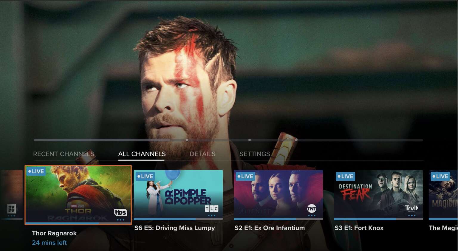
That minimalist interface has been totally bungled with the latest update. You have to swipe up, then down, then right, then down again to get to the equivalent menu — which for some chaotic reason is now ordered alphabetically, with smaller channel logos tucked inside giant thumbnail images (which often are a useless, blank default graphic).
Get instant access to breaking news, the hottest reviews, great deals and helpful tips.
Despite only displaying the channel logos as a tiny icon and showing far less data, this new menu somehow eats up more than a third of the screen. It’s taken one of Sling’s strengths — easy channel surfing while watching a live show — and rendered it utterly frustrating.
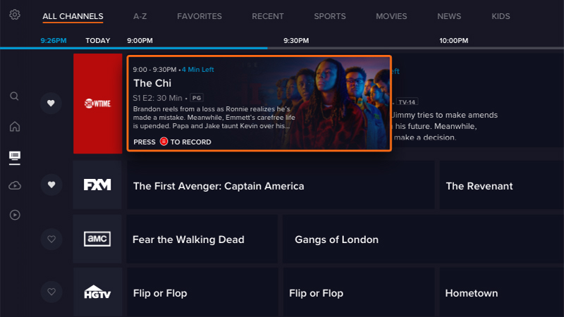
Sure, you could go over to the full-screen Guide page to surf around instead, but doing so takes you away from what you’re currently watching. That’s exactly what I hated about live TV on Hulu, and now Sling has essentially copied it. Boo.
It’s way harder to get quick info about what you’re watching
Another massive downgrade in terms of ease-of-use comes with how you view program information. Swiping down on the Apple TV remote used to quickly show the info for what you’re currently watching: season and episode info, recording controls, etc.
Now you have to swipe all over the place to see the same thing: Up, down, right, right again, then down again. It’s turned a simple UX action that I’d previously performed dozens of times a day into an unpleasant and tedious Dance Dance Revolution combo move.
It’s not all bad
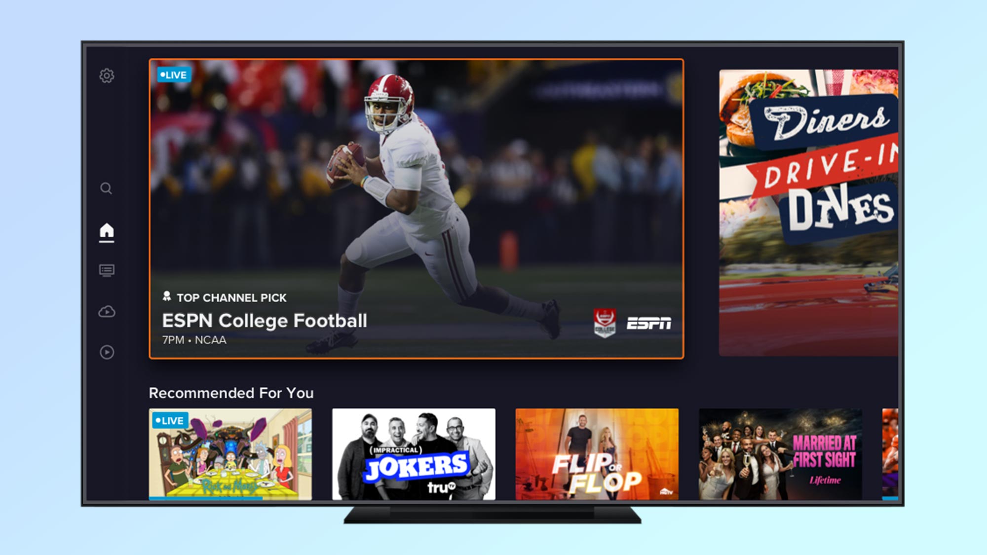
To be fair, there are some good things about Sling’s latest update. The overall design has benefitted from cleaner elements and better search functionality.
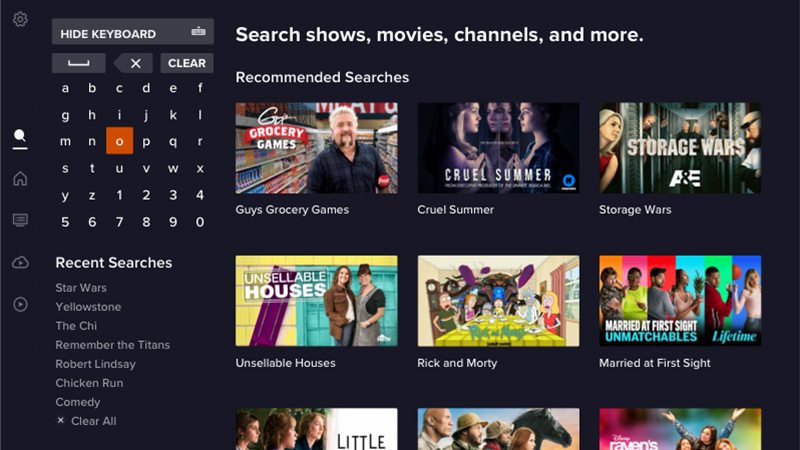
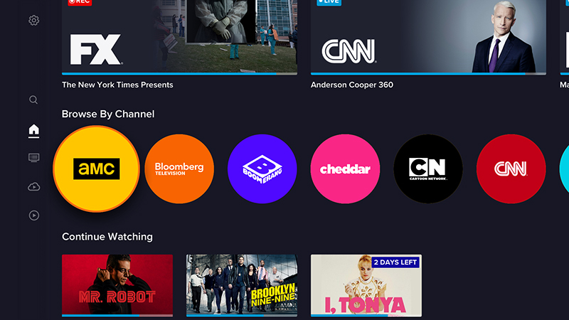
The home screen now offers more logical menus for accessing DVR and on-demand content, which was previously hidden away. And the addition of “Recent Channels” to the mini guide is useful for ping-ponging between a few live shows — even if the current implementation leaves a lot to be desired.
What Sling needs to do next
Sling can still salvage this redesign; in fact, with a few key modifications it might even be better than ever.
First off, swiping (or clicking) up once when watching live TV should take you directly into the mini guide, like it’d been before. And swiping down should again take you directly into the program info. The process for channel surfing needs to lose all the unnecessary clicking around brought by the update.
Next, Sling needs to redesign the mini guide so it makes sense again (and takes up less space). It should make the channel names more clear, instead of using small, inscrutable icons. You could easily borrow back some of the space now taken up by gigantic thumbnails; these thumbnails don’t add much, and aren’t really necessary in a mini guide to begin with.
Finally, de-alphabetize the “All channels” view and make it the default in the mini guide — setting it back to the old channel order, with local channels first. And bring back the customizable “My channels” or “Favorite channels” view as a mini guide option, allowing users to reorder them however they please there.
Give people the power to build their own experience. At a minimum, users should have the ability to make these kinds of menu changes in the settings, rather than being locked into half-baked default options. Make Sling TV great again.
 Club Benefits


