Sling TV's new redesigned app is a huge upgrade — we went hands-on
The new Sling TV app is great — but leaves us wanting more
Here at Tom’s Guide our expert editors are committed to bringing you the best news, reviews and guides to help you stay informed and ahead of the curve!
You are now subscribed
Your newsletter sign-up was successful
Want to add more newsletters?
Join the club
Get full access to premium articles, exclusive features and a growing list of member rewards.
Sling TV is redesigning its app — finally — and we got to see it for ourselves. While this app isn't out on devices at the time of publishing, I got to give it a test drive on a Fire TV stick that Sling sent over.
Overall, the new Sling TV just looks a lot cleaner and fresher than before, with bigger art and less empty space between buttons. It delivers some big changes to the Guide and DVR interfaces that were long overdue, enough to keep it in our best streaming services list, but Sling has still left out one feature that I hope to see in the future.
- Sling is one of the best cable TV alternatives
- Sling Orange vs. Blue: What's the difference?
- Plus: Are you ready for Yellowstone season 4?
Sling TV app: What's new
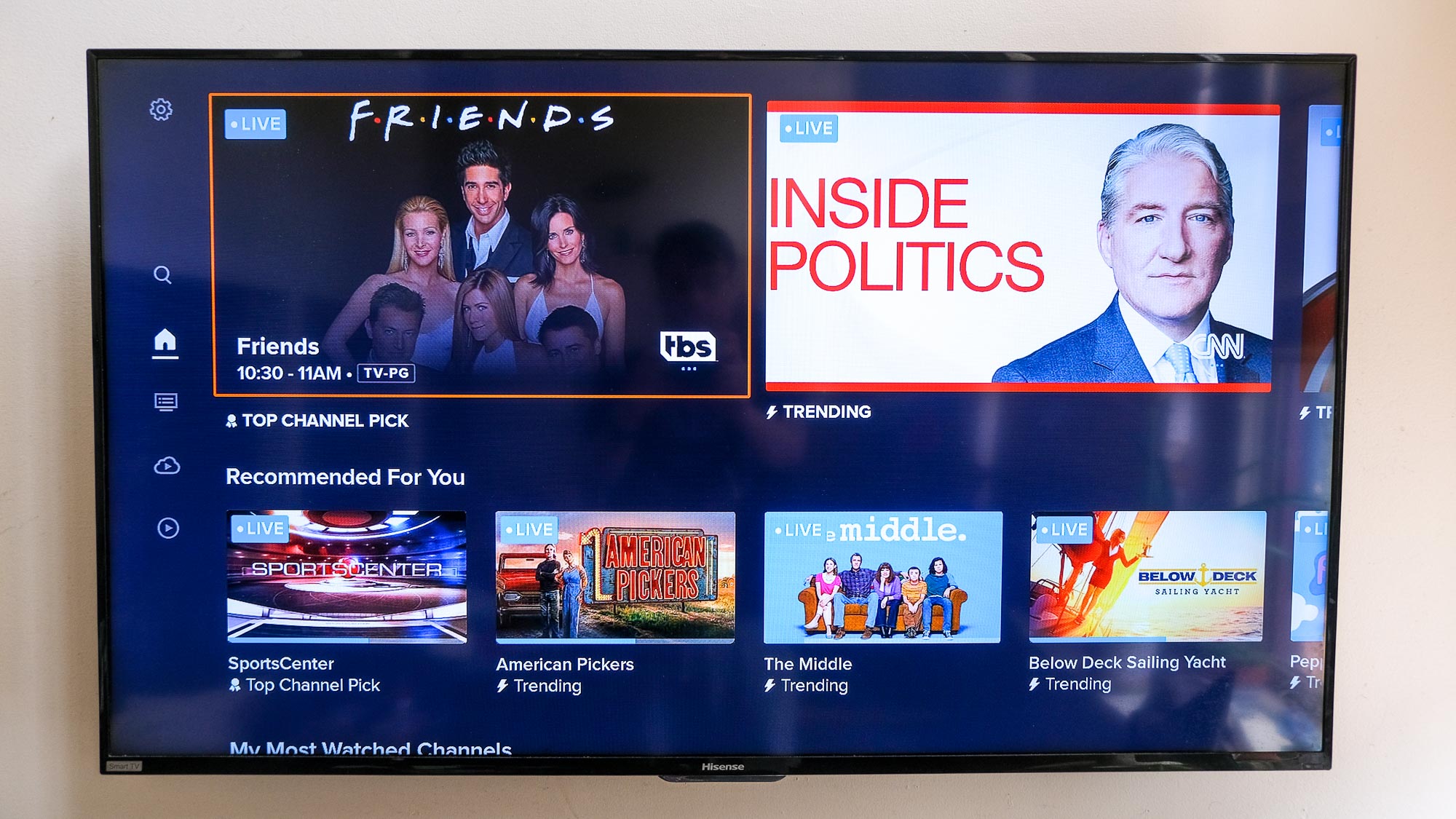
Of course, the new Sling TV app's biggest changes come with its new home screen. The "MY TV" screen (a grid with your channels, recordings, recommended content and popular content) is gone, and in its place is a screen that promotes a "Top Channel Pick." In my case, it was pulling from TBS, recommending the shows that were on at the time: Friends and (later) American Dad.
Article continues belowUp next, more Top Channel Picks, showing what's on popular networks. First, it's The Jump on ESPN, then CNN Newsroom, Chicago P.D. on USA, Return to Amish on TLC and Chopped on Food Network. This row had 15 recommendations in total, and I eventually landed on a South Park episode.
The most interesting change so far comes in the next row, which displays your most watched channels. Of the home screen sections so far, this is probably the best way to find something you might actually want to watch. Then, you get content by category (sports, news, shows, movies and kids), your recent recordings and a Continue Watching section. If I had to make any changes here, I'd move Continue Watching up a little bit, since it's a little more personalized than the Top Channel Picks.
Sling fixes the Guide screen
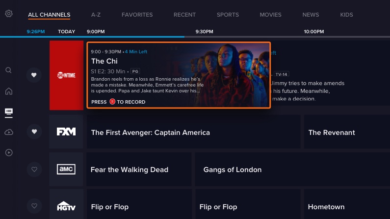
But the best change, if you ask me, is on the Guide screen. Now, it's super easy to mark a channel as a favorite, as there's a little heart on the far left column of each channel row.
Filtering down to just your selected favorites is easy, because there's a Favorites tab right at the top. It would be great if you could manually sort your favorites, as the only available option is to let Sling sort them alphabetically. "But what if I watch more on USA than AMC?" I wondered to myself during testing. Guide has other tabs: A-Z, Recents, Sports, News, Movies and Kids.
Get instant access to breaking news, the hottest reviews, great deals and helpful tips.
DVR gets its own tab
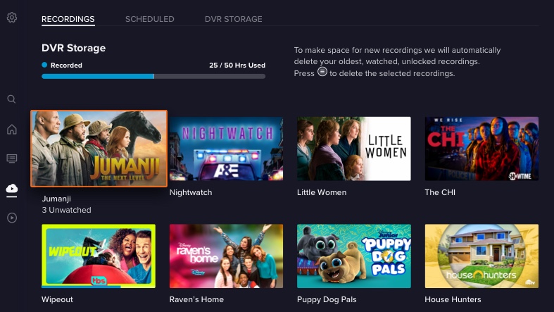
This is one of those "no brainer" changes. Over the last few years, Sling has been integrating DVR capability to its system, expanding how much space you get, and catching up to everyone else.
So, now that DVR is where it should be on the service, it makes sense that Sling has a unified DVR section. It's right below Guide on the left rail, and has a little bar graphic for how much space you're using, followed by art for each of your DVR'd programs.
This is the kind of change you wish didn't wait for a big update, but it's welcome nonetheless.
What's left for the Sling TV app?
While user profiles may not sound like an app feature — and more like a service feature — the lack of multiple user profiles means that Sling can still get more cluttered than it should. This could allow you to have a more personal DVR or Favorite Channels list, and enable more personal recommendations.
This is annoying especially for Sling Blue and Sling Orange + Blue subscribers, as they get three and four (respectively) simultaneous streams, but everyone still uses the same DVR and list of favorite channels.
- More: Sling has all of the NBA playoffs live streams
- Sling TV promo codes

Henry was a managing editor at Tom’s Guide covering streaming media, laptops and all things Apple, reviewing devices and services for the past seven years. Prior to joining Tom's Guide, he reviewed software and hardware for TechRadar Pro, and interviewed artists for Patek Philippe International Magazine. He's also covered the wild world of professional wrestling for Cageside Seats, interviewing athletes and other industry veterans.

 Club Benefits


