The iPhone 17 got a lot of big updates from Apple — but there's one thing missing
Apple's base model flagship could use a refresh
Here at Tom’s Guide our expert editors are committed to bringing you the best news, reviews and guides to help you stay informed and ahead of the curve!
You are now subscribed
Your newsletter sign-up was successful
Want to add more newsletters?
Join the club
Get full access to premium articles, exclusive features and a growing list of member rewards.
Apple packed a lot of features into the iPhone 17, from upgraded storage and a new ultrawide camera to a fast-refreshing display and speedier charging. Those improvements are especially impressive in light of the fact that Apple didn't raise the starting price on the iPhone 17 — it's the same $799 as its predecessor.
My colleague John Velasco is so impressed with the iPhone 17 that he's made the case that it delivers more value than the more fully featured iPhone 17 Pro. And I don't really disagree with him.
Still, there's one area where the iPhone 17 falls well short of the iPhone 17 Pro, and I see it each time I pick up my recently acquired handset. I'm quite pleased with the iPhone 17 as a new device, but I can't help but feel that in terms of design, Apple kind of mailed this one in.
Article continues belowDesign changes — but not for the iPhone 17
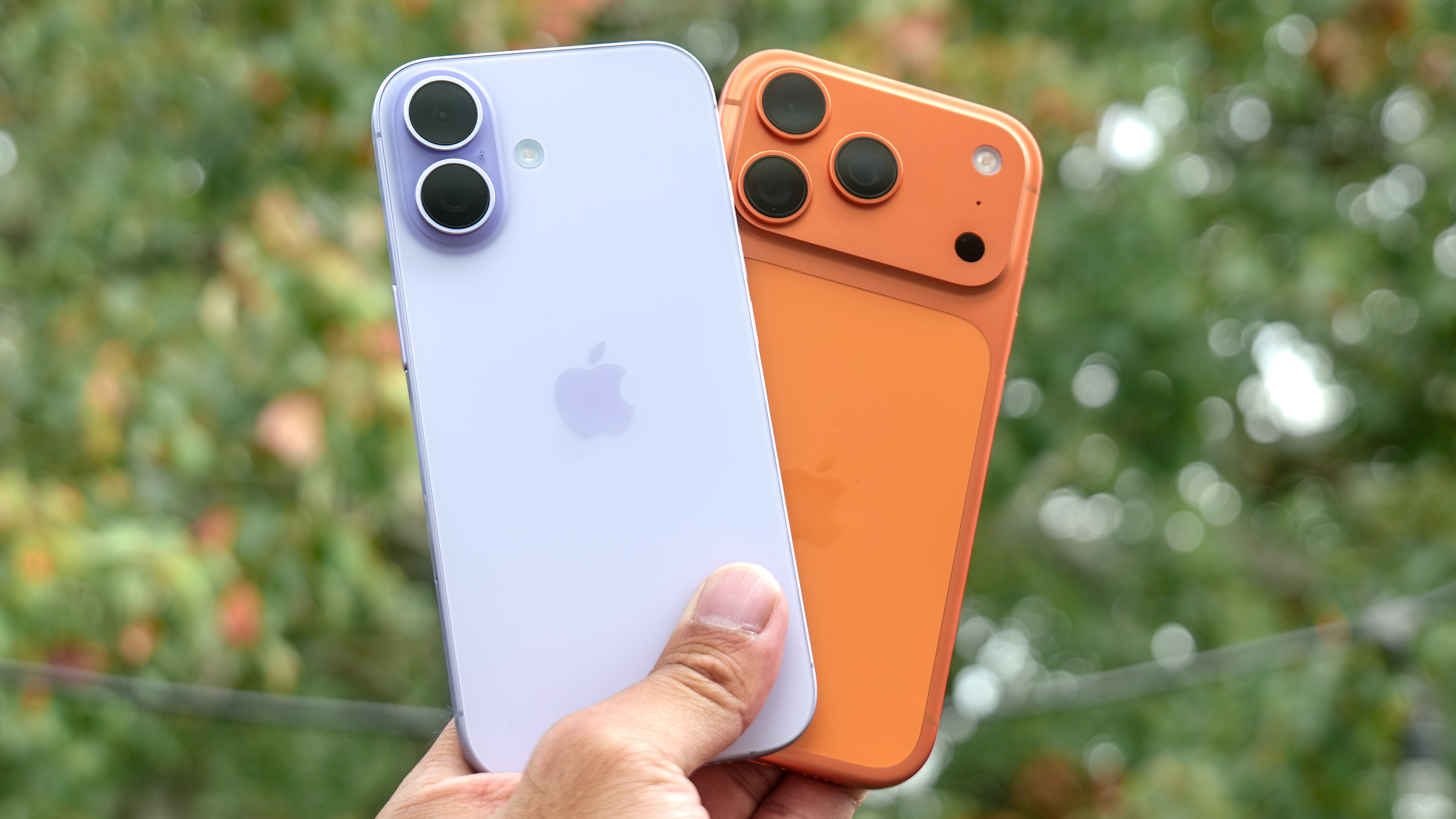
It doesn't help that an iPhone 17 vs. iPhone 17 Pro comparison immediately shows off the new look of the Pro models. I know not everyone's a fan of the Pro's camera plateau, but I tend to like camera arrays that stretch out across the back of the phone. I also appreciate how the design changes on the iPhone 17 Pro allow for more space for the battery and help dissipate heat for better performance. (The vapor chamber in the iPhone 17 Pro models plays a big part in that, too, obviously.)
So you've got a new look iPhone 17 Pro and the thinnest Apple phone ever in the form of the iPhone Air. Meanwhile, with the standard iPhone 17, it's the same old same-old — and that includes the layout of the rear cameras.
Apple would counter that the iPhone 17's design is not exactly the same as what you got with the iPhone 16. For starters, the new phone uses an upgraded Ceramic Shield 2 material that's more scratch resistant than the original flavor of Ceramic Shield on last year's model. The iPhone 17 is also a bit taller to accommodate the new 6.3-inch display, and the phone has picked up around of a quarter-of-an-ounce in weight.
Where the iPhone 17 design falls flat
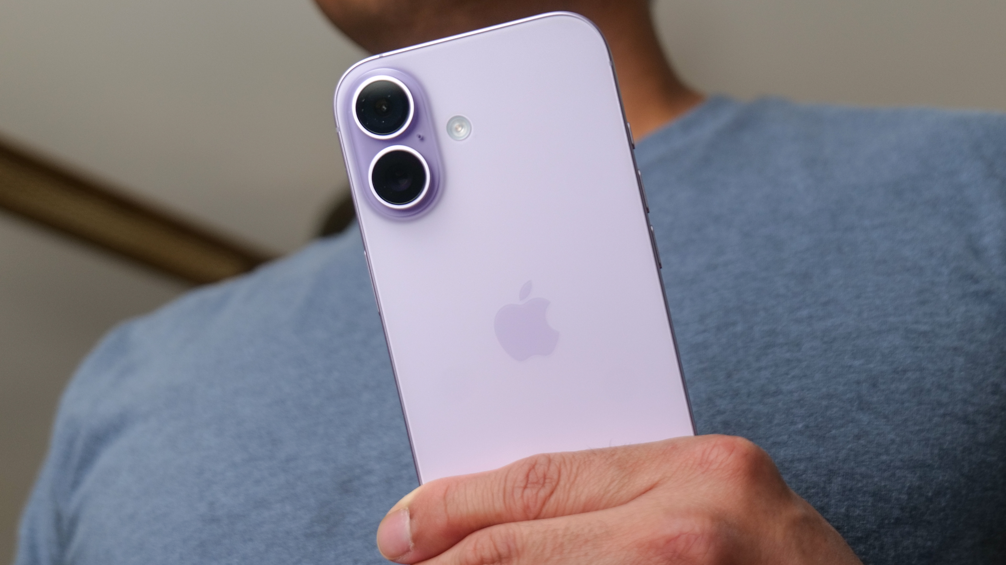
I appreciate the more durable design, and while I like my phones compact, I feel that Apple managed the increased size on the iPhone 17 well, so that the new phone is still fairly easy to tote around. Really, my beef is with the iPhone's camera array, which feels tacked on to the standard model.
Get instant access to breaking news, the hottest reviews, great deals and helpful tips.
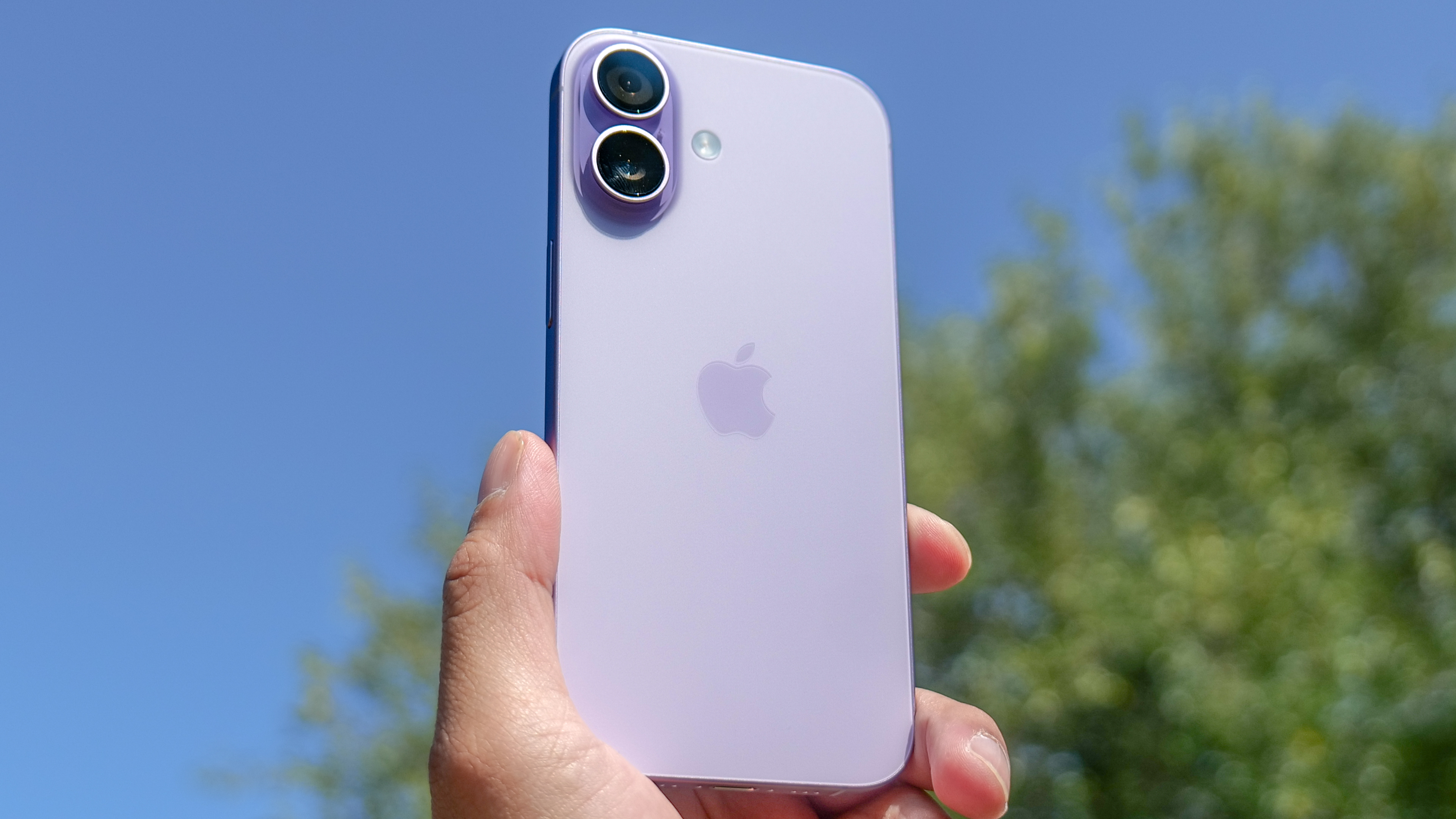
The iPhone 17 features two vertical stacked lenses tucked into the upper left corner of the phone's back panel. Like the iPhone 16 before it, the cameras are housed in a raised oval bump instead of the square array that Apple used with prior models. The flash on the iPhone 17 sits all by its lonesome to the left of the camera array, interrupting the flow of the back panel with a circular dot that sticks out like a sore thumb.
Then again, a lot about the camera array sticks out. Rather than keeping the lenses flush to the rear of the phone as the Galaxy S25 phones do, Apple uses that bump, which makes the phone rather wobbly when you set it down screen up.
The camera array is also a different color than the rest of the back panel — on my Sage iPhone 17, the array is a darker shade of green — which further draws the eye to the camera. That's fine for making sure people are looking at the camera when you snap a portrait shot, I suppose, but it really doesn't give the iPhone a subtle look.
Apple is always going to want to stack those main and ultrawide lenses on top of each other — it allows you to take spatial photos and videos for that $3,499 headset you're never going to buy — so adopting a camera array like the one on the iPhone 17 Pro is probably out of the question. But why not make the lenses more flush so the array doesn't jut out so much?
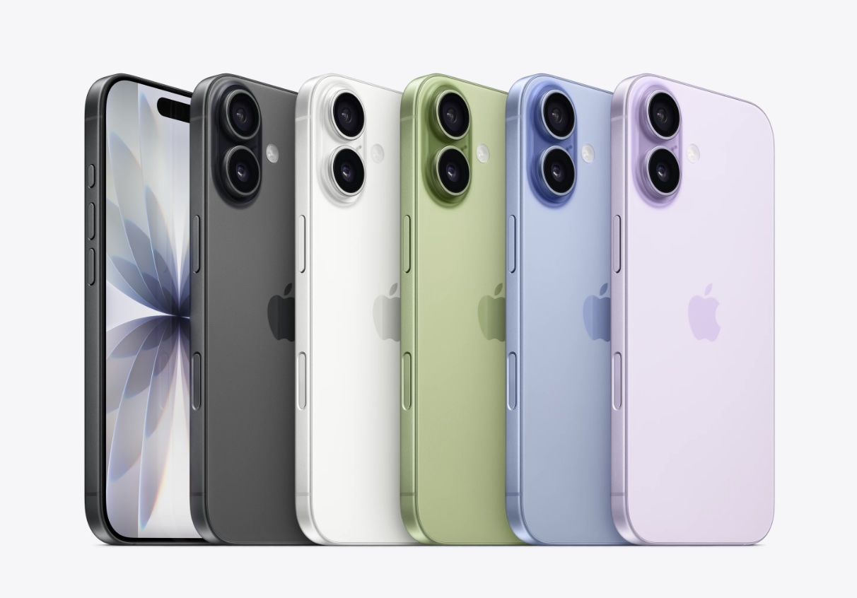
While I'm lodging criticisms of the iPhone 17's look, let me echo John Velasco's observation that this year's colors feel a little bit muted. The Sage option that I own is the best of the lot, but the Mist Blue and Lavender colors look very slight to my eye — especially in contrast to the more eye-popping Cosmic Orange and Deep Blue shades of the iPhone 17 Pro. Stop making me pine for the iPhone 5c, Apple!
iPhone 17 design outlook
Even after all that, none of this makes me regret turning to the iPhone 17. And I don't think it should — or will — stop anyone from upgrading to the new model. The other improvements are too notable to overlook just because the phone's appearance is a little underwhelming.
Still, Apple is capable of freshening up designs. It showed as much with the three other phones it released this fall. So maybe the agenda for next year's updates can include jazzing up the look of the iPhone 18.
Follow Tom's Guide on Google News and add us as a preferred source to get our up-to-date news, analysis, and reviews in your feeds. Make sure to click the Follow button!
More from Tom's Guide
- iPhone 17 durability put to the test — how well Apple's new phones withstand bending, scratching and dropping
- I tested the iPhone 17 Center Stage camera vs Galaxy S25 Ultra vs Pixel 10 Pro XL — here's the winner
- I’ve spent over two weeks with the iPhone 17 — here’s why I recommend it over the iPhone Air
Philip Michaels is a Managing Editor at Tom's Guide. He's been covering personal technology since 1999 and was in the building when Steve Jobs showed off the iPhone for the first time. He's been evaluating smartphones since that first iPhone debuted in 2007, and he's been following phone carriers and smartphone plans since 2015. He has strong opinions about Apple, the Oakland Athletics, old movies and proper butchery techniques. Follow him at @PhilipMichaels.
You must confirm your public display name before commenting
Please logout and then login again, you will then be prompted to enter your display name.
 Club Benefits


