Club Benefits


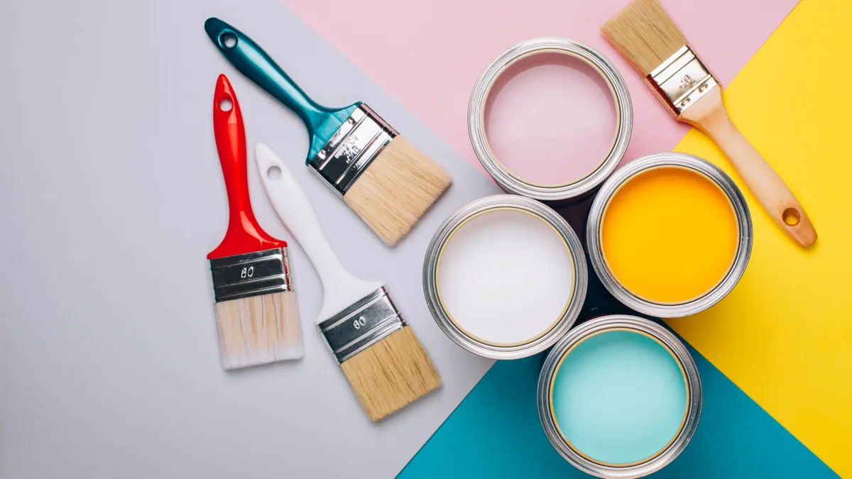
Whether you’re renovating from scratch or updating a room, color can instantly transform your home from drab to fab. And while choosing your favorite tones may seem easy enough, there are some color scheme mistakes it's all to easy to fall victim to.
Room color combinations can be tricky to nail if you want to get the right balance. This is especially the case when combining different colors with patterns, and throwing in your soft furnishings and pieces. And with so many different trends and décor styles, it’s very easy to get carried away!
In fact, interior designers highly recommend using a color wheel to help get the ideal decorating scheme right for your home. Essentially, this tool is a visual representation of 12 core colors in a circle, from primary hues, secondary colors and tertiary colors that complement each other. Otherwise known as color theory, this balanced palette will not only look striking, but can also create the right moods. Just avoid these paint colors that will make your home look cheap, according to the experts!

So, if you don’t want an overwhelming (and technicolor!) home, avoid these 7 color scheme mistakes right now.
Plus, these are the 5 paint colors you should never use in a bedroom.
1. Clashing vivid colors

If you’re a fan of bold and vibrant tones, avoid placing vivid colors together, or using the wrong shades altogether. This is color scheme mistake number one, and can create a high-intensity environment way too bright for the space.
For instance, a vivid red and green combo will clash, and can easily look tacky. However, muted shades like a burgundy red tone and an olive green, or blush pink and blue tones will work much better — and look more elegant.
Experts also recommend allowing one color to dominate the other if you opt for decorating with vivid tones. This would make the environment feel less overwhelming, and more impactful. What’s more, vivid, harsh colors can make a space feel less inviting or relaxing. So, if you want your bold colors to be beautiful, stick to lighter, muted shades.
2. Not applying the 60-30-10 rule
Another common mistake we make is not properly distributing color around a room. Consider the ‘weight’ of colors, particularly if one tone is overpowering the space. According to experts, you should always follow the colour principle of 60-30-10 to create your ideal color scheme.
The 60-30-10 rule is essentially a way of separating your palette so that it compliments the room. Typically, you should fill 60% of the room in the dominant colour of your choice, which could be walls, sofas, rugs or anything large or central to the space. 30% should be the secondary (complementary) colour, like the soft furnishings or curtains, while the remaining 10% should be accent colours used on the smaller items like a lamp, accessories or artwork.
This is a great way to achieve the right color balance and harmony in the home, without being too garish.
3. Matching furniture with the walls

Another no-go is to paint your walls first, before matching your furnishings to that color. Be it an all-grey living room, or cool blue bedroom, matching everything will only make the room feel lacklustre and repetitive.
It’s always advisable to choose two or three colors in a room — remembering to stick to the 60-30-10 rule (60% of the room should be a dominant color, 30% the secondary color and 10% should be an accent). So you can still have your dominant color throughout the room, but throw in a handful of other elements that will suit it well.
For instance, cool grey tones are best matched with other cooler colour schemes, such as blue, green, and cool whites. While warm grey shades go well with other warm-toned colors, like taupe, blush pink, butter yellow, and burnt orange. If in doubt, it’s always best to refer to color charts or invest in a color wheel to help you decide on your perfect interior scheme.
In addition, gone are the days when every piece of furniture had to match, or color co-ordinate with the rest of your interior. While it may have been trendy at the time, most homes ended up looking identical or simply boring. It’s no surprise that this is one of the 7 things that are making your home look outdated, according to interior experts.
4. Sticking to ‘safe’ monochrome
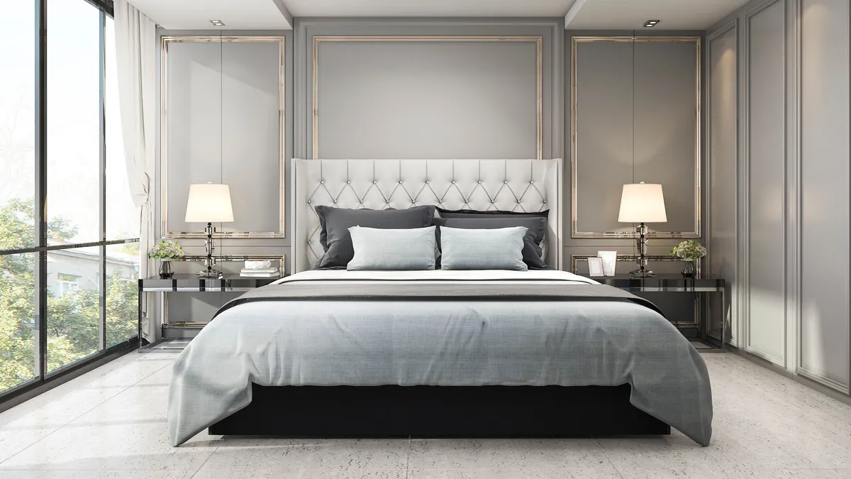
While the monochrome look may seem a popular (and safe) choice of color scheme, there is a risk of it looking rather flat and dull. In addition, the black and white tones can often lack personality and style.
Instead, experts recommend choosing one color, and weaving in tones, tints and shades of that same color. By varying your shades, you can keep your monochromatic color scheme from becoming monotonous! This will also help to balance everything out, and make it a more visually appealing space.
5. Forgetting your window treatments

When decorating our homes, we often forget about our window treatments. However, curtains or blinds play a huge role in making a room come together.
Experts advise that the color of your curtains or blinds should always compliment the color of your walls. So if you have neutral walls, you can either opt for a color in the same tone, or, you can contrast with a bold color, botanical print or geometric pattern.
Alternatively, if you already have bold walls, you can balance them with softer, muted tones for the windows. These will work well to add character to any room, and can look elegant.
6. Mixing too many colors or patterns

Another common mistake is getting the color proportion all wrong. This is especially the case if we’re working with too many tones and patterns in one space. While it’s good to experiment with bold colors and patterns, always use in moderation. If you overdo it with styles, these can start to compete with each other — resulting in a mish-mash of colors, and becoming an eyesore!
To avoid a visual disaster, always offset patterns with neutral breaks to create balance. For instance, if you have a patterned or multi-coloured rug, opt for cushions that are neutral or tones of beige. And don't even think about buying more patterned cushions, which would only clash.
By grounding the room with neutral tones, it's easier to add one or two colourful/patterned elements around the room, which will be more aesthetically pleasing.
7. Using dark color schemes in small spaces

While darker color schemes have been on-trend and a contemporary choice, it doesn’t always work in small rooms. Be it charcoal, black or navy blue, darker tones can easily absorb light, making a space look and feel smaller than what it is.
The best option for smaller rooms is to use paler or muted tones, rather than a strong color scheme. However, if you want to stick to a dark color scheme, opt for painting one feature wall, rather than the entire room. This will allow more light to bounce off the walls, yet still give the space a stunning look.
If you lack natural light however, here are top tips on how to brighten a dark room, and maximize your living space.
More from Tom's Guide
- Here are 7 vintage home trends that still look good, according to experts
- If you’re doing a home makeover, avoid these 5 mistakes when rearranging furniture
- Check out these 7 hacks to make a small bedroom look bigger