I’m colorblind, and even I think Tekken 8’s accessibility filters are overkill
The answer for colorblind accessibility needs a little more thought than Tekken 8

The Tekken 8 demo is out in the wild, and it has revealed Bandai Namco’s "impressive" array of accessibility settings. But I do have some problems with them, as someone with colorblindness.
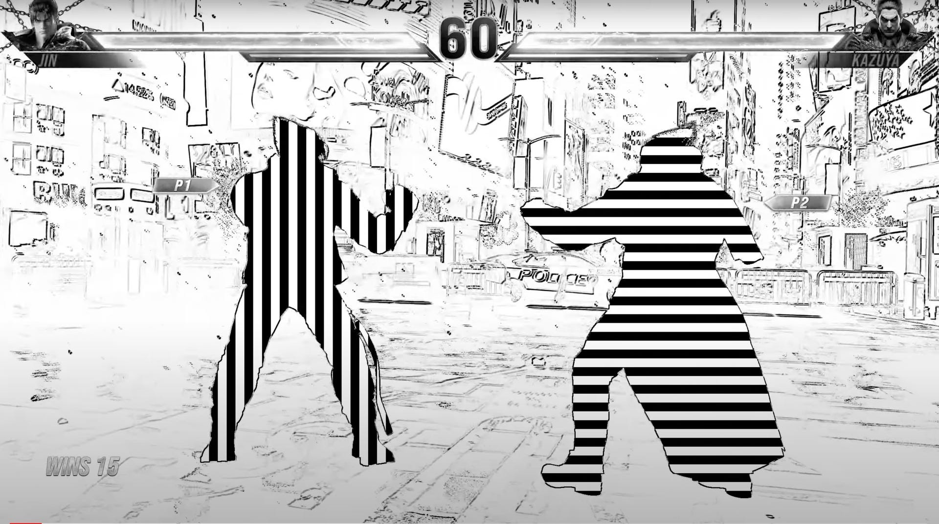
One that has been highly circulated in the news sphere is the Mask Filter with Pattern Display characters and a grayscale display. There seems to be a misunderstanding around this one, as it’s intended for legally blind people — low-vision players who have trouble picking characters out from the visual effects and the background.
Regardless, accessibility experts have been raising red flags about this one for its potential to cause vertigo, migraines, and possible seizures. You’ve been warned before you click on the below video to see what I mean.
However, my issue is not with this one in particular. Rather, it’s with how OTT the various Color Filters get, and how there should be more to tackle the wider sliding scale of colorblindness without putting everyone in the same bucket in terms of severity.
How colorblind am I?
So, for full context, I have deuteranomaly and protanomaly color blindness. It’s often diagnosed wrong as simply being red-green color blind, but I also struggle with different hues of blue and purple.
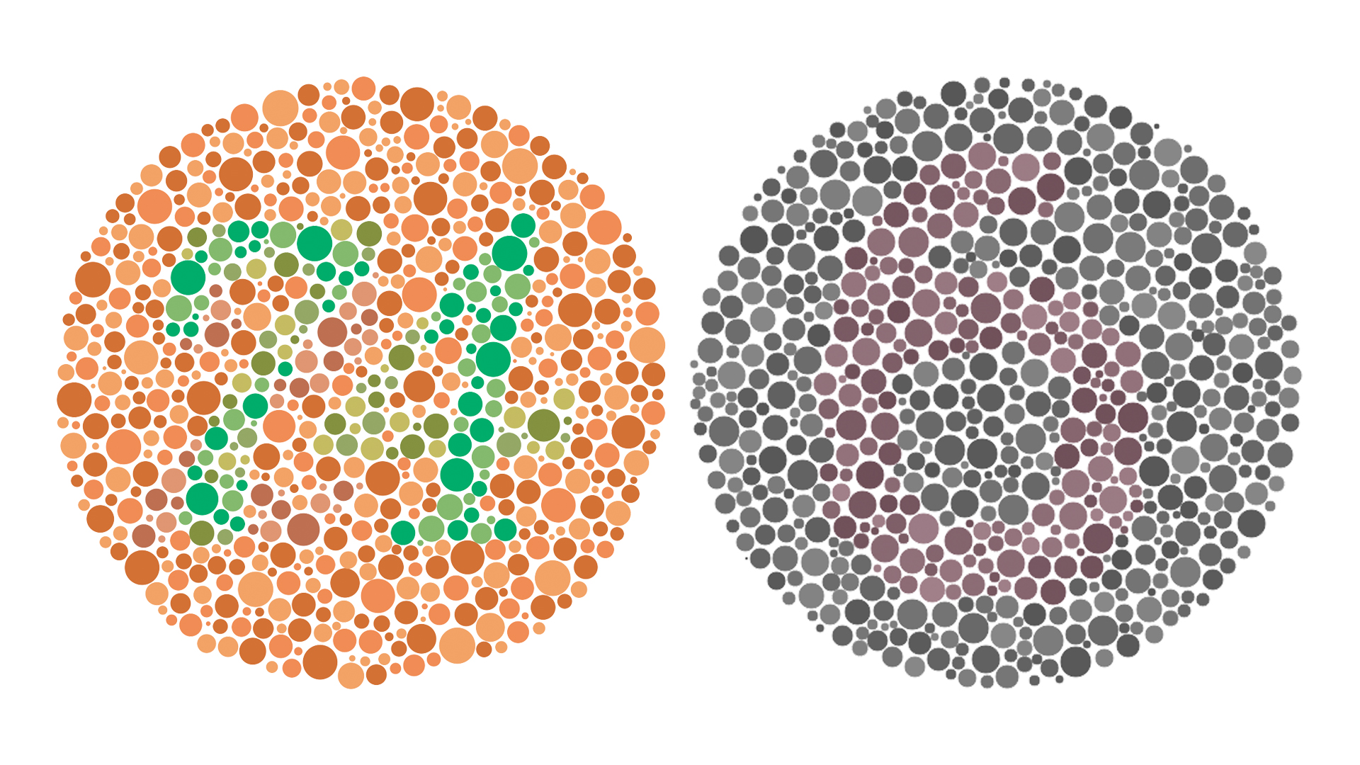
My diagnosis puts me at moderate. For example, I can’t see the numbers in either of these Ishihara tests — if you could tell me what they are in the comments, that would be massively appreciated!

Good intentions, but overcompensating
There seems to be one common rule around games when it comes to tackling colorblindness: stick a filter over everything. It’s a sound strategy that is led by some science — similar to how wearing filtered glasses can increase the eye’s response to different chromatic contrasts.
Get instant access to breaking news, the hottest reviews, great deals and helpful tips.
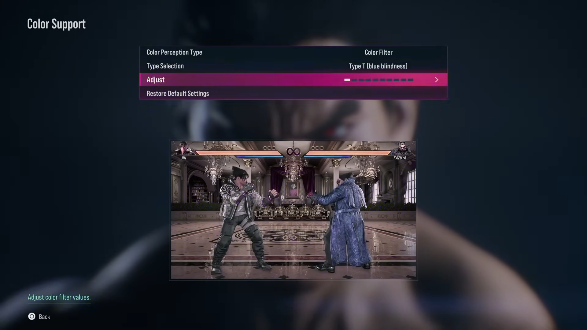
But on the flip side, it’s kind of like fixing a car’s small problem with a sledgehammer to the engine block. I won’t speak for every colorblind person, but I’ve become used to seeing the world's various hues in my own way. I may not know what color they are specifically, but I know it’s the “normal” shade. To highlight a particular example, I know that everything here looks weirdly blue.

Slapping a filter over the screen may help see more of the scene, but I (and others that I’ve asked) can still tell it looks odd compared to the color-accurate scene. It negatively affects everything else on the screen, and it can break the immersion.
So if I was to make a couple of recommendations (if you’re reading this, Bandai Namco):
- Make UI element colors customizable: Instead of relying on a filter to alter the entire scene, let me just change the hue of the health bar to make it stick out better from the scene.
- Add the option to put a colored outline around the characters: Keeping the colors of the scene as is without putting a tint on everything is critical for that immersion of the game itself. But the better solution (in my opinion) would be to add an adjustable outline to the on-screen characters — being able to change the color, opacity and thickness of the line itself.
Bottom line
On one hand, I’m definitely happy that game devs are taking color blindness seriously in its accessibility settings. Though that’s an obvious statement — they’ve been doing it for years. But on the other hand, Tekken 8’s implementation is definitely a double edged sword.
Bandai Namco’s intentions come from a good place, but in going a little over the top, the team has caused some problems. Not just the ones I mentioned above, but for the fact that color blindness settings can’t just be a blunt instrument. You need to provide depth to these settings, rather than put a filter across the entire display.
More from Tom's Guide
- 120 frames per second is gaming’s future — and something PS5 Pro needs to deliver
- The 13 best games you didn't play in 2023 — PS5, Switch, Xbox and PC
- Nintendo Switch 2 could be unveiled by March — and get a must-play exclusive

Jason brings a decade of tech and gaming journalism experience to his role as a Managing Editor of Computing at Tom's Guide. He has previously written for Laptop Mag, Tom's Hardware, Kotaku, Stuff and BBC Science Focus. In his spare time, you'll find Jason looking for good dogs to pet or thinking about eating pizza if he isn't already.

 Club Benefits


