Google Maps just got a great new feature to help you find clean air
Google Maps just got air quality information for your peace of mind
Update: Google Maps is adding a new widget to Android, and it could shape the future of Android widgets on Google Maps
There are a bunch of hidden Google Maps features you probably didn’t know about, and more are being added all the time. The latest one can help you find the highest quality oxygen in your area, and improve your breathing in the process.
No we don’t mean directions towards the best scuba diving shop, though Google Maps can do that as well if you want it to. The bigwigs over at Google have just added a brand new layer to the map, letting you see just how good the air quality is across the United States.
This feature is available on iOS and Android devices right now, and shows you the local Air Quality Index (AQI) over the standard map interface.
Article continues below 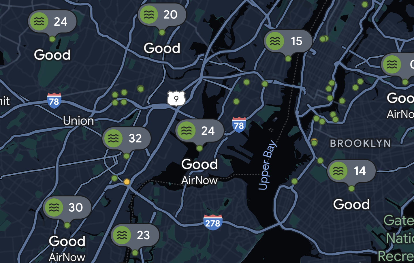
This layer utilizes data from government agencies, including the Environmental Protection Agency, as well as PurpleAir. PurpleAir has a low-cost sensor network that offers Google Maps hyperlocal data, so you can see just how good (or bad) the air is in quite a small area.
Here’s how to check air quality in Google Maps:
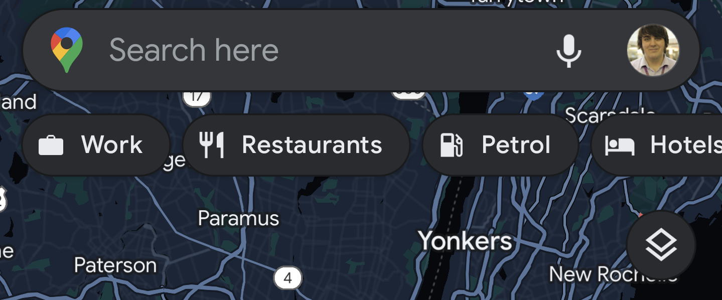
1. Open Google Maps and tap the Layer button, it can be found at the bottom right of the search bar (right below the search terms such as 'Restaurants' and 'Hotels').
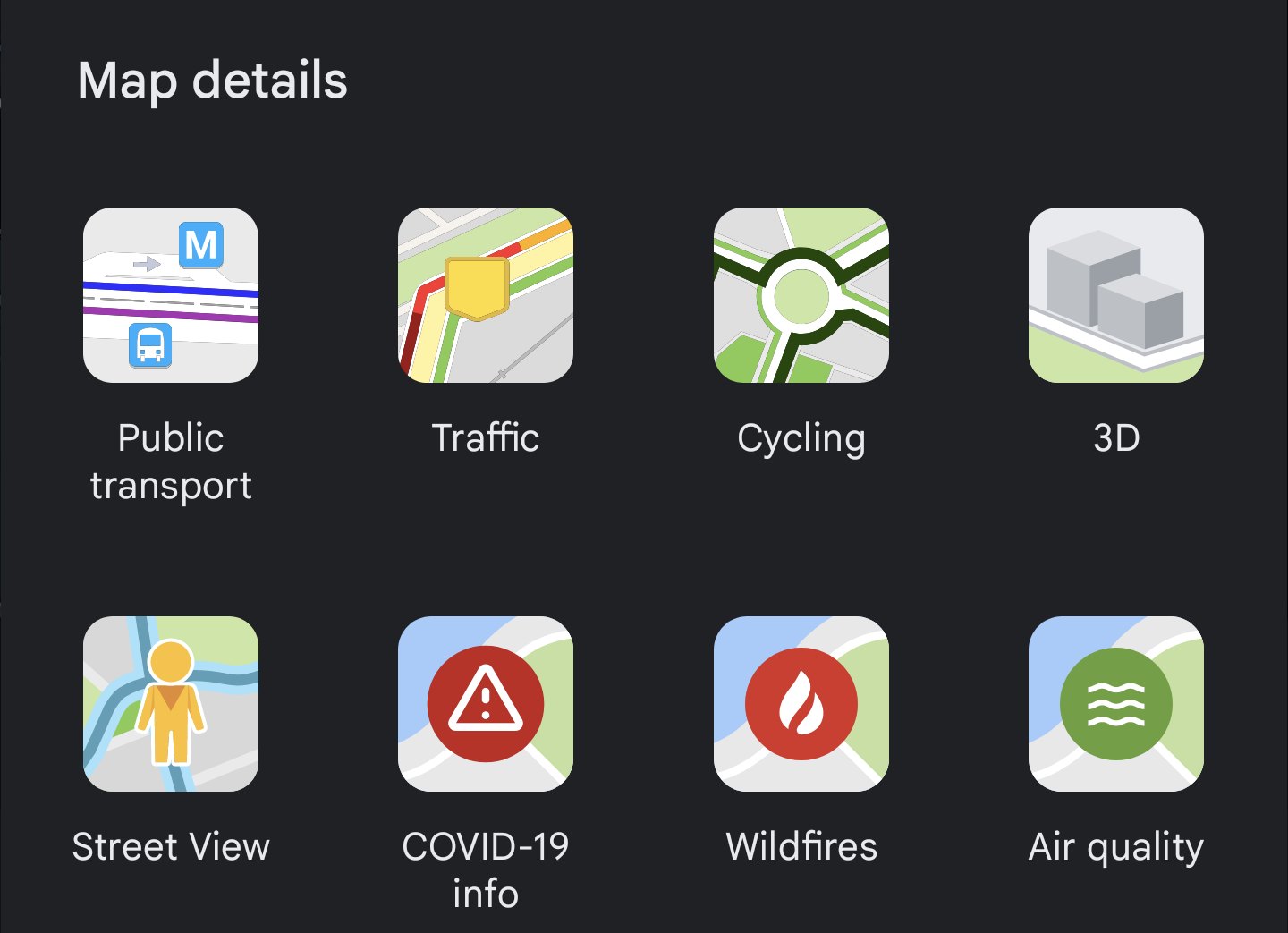
2. Choose the Air Quality option at the bottom right of the pop-up menu.
Get instant access to breaking news, the hottest reviews, great deals and helpful tips.
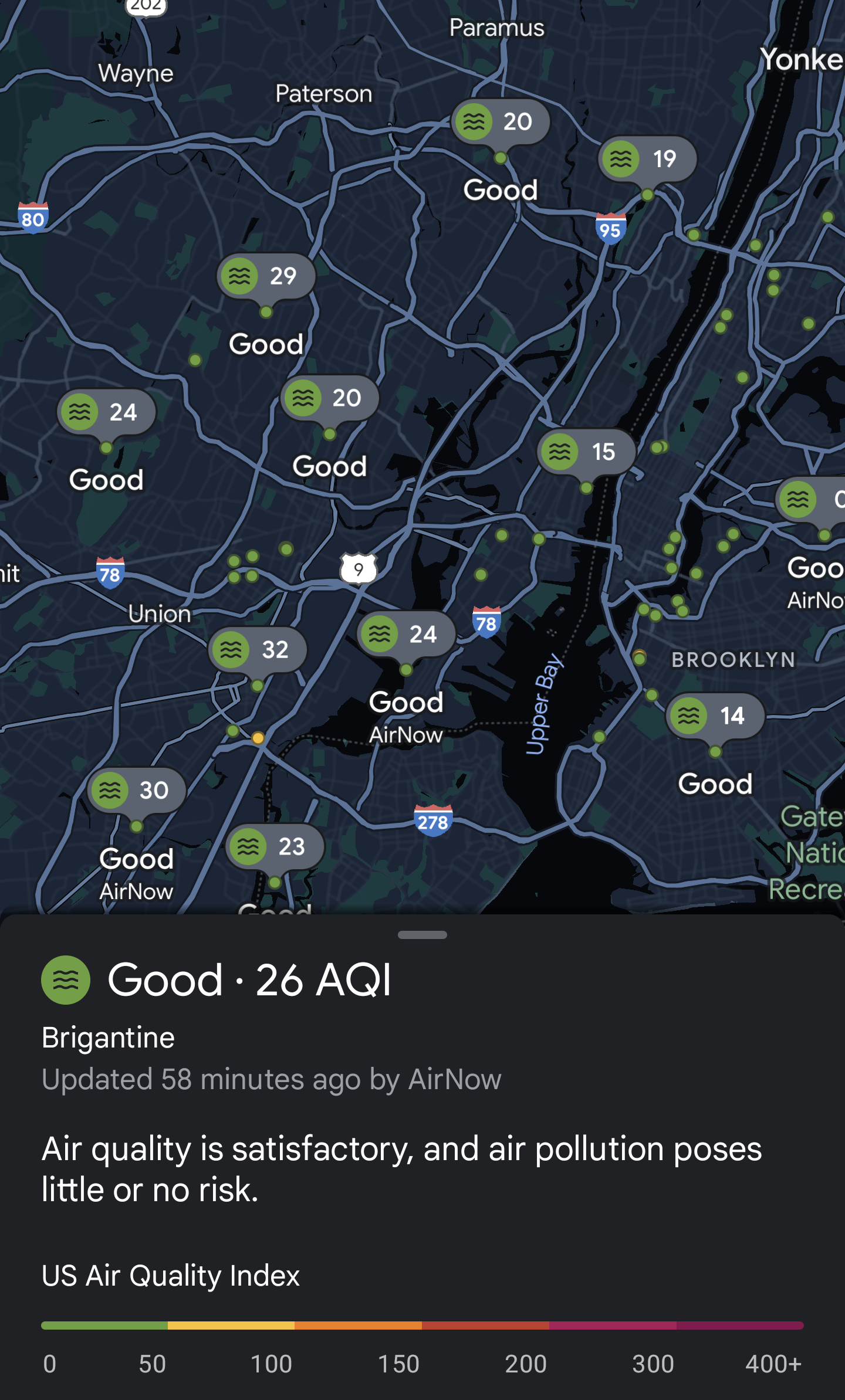
3. You’ll notice two changes: A pop-up menu showing the general air quality for the area in view, and a series of dots on the map itself.
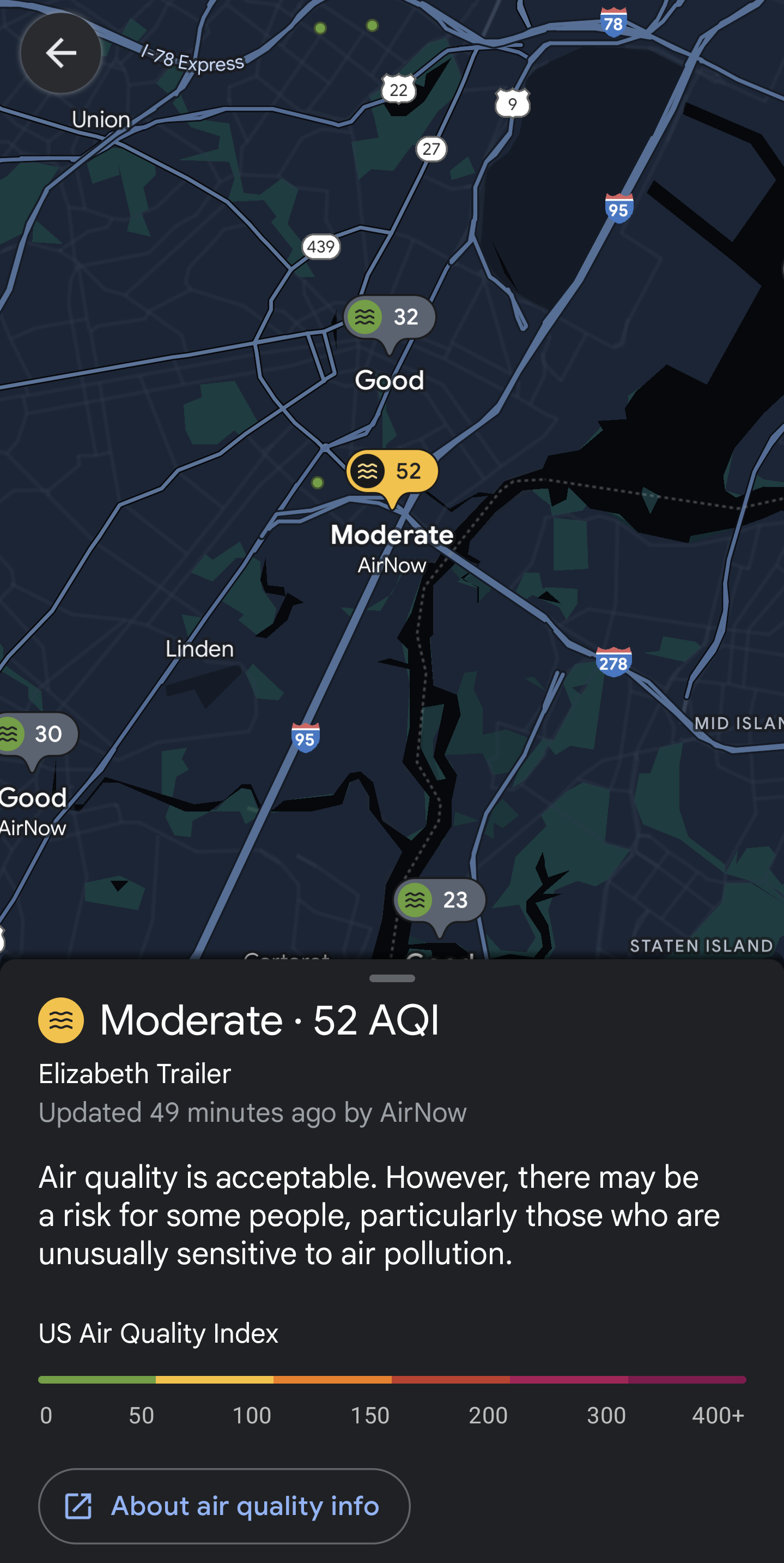
4. Tapping a dot gives you more localized data for a specific spot, including information on how much risk you are of pollution.
Green dots mean the air quality is generally good, yellow is moderate, orange is unhealthy, red is very unhealthy, and darker shades are deemed ‘hazardous’.
Google has also taken this opportunity to remind users that it also has a dedicated wildfire layer, featuring reported fires and the area they pose a risk to. Wildfires have become increasingly common across the world, especially in the warmer summer months.
If you live in an area at risk of wildfire, you can access this layer the same way you’d find Air Quality.
The Air Quality layer is currently available in the United States, India and parts of Australia. This data can be accessed in the Google maps app, or through Nest speakers and displays.
Read next: Google Maps is copying one of Apple Maps' best unique features — here's what you need to know

Tom is the Tom's Guide's UK Phones Editor, tackling the latest smartphone news and vocally expressing his opinions about upcoming features or changes. It's long way from his days as editor of Gizmodo UK, when pretty much everything was on the table. He’s usually found trying to squeeze another giant Lego set onto the shelf, draining very large cups of coffee, or complaining about how terrible his Smart TV is.

 Club Benefits


