Here at Tom’s Guide our expert editors are committed to bringing you the best news, reviews and guides to help you stay informed and ahead of the curve!
You are now subscribed
Your newsletter sign-up was successful
Want to add more newsletters?
Join the club
Get full access to premium articles, exclusive features and a growing list of member rewards.
Live-updating coronavirus maps provide everyone a way to track worldwide COVID-19 cases, so we can see the full scope of the novel coronavirus pandemic's breathtaking spread across the globe.
There are several coronavirus maps and dashboards from reputable sources, but most of them use data from Johns Hopkins University’s Center for Systems Science and Engineering.
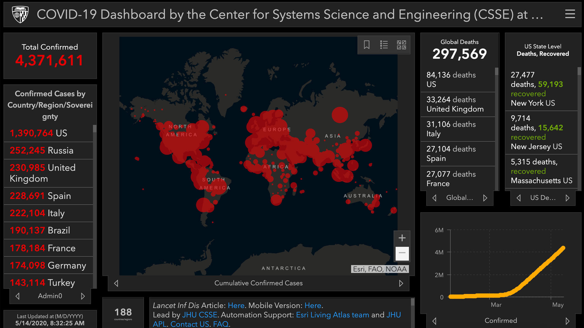
Coronavirus maps: Latest update May 14
The coronavirus maps show the breathtaking speed and reach of COVID-19. On Jan. 27, there were 2,886 confirmed cases.
Article continues belowAs of May 14, there are over 4.37 million confirmed coronavirus cases worldwide with over 297,500 total deaths.
The US leads in confirmed COVID-19 case with over 1.39 million confirmed cases across all 50 states. Among them were over 84,100 deaths, including over 27,400 deaths in New York state.
US. Governors of many states are calling on the federal government to help get more of their residents tested. There is also an outcry for more antibody tests to determine if some people have already been infected and might be immune (research hasn't proven yet if people who've had COVID-19 can get reinfected).
It's unclear if some of those numbers are completely accurate. Some countries may be underreporting their COVID-19 cases. US intelligence officials believe China has concealed the extent of their coronavirus outbreak. And it's possible that COVID-19 related deaths are being undercounted if they take place at home.
Get instant access to breaking news, the hottest reviews, great deals and helpful tips.
The best coronavirus map and dashboard
Launched on Jan. 22, Johns Hopkins University’s COVID-19 dashboard displays the number and location of confirmed cases as they are reported, as well as the total number of deaths and recoveries. You can zoom in on specific locations and scroll to different regions. Click on a red dot and you’ll see information on the number of cases by country, by region, by city and in the U.S., by state. And there’s a mobile version, so you can monitor the coronavirus map on a phone.
According to the university, the coronavirus map was created to “provide researchers, public health authorities and the general public with a user-friendly tool to track the outbreak as it unfolds."
More coronavirus maps and dashboards
Microsoft's coronavirus tracker is easy to use and has a nice interface. Much like the other maps, the Bing COVID-19 dashboard lets you see a worldwide view of the disease's spread as well as the numbers per country.
HealthMap’s coronavirus map is slick and well-designed and features animation, so you can animate the spread of COVID-19 from the very first cases.
NextStrain’s coronavirus map is more technical and provides some detailed information, like the genome of the virus. And you can watch an animation of the routes that the coronavirus took from region to region, country to country.
The New York Times’ coronavirus dashboard features easy-to-read charts and graphs explaining
NBC New York’s coronavirus maps is based on the same Johns Hopkins data but is a little simpler and features animation.
- Coronavirus tips: 8 steps to staying healthy
- How to make a face mask at home

Kelly is the managing editor of streaming for Tom’s Guide, so basically, she watches TV for a living. Previously, she was a freelance entertainment writer for Yahoo, Vulture, TV Guide and other outlets. When she’s not watching TV and movies for work, she’s watching them for fun, seeing live music, writing songs, knitting and gardening.
 Club Benefits


