Windows 10 video reveals brand new interface — here’s what it’s like
With the new Windows 10, less is definitely more
Here at Tom’s Guide our expert editors are committed to bringing you the best news, reviews and guides to help you stay informed and ahead of the curve!
You are now subscribed
Your newsletter sign-up was successful
Want to add more newsletters?
Join the club
Get full access to premium articles, exclusive features and a growing list of member rewards.
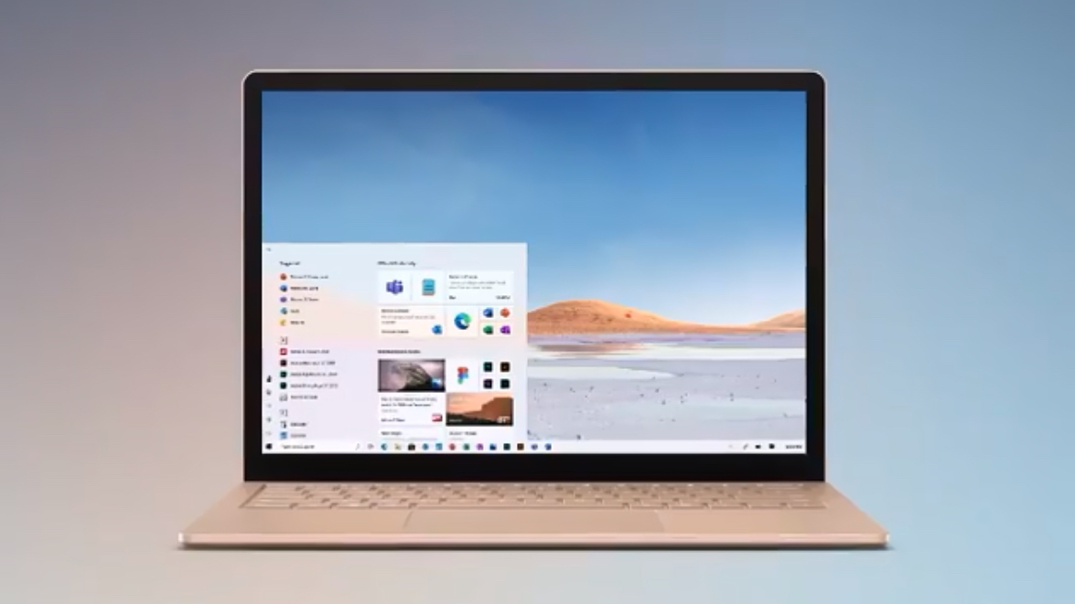
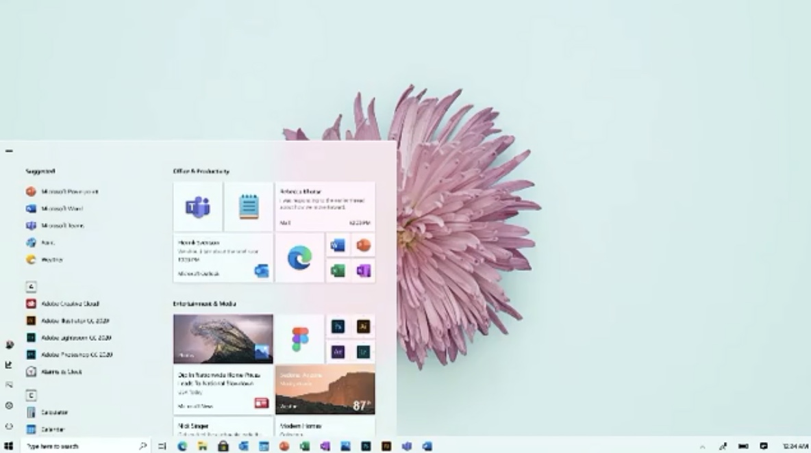
Microsoft‘s Chief Product Officer Panos Panay has published an Instagram video that gives the first official detailed look at the new Start menu — which actually has live tiles — and other new user experience elements in the incoming Windows 10. It looks great.
Here’s a frame-by-frame analysis of what we can see in it.
- The best laptops you can buy now
- New iPad Pro 2020: Everything you need to know
But before diving it, let’s watch the video:
Article continues belowA photo posted by @panospanay on Mar 19, 2020 at 12:47pm PDT
The new Windows 10 icons look great
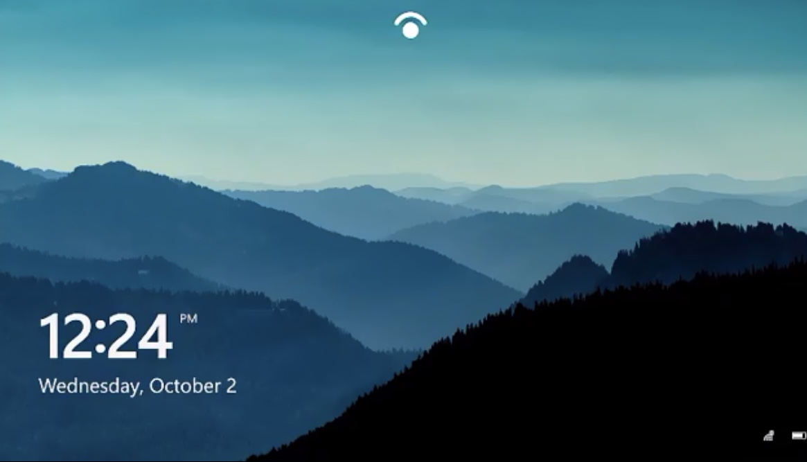
After the down-the-memory lane intro sequence — showing the boot screen and the windows icon evolving — we pass from Windows 10’s face-recognition login to jump right into the star of the show: the Start menu.
First, we go into the new Fluent design icons, as they replace the old Metro design ones.
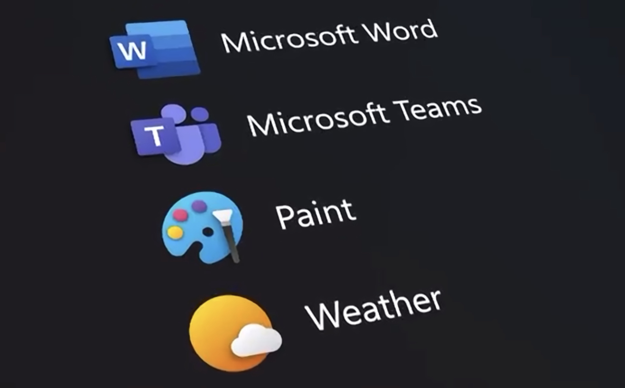
The new icons are more easily identifiable than the old ones, jumping right at you without the distraction of the background color.
There are no 3D effects except for a subtle layering effect — like the “W” over the color stripped background square or the brush over Paint’s palette. It’s a good equilibrium between elegance and keeping things simple. In the case of Office’s icons, Microsoft is still using color coding for easier identification.
Get instant access to breaking news, the hottest reviews, great deals and helpful tips.
The result of the distinct shape and smoothly shaded colors over the dark (or white, if you choose the light theme) is that the apps jump right at you.
Live Tiles are not really dead, apparently
Then we go into the old Live Tiles menu itself, as the icons start replacing the old colorful boxes with dark ones with the new icons and... some new Live Tiles?
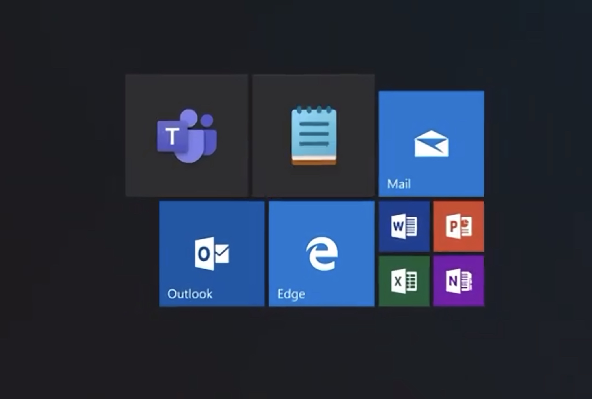
The rumor was that Microsoft was totally killing Live Tiles because no developers were using them. We heard a Microsoft team member saying that no, they weren’t killing Live Tiles and we thought that this meant that the Redmond company may be eliminating the current Live Tiles architecture but keeping the concept of Live Tiles around for future use.
After this video, I’m not so sure about that anymore.
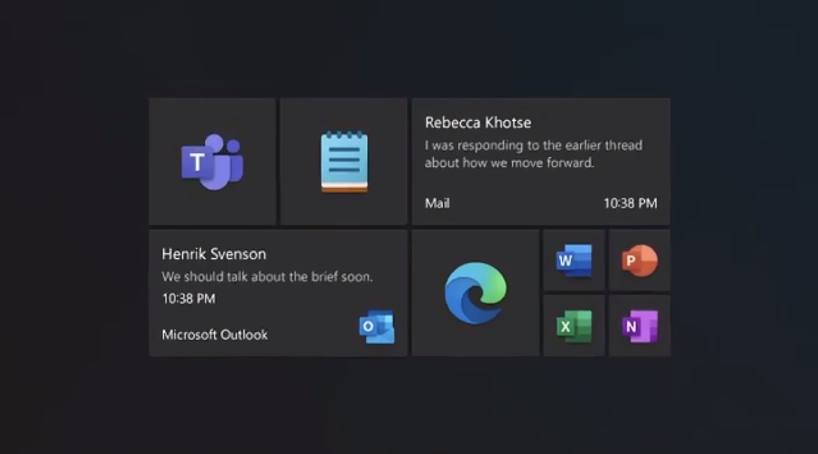
As you can see there are two long rectangles taking two big tiles that appear to be live, showing a view of incoming mail from Mail and Outlook. The white over dark text is easy to see.
There are also live tiles for the photo gallery and the weather, as the frame below shows:
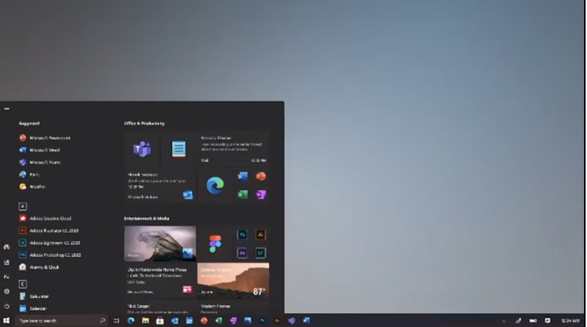
We can also see that the tiles’ size seems to be customizable, just like the old menu. In the video we can see 1 x 1, 2 x 2 and 2 x 4 tiles.
Customization for everyone
The video then starts to talk about personalization, showing how your typical custom backgrounds look with the dark and light themes — which could be translucent, as the next frames show.
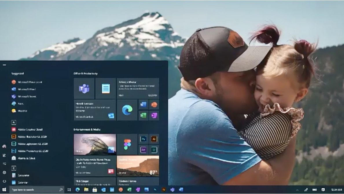
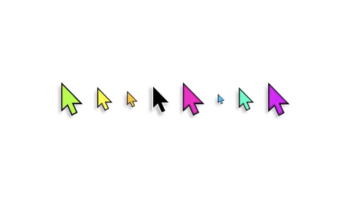
New pointer of any size and color
The video then focus on how you will be able to personalize the interface even further, by customizing thing like the pointer to any size, fill color and border you want.
Windows 10 focus on accessibility
That bridges nicely with the next beat, which is Windows 10’s new focus on accessibility.
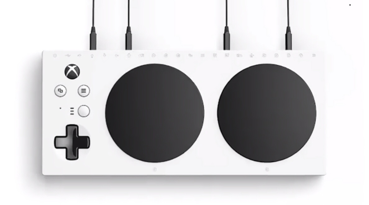
The video shows the new Adaptive controller interface for the Xbox that we already saw touted for people that have accessibility problems. This seems to imply that Windows 10 will fully support this device to allow anyone to interact with their PC.
Windows 10: A focus on Focus
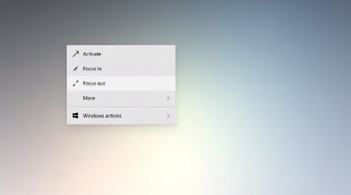
The video also puts the accent on focus, a feature that allows you to silence notifications and other distractions during certain times. This was implemented in 2018 but was buried in the settings, where you set it up by establishing a schedule.
While the video doesn’t how the revamped focus feature works, it appears that a contextual menu will allow you to quickly get in and out of the focus mode when you need it, without having to depend on a static schedule. It’s yet to be seen if Microsoft will implement other focus features seen in other apps and operating systems, like turning the interface monochrome to reduce distractions or locking applications in the foreground.
Making notes on captures and whiteboard
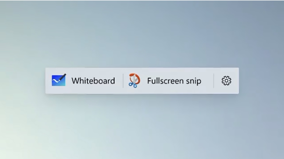
Microsoft was a pioneer in the treatment of screen captures, allowing people to easily make notes over anything that happened on their screens. The video appears to suggest that Windows 10 will go further into this baking the Whiteboard app in the operating system and seemingly accessible through a special context menu.
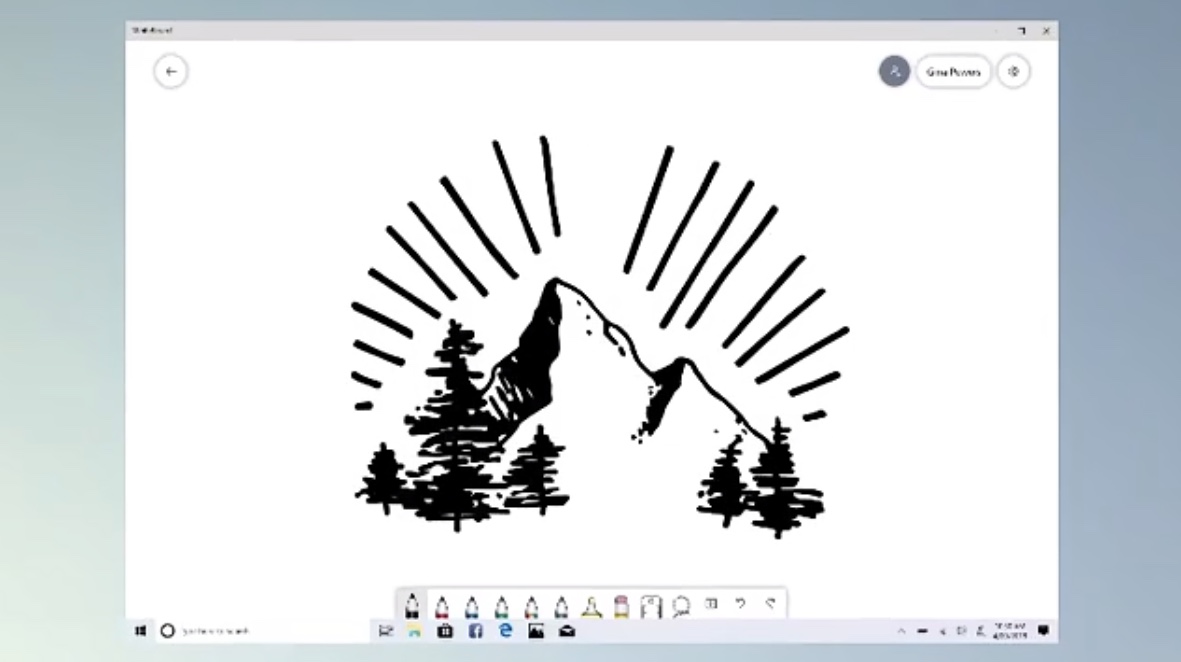
I don’t see anything new at first sight, though. The actual app looks just like the Whiteboard app that you can download from Microsoft.
The new Windows 10 File Explorer
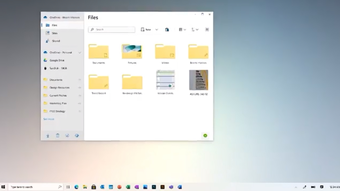
The video also shows an extremely brief, blink-and-you-will-miss it look at the new streamlined File Explorer.
As reported before, the File Explorer has been greatly simplified, flattened, and enhanced. The search will finally be fixed and it will work across all drives, including Microsoft’s cloud and Office storage. But we can’t see any of that in the video. Just a brief peek at how the interface looks.
A clearer calendar in Windows 10
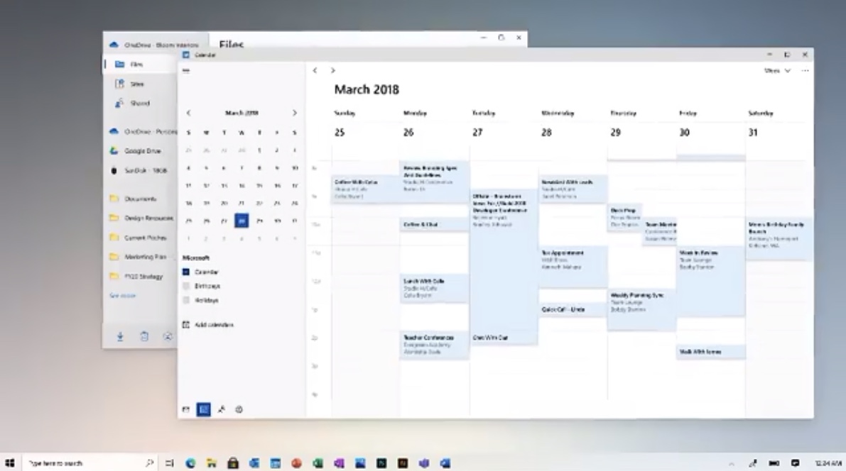
The Windows 10 video also gives a very brief look into the calendar, which looks flatter and simpler than the current version. It‘s a good look that, like the rest of the operating system, appears to abandon the strong colors and contrast of the previous version following the Fluent design directives.
And yes, it actually looks a lot like Apple’s calendar.
The new Windows 10: Simplicity everywhere
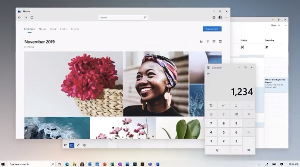
The flattening and simplification permeates all the operating system‘s apps. We can see that in the refreshed Photos app and calculator.
The former seems to take a page from Apple and Google’s latest photo apps. The variable image sizes look bigger to me and it has simplified its appearance, giving more importance to the dates, eliminating the jarring contrast top bar and putting search at the top center. We can‘t see a lot more, though.
Magnetic windows in Windows 10
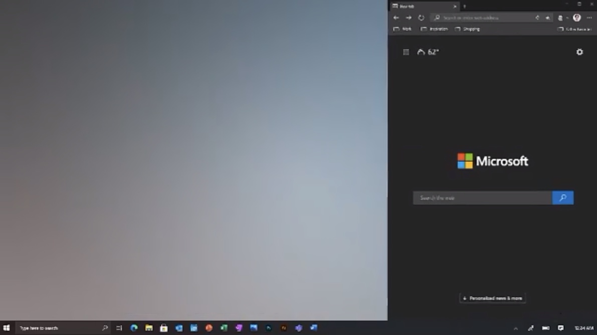
Finally there’s a demonstration of how the magnetic windows work, with a floating window getting docked to the right side of the screen and then being resized in different ways.
And that’s it. The video then goes on with the usual marketing yadda yadda, but there are no details about when we will see all this happening. In fact, we don’t even know if we will see all these features deployed at the same time. We know that the features are coming this year, perhaps divided in two updates called 20H1 and 20H2 — for first and second half of 2020.
After this sneak peek, however, we wish that Microsoft could give us some sugar in the coming weeks. Let’s just hope that they don’t break anything in the process.
Jesus Diaz founded the new Sploid for Gawker Media after seven years working at Gizmodo, where he helmed the lost-in-a-bar iPhone 4 story and wrote old angry man rants, among other things. He's a creative director, screenwriter, and producer at The Magic Sauce, and currently writes for Fast Company and Tom's Guide.

 Club Benefits


