
It happens every summer: Apple unveils a new version of iOS, and that update includes at least a feature or two that bears a striking similarity to one Android users have enjoyed for years.
Inevitably, the same tired arguments are dragged out of the woodwork. Either Apple is pathetic for taking so long to copy Google, or Apple is undeniably more clever because it waited until the feature in question could be done properly, and its approach is more refined than what Android has to offer.
- iOS 14 release date, beta, features and iPhone compatibility
- Everything you need to know about iOS 14 privacy
- New iPhone 12: All the latest leaks and renders
As with most things in life, the real answer lies somewhere in the middle between those two extremes. In some respects, Apple is legitimately offering fresh takes on features that have been exclusive to Android for years, and iOS 14 introduces some welcome enhancements. In other instances, Apple is merely flirting with new ideas, and Google’s approach remains the superior one.
To make sense of it all, we’ve identified six areas in which the freshly unveiled iOS 14 borrows heavily from Android. And, because we have both iOS 14‘s Developer Beta and the public beta of Android 11 live on two of our devices, we can weigh in on which tech giant really did it better in each case.
Here’s a closer look at some of the identical features in iOS 14 versus those in Android.
iOS 14 vs. Android: Widgets
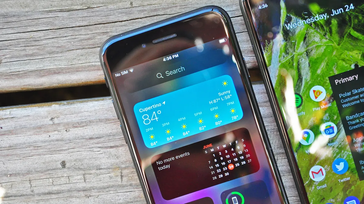
This is the big one. Of course, iOS has had widgets for some time now; as it stands in iOS 13, they reside within the Today view, to the left of your first home screen. They span the width of the display and you pretty much have to scroll vertically to view them all.
Historically, iOS’ widgets have never behaved like Android's, which can accommodate multiple sizes and sit on the very same grid that app icons do on your home screen. But that’s all changing with iOS 14.
Not only can widgets in iOS 14 sit alongside apps, they also come in a variety of sizes. For the most part, there isn’t much that separates their behavior in iOS 14 from the precedent Google established upon Android’s inception, though Apple's widgets do have a few useful and exclusive benefits.
The first is that they’re stackable. You can drop a Smart Stack — which is a collection of widgets for different apps in one space — anywhere on your home screen, or you can drag one widget into another to create a stack from scratch. You can then swipe through the stack to see the particular widget you need in that moment, or you can allow iOS 14 to use context to determine which is most useful to you at that point in time. Neither of these things are possible in Android 11, and the fact that space for one widget can serve multiple purposes helps keep a tidier, less-busy home screen.

Another plus to Apple’s approach is the way you edit settings for widgets. People don’t often talk about this, but it’s an absolute chore in Android to adjust settings for a widget you’ve already placed on your home screen. You have to dive into the particular app the widget belongs to, sift through its settings menu and find the widgets section, which is a different process for every piece of software and increasingly grating if you want to test out small tweaks just to see how they look.
However, iOS 14’s approach carries forward one of Apple’s great ideas from OS X’s heyday. Just like on the Mac Dashboard of old, you can tap a little information icon when editing a widget that flips the widget in question around and offers options to adjust it directly, right there.
Finally, it has to be said: iOS 14’s widgets just look better compared to Android’s, which Google has allowed to languish in terms of both form and function. System-level Android widgets are marked by antiquated designs unlike the rich, colorful experiences iOS 14 brings, while third-party developers on the whole tend to ignore the value of developing good Android widgets.
Widgets on Android also rarely seem to ever change. Google Calendar’s widget doesn’t jibe with the current design of the app, and the stock Android clock widget has been exactly the same since KitKat. In fact, the only core Android widget that Google improves with any regularity is the At A Glance one that dynamically serves up appointments, traffic alerts and the weather in a neat little bar.
Really, the only advantage Android’s widgets have over iOS 14’s is that they can be easily resized after you’ve placed them. In the initial iOS 14 Developer Beta, you have to remove an existing widget and replace it with one of a different size if you want it to take up more or less space on your home screen. But that’s really the only positive to Google's method, and it’s safe to say Apple has pushed Google to play catch-up at its own game when it comes to widgets.
iOS 14 vs. Android: App Library

Don’t call it the app drawer. Apple has a different name for the place apps are stored in iOS 14 — it’s called the App Library and it lives to the right of all your home screen pages. It also intelligently groups apps based on category, rather than offering pages and pages of apps with no advanced sorting system.
Now, there’s a caveat to this particular round, because there’s no single way in which Android OEMs model app drawers. Stock Android and the Pixel’s slightly-customized iteration goes for the most stripped-down approach: an alphabetized list with a search bar up top, headlined by suggested apps based on machine learning. That’s quite different from Samsung’s tack with its One UI interface, where you have the option of sorting by alphabet or a custom order of your choosing, and manually creating folders for apps you decide to group together.
Samsung’s system doesn’t automatically categorize apps either, which Apple’s does. And the accuracy and utility of Apple’s categorization scheme won’t be entirely clear until we’ve spent more than just a few days with iOS 14. At first glance, the logic seems to check out, though it takes a little getting used to, because groupings of apps in the App Library both offer shortcuts to launch software directly as well as an additional “icon” (made up of four smaller app icons) to view the overflow of software beyond the first three in a category. Visually, it’s a little overwhelming and unintuitive, though perhaps it’s something that’ll prove useful in time.
iOS 14 vs. Android: Translation

The iPhone now has its own translation app — called Translate — and it can conduct live, on-device translation and transcription without pinging a server to crunch all the data. That’s a tremendously powerful capability, and one Android has enjoyed for some time now, thanks to Google Translate. iOS 14 also bakes translation within Safari, which has long been one of Chrome’s most powerful features.
The issue for Apple is that Google’s been at this for a much longer time, and so Mountain View has amassed a far larger trove of languages that can be translated to and from, all locally stored on the phone. While iOS 14’s on-device translation tops out at 11 languages, Google Translate currently incorporates 59.
An attempt to transcribe English phrases using a new iPhone SE running iOS 14 and a Pixel 4 running Android 11 side-by-side showed that while Google’s software is faster at translating words on the fly without context, Apple’s is ultimately able to produce a final result just a shade quicker.
The interface of Apple’s Translate app is also a little more intuitive, because it automatically switches to conversation mode just by turning your device sideways. That's more convenient than Google Translate’s conversation mode, which inhabits a separate space within the app and thus takes an extra step to get to. However, both Apple’s and Google’s apps have the capability to listen for phrases in either language simultaneously, without requiring each speaker to press a microphone button for transcription in one language or the other.
iOS 14 vs. Android: Picture-in-picture

Phones today have more than enough power to do two things at once, and that’s especially true for Apple’s iPhones. So it’s about time Cupertino caught up with its rivals and enabled picture-in-picture video that floats atop apps and other content in iOS 14.
In terms of software and the user interface, Apple’s approach to picture-in-picture is well thought out. You can resize the picture-in-picture window by pinching or expanding with two fingers, which you can’t do on Android. You can also slide video away for times when you want to hear audio, but you don’t necessarily want to be watching something with your full attention.
Android’s picture-in-picture implementation is behind in those areas, however you could still make the case that it’s better, for one very simple reason: support. As it stands now, iOS 14’s picture-in-picture capabilities are extremely app-limited. YouTube doesn’t support picture-in-picture on iOS, for example, and neither does video playing via Safari. Apple TV Plus does incorporate picture-in-picture, which is great if you enjoy (and subscribe to) Apple TV Plus, but pretty meaningless if you don’t.
And so, Apple will have to work with third-parties to close this gap and enable picture-in-picture video in more places. Until it does, it’s not going to matter to many iPhone owners.
iOS 14 vs. Android: App Clips

A few years back, Google introduced a new class of Android apps called Instant Apps. These apps were trimmed down versions of larger, existing apps, made to serve specific functions without requiring installation, and they work well for that purpose.
App Clips are iOS 14’s answer to Android’s Instant Apps, and they’re very much cut from the same cloth. The primary difference between App Clips and Instant Apps is less their functionality and more the way in which you might encounter and use one.
Apple envisions App Clips being triggered by QR codes, or links sent from friends in Messages. The perfect example is parking payments: Nobody wants to download an app for a parking meter they might use one time, and so you scan a code near your stall or tap an NFC tag, and your iPhone will instantly send you to the appropriate app. You’re authenticated using Sign In With Apple — saving you the indignity of spending five minutes to make an account — and ideally, you can pay and be on your way in a snap.
That’s a stark contrast to Google’s Instant Apps, which have struggled to catch on simply because they’re a solution to a problem Google never bothered to identify. Instant Apps can’t be triggered by links from friends, or outside sources — or if they can, that’s never how they’re encountered. Instead, you’re most likely to find an Instant App by looking for a regular app, either on Google web search or the Play Store, and tapping a “Try Now” button to give it a whirl before downloading and installing the full app. And that’s simply not very useful.
What’s more, because Instant Apps aren't all that useful, third-party Android app developers haven’t taken to the feature in large numbers. A list of the latest Instant Apps on the Android Developers website cherry picks a number of small services and startups your average user probably has never heard of before and will never need an Instant App from. Meanwhile, even though Apple’s initiative is only in its infancy, it seems as though iOS' App Clips will enjoy much more support from brands like Panera, ParkWhiz and Etsy.
iOS 14 vs. Android: Default apps
Finally, we arrive at default apps and the ability to pick your own — one of iOS’ most frequently-requested features from power users, and something any Android-to-iOS convert surely misses.
The freedom to customize default apps has been a staple of Google’s mobile platform since its inception, and it's beloved because it allows you to replace a system app you don’t like with one that you do, to serve the same purpose. For example, if you’d prefer to use Outlook for email instead of Gmail, you can set Outlook as your default email client on your Android device, so that new drafts won’t open in Gmail by default, which wouldn’t do you much good.
Apple, ever concerned about directing and curating experiences on its products, unsurprisingly never opted to allow users to set custom default apps before. However, that’s changing in iOS 14 — at least, in two small respects.
Unfortunately, Apple has limited default app settings to web browsers and email clients. Those are arguably the two most critical app categories you’d want to set your own default for, though they’re far from the only ones. Music players, media galleries and social media apps (for platforms that allow third-party apps, like Twitter) remain restricted to Apple’s system default, or the official software associated with that type of link.
It’s worth pointing out at this juncture that Apple runs its own paid music streaming service and cloud storage photo platform, and it’d really prefer if you used those and not mean old Spotify or Google Photos.
There’s an obvious conversation to be had here concerning antitrust laws and how much control a platform maker should have over the software its customers use on it. But at face value, iOS 14’s approach to default apps is flatly worse than Android’s. It doesn’t grant users the same freedom, which is the whole purpose of default app controls in the first place. We’re glad Apple is starting to entertain the idea, let’s just hope it does what’s best for iPhone owners and actively expands it down the line.
iOS 14 vs. Android: Outlook
It's true Google did all of the above first on Android, and in some cases, did it extremely well out of the gate. That said, you can still recognize that fact while also acknowledging that Apple has improved on some of these ideas.
iOS 14’s widgets feel more premium and are dynamic in a way Android’s aren’t. App Library is arguably more intuitive than a dumb alphabetized list, and App Clips are a great idea precisely because Apple has figured out a better, more visible method of distributing them so they actually have an opportunity to save you time.
But in other areas, Apple hasn’t gone far enough. Translate is a cinch to use and looks and feels really nice, but it’s limited in terms of the languages it supports at launch. Likewise, the picture-in-picture video experience on iPhone is technically sound, but it’s not supported by video apps people actually use yet. And Apple’s half-hearted approach to setting default apps is as limiting as it is overdue.
Perhaps Apple can address some of these shortcomings by the time the full version iOS 14 launches this fall. These are fixable problems, though, and if they’re not dealt with in the next three months, we have hope they’ll be a continued area of improvement for iOS in successive releases. And who knows — maybe Google will copy them back?
