7 color trends everyone will want in 2024
These are the color trends that we’re all excited about for 2024
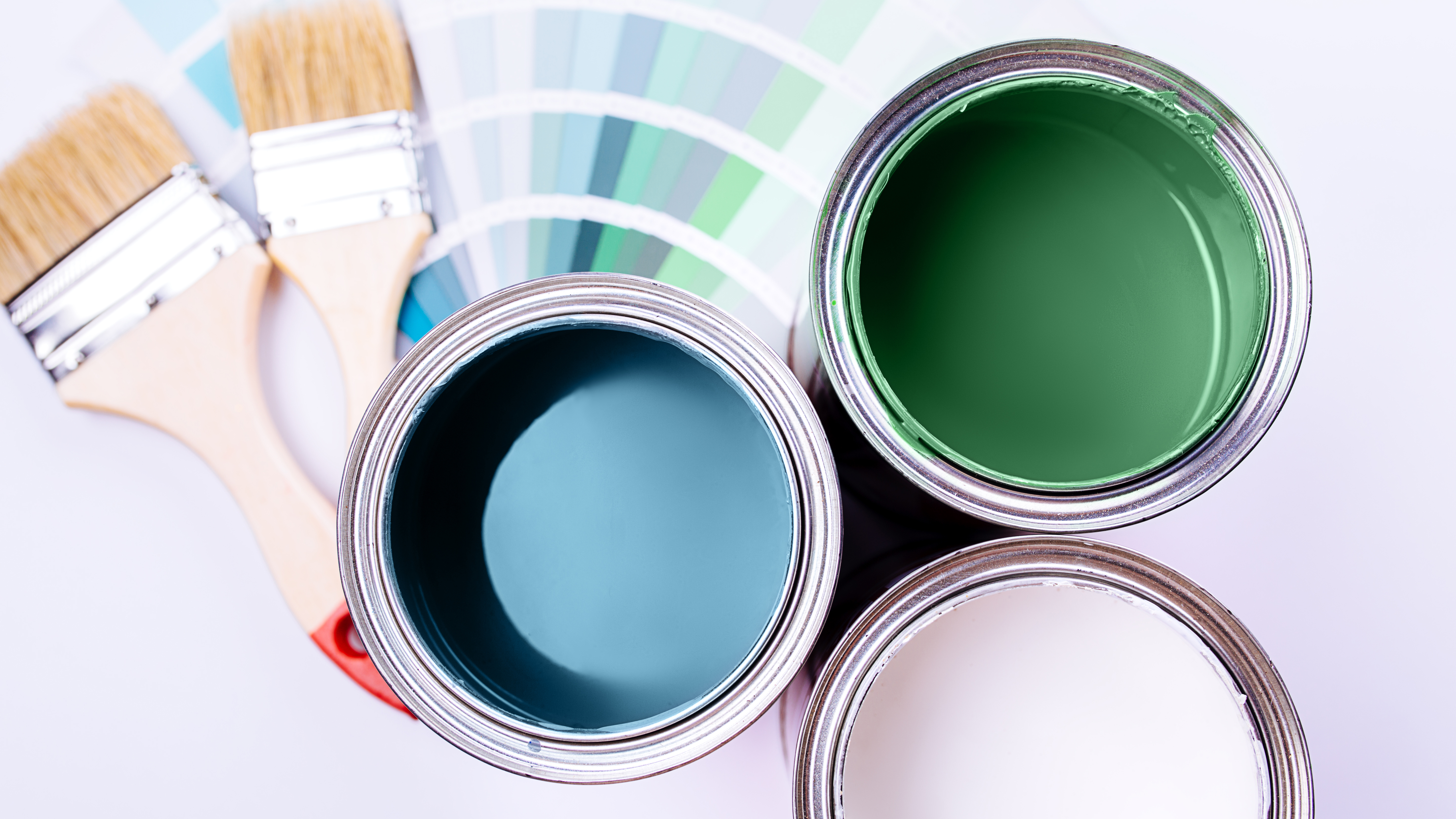
Whether you want to give your dated interiors a stylish makeover for the new year, or just want to paint a room, you might need some color inspiration from the pros. And if you’re stuck for new tones, the color trends set to be huge in 2024 have been revealed.
In fact, the interior and paint experts predict these stunning colors will define our interior design which everyone will want to have in their homes. So what can we expect for 2024? While we saw bold and intense colors dominating 2023, we can expect to see more shades of soothing blue, light pastels and earthy, nature-inspired tones like terracotta this coming year.
"I am energized by the chosen color trends for 2024 because they are full of personality. Even the neutrals have a richness to them," says interior designer, Katie Kime. "A soft honey yellow or a deep cracked-pepper black are an infinite improvement on the years-long trend of simple white on white," , "I love that these colors of the year encourage us to have perspective. If you're looking for a trend-forward refresh to your home in the new year, opt for one of these more adventurous colors - and perhaps a bold wallpaper to go with it - for a confident start to your 2024."
We can expect to see more shades of soothing blue, light pastels and earthy, nature-inspired tones like terracotta this coming year.
So before you plan your home renovation, here are just some of the stunning and expressive colors for 2024.
1. Blue Nova by Benjamin Moore
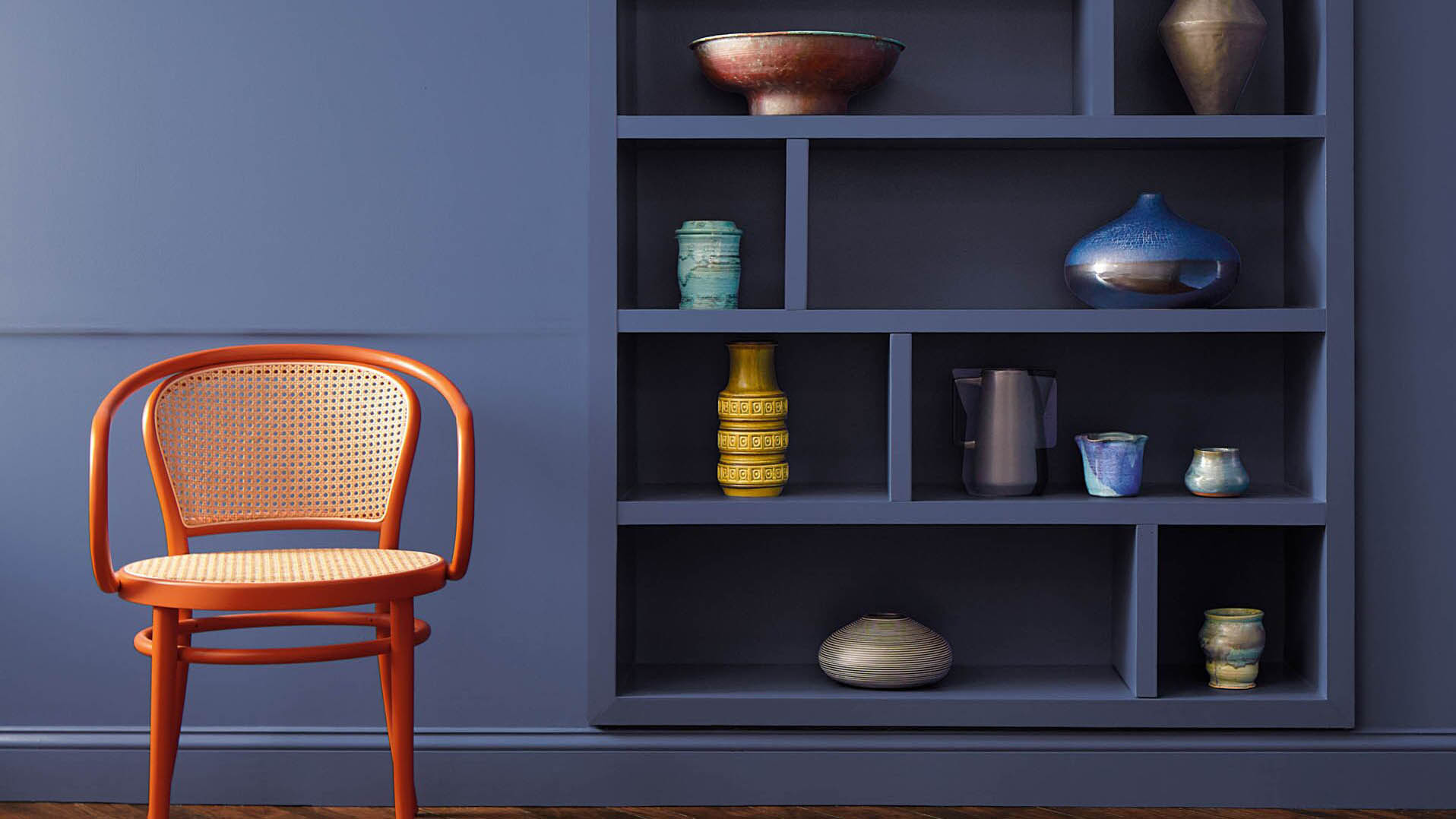
With its rich blend of blue and violet, Blue Nova by Benjamin Moore is deeper and darker than the other blue shades for 2024.
"This color is incredibly versatile because it pairs well with both light white oak and darker walnut. But also it effortlessly complements various metallic finishes, from chrome and matte black to brushed or antique gold hardware" adds interior designer Raf Michalowski. "In well-lit spaces, Blue Nova will hold its depth quite well. While it's true that any color appears lighter and brighter in ample light, Blue Nova, with its darker Light Reflectance Value (LRV), doesn't lose its impact."
This juxtaposed color took inspiration from the night sky and new star forming in space. As a result, it has an intense and rich tone that conveys elegance and calm. With its bold appeal, it will make any room look stylish and chic.
Get instant access to breaking news, the hottest reviews, great deals and helpful tips.
2. Skipping Stones by Dunn-Edwards
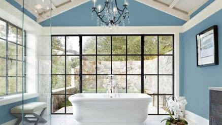
Another cool blue color of 2024 is Skipping Stones by Dunn-Edwards. This tone is slightly lighter than the other shades, yet still looks rich and vibrant.
Designed to add a sense of intrigue and calmness to a space, Skipping Stones is “part of the resurgence of blue and represents a shift away from the bold, warm-toned colors we’ve seen gain popularity over the past few years,” states color expert DeMing Carpenter at Dunn-Edwards.
In fact, this is the ideal tone for feature walls or doors, and looks stunning when paired with white and earthy colors such as warm, beiges and natural elements
3. Persimmon by HGTV Home by Sherwin-Williams
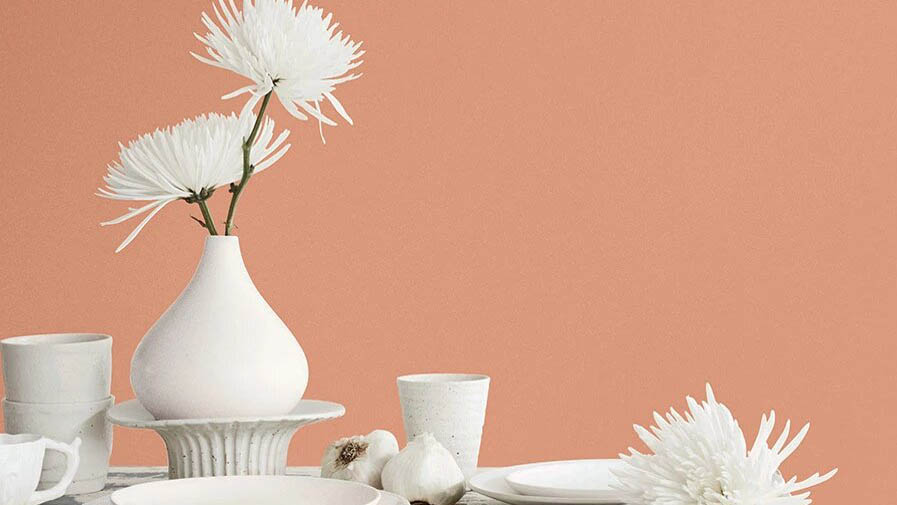
If you’re after a more earthy tone, Persimmon HGSW6339 by HGTV Home by Sherwin-Williams will bring warmth and light to a space without being too overpowering.
With its tangerine hue, and neutral, pastel undertones, Persimmon is designed to be warm and inviting, “making it perfect for spaces like living rooms and kitchens as it promotes positive relationships and conversation," says Ashley Banbury, Sherwin-Williams' color marketing manager. This cozy color is definitely needed to warm up the cold winter months.
4. Limitless by Glidden
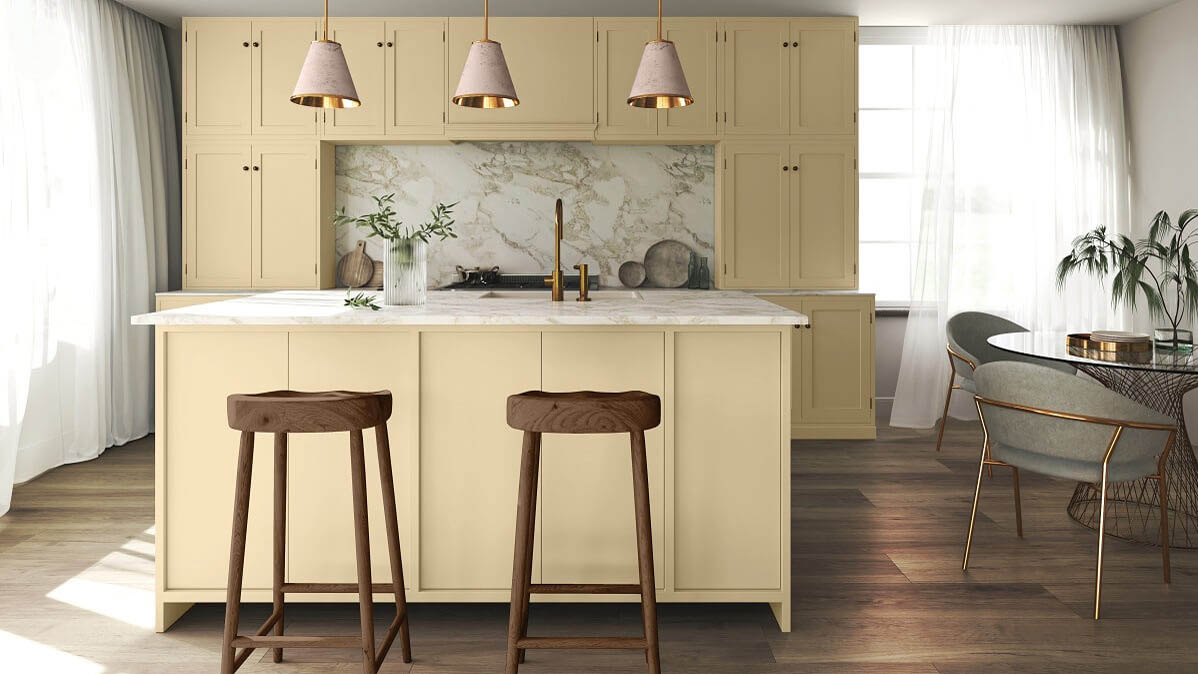
Another warm and earthy color is Limitless by Glidden. This honey-beige shade offers a fresh and neutral feel to a space without being too bright. It’s also a great versatile paint color that can be paired with different tones and interior styles.
Its light hue offers a cozy and calming feel, yet still an elegant choice. What’s more, Limitless will look stunning with both warm and cool tones such as whites, pastels, earthy-tones, and bold hues and brass metal accents.
“Limitless can be your main room color or act as an invigorating pop against warm or cool tones,” says Ashley McCollum, PPG color expert, Glidden brand. "Apply Limitless to exterior doors and even all-over exterior and trim to add curb appeal, and get ready for TFW (that feeling when) your house is the main character of your block.”
5. Ironside by Dutch Boy
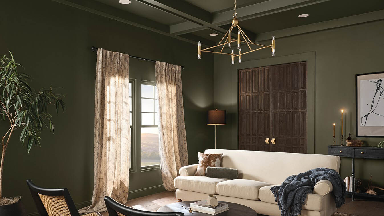
If you want to embrace the moody color trend with deep greens, then Ironside by Dutch Boy is the color of 2024. With its deep olive green hue, and cool, dark undertone, this will exude sophistication yet comfort in any room.
This nature-inspired tone is designed to be bold yet a comfortable space for relaxation. “Creating a space for wellness should be a driving factor in everyday life; that’s why taking a natural approach to healthy living and safe spaces is a pivotal part of the current landscape.” states Ashely Banbury, NCIDQ and color marketing manager of Dutch Boy.
Ironside’s versatile, dark tone can work well in open spaces, or an effective accent color in smaller living spaces, and home accessories.
6. Renew Blue by Valspar
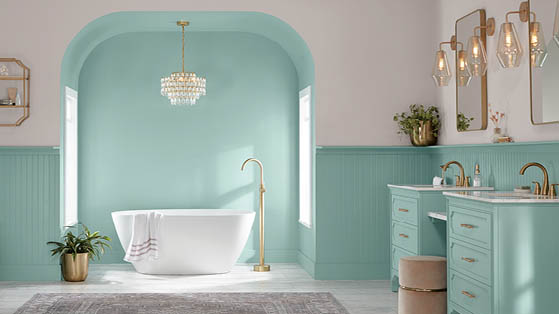
As the name suggests, Renew Blue by Valspar will bring a soothing, new lease of life to your home. This stunning, green-influenced blue tone aims to create a sense of peace and calm in a space.
"I particularly like Valspar’s pick alongside a warm taupe, like Valspar’s Perfect Backdrop, with a pastel gray, or layered atop a pale tint like the brand’s Dusk in the Valley, says Zara O'Hare. "
Since it’s a neutral pastel, Renew Blue will look beautiful when co-ordinated with other earthy neutrals, particularly handmade accessories.
7. Upward by Sherwin-Williams
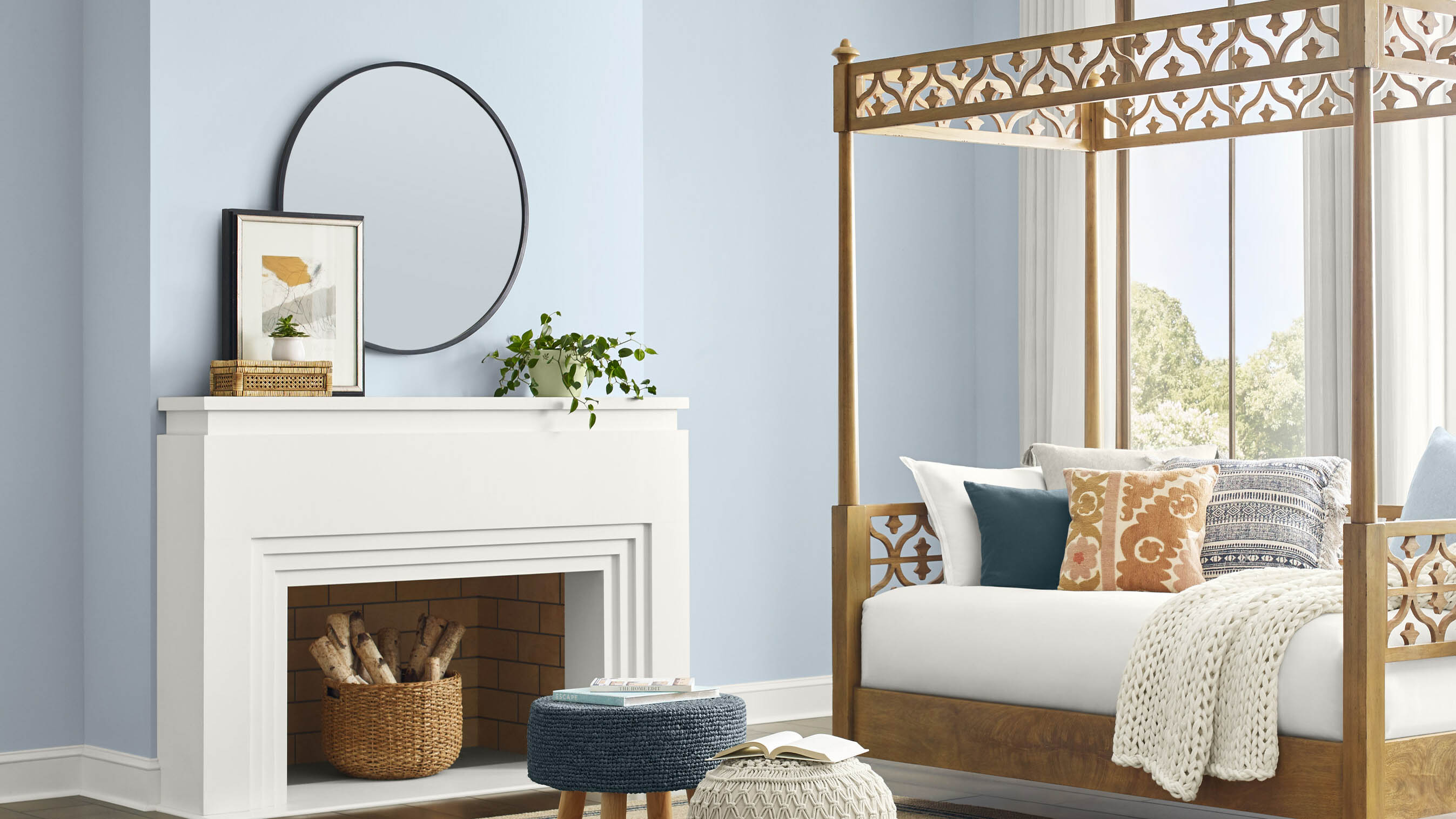
If you prefer a bright and breezy blue color is Upward by Sherwin-Williams. This light blue pastel aims to evoke feelings of peace and calm in a space.
"Upward looks great in homes with clean white finishes. But if you have earthy granite countertops and tiles, we suggest exploring other color options" says Zara O'Hare from Land of Rugs.
This blissful blue tone will work well as an accent wall, or paired with neutral, earthy accents around the home.
If you need some help choosing a color palette, a color wheel might help — interior designers swear by this hack when designing a room.
More from Tom's Guide
- Here are 7 ways to make your living room look more expensive
- Check out these 7 paint colors that make a room look bigger
- Plus, 5 paint colors that make you feel anxious

As the Homes Content Editor, Cynthia Lawrence covers all things homes, interior decorating, and garden-related. She has a wealth of editorial experience testing the latest, ‘must-have’ home appliances, writing buying guides and the handy ‘how to’ features.
Her work has been published in various titles including, T3, Top Ten Reviews, Ideal Home, Real Homes, Livingetc. and House Beautiful, amongst many.
With a rather unhealthy obsession for all things homes and interiors, she also has an interior design blog for style inspiration and savvy storage solutions (get rid of that clutter!). When she’s not testing cool products, she’ll be searching online for more decor ideas to spruce up her family home or looking for a great bargain!

 Club Benefits


