Interior designers swear by this hack when designing a room — I use it too
Top tip to create a balanced color palette
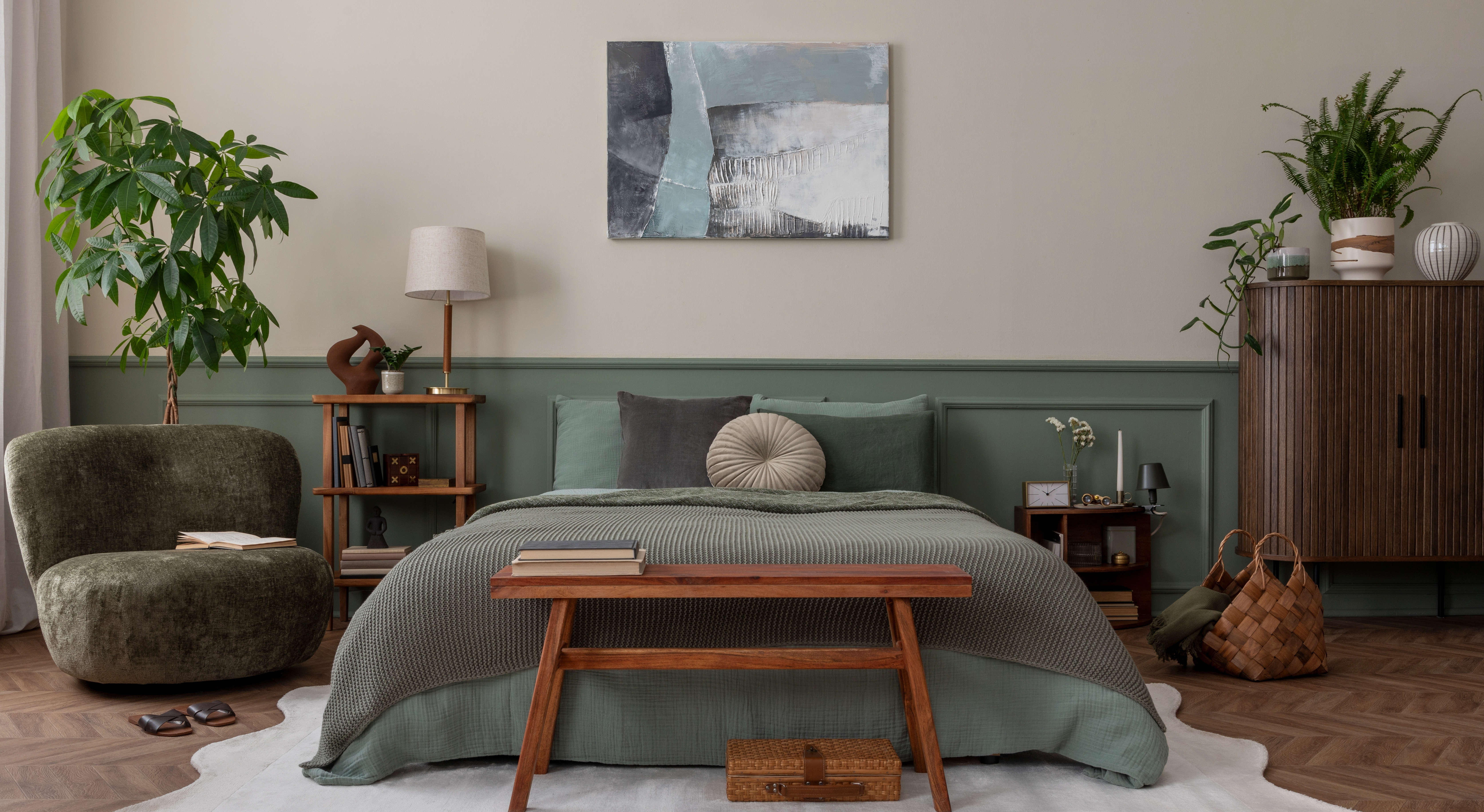
While some people have a good eye for color and instinctively know which colors work well together, it’s not so easy for others. Even when you put a lot of thought and preparation into choosing a color palette of paints, fabrics, furnishings and accessories for an interior room scheme, it doesn’t always come together as you’d hoped.
I haven’t always gotten it right, but through experience and a few mismatched interiors, I now rely on the color wheel to guarantee a balanced scheme. But the color wheel isn’t just for domestic DIYers. It’s a firm favorite with interior designers, artists and architects who use it in their day-to-day practice.
A colour wheel can save you from a color-clash disaster and give you the confidence to be bold with color rather than choosing a neutral scheme. So, move over beige and become a color lover.
Article continues belowWhat is a color wheel?
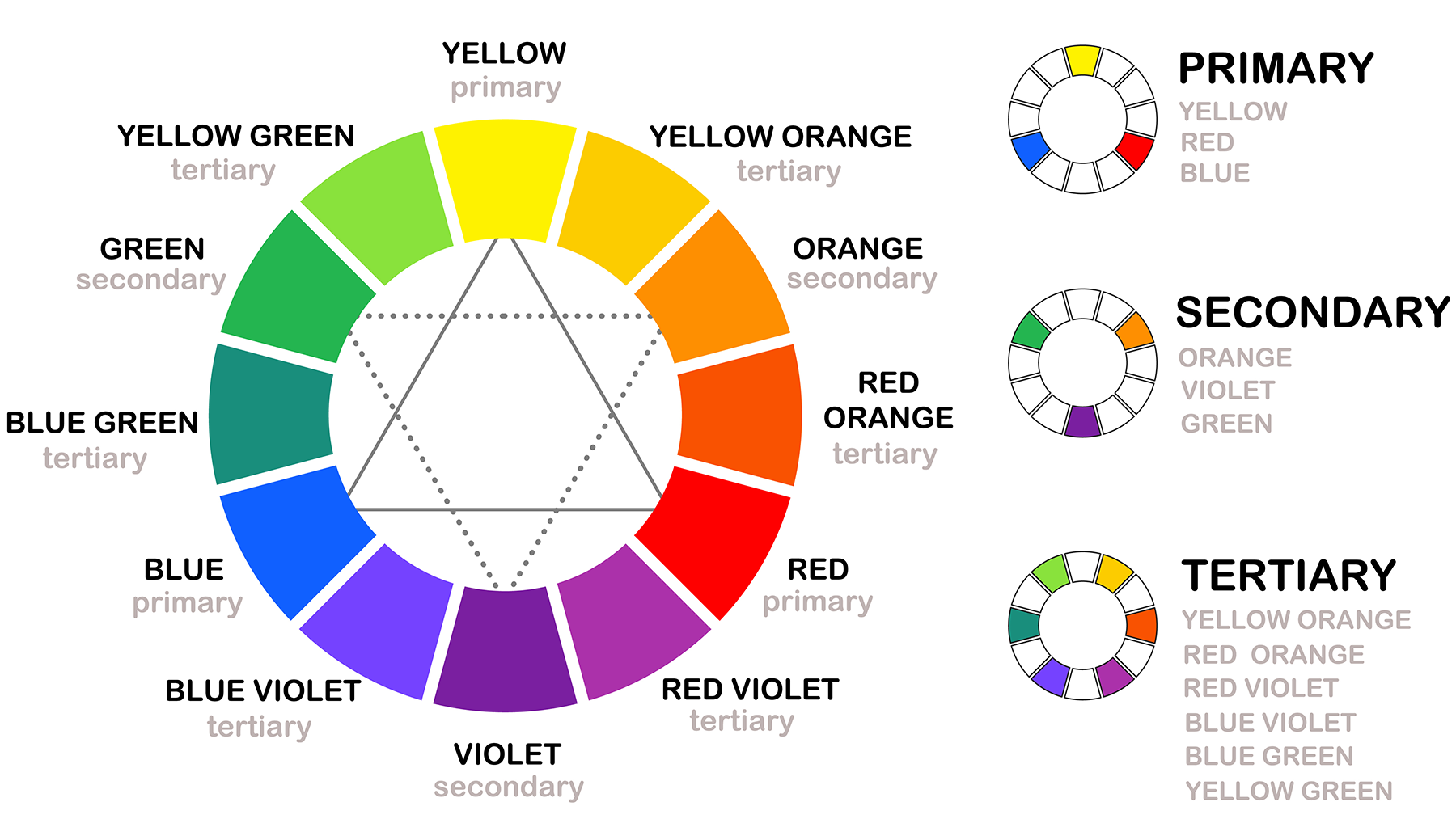
The color wheel is a diagram that shows the relationship between colors. It’s based on 12 color segments and is split between primary, secondary and tertiary colors, across a warm and cool spectrum.
The color breakdown
I was hopeless at mixing color when I was in school. My art teacher’s eyebrows shot up in despair whenever I entered the classroom. I never understood which colors to mix to make other colors. So, in case your color knowledge is as fundamental as mine, here’s a breakdown of how the colors in the color wheel work.
Primary colors
There are three primary colors: red, yellow, and blue. These are pure colors and can not be made from any other, while all other colors are made from them.
Secondary colors
When primary colors are mixed, they form secondary colors — green, orange and purple.
Get instant access to breaking news, the hottest reviews, great deals and helpful tips.
Tertiary colors
Tertiary colors are created when a primary color is mixed with a secondary color. These tertiary colors include red-orange, yellow-orange, yellow-green, blue-green, blue-violet, and red-violet. In simple terms, think magenta, turquoise and lime.
Color theory terms: getting the language right
You’ll often hear the terms ‘tone,’ ‘shade,’ and ‘hue’ mentioned in interior design. While they all may mean pretty much the same thing, there is a difference. And with a graphic designer as a husband, who understands a thing or two about color theory, I’m forever being told off for getting it wrong.
Hue — The hue refers to the pure pigment without the addition of a tint or shade and relates to primary and secondary colors.
Tone — This is when grey (equal parts black and white) is added to a color. It will reduce the color’s intensity and make it duller.
Shade — A shade is created when black is added to a color. Adding black to blue will create a darker shade of blue.
Tint — A tint is the opposite of a shade. So, instead of adding black to a color, white is added. If adding white to green, you’ll get a lighter tint of green.
Saturation — This refers to the intensity of the color. If the color has no added hues it is pure, but when other pigments are added it becomes less saturated.
Warm and cool colors
How can you tell if a color is warm or cool? It’s all related to the color temperature. Yellows, oranges and reds are warm, while blues, purples and greens are cool. Warm colors appear bright and bold and cool colors are calmer and more gentle.
Create a balanced color palette with a color wheel
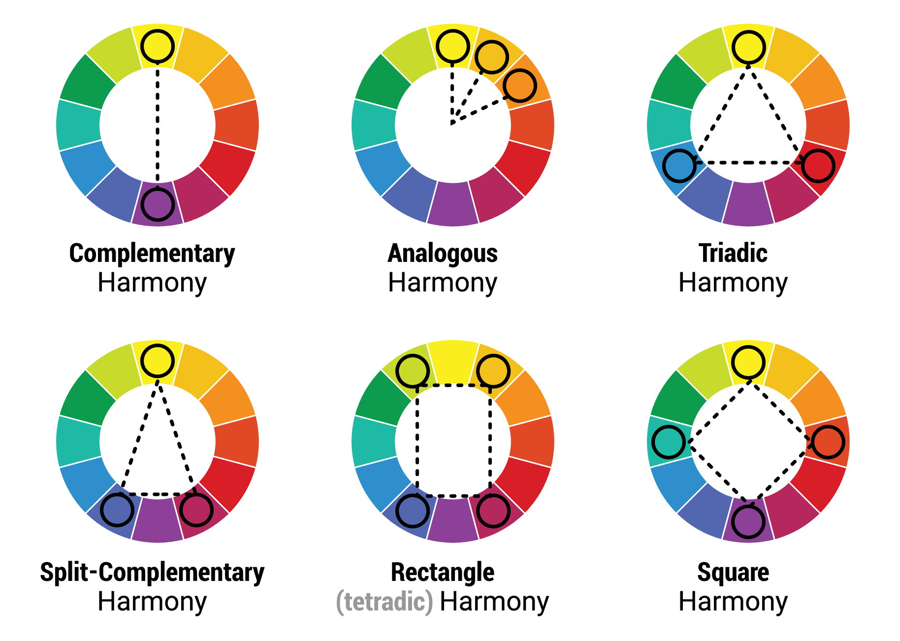
To help create a balanced mix of colors that work together, the color wheel is split into several sections. You can then use the following methods to select colors that are balanced and work in harmony.
Decorate with one color
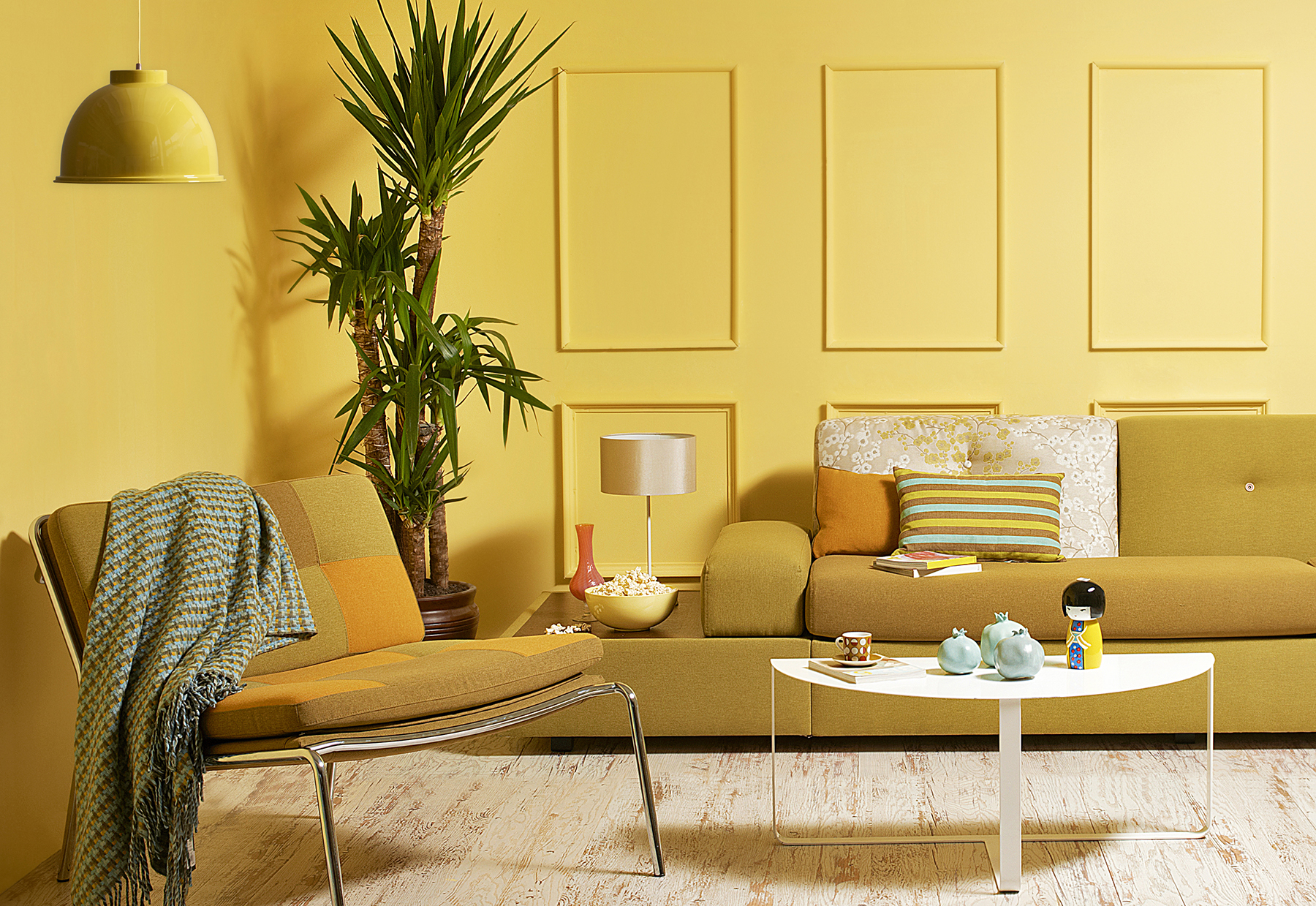
The easiest option is to choose a monochromatic color scheme, which is based on one color. Then to add variety, pick different hints and shades of the same color. But be warned, you’ll be surrounded by one color, so be sure you love it as there'll be no escape.
Be neighborly — go for harmony
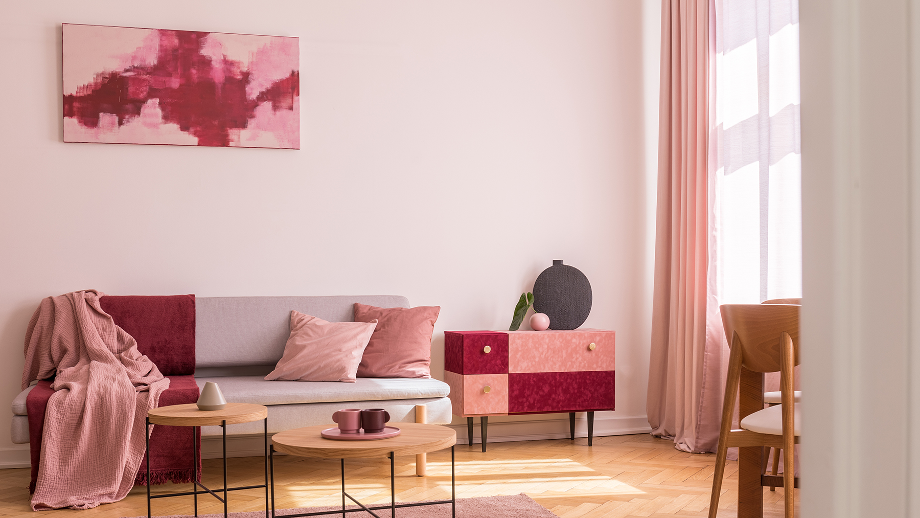
Select a color and then pick what’s either side it on the color wheel. Although it doesn’t roll off the tongue, it’s called an analogous color — meaning different but similar.
So, if you choose orange as your main color, select red or yellow as the colors that work in harmony. And although it may seem shocking, red and pink will work well together too.
Be opposite but complementary
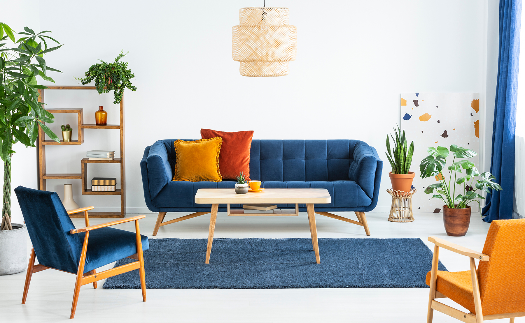
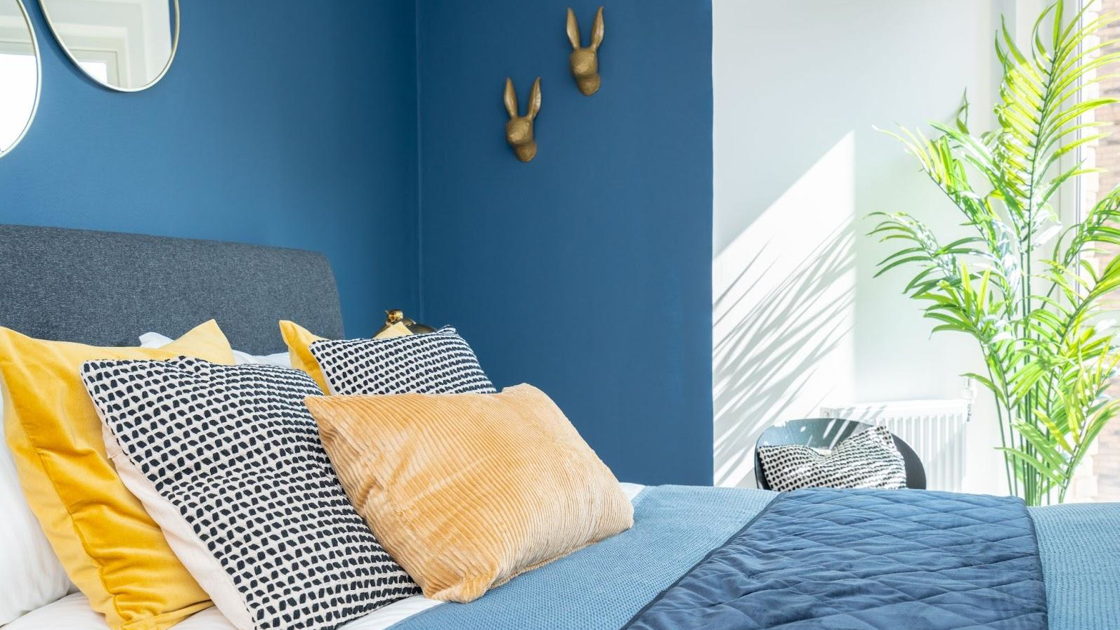
If you’re looking for some dramatic color, choose a complementary color on the opposite side of the color wheel. You’ll also be working with warm and cool colors, which will help balance one another. Think orange and blue, red and green or yellow and violet.
A triangle of color
Triadica color schemes are based on using three points on the color wheel. However, these vibrant schemes are not for the faint hearted unless you tone down the saturation level and select a hue that isn’t so bright. Are you brave enough to choose purple, orange and green?
Splitting color
It’s now starting to get a bit more complicated. For a split-complementary color, choose your main base color and then select two colors either side of your base color’s complementary color. It will form a ‘Y’ shape on the color wheel with your base color forming the stem. You’ll gain a color palette with a strong visual contrast.
Pairing up
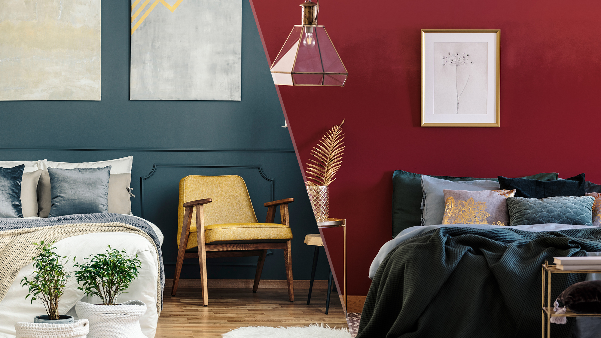
If you can handle more than three colors, you could apply the tedradic method to the color wheel, and there are two ways of doing it. This is where four colors are selected by using two complementary color pairs on the wheel based, which form a rectangle or square. You could be looking at green with red and blue with yellow.
Using four bright colors can be overpowering, so tone down the colors with a softer scheme to help it work — a pastel scheme based will look harmonious.
More from Tom's Guide

Camilla is the Homes Staff Writer and covers everything to do with homes and gardens. She has a wealth of editorial experience, mounting over 30 years, and covers news and features, tests products for reviews and compiles buying guides.
Her work has appeared in business and consumer titles, including Ideal Home, Real Homes, House Beautiful, Homebuilding & Renovation, and Kitchen & Bathroom Business. She’s even appeared on the cover of Your Home, writing about her own house renovation.
Although she’s obsessed with decorating her home, she also enjoys baking and trying out the latest kitchen appliances. But when she’s not inside, you’ll find her pottering about in her yard, tending to her vegetable patch or taking in her prized hydrangeas.

 Club Benefits


