Club Benefits


Whether you live in a small apartment or have a compact room, it can often feel cramped and dull. And if you don't have the budget to extend your home, there are quick and affordable alternatives!
According to experts, there are certain paint colors that make a room look bigger by creating the illusion of a larger space, and increasing visual impact. And while there is a common belief that all tiny spaces should be painted in brilliant white or "safe" neutral tones, there are bold colors that can be used to give it character.
So, if you’d like more space without renovating or moving, check out these 7 paint colors that make a room look bigger.

1. Crisp white
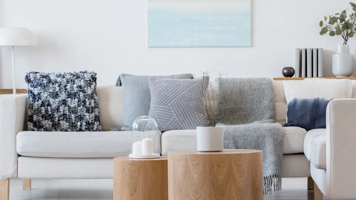
White is the popular, more common color solution for making a small room look bigger. This is especially the case in a room with plenty of natural light to bounce off the walls, or in south-facing rooms.
For compact spaces, opt for crisp or brilliant white tones to offer a clean feel to a room and create a calming ambiance. To avoid it feeling too clinical, however, mix in some warm or bright colors in the furnishings, accessories, or even lush plants to add a pop of color. What’s more, white stands out better when paired with a darker wooden flooring or a beautiful rug.
Typically, eggshell or satin finishes will help reflect the light, creating the illusion of even more space.
2. Cool grey
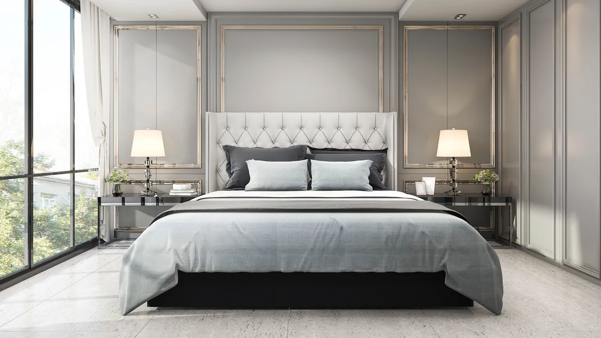
If you didn’t want to stick to boring white tones, another popular alternative is light cool grey. This tone can instantly make a small space appear and feel spacious.
In fact, a light grey brings the same quality that a white tone does, allowing light to reflect off the walls, while also keeping the room "cool." In addition, light grey tones can compliment any color or interior scheme; it's also a great option for renters.
On the other hand, if you’re the one renting, check out these tips on how to decorate a rental property without annoying your landlord!
3. Pale blue

Traditionally, blue is known to be a calming color, and so if you want a soothing, airy space, pale blue can really open up a room. When paired with other lighter tones, such as white or blush pink, pale blue shades can feel relaxing and fresh — reminiscent of blue skies and ocean sprays!
Pale blue works well in kitchens, bathrooms, living rooms or playrooms, creating an airy space. In fact, experts suggest pairing pale blue tones with white, cream or warm, woody colors such as terracotta to make an impact. For a sleek finish, you can also pair this color with metallics or chrome accents.
4. Sea green

Similarly, the color green is associated with the beauty of nature and botanicals. So if you want to create an earthy ambiance, Sea Green (or a softer shade of green) is a great choice. Best of all, softer shades of green can instantly make a small room appear bigger, and turn a drab space into a calm sanctuary.
While green is a versatile color, it tends to work well in kitchens, bedrooms or vibrant playrooms. Additionally, such tones pair well with wooden furniture, earthy tones and natural materials.
5. Light taupe

If you don’t want the harshness of white but still prefer a neutral color, light taupe is a great alternative. This classic color falls between brown and grey, and it's bright enough for the light to bounce off the walls, making a small room look bigger.
Unlike brilliant white tones, light taupe or greige (think grey and beige) can add warmth to any room, and make a space look elegant. In fact, when used in a space with architectural character, it can make a room look more expensive, and give it a timeless feel. Best of all, these tones can go well with most colors and interior styles.
Just ensure you choose the right shade of taupe. Typically, a light shade of taupe will make small, dark rooms feel brighter and more spacious; however, dark taupe will create the opposite effect.
"The constant battle and debate between light and dark can feel overwhelming at the best of times, let alone when you’re contending with a smaller space," agrees Michael Rolland, interiors expert and managing director of The Paint Shed. "Lighter palettes of warm and cool neutrals can allow for extra light in a smaller room, giving the illusion of more space."
6. Earthy pinks

Far from being a feminine color, earthy/blush pinks have gained popularity over the years. And if you want to make a small room look bigger, a soft shade of pink can really open things up.
In addition, earthy pinks work best in a room with plenty of natural light and create a cozy, relaxing space. Although it might seem tricky to decorate around this color, you can easily pair it with light neutral shades like beige, sand, and ivory for that earthy feel. Or if you’re opting for a blush pink tone, this usually works well with solid woods, plush velvet, metals or leather furnishings.
7. Warm neutrals

You can’t go wrong with neutral colors, and these can really make a room look and feel bigger. Warm neutrals are the ideal base color for any room, incorporating earthy tones, such as beige, yellow, brown and off-whites. What's more, these soft hues create a calm and cozy space to relax in at all times.
When choosing a neutral, it’s important to consider the amount of natural light in that room. For instance, if your space already gets plenty of sunlight, yellow tones can either make it look too bright, or can often look more brown than yellow. In this case, opt for a neutral that is more on the beige or off-white scale and balance the interior scheme with other neutrals such as gold, copper and bronze. "It is recommended to paint from dark-to-light, keeping the darkest colors towards the floor, slowly disappearing into the white ceiling," suggests Rolland. "This will give an open and airy, cloud-like feel to the room where colors disappear to almost nothing."
Tips for painting a room to look bigger
Other things to consider when painting a small room include what direction the windows face. Experts suggest that dark colors work well in north-facing rooms, while sunset tones (yellow, orange and reds) look better in a west-facing room; light colors do better in brighter, south-facing spaces.
More from Tom's Guide
- Check out these 7 ways to double your space in a small kitchen
- Also, do you have any of these 7 things making your home look cheap?
- Try out these 7 hacks to make a small bedroom look bigger