iOS 26's Liquid Glass looks amazing, except for this one glaring issue
Apple needs to do something about app tinting
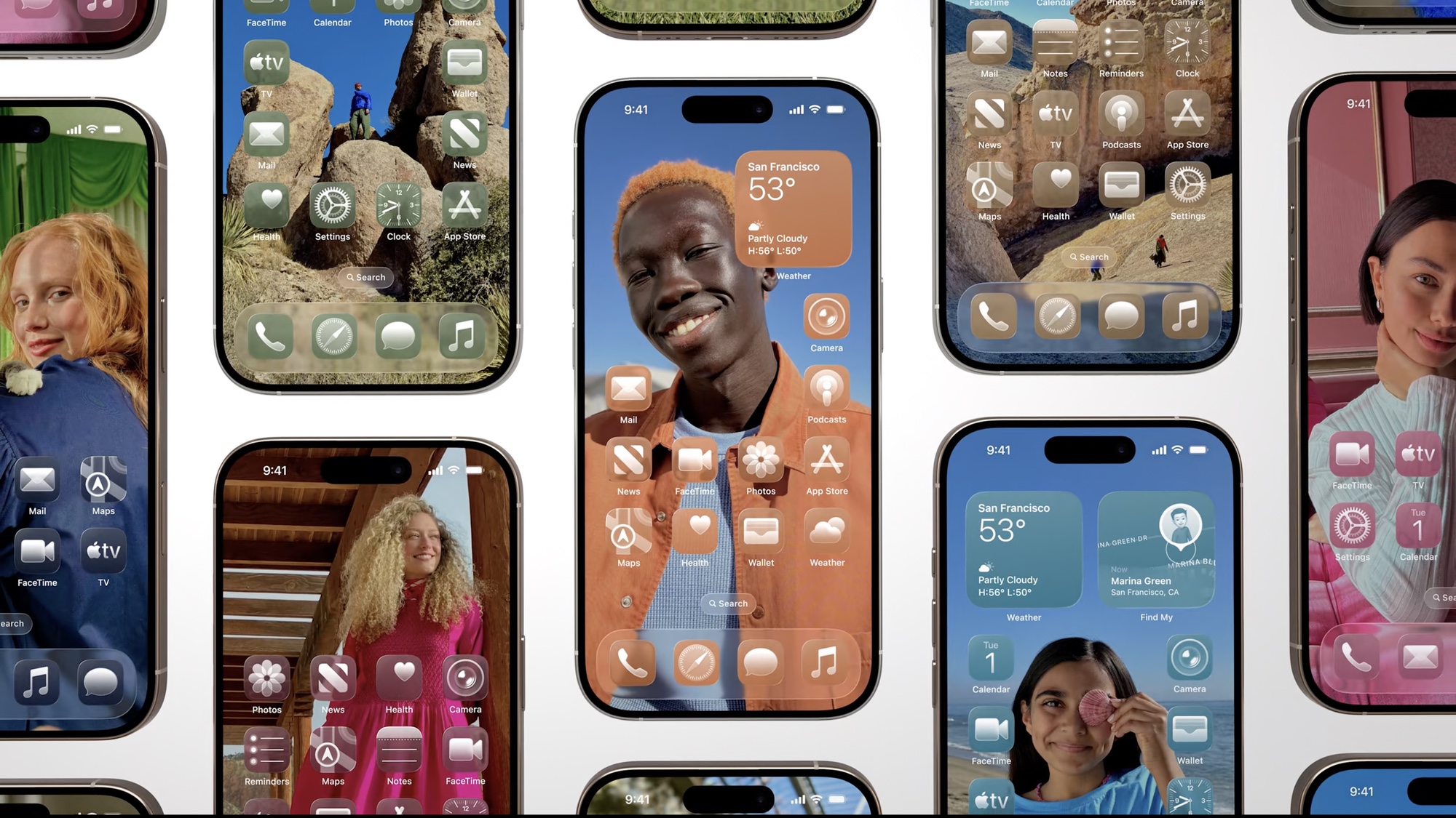
WWDC 2025 revealed some pretty amazing new features and developments that will land on Apple products later this year. And certainly the biggest change figures to be Liquid Glass, the new design language coming to all of Apple's different software platforms.
I'll have a better idea of how Liquid Glass performs once I get a chance to use Apple's beta software, particularly when it comes to iOS 26 on my iPhone. But watching Apple's keynote on Monday (June 9) and looking at the iOS 26 preview page, I'm concerned that the updated software may not fix one of my big issues introduced with iOS 18.
As you may recall, iOS 18 brought a new way to customize your phone's home screen including app tinting. This feature allowed you to change the color of your app icons — at least in theory. In practice, the finished result made it look like you poured sauce all over your apps.
Article continues below 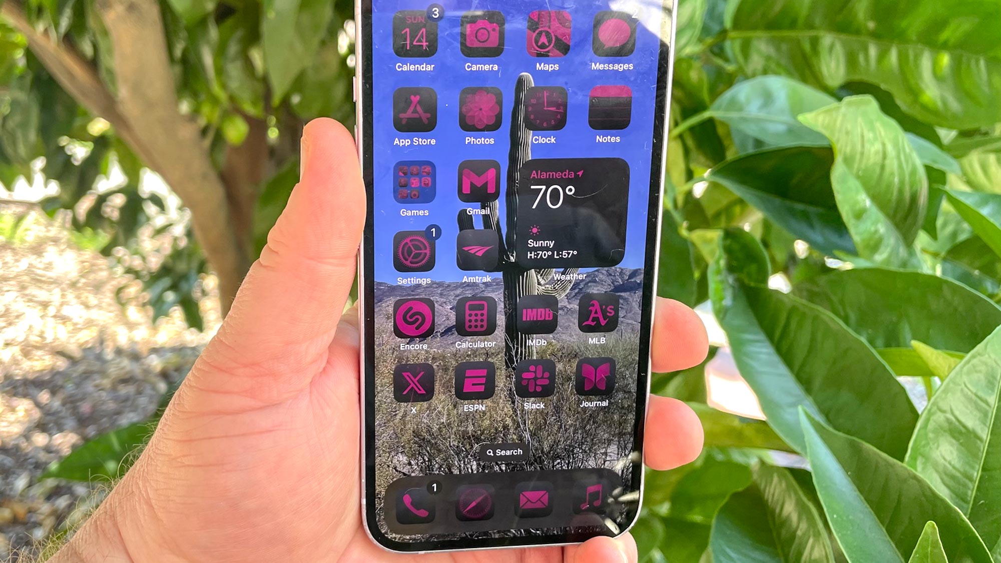
Ultimately, I never wound up using app tinting to adjust the color of my home screen icons — except when I wanted to show how weird it looked. I had hoped that iOS 26 would improve things, but everything I've seen so far doesn't fill me with hope.
What iOS 26's app tinting look like
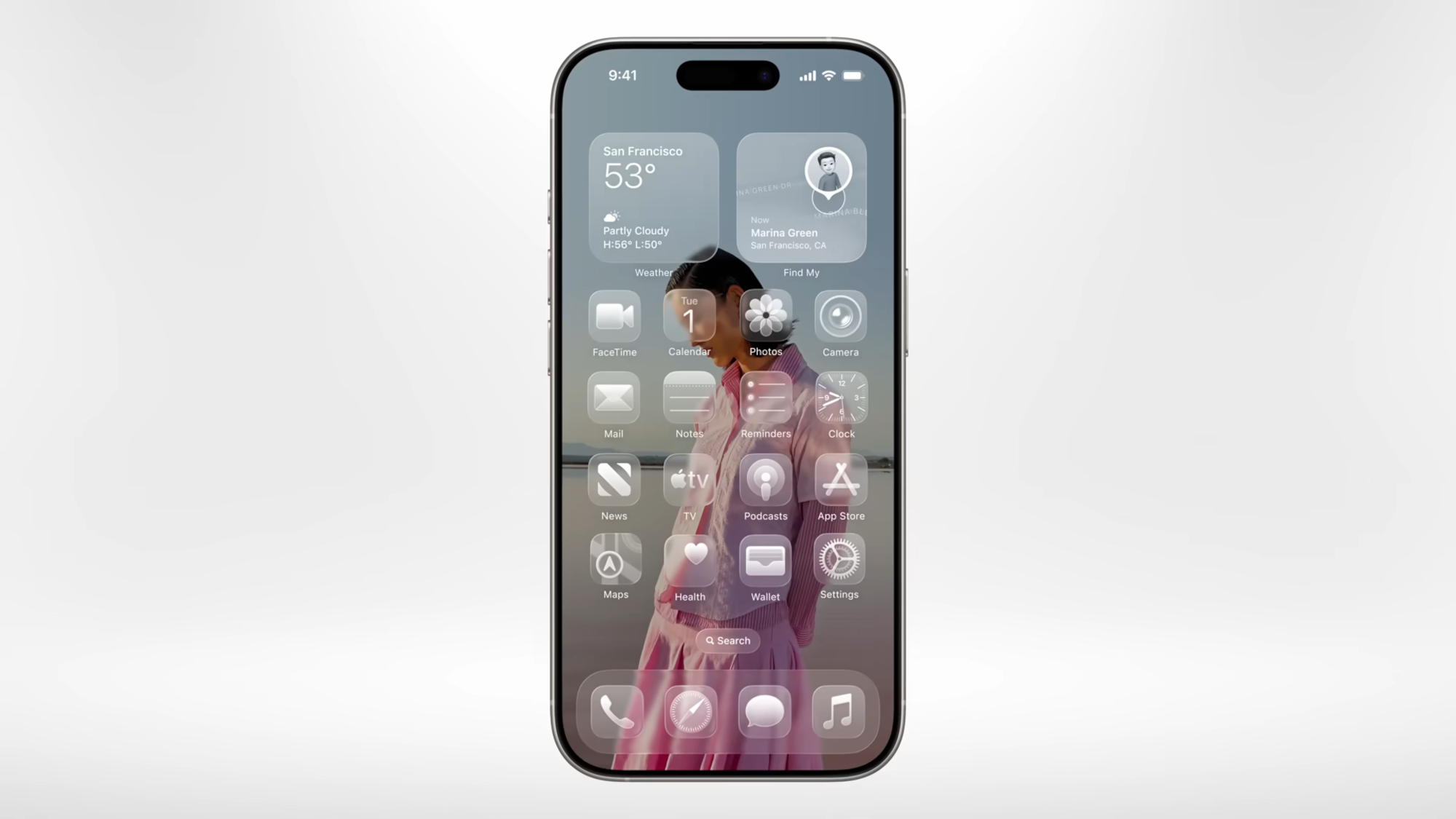
As a reminder, Liquid Glass is Apple’s new design language that aims to improve the look of, well, everything. Essentially, Apple wants to create an iconic, stylized design that's uniform across everything from iPhones to Macs to Apple Watches.
And from what we saw at WWDC, Apple seems to have managed this, thanks to the new translucent look, expandable menus and a design that works with the contours of the screen of whatever device you happen to be using.
During the part of the WWDC keynote that focused on Liquid Glass, Apple gave us a glimpse at what tinting your apps will look like in iOS 26. When you change the color of an app in the new update, the main body of the icon will still be slightly translucent, but will take on a slight hue that matches your chosen color. Meanwhile, the main element of the icon will be brighter, usually close to white, but again with a shade of the chosen color.
Get instant access to breaking news, the hottest reviews, great deals and helpful tips.
Initially, I liked the look of the new tints when I first saw them, although that's changed the more I look at them. The final product just looks dull, as the icons don't jumping out at me. Take a look at the screenshot above with the Map widget in the top right corner. The person icon in that map looks really low-res as a result of that tinting.
And this is just with Apple's built-in apps on the iPhone. It's third-part apps where the really issues have been with app tinting in iOS 18.
The trouble with third-party tinted apps
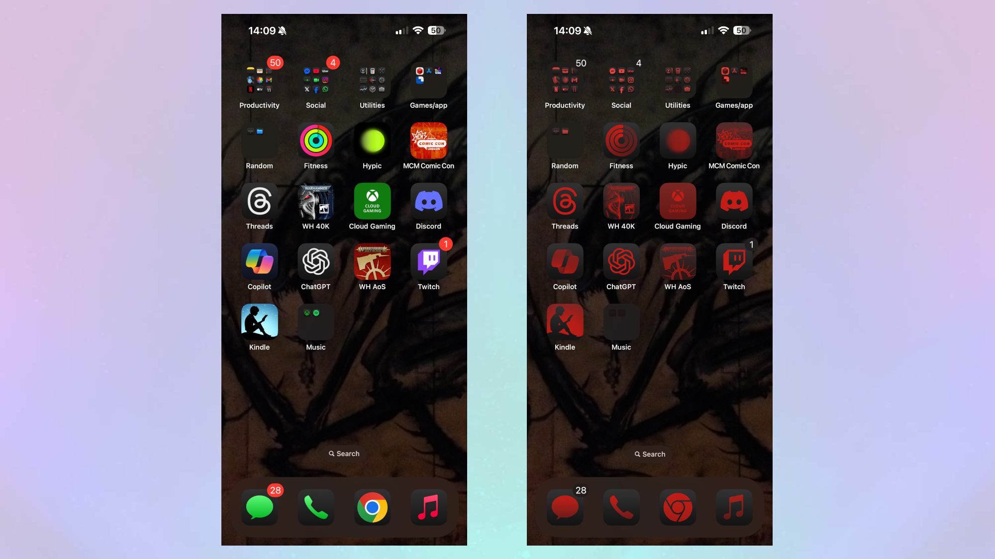
iOS 18's app tinting doesn't just look blocky — the real issue surfaces with third-party apps downloaded from the App Store. In the above image, you can see the home screen for my iPhone 15 Pro Max, which includes a mix of Apple's apps and a few third-party ones. Notice how Apple's apps split the colors fine, the background is black and the main element is red.
However, if you look at my Warhammer 40,000 app or the MCM ComicCon app, you'll notice that the phone just shoves a red screen over them. There's no attempt made to make them match the other apps, and in fairness, I don't see how you could. So what you end up with is these odd-looking red blotches on the screen.
Consider the Kindle app, which features a lovely design of someone reading normally; with the tint, though, it's just a block of color.
There's more than just aesthetics at play here. App tinting as it stands makes it just a little more difficult to quickly pick the right app. It can be annoying when you're in a rush and you accidentally tap the wrong icon because they all start to look the same. This is made worse for someone with a vision problem like myself, where images on a screen can be harder to read.
What could iOS 26 third-party apps look like with a tint?
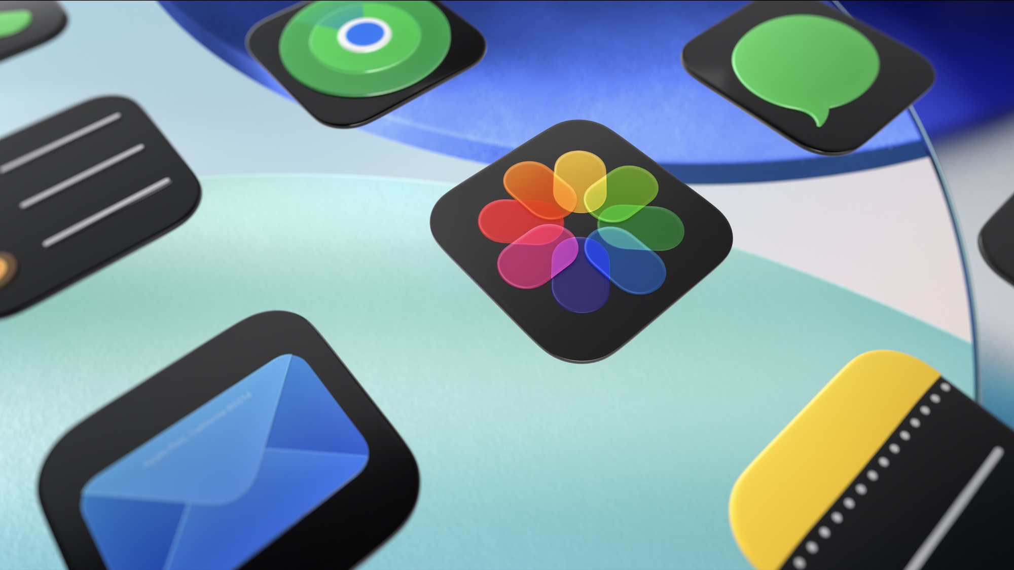
We won't really know what app tinting in iOS 26 looks like until the update comes out, and we see how developers tweak their apps for the Liquid glass interface. But there are ways Apple could bolster the chances of icons looking their best.
The most obvious answer is to simply make the icons more translucent, while keeping their original color. This isn't a terrible idea, although it would remove the feeling of uniformity that Apple appears to be going for.
Alternatively, Apple could make sure each developer codes in the same design options for their apps so that they match the look of the native apps. That said, developing an app is difficult enough and I can't see companies making sure each has an option in case someone tweaks the tint of an icon.
The final option would be to repeat what was done in iOS 18, but that seems even less likely as it would ruin the sleek look of the new home screen.
While I don't think any design will entice me to actually tint my apps, I am curious what you all think. Let me know: do you already make use of app tinting and will you continue to do so, or do you view it as more of an option you won’t bother to use.
More from Tom's Guide
- iPhone 17 could get a display upgrade — but still be inferior to the iPhone 17 Pro
- I’m stoked about iOS 26 Call Screening, but it proves Apple Intelligence is still playing catch up — here’s why
- WWDC 2025 — 7 biggest announcements that will actually make your life easier

Josh was a staff writer for Tom's Guide is based in the UK. He has worked for several publications but now works primarily on mobile phones. Outside of phones, he has a passion for video games, novels, and Warhammer.
You must confirm your public display name before commenting
Please logout and then login again, you will then be prompted to enter your display name.

 Club Benefits


