iOS 26's Liquid Glass design can be confusing to look at — but there’s a way to change that
Readability can be a concern for the OS's default look
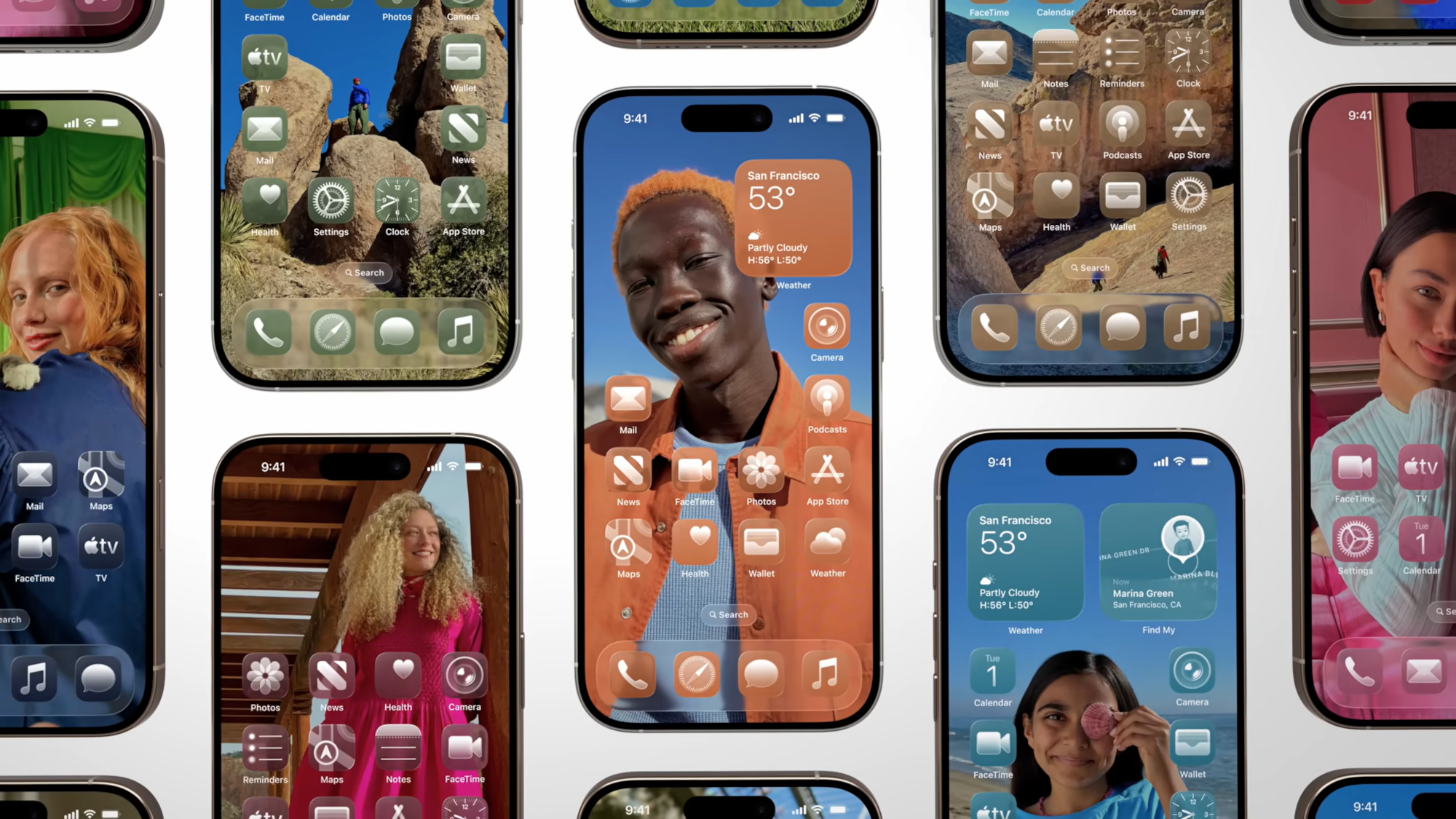
Developers are getting their first taste of iOS 26 and its Liquid Glass design, and the initial impressions appear to be mixed. Fortunately, it appears that Apple has included a means to minimize the glassy look for those who aren’t a fan.
Apple launched the first developer beta for iOS 26, which has given many their first look at the new Liquid Glass design in the real world. This includes Android Authority's Druv Bhutan, who shows off how Liquid Glass’ new translucent look for on-screen elements and expandable menus look in practice. However, it should be noted that this is only the first beta, so there could be a number of alterations made and issues fixed before we see the final version of the software, slated to arrive this fall.
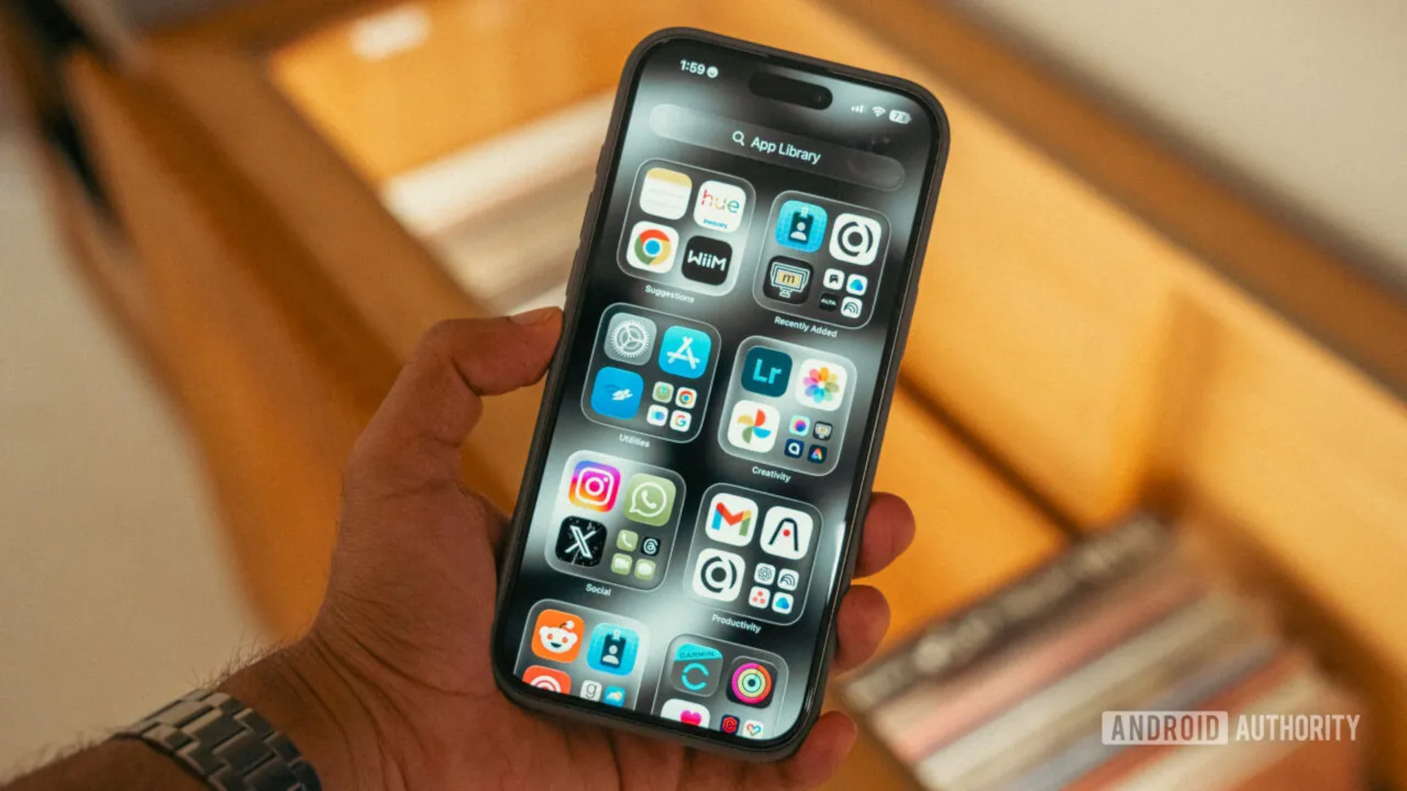
According to the report, this new look is best shown off on the home screen, with app icons that appear like digital glass. Meanwhile, when it comes to the Control Center and Lock Screen, Apple has made the flat backgrounds translucent layers, which helps to make them feel like they’re “floating rather than just sitting on top of your wallpaper.”
However, there are some issues caused by this new transparent look. According to the report, both the Control Center and the browser pop-ups can be difficult to read depending on the chosen background. This issue may be solved in future versions of the beta, but there is a possible solution in the Settings menu already.
There is an option for those who want less transparency
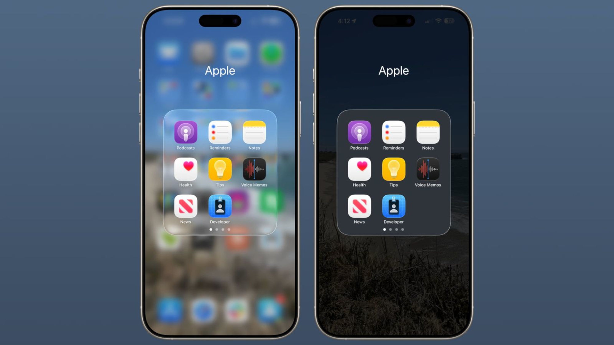
Apple has included a specific option to limit the transparency of the icons, according to a recent report from MacRumors.
iOS 26 includes several accessibility options to help customize the look of the phone for different visual needs. But this one is particularly useful to know about if you're not getting on well with the transparency of the new interface.
All users will need to do is find the Accessibility section in the Settings App, then navigate to the Display and Text Size option. There, they will find a toggle titled Reduce Transparency, which will add a darker background to areas like the Control Center, app icons and more.
Get instant access to breaking news, the hottest reviews, great deals and helpful tips.
The screenshots make it clear that activating this option will not remove all the translucency, but just limit its effect. It also won’t change the overall look of the app icons or revert the design back to iOS 18’s look.
As it stands, iOS 26 is looking to be a pretty major visual change and it will take some getting used to. However, it’s good to know that there are options for those who aren’t a fan of the see-through design.
More from Tom's Guide
- Are rugged phones worth it? I tried one for a month to find out — here’s what happened
- iPhone 17 could get a display upgrade — but still be inferior to the iPhone 17 Pro
- Live Updates just arrived on Android 16 — but it's not quite finished yet

Josh was a staff writer for Tom's Guide is based in the UK. He has worked for several publications but now works primarily on mobile phones. Outside of phones, he has a passion for video games, novels, and Warhammer.
You must confirm your public display name before commenting
Please logout and then login again, you will then be prompted to enter your display name.

 Club Benefits


