Club Benefits


If you were envious about the flashy lights of the Nothing Phone (1) but couldn’t get it because the phone wasn’t available stateside, then you’ll be delighted to know that the Nothing Phone (2) is now officially on sale in the U.S. This is big news, seeing that it’ll help consumers become acquainted with the Carl Pei-backed company, which makes audio gear in addition to phones.
I’ve spent the last 24 hours getting a feel for the Nothing Phone (2), so now I have a better idea of what’s making a lasting impression on me. In a sea of Android phones, there’s no denying the uniqueness of the phone amongst the usual slate designs out there.
After the frenzied campaign Nothing built around its products over the last year — remember the Nothing Ear (2)? — the Nothing Phone (2) arrives with the potential of being one of the best Android phones you can buy. At the very least, it's a top contender in the midrange smartphone space currently dominated by Samsung and Google.

Here's a closer look at the things I like about the Nothing Phone (2) after a day of use, and something I'm not a big fan of.
What I love about the Nothing Phone (2)
Nothing OS 2.0 widgets are aesthetically different
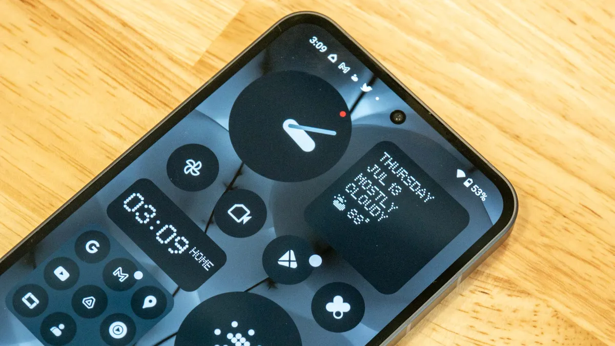
One of Android’s big selling points is its deep customization, particularly when it comes to the way the interface looks and feels. However, I’m not the kind of person that works a lot to customize my phone’s interface — I’m usually content with the default look out of the box.
That’s why the biggest thing I like about the Nothing Phone (2) aren’t the lights on the back, nor the transparent design. Instead, I’ve fallen in love most with Nothing OS 2.0 in my initial Nothing Phone (2) hands-on.
Specifically, it’s the default set of widgets with Nothing OS 2.0 that reels me in the most about the phone. Some may argue that stock Android is minimalism at its finest, but Nothing OS 2.0 takes a detour with its aesthetics. The interface is as minimalistic as they come, with attention to detail to the typography it uses. The weather widget exemplifies Nothing’s penchant for minimalism, with its solid colors, and clean shapes.
Quite simply, it's one of the most attractive Android skins I've seen in recent memory.
Premium construction reminds me of the iPhone

As I unboxed the Nothing Phone (2), it became apparent to me that the device reminded me a lot of the iPhone 14 Pro Max. Considering that the Nothing Phone (2) is a fraction of the iPhone's cost, I’m really astounded by how it delivers a similar, premium construction — such as how the 100% recycled aluminum frame that outlines the phone tastefully adds to its premium look. That outer frame on the Nothing Phone (2) is also flat, just like Apple’s flagship.
Unlike the iPhone 14 Pro Max though, I love how the Nothing Phone (2) feels better in the hand due to how the glass on the back curves around the edges. This results in a more comfortable feel, whereas the iPhone’s sharp edges tend to dig into my hand. Additionally, it’s hard for me to overlook the fact that Nothing's phone is much lighter too. The iPhone 14 Pro Max feels dense by comparison.
For a phone that costs a lot less, it’s really impressive how the Nothing Phone (2) exudes a premium look and feel.
Flashier Glyph Interface

Everyone I’ve shown the Nothing Phone (2) to has been drawn to its Glyph Interface, including myself upon activating the lights for the first time. Rightfully so — it’s a feature unlike any other, but Nothing changed things up slightly this time around by splicing the LED light strips into even more segments.
Technically, there are more lights on this new phone to personalize the Glyph Interface for different functions and notifications. The Glyph Composer allows me to create ringtones using custom lighting sequences and sounds, which I can then attribute to individual contacts. That way, I can visually tell who’s calling me by just looking at the lighting sequence of the Glyph Interface.
These are all flashy features that lend to the Nothing Phone (2)’s allure, but I’m also excited by how the Glyph Interface will be extended to third-party integrations — like Uber, where it’ll display a timer using the lights to indicate your ride’s arrival.
What I hate about the Nothing Phone (2)
The price makes it a tougher sell

I get that the Nothing Phone (2) is a bigger, flashier phone than its predecessor, but I feel that the price increase makes for a tougher sell. The new phone costs $600, compared to £399 for the original Nothing Phone (about $525 if you do a straight currency conversion).
The Nothing Phone (2)'s closest rival on the Android side is the Google Pixel 7a — which normally costs $499, though Pixel 7a deals currently lower that cost by about $50. The most recent Apple iPhone SE also makes a compelling argument in the midrange territory at an even lower $429 cost.
It's critical for companies to convince consumers to choose their phone over the alternatives. That’s why I’m not much of a fan of the Nothing Phone (2)'s cost, but I suppose if it’s able to deliver top-notch results with its cameras — the original phone's downfall, I might add — only then it might prove itself enough to justify a higher cost.
I really want to be optimistic while continuing to put the Nothing Phone (2) through its paces, but I'm crossing my fingers that the new sensor in the main camera is enough to propel it to the Pixel 7a level. Most people buying a smartphone look for a strong performance out of the camera. It's one of those must-have qualities that can make or break a phone.
Even with all the flashy lights, premium looks, and fresh take on Android with Nothing OS 2.0, the Nothing Phone (2)'s success mainly hinges on how well it can prove it stay in the ring against Google's popular mid-ranger.
More from Tom's Guide