iOS 18 Mail has a new look — and I've got 3 big problems with it
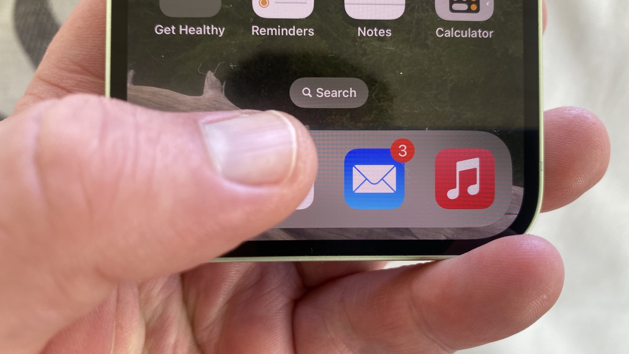
Redesigns usually go hand-in-hand with hyperbole, as any change inevitably brings a chorus of complaints that the new look has ruined things beyond compare.
You only have to look at the redesigned Photos app in iOS 18, which arrived to howls of complaints that faded away as people got used to the changes. In fact, I'm Exhibit A of someone who's learned to live with the revamped Photos.
So please bear all that in mind when I tell you that whatever Apple hoped to achieve with the reorganization of the Mail app that went live with iOS 18.2, this current version ain't it.
Article continues belowI applaud the idea behind Apple's Mail renovations. Apple is splitting up the inbox into different categories — one for your primary email, but separate areas to contain receipts, newsletters and other subscriptions and promotional emails. Apple want to put everything in its proper place in Mail, with the idea being that it will help you more easily find the types of messages you're looking for.
That all sounds great on paper. Unfortunately, the way it's been implemented in the iOS 18.2 beta undermines that goal by making your inbox harder to manage and your messages more difficult to find.
Here are the problems I've spotted with Mail after using it over the weekend.
No message indicators

The screenshot above shows my inbox in Mail, with a view of the Primary inbox. Looking at it, you'd assume I have no new messages. After all, there's no indicator of any unread or newly arrived message — no counter or dot or visual cue that anything's awaiting my attention.
Get instant access to breaking news, the hottest reviews, great deals and helpful tips.
There's just one problem — I do have a new message.
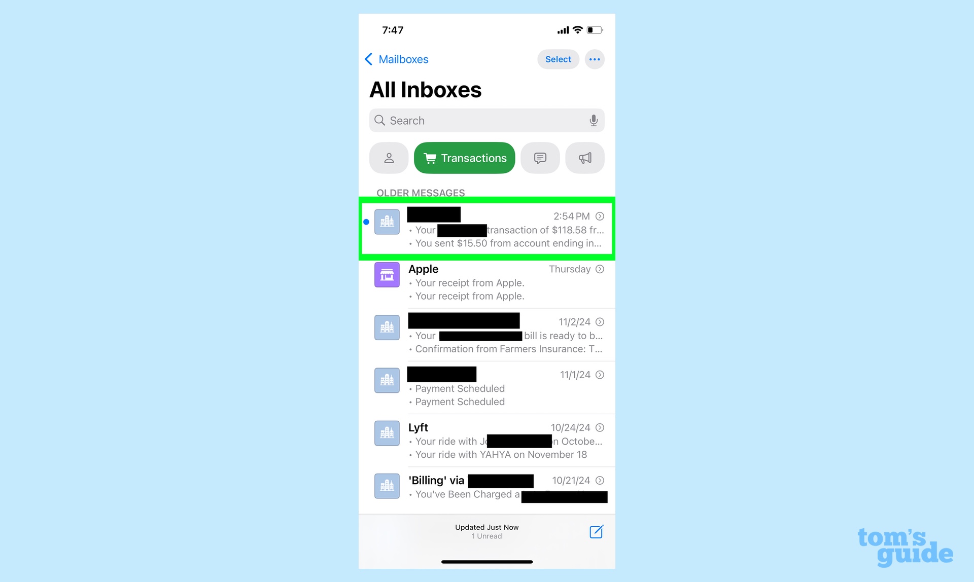
If we pop over into the Transactions inbox, you'll see I have a new alert from my bank of a purchase I made with my debit card. Now maybe that's not the most pressing email I've ever received, but it would have been nice to know that it was there. The redesigned Mail doesn't tell me, though, forcing me to tap on each individual inbox to check if any new messages have arrived. That seems to run counter to the idea of better organization if I have to go on a wild goose chase just to find an email.
Deleting messages is more complicated
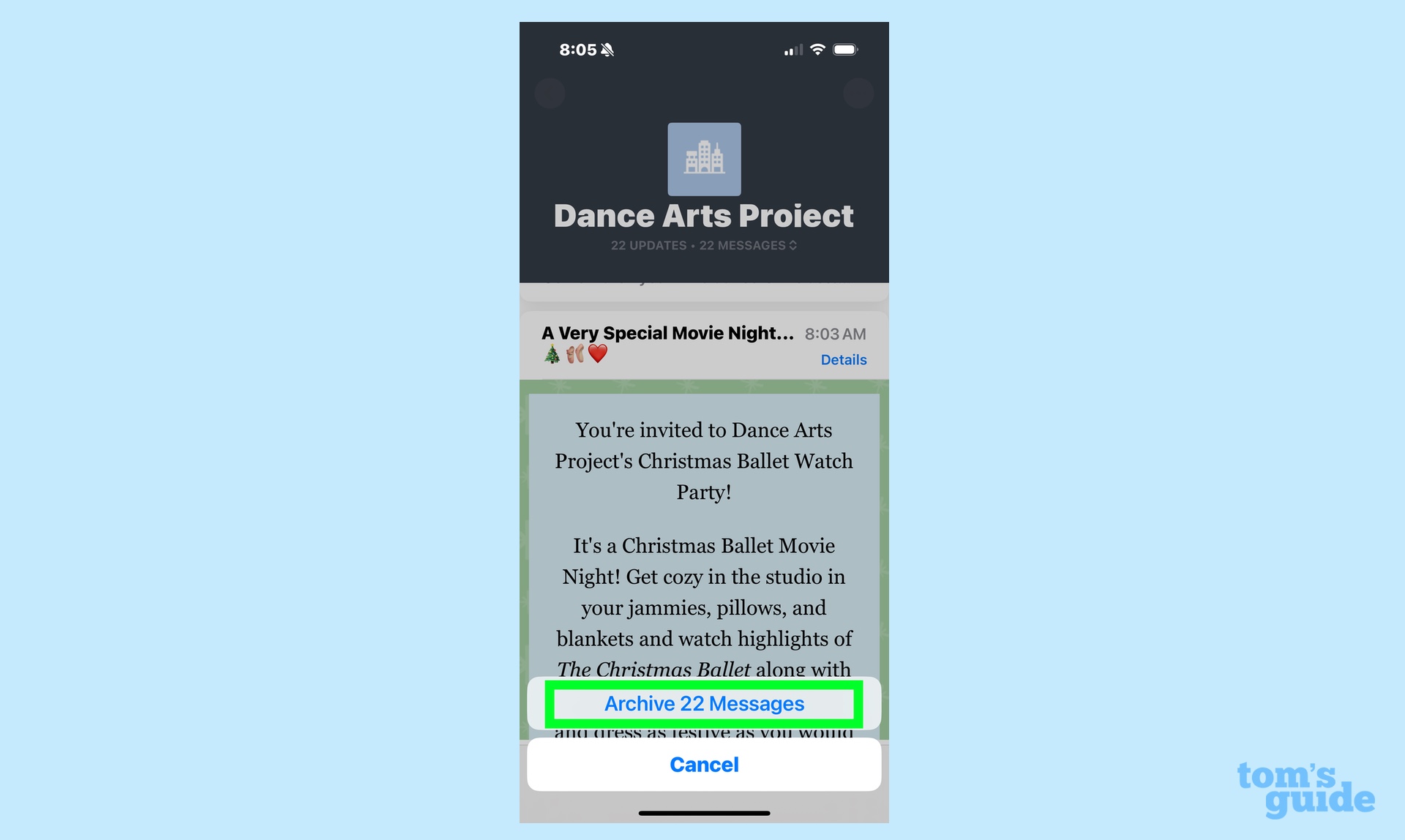
Mail groups messages from some senders together now. It's done inconsistently. but it seems to mostly seems to impact things like newsletters, group mailings and receipts. My problem isn't really with the inconsistency of what gets grouped together, though. Rather, it's the fact that grouping has changed how emails get deleted.
Say I get an email from my daughter's dance studio about a scheduling change, and I go to delete it by tapping the archive button at the bottom of the screen — the way I've deleted messages since using Mail. However, because that scheduling change announcement is now grouped with every email the dance studio has ever sent me, tapping that button will delete every one of those messages, even if I kept them around for good reason.
There's a workaround — if you swipe left on an individual message in the grouped emails, a menu pops up allowing you to delete just that message. I'll just have to relearn how I delete emails, I suppose, but I do think Apple should have kept the old behavior in place.
Cut-off email
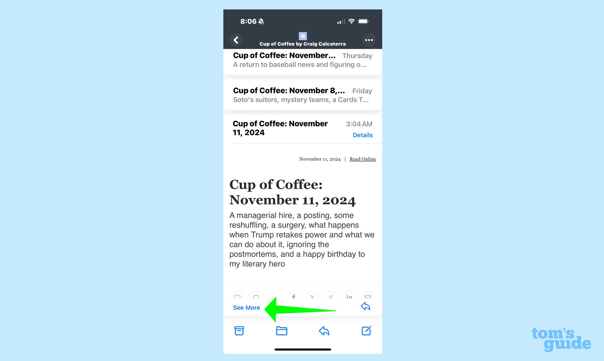
Grouping together emails from the same sender has another consequence — you end up having to tap twice to read a message if Mail determines that it's too lengthy.
Above, you can see an email newsletter I subscribe to. Or more accurately, you can see the headline and first paragraph. Mail has hidden the rest, adding a See More command I need to tap if I actually want to read the email I selected to read in the first place. In the greater scheme of things, it's a minor annoyance, but why even add this completely unnecessary step? The only thing it accomplishes is to make Mail less useable and hasten my switch over to Gmail.
iOS 18 Mail outlook
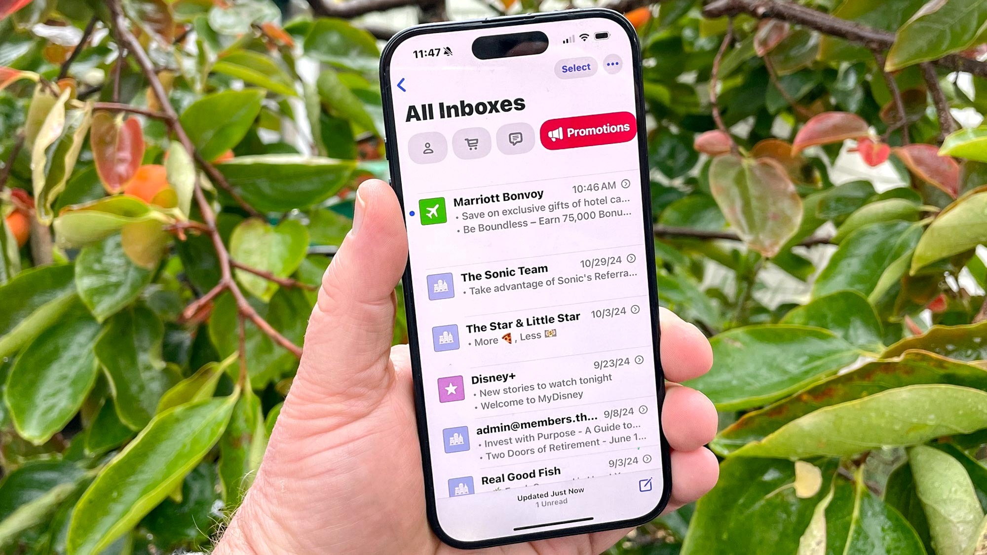
There are two important things to be aware of as we discuss the problems with Mail's new look. For starters, you don't have to suffer through this redesign if you don't want to. Apple included a way to go back to the List View in the Mail app, perhaps anticipating that not everyone is going to be pleased with the changes to the app.
We should also remember that iOS 18.2 is in beta, and betas give people the chance to provide Apple with feedback. That happened with the initial iOS 18 beta when users complained to Apple about a feature in Photos where you could swipe to the left or right of your photo library to see other collections of photos. Some people found that too busy, and so Apple dropped it from the final iOS 18 release.
I'm hopeful that Apple is similarly open to fine-tuning Mail. Like I said at the outset, the idea behind reorganizing the app to sort messages into relevant categories is a solid one. But right now the execution leaves a lot to be desired.
More from Tom's Guide
- I just tried Visual Intelligence on the iPhone 16 — this is actually upgrade worthy
- In iOS 18.2, you can share your AirTag location with other people
- I've been testing Apple Intelligence — here's 3 reasons why it's worth upgrading to a new iPhone
Philip Michaels was a Managing Editor at Tom's Guide. He's been covering personal technology since 1999 and was in the building when Steve Jobs showed off the iPhone for the first time. He's been evaluating smartphones since that first iPhone debuted in 2007, and he's been following phone carriers and smartphone plans since 2015. He has strong opinions about Apple, the Oakland Athletics, old movies and proper butchery techniques. Follow him at @PhilipMichaels.

 Club Benefits


