
 Club Benefits


You may think that the iPhone 14 Pro and iPhone 14 Pro Max's Dynamic Island is one of the biggest reasons to upgrade. But as far as I'm concerned, this morphing display cut-out is currently a waste of potential.
Apple decided to one-up the simple selfie camera punch-hole found on Android phone displays, by letting the display area around it adjust to show you ongoing activities from certain apps. It gets rid of the long-maligned notch and tries to give it some actual use beyond just being a hole in the screen. But having initially been impressed by the concept at launch, I'm disappointed at how little use it's provided me over a month of the iPhone 14 Pro Max being my daily driver.
I appreciate that we're less than two months into the iPhone 14 Pro's life, but the apps I commonly use don't have any use for the Dynamic Island. Most of the time, the Dynamic Island stands empty, essentially being just a regular notch like the standard iPhone 14 and earlier iPhones had.

More functions are coming, such as the recently added ability to show live sports scores in the Dynamic Island. But until more third-party developers find a way to make use of the Dynamic Island, its potential will understandably be limited. The only non-Apple app that I use which takes advantage of the Dynamic Island right now is Tidal, but trying to control streaming music through the Island is an exercise in frustration.
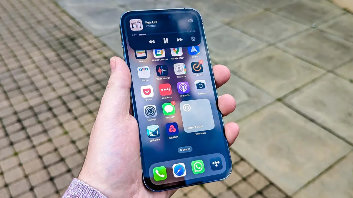
When I do have music or a podcast playing, the Dynamic Island can be useful for controlling playback. But for some inexplicable reason, Apple decided to make those apps exit the Island after just five seconds when you pause them. That means to get your music playing again, you either have to leave the Island open (meaning you can't touch anything outside the Island), or open Control Center or the app itself.
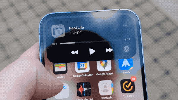
The lock screen and Control Center Now Playing Widget don't clear immediately when you pause, so I don't know why the Dynamic Island can't keep my album or podcast around for longer. It's not even that I'm trying to use another app that would compete for space, because the only app I do tend to use at the same time, the Clock app for timing my tea and coffee brewing, can be used simultaneously.
There are some things I like about the Dynamic Island, like how it handles brief pop-up notifications such as Face ID, Apple Pay, or confirmation you've started charging. It provides a convenient secondary space for those to quickly catch your attention while letting you continue to use the rest of the screen. Ideal if you're a compulsive multitasker like me. But I want it to be capable of far more than just alerts and a temperamental Now Playing widget. Ideally, I'd like it to become the iPhone equivalent of the slide-over app window I regularly use on my iPad. An always-accessible way to interact fully with one app, that can then be quickly minimized to get back to a second app in the foreground.
I don't regret upgrading to the iPhone 14 Pro Max, as the display, performance and cameras are all good reasons to swap already. But the Dynamic Island isn't worth visiting by itself, and it likely won't be until Apple and other developers can build new attractions, and make its existing features more practical.

