
 Club Benefits


Windows 11 is not, I’ll admit, as exciting an upgrade as I’d hoped for. Windows 10 felt like it was rescuing us from the touchscreen-warped horrors of Windows 8, but in the absence of anything seriously wrong with the current OS, Windows 11 looks a lot more modest.
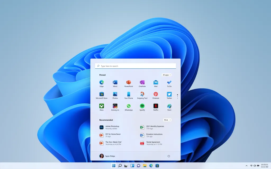
That said, there is one big change I’m looking forward to: the new Windows 11 Start Menu. For this alone, I’ll probably take advantage of my free upgrade from Windows 10 as soon as the finished version launches.
- Windows 11 system requirements: Check to see if your PC can run it
- How to install Windows 11 — a step-by-step guide
- Plus: Windows 11's most exciting gaming feature is coming to Windows 10
Yes, the fact that this opens from the middle of the Windows 11 taskbar is a little weird, and will likely need a reconditioning of several decades’ muscle memory. But it’s a wholly sensible, practical upgrade for a feature that’s acted as the very backbone of Windows since its inception.

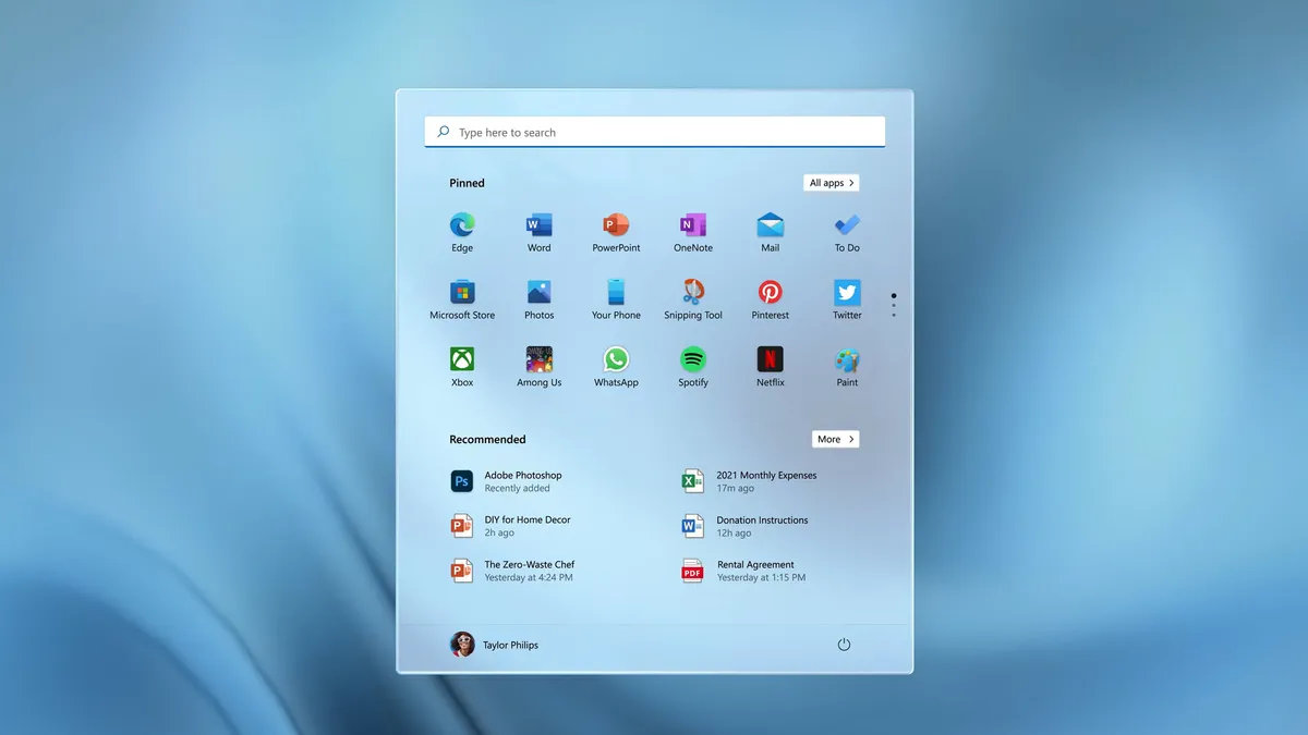
To truly understand why it’s worth getting hyped for a UI element, you first need to understand what’s wrong with the Windows 10 Start Menu. And to demonstrate, here’s a completely candid, no-changes-made screenshot of my own PC’s Start Menu:

I mean, just look at all that… nothing. I vaguely remember opting for as few Live Tiles as possible, but this just leaves digital acres of grey void. And of the tiles that remain, why are most of them even there? I haven’t used Microsoft Edge since I last installed Chrome, and there’s an “Xbox Console Companion” despite the minor detail that I have never owned an Xbox console in my life. I think the Blue app is on me — probably pinned by accident — but I don’t even know how to play Solitaire.
As such, 70% of the Windows 10 Start Menu is functionally useless to me. There’s nothing offensive about the alphabetical list of apps, but note how it cuts off once we barely reach the Bs. If I want to find an app that isn’t deemed worthy of being pinned to my taskbar, or has a desktop shortcut, it’s quicker to just start typing its name in the Search Bar than it is to scroll through.
The Windows 11 Start Menu, in my eyes, makes far better use of the space. Its single wisest move is to kill off Live Tiles entirely, leaving more room for pinned apps while simultaneously arranging them into a cleaner, more readable grid.
I suspect this will actively encourage me to make better use of app-pinning; while I have some work-critical software stuck to my taskbar, the ugly and unintuitive Windows 10 Start Menu never felt like an ideal alternative.
In Windows 11, I’ll be able to build a much tidier 3 x 6 lineup of apps I use a lot, but which don’t quite merit a seat on the taskbar. I shouldn’t need to use Search or scroll through that alphabetical list as much, either.

Another new Start Menu feature, the Recommend grid of apps and individual files, is intriguing, too. It looks as if this presents recently opened items that aren’t currently pinned elsewhere, so could be handy for jumping back into a Word document or media-editing project that I’d previously left unfinished. In Windows 10, there’s also a “Recent files” section in File Explorer that gives me a similar form of quick access, but it makes sense to consolidate Recommended items with pinned apps under one “Stuff you probably want to open” umbrella.
The Start Menu might not be as overtly flashy an upgrade as some Windows 11 features, like its Auto HDR mode for games or its support for Android apps. But in terms of what I’d actually use every day, it could easily end up as one of the new OS’ most significant improvements.

