iPadOS 14 suddenly makes the iPad look a lot like a MacBook
iPadOS 14 contains a series of visual steps in the evolution of the iPad
Here at Tom’s Guide our expert editors are committed to bringing you the best news, reviews and guides to help you stay informed and ahead of the curve!
You are now subscribed
Your newsletter sign-up was successful
Want to add more newsletters?
Join the club
Get full access to premium articles, exclusive features and a growing list of member rewards.
When I first saw iPadOS 14, I felt like I was seeing a significant change in Apple's tablets. While many saw the Magic Keyboard as a step to make the iPad Pro more like a MacBook, these new software changes give an even stronger hint to how Apple's hardware is unifying.
These changes feel like they add up to a substantial shift where iPadOS better fits the larger iPad display than it used to. While the Apple Pencil changes will make for neat new ways to use the iPad, the refined interface is why I'm most excited to get the iPadOS beta installed.
- Read our iPad Pro (2020) review
- iPadOS 14: Everything you need to know
- Just in: Acer Swift 5 is a super-light XPS 13 rival with Tiger Lake power
While Apple's devices don't all run the same operating system, the company's decision to slowly move to a unified design language is exciting to see. As Apple revealed during the unveiling of its custom Apple Silicon chips, we'll soon see iPhone apps such as Monument Valley on the Mac.
Article continues belowIt all makes for a very interesting moment in Apple's ecosystem. Here are the biggest signs that the Mac is infiltrating the iPad:
iPadOS borrow's macOS Spotlight search
The iPad started out with the visual language we knew from the iPhone, with the search field appearing at the top of the screen. But now that the iPad is slightly forking away from the iPhone, it's picked up cues from its nearest relative (in size): the Mac.
Now, when we go to search, we'll see a grey rectangular field pop up in the middle of the screen. It looks just like the Spotlight search field that comes up when I hit Command+Space, or click the magnifying glass icon in the menu bar.
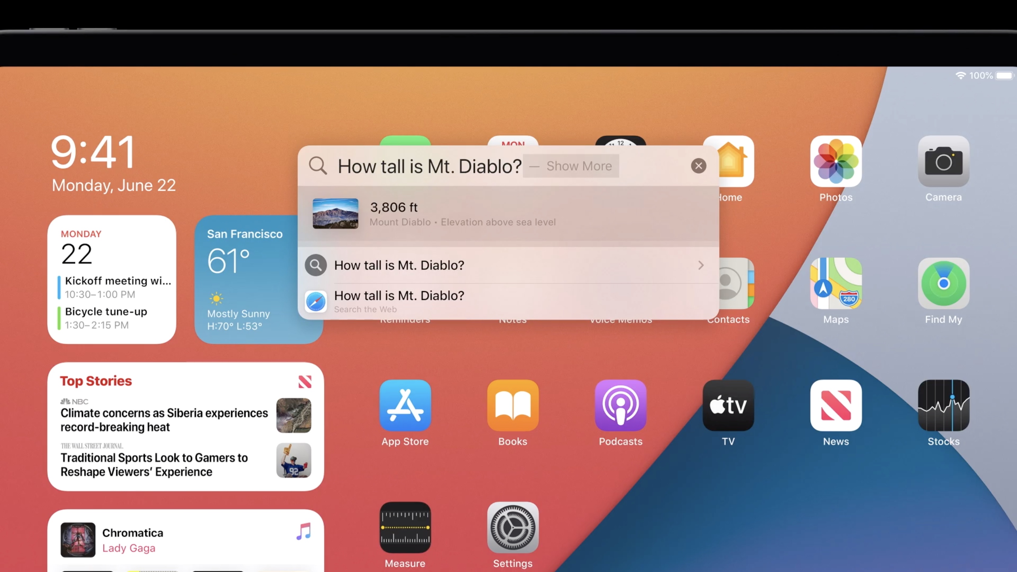
And just like in macOS, search on iPad can be used to open apps, look up specific facts and perform more tricks. It's always shared some of these tools, like the ability to convert measurements and perform mathematic equations.
Get instant access to breaking news, the hottest reviews, great deals and helpful tips.
The new search in iPadOS also presents a dropdown list of suggested answers. Just like on the Mac.
Those iPadOS menus look familiar
In iPadOS, many Apple applications now feature a left-side menu that's been a long time coming — and will remind Mac owners of how those apps look on the Mac. This is where Photos lets you easily jump between different ways you view your library.
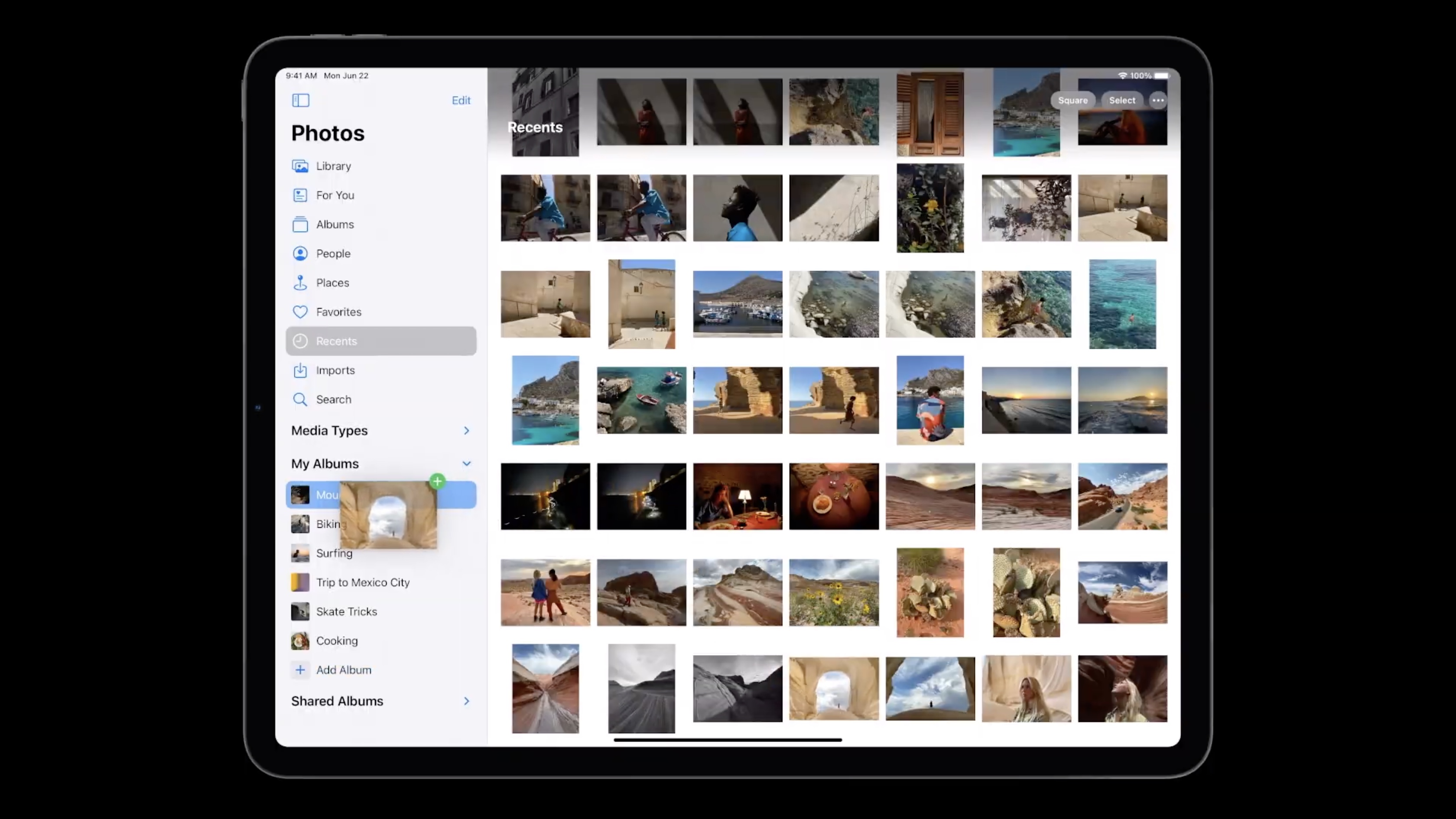
You start in the overall library with all of your photos, then there's For You, Albums and all the rest. It's nothing revolutionary, but it just looks right.
That's because here we see the iPad throwing out its inherited iPhone interface — where these options were tabs on the bottom of the screen — and moving them to the left. It's a smart change because it helps maximize the horizontal space on the iPad's screen.
Calls have thankfully become less-iPhone-like
Currently, the iPad's entire screen gets taken over when you get a telephone call. While that's changed in iOS 14 and iPadOS 14, I'm pleasantly surprised that both moved to a notification that appears on the top of the screen, like the Mac's.
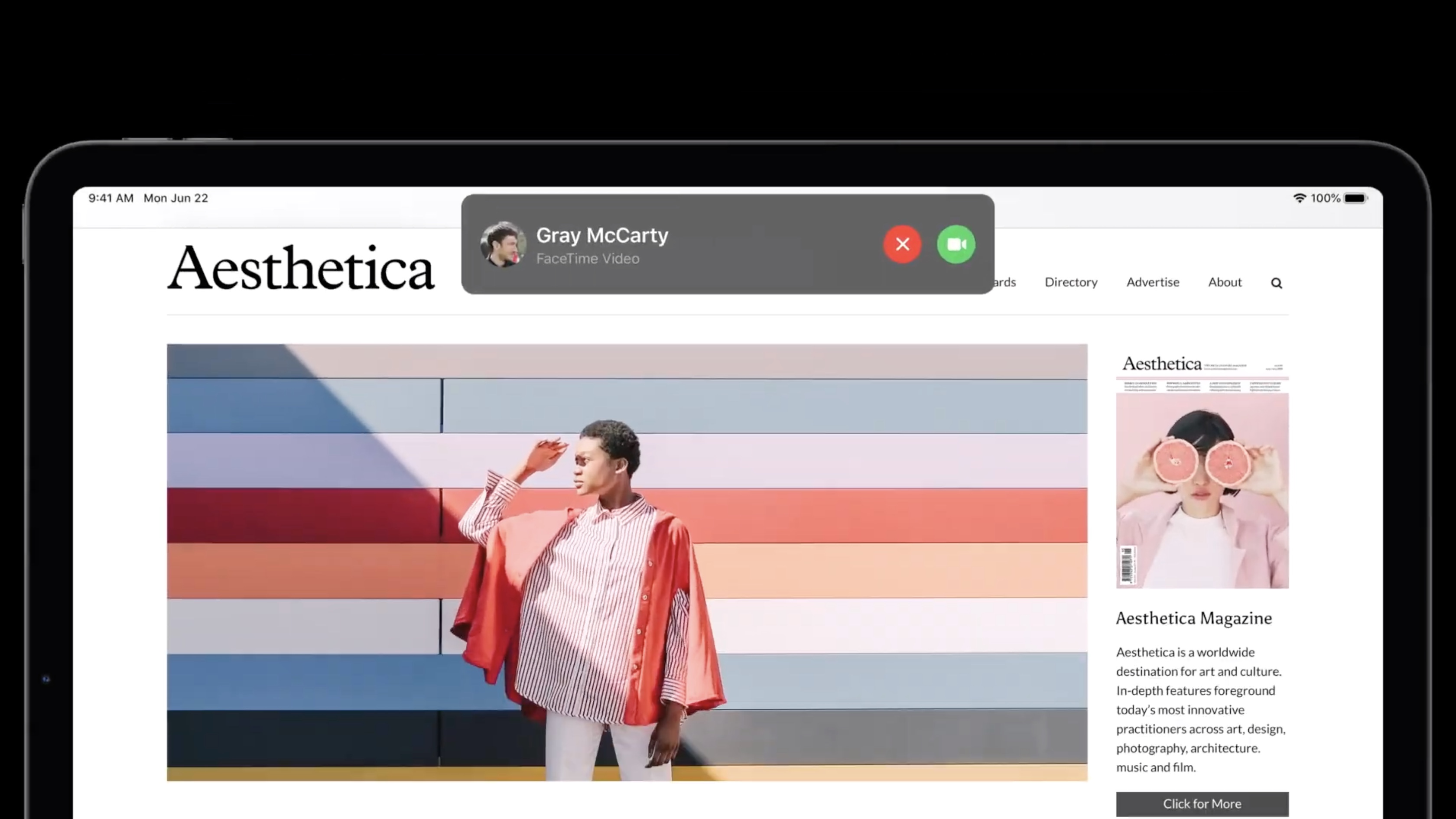
The only difference is that these notifications appear in the top center of the screen, and not the top right. This change makes some sense, as a phone call (even as we get more and more robo-calls) is more immediate than your average notification.
As we see here, iPadOS is being smarter about using the most of your screen estate, and now you can still see the rest of what you were doing.
Looking to WWDC 2021
With all of these changes, we get a lot of reason to think that Apple is working towards one unified operating system for its devices. This has long been rumored and murmured about in the tech press, and as I use iPadOS 14 on an iPad Pro connected to a Magic Keyboard, it's easy to see that future becoming a reality.
That being said, there's one more change that I think Apple's apps need on the iPad. If certain apps could work seamlessly across Apple devices, keeping your work and progress across platforms, it could allow for greater productivity.
It's great for iPadOS to look more like macOS. I'd just also like it to have some of the same strengths.

Henry was a managing editor at Tom’s Guide covering streaming media, laptops and all things Apple, reviewing devices and services for the past seven years. Prior to joining Tom's Guide, he reviewed software and hardware for TechRadar Pro, and interviewed artists for Patek Philippe International Magazine. He's also covered the wild world of professional wrestling for Cageside Seats, interviewing athletes and other industry veterans.

 Club Benefits


