PS4 vs. Xbox One (2013): Which Console Wins?
The launch smoke has cleared and gamers have officially entered the era of next-generation gaming. In one corner, you have the $499 Xbox One, a gaming console that wants to be the center of your living room experience. Complete with live TV integration,
User Interface

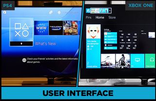
The PS4’s interface is more visually appealing than the PS3’s XMB presentation. The home screen features five default tabs, including What's New, Internet Browser, The Playroom, Live From PlayStation and Downloads. New tabs are added as games and apps are installed. The tabs are arranged horizontally and are navigated from left to right. Icons on the homescreen are larger than last time around, displaying the app’s name with a brief description.
MORE: Top 10 Xbox One Launch Titles
Xbox One’s interface is a mashup of the tiles from Windows Phone and Windows 8 with the old 360 interface. The result is a presentation that is clean, colorful and intuitive. We were disappointed, however, to discover that the interface doesn’t feature any animated Live Tiles.

Our favorite part of the interface by far is the Snap feature, which allows users to open two apps simultaneously and view them side by side. A great use of this feature was playing “Dead Rising 3” alongside an Internet Explorer browser set to gamefaqs.com.
Winner: Xbox One
Overall, we like the revamped user interface on the PS4 with its bigger images and straightforward interface that’s easy to use and master. However, the Xbox One presents a cleaner and more visually engaging interface with nearly effortless multitasking.
Current page: PS4 User Interface vs. Xbox One User Interface - Tom’s Guide
Prev Page Kinect 2 vs. Playstation Camera - PS4 vs. Xbox - Tom’s Guide Next Page PS4 vs. Xbox One - Social Features and Integration - Tom’s GuideSign up to get the BEST of Tom's Guide direct to your inbox.
Get instant access to breaking news, the hottest reviews, great deals and helpful tips.
Sherri L. Smith has been cranking out product reviews for Laptopmag.com since 2011. In that time, she's reviewed more than her share of laptops, tablets, smartphones and everything in between. The resident gamer and audio junkie, Sherri was previously a managing editor for Black Web 2.0 and contributed to BET.Com and Popgadget.
