Latest about Gaming
Amazon Gaming Week — 13 deals I’d buy now to upgrade my gaming setup
Amazon just launched its Gaming Week 2024 sale, where you can find unmissable deals across PlayStation, Switch, Xbox and PC.

I tried CRKD’s new NEO S gamepad, and it’s made me completely rethink retro controllers
First CRKD turned my Nintendo Switch into a Steam Deck, and now they've shown me just how good a retro-style controller with a few modern twists can be.

Today's Wordle hints and answer — solution #1,050, Saturday, May 4
Find out what today's Wordle hint and answer is and get some hints for it, plus see the solutions to previous games.

NYT Strands today — hints, spangram and answers for game #62 (Saturday, May 4, 2024)
We help you find today's Strands answers with some useful hints and tips to win.
Nintendo utilizes Gom Jabbar pain box to hide Switch 2 from third-party manufacturers
How far is Nintendo willing to go to keep Switch 2 details from leaking out? A recent report claims the console maker is taking a page out of Dune's book to keep the upcoming device a secret.
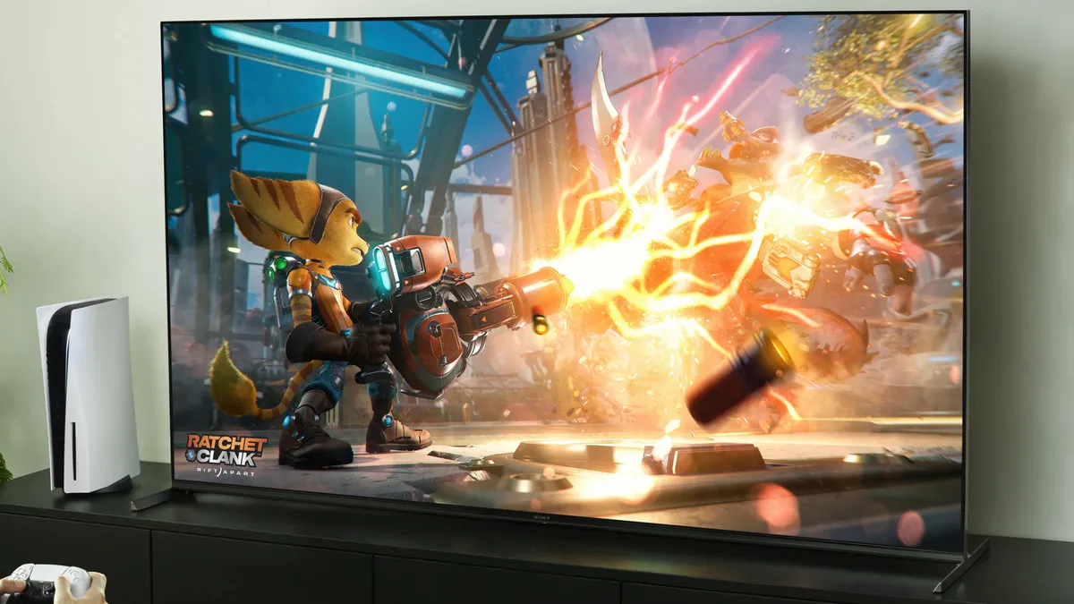
Best TV for gaming in 2024: TVs for PS5, Xbox Series X, PCs and more
These are the best gaming TVs you can buy, whether you play on a PS5, Xbox Series X, Nintendo Switch or last-gen console.

Sony just made this big change to Helldivers 2 — and PC players aren't happy
On Steam, Sony announced that PC users will need to link their Steam account with a PSN account. It has not gone over well.
One of the most valuable NES games of all time could be coming to Nintendo Switch
The Nintendo World Championships: NES Edition has been rated by the ESRB for Nintendo Switch.