iPadOS 15 is one of the most important iPad updates ever
Multitasking for everyone looks possible in iPadOS 15
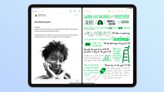
Seasoned iPad veterans may not see iPadOS 15 for the massively important update it truly is. As someone who groused about wanting a more Mac-like experience, I was admittedly let down at first glance. But the more I looked at iPadOS 15's changes, the more I realized how it is a huge game-changer for the iPad.
Multitasking has long existed in the iPad, dating back to iOS 9, before "iPadOS" was a thing. But this update refines it in ways that will make many more people will likely be able to use the iPad's potential, and not just see it as a thing where you do one thing at a time, or just consume content.
- iOS 15: All the new features for your iPhone
- How to download the iPadOS 15 developer beta
- Save money with the best Apple Pencil alternatives
iPadOS 15 multitasking made easy
One little change that you shouldn't take for granted is the Multitasking menu button at the top of every iPadOS 15 app. In iPadOS 14 and earlier, there was a line in this space, which you could drag down to detach a window for all kinds of multitasking.
You could move it around, to either be on the other side of the screen in split view, move it to the center to go to full screen mode or position it as a slide-over app, popped on top of another. And as an iPad power-user, I've learned those features for writing articles about how to split screen on an iPad and how to use slide-over apps on an iPad.
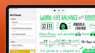
But unless you pay close attention during set-up (where most just tap Next until they're done), use the iPad's Tips app (most won't) or read our articles (I would love that), that mechanic isn't obvious. In fact, it's not that clear at all. To paraphrase Little Shop of Horrors, that little horizontal line doesn't scream "tap me, Seymour." It says "Hey, I'm a line."
The three dots button, however, screams to be tapped. We've seen this kind of icon throughout apps everywhere — most notably in Chrome — an indicator for options. And that's what it does here as well: options for multitasking.
Tapping that button opens up a small menu of three choices: full screen, split-view and slide over. These little glyphs may not be clear to all at first sight, but they are so much easier to try and understand than the process of dragging and dropping a bar. And the change to the design language makes me think many more people will likely discover iPad multitasking for the first time.
Sign up to get the BEST of Tom’s Guide direct to your inbox.
Upgrade your life with a daily dose of the biggest tech news, lifestyle hacks and our curated analysis. Be the first to know about cutting-edge gadgets and the hottest deals.
iPadOS 15 means less reliance on the Dock
Before iPadOS 15, multitaskers looking to pair applications relied on dragging an app from the dock to the screen, to either split the screen or use an app in slide over mode, was the primary way to start multitasking. That meant you had to pick and choose the apps you put in the dock wisely. Dragging
There was a secret way to get another app, though. If you have an external keyboard, you could use Command+Space to search and find an app not in your dock, and drag that app icon out of the results onto your screen. But not everyone had a keyboard, and so you were limited to the dozen or so apps in your dock, for what you wanted to multitask with.
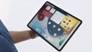
Now, iPadOS 15 solves that issue with a new interface change. If you drag that little three-dots button dragged down, it goes away to reveal your whole iPad home screen. And the app you select will either replace the split-view app you moved down or fill in the other half of the screen if you moved the three-dots button for a full-screen window.
This is one of those "how it should have been all along," moments for iPadOS 15.
iPadOS 15 gets the App Library finally
iOS 14 introduced the App Library, a way to organize all your apps by category — and also reduce your number of home screen pages (without folder management). iPadOS 14 didn't get this feature, which was curious to say the least. Yes, the iPad screen is bigger and can store more applications, but what if you don't want 6 pages of apps?
Well, thankfully, iPadOS 15 now has the App Library, and it helps in three ways. Of course, it lets you reduce the number of home screens, if you so choose. As shown off at WWDC, holding down on an icon to edit the home screen will give you a subtle button at the bottom of the screen that shows how many pages of apps you have. Tap that button to see all your home page screens at once, and click the Minus button to remove a whole page of apps, confining them to the App Library.
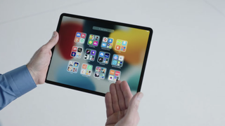
Next, remember how I said swiping a three-dot button reveals your home screen? In the bottom right corner, at the suggested apps side of the dock, you'll see an App Library button — which iOS 15 doesn't have (likely due to space concerns). this will make it super-easy for you to find that app you're looking for.
Placing the App Library there is basically Apple's way of giving the iPad its own version of Windows' Start Menu. Except it organizes your apps by type, while also having an alphabetical sort (found in the search field at the top of the screen).
Widgets maximize the iPad screen
Lastly, there's also the whole "widgets everywhere on the home screen" feature, another iOS 14 feature that the iPad had to wait an extra year to get.
This is a huge deal because of all that screen space. Your dock already lets you access most of your favorite apps easily, so how many more do you need filling up the rest of your iPad display? All that space may feel underutilized, but now it can be maximized. Now, you've got something more akin to a desktop and dashboard of functionality, with all your favorite app widgets (including the new XL-sized Photos widget that seems ideal).
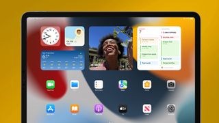
This makes the iPadOS 15 home screen more complete, and a more productive place to skim for information or enjoy an old photo of family, friends or a nice meal you just had to capture.
iPadOS 15 outlook
I still yearn for an iPadOS update that lets apps work in greater harmony together, something that sandboxing explicitly forbids. So, until Apple comes around on that, I'll give them credit for how iPadOS 15 seriously improves how users will make apps work side-by-side.
Many users may want the iPad to be more like the Mac — it shares the same CPU after all, we saw Tim Cook remove the M1 from the Mac and put it in the iPad Pro in that ad! But, now, everyone has a better shot of figuring out how to make their iPad more effective. And that's a pretty big win.
- iPad vs iPad Air vs iPad mini: Which tablet is right for you?
- Read next: Check out our iPad Pro 2021 (12.9-inch) review

Henry is a managing editor at Tom’s Guide covering streaming media, laptops and all things Apple, reviewing devices and services for the past seven years. Prior to joining Tom's Guide, he reviewed software and hardware for TechRadar Pro, and interviewed artists for Patek Philippe International Magazine. He's also covered the wild world of professional wrestling for Cageside Seats, interviewing athletes and other industry veterans.
